Add charts, maps and diagrams to slides
Put real data on your slides. Ten chart types, world maps, Gantt timelines, flowcharts and classic frameworks like SWOT and Venn, all editable and styled by your theme.
Presentations 4 min read Updated
This guide shows you how to put real data on your slides: charts, world maps, Gantt timelines, flowcharts and framework diagrams, and how to edit the numbers behind them.
A wall of bullet points asks the room to imagine your point. A chart just makes it.
Add a data slide from the library
Click From Library at the top of the slide rail and filter by Role: metrics for KPI layouts, comparison for side by side layouts, timeline for roadmaps and Gantt charts, diagram for frameworks. Pick a template and it joins the deck already wearing your theme’s colors.
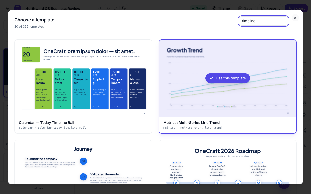 Filter by role and pick a designed slide. It arrives in your theme’s colors.
Edit a chart’s data
Click any chart and its editor opens in the side panel. Switch the type between columns, bars, stacked, line, area, pie, donut, radar, waterfall and waffle. Then make the data yours: rename categories, type in values, add series, set the unit, $, %, K. Series colors come from your theme, so the chart never clashes with the deck, and Reset to AI brings back the generated values if you experiment too far.
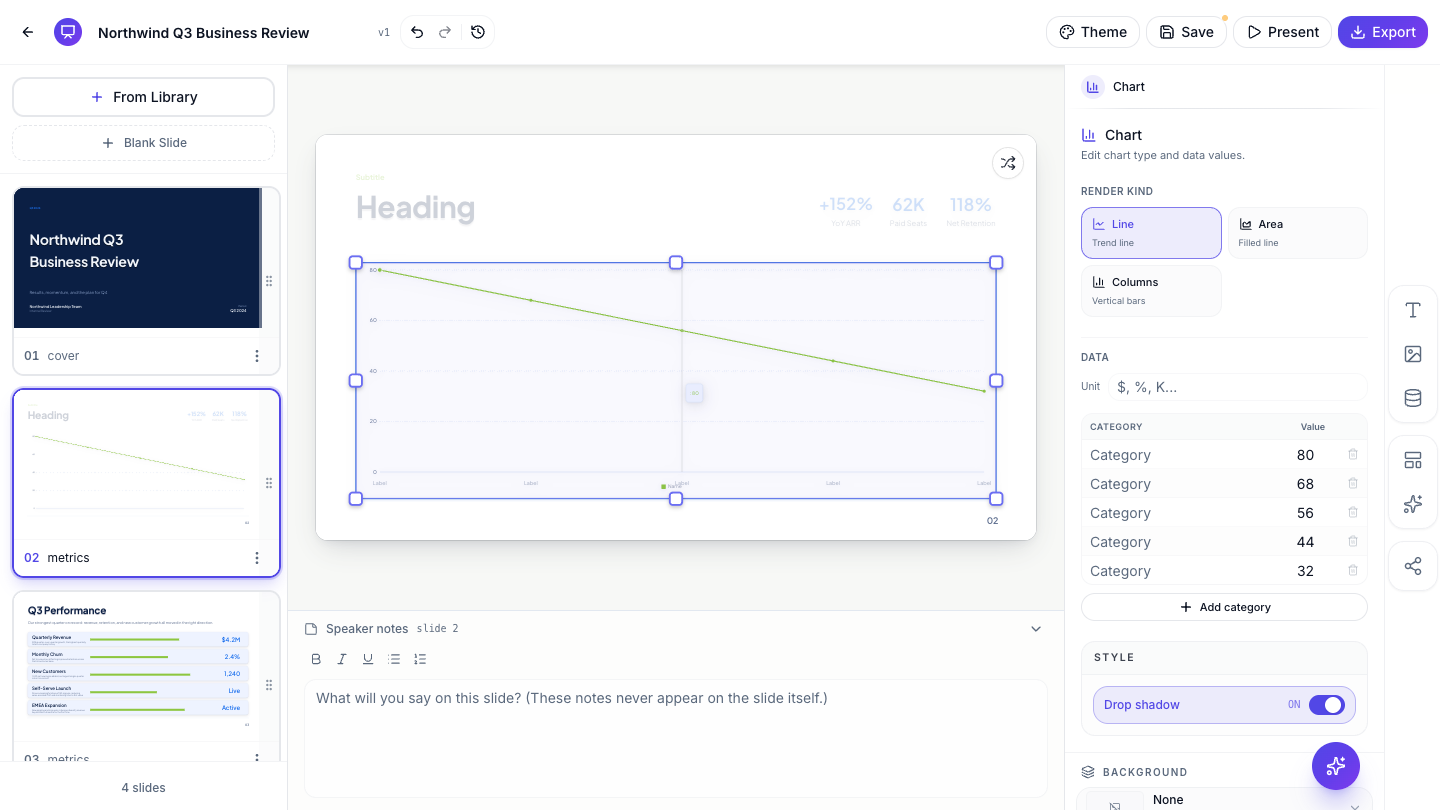 Pick the chart type, then edit categories, values and series in place.
Switching kinds never touches your numbers. The same three product lines can run as a trend line one minute and stacked columns the next, and the chart re-draws around the data.
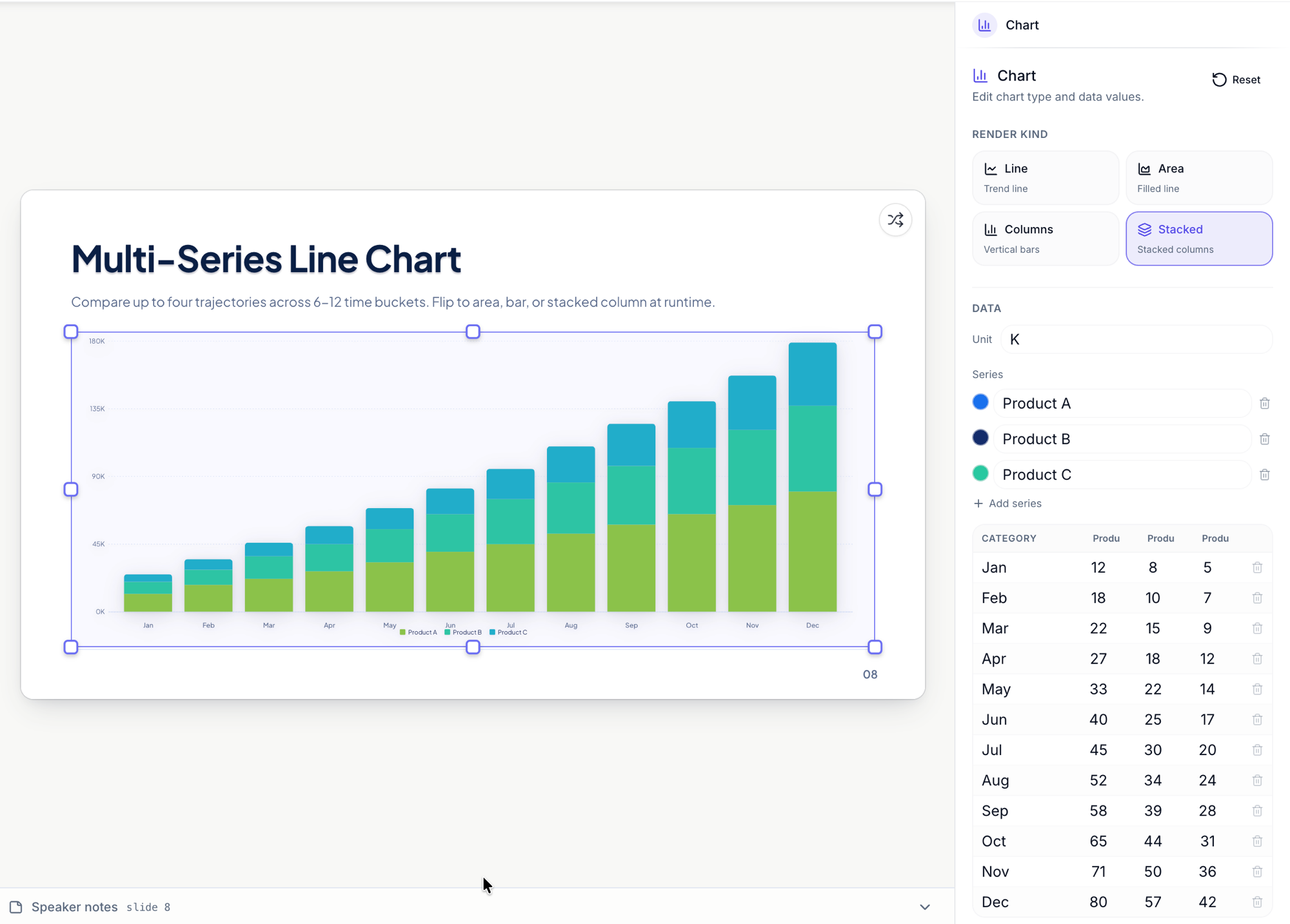 Same data, one click later. Line becomes stacked columns, nothing re-entered.
For share-of-total stories, the same editor drives pie, donut, horizontal bars and the waffle, a 100-cell grid that makes dominance visible at a glance.
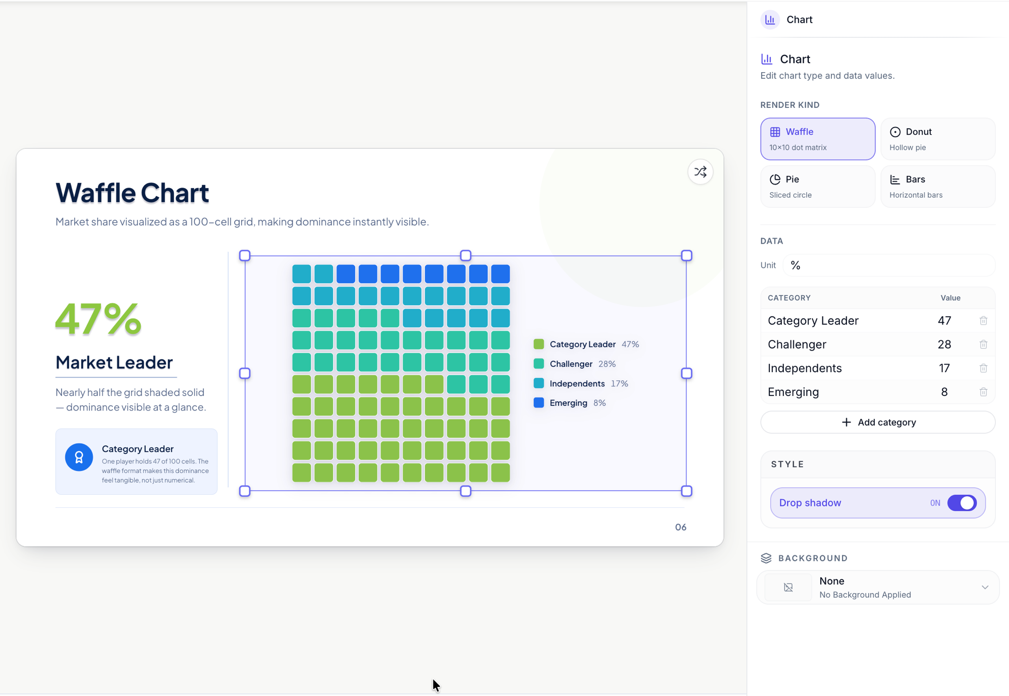 The waffle: market share as 100 cells. Flip the same data to pie, donut or bars.
Highlight countries on a world map
Map slides color real countries. Add them by code, USA, DEU, JPN, with autocomplete to help, and choose the mode: Highlight paints your markets in a flat accent, Choropleth shades each country by its value, revenue by region, users by country. Fill colors are theme tokens, so maps restyle with the rest of the deck.
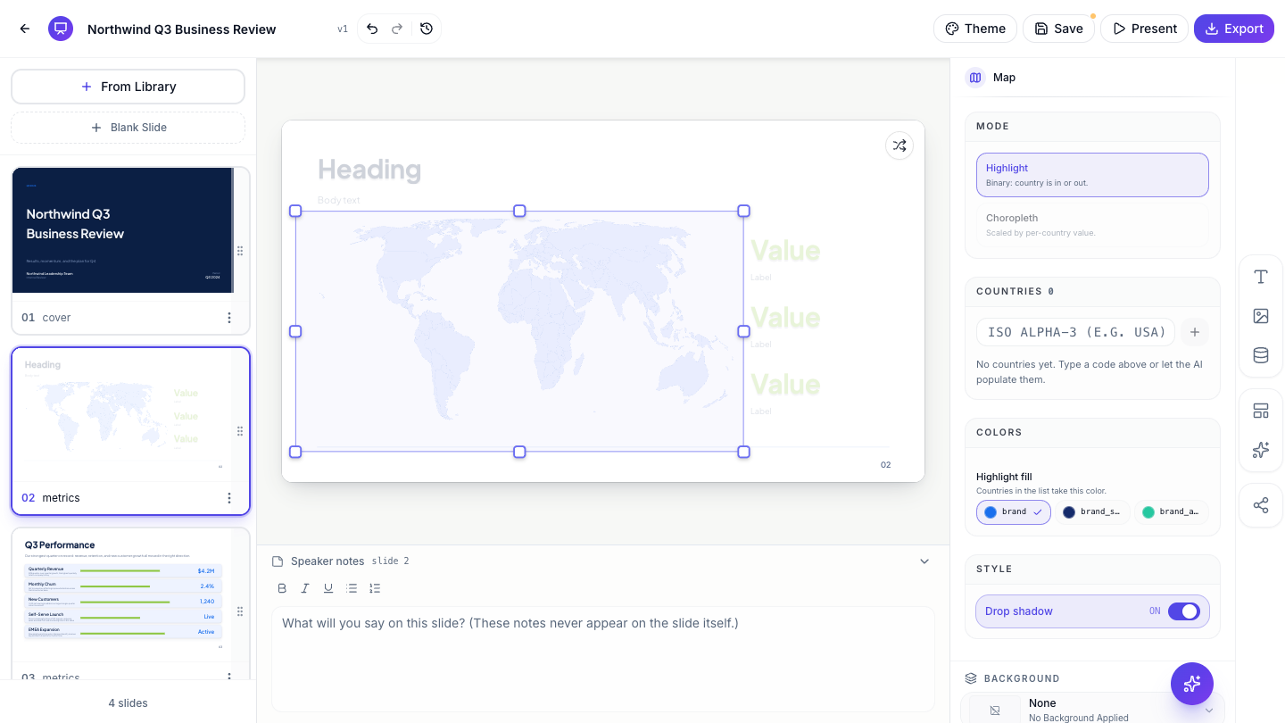 Highlight your markets, or shade countries by value with choropleth mode.
Plan on a Gantt, explain with a flowchart
For roadmaps, the Gantt editor works in plain tasks: name each one, set its start and end column, and group related tasks by color. Column labels are yours to edit, so it can run in weeks, quarters or phases.
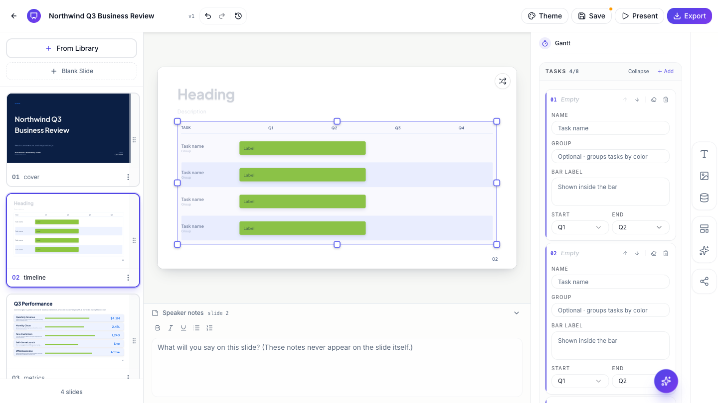 Tasks, start and end, and a group color. The layout takes care of itself.
Not every roadmap needs bars. Milestone timelines walk your quarters along a single line, each stop with its own title and detail, and every milestone is a plain item you edit in the side panel.
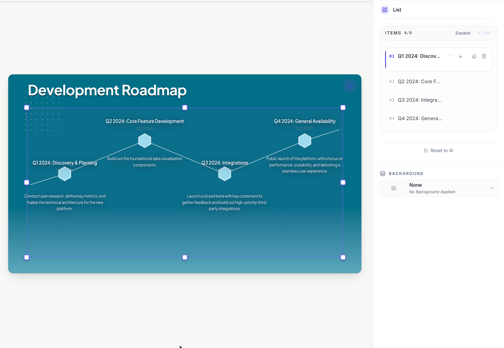 A quarter by quarter milestone timeline. Each stop is one editable item.
Flowcharts handle processes and decisions. Each node gets a shape, rectangle, pill, decision diamond or circle, you connect them with edges, and the layout arranges itself so you never nudge boxes into line. Perfect for “which chart should I use” decision trees, approval flows and onboarding paths.
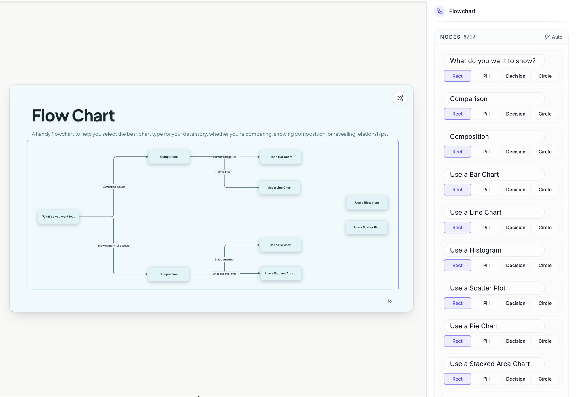 Pick a shape per node. The connections and the layout are automatic.
Frameworks the room already knows
The diagram library covers the shapes meetings run on: Venn with two or three sets, funnel, pyramid, cycle, fishbone, org chart, honeycomb, Porter’s 5 Forces, Kano and gap analysis, plus 2×2 and SWOT matrices. Each one is a proper editable diagram: click it, pick the visual kind, and edit each node’s label and description in the side panel. QR codes and 1,500+ icons round out the set.
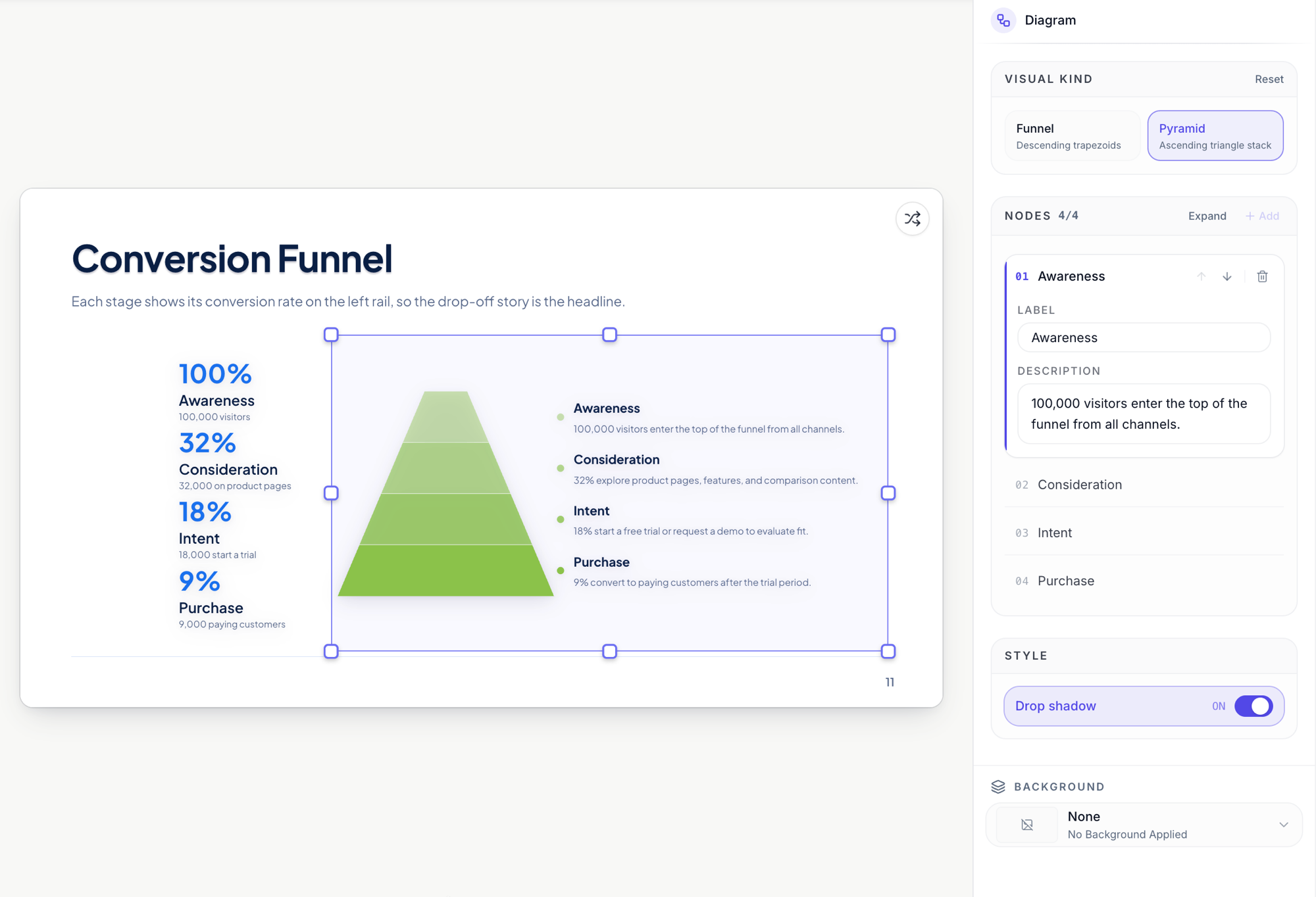 A funnel is data too: each stage is a node you edit, and one click turns it into a pyramid.
SWOT arrives already boxed: four quadrants, each a plain list of points you edit in place. Switch the matrix kind to 2×2 and the same slide becomes a generic quadrant chart for prioritising anything.
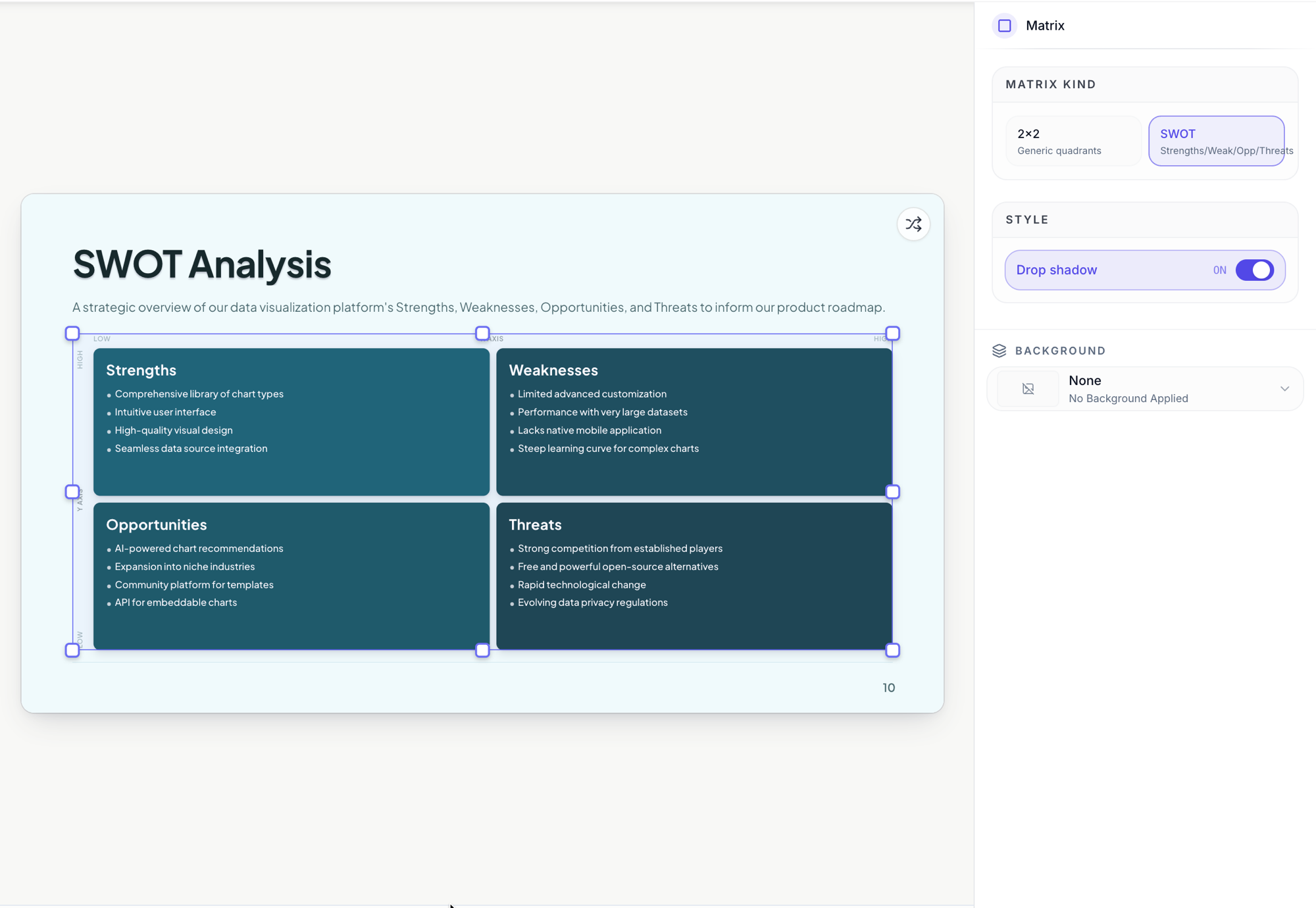 SWOT or a generic 2×2, one toggle apart. Every quadrant is an editable list.
Org charts work the same way: a root node, departments under it, and the people inside each one, all edited as simple labels in the side panel while the tree draws itself.
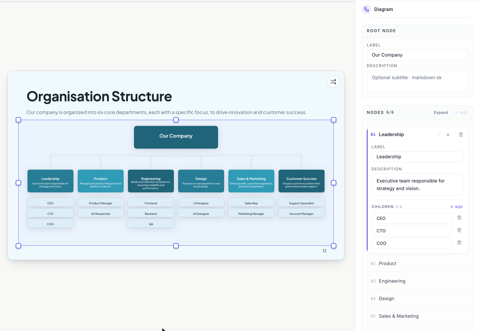 Departments and their people as plain labels. The tree lays itself out.
Or just ask the assistant
Describing beats configuring: open the AI assistant and ask for “a bar chart comparing our three plans” or “a timeline slide for the Q4 roadmap”. It proposes the slide, you preview the change, and apply it when it fits. From there the side panel editors above are how you polish the numbers.
Ready to try it yourself?
Start free. Describe what you need and let OneCraft do the first draft.
Get startedMore presentations tutorials
- Make a pitch presentation with AI Describe your topic and let AI write and design the whole presentation. Restyle it, add slides and your logo, then export to PowerPoint or PDF, or share a link.
- Present your slides with speaker notes and a pen Present full screen in your browser, keep private speaker notes beside the slides or on a second screen, and mark things up live with the highlighter and pen.
- Record a presentation with voiceover Present your finished deck and record it as a video, your voice and camera over your slides, with pause and resume, then download it to share anywhere.