Every document component and when to use it
A tour of the blocks you build documents from, headings and sections, stats and charts, tables, signature blocks and inline fill-in fields, with the settings each one gives you.
Documents 8 min read Updated
This guide is a tour of the components you build documents from: what each one is for, when to reach for it, and what settings it gives you.
There are a lot of them. You will use six regularly and be glad the rest exist the day you need them.
The toolkit
Everything lives in the Components panel on the left, grouped into categories: Document, Layout, Media, Design, and then the field groups. Drag a tile onto the page to place it, or just click it and it drops at the end of the document.
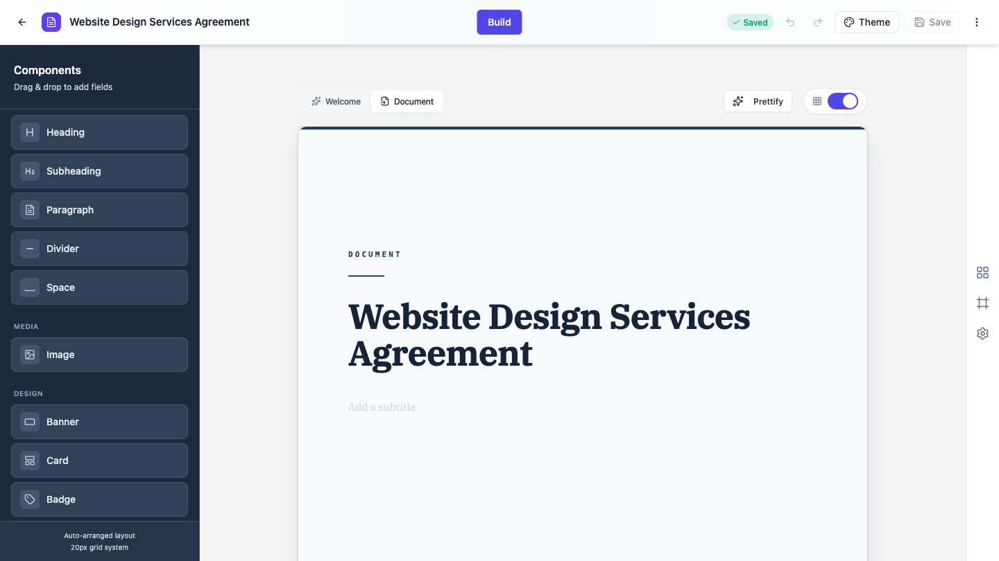 The toolkit, grouped by category. Drag a tile in, or click to add it at the end.
Once a block is on the page, most of them let you type straight into them: click the text and edit it in place. For the rest of the settings, click the block to select it, then click the gear on its top right corner. That opens the Properties panel on the right. The red X beside the gear deletes the block.
A few things worth knowing up front. Hold Ctrl or Cmd and click to select several blocks at once, or Shift and click to select a range, then use the Delete button that appears. Ctrl+Z and Cmd+Z undo. Colors come from your document theme rather than from each block, so restyling everything at once happens in Theme Studio, not here.
Layout: the everyday text blocks
Heading and Subheading are your section titles. Both have a Style setting with three choices: Plain, Card, which fills the title with a solid accent block, and Soft tint, a gentler tinted version. Font size, family, color and alignment live in their Font Settings.
Paragraph is ordinary body text, and the one block with full rich text. Select it and a toolbar appears with bold, italic, underline, font, size, text color, alignment, bullet and numbered lists, and links.
Divider draws a hairline rule across the column. It takes its color from the theme and has no settings of its own.
Space adds a deliberate gap. Page break ends the page. Both are covered in Lay out a document exactly how you want it.
Document: the contract and report blocks
Section is the numbered clause block, the backbone of any contract. It has a number, a bold title, and a body, and it handles a page boundary gracefully: when the body runs onto the next page, the continuation carries on without repeating the number and title.
Letterhead is a company name on the left with an address and contact block on the right, underlined by an accent rule. Put it at the top of a letter or an agreement.
Contents is a table of contents: section titles on the left, dot leaders, page numbers on the right. The useful part is that the page numbers are worked out for you when the document is exported, matched against the headings and sections in the document. Add or remove entries under Contents Entries in the panel.
Timeline is a vertical list of milestones, each with a date or phase above and the milestone below, joined by a connector line. Good for project phases and payment schedules. Add and edit steps under Timeline Steps.
Callout is a tinted note box with an icon, a bold title and a supporting line. Use it to lift a warning or a key condition out of the body text.
Stamp is a rotated, outlined word like DRAFT laid over the page. Its Rotation (°) setting takes anything from -45 to 45.
Design: the presentation blocks
These are the blocks that make a proposal look like a designed document rather than a memo.
Stat is a single big number with a caption, for one figure that matters. Key Values does the same job for several figures at once, and it has four layouts: Stat grid, Label / value rows, Titled card and Stat cards, with a 2, 3 or 4 column choice on the grid layouts.
Chart plots a small data set. Six types: Bar, Horizontal bar, Line, Area, Pie and Donut. You type the data straight into the panel, a label and a value per row, and Add point for more.
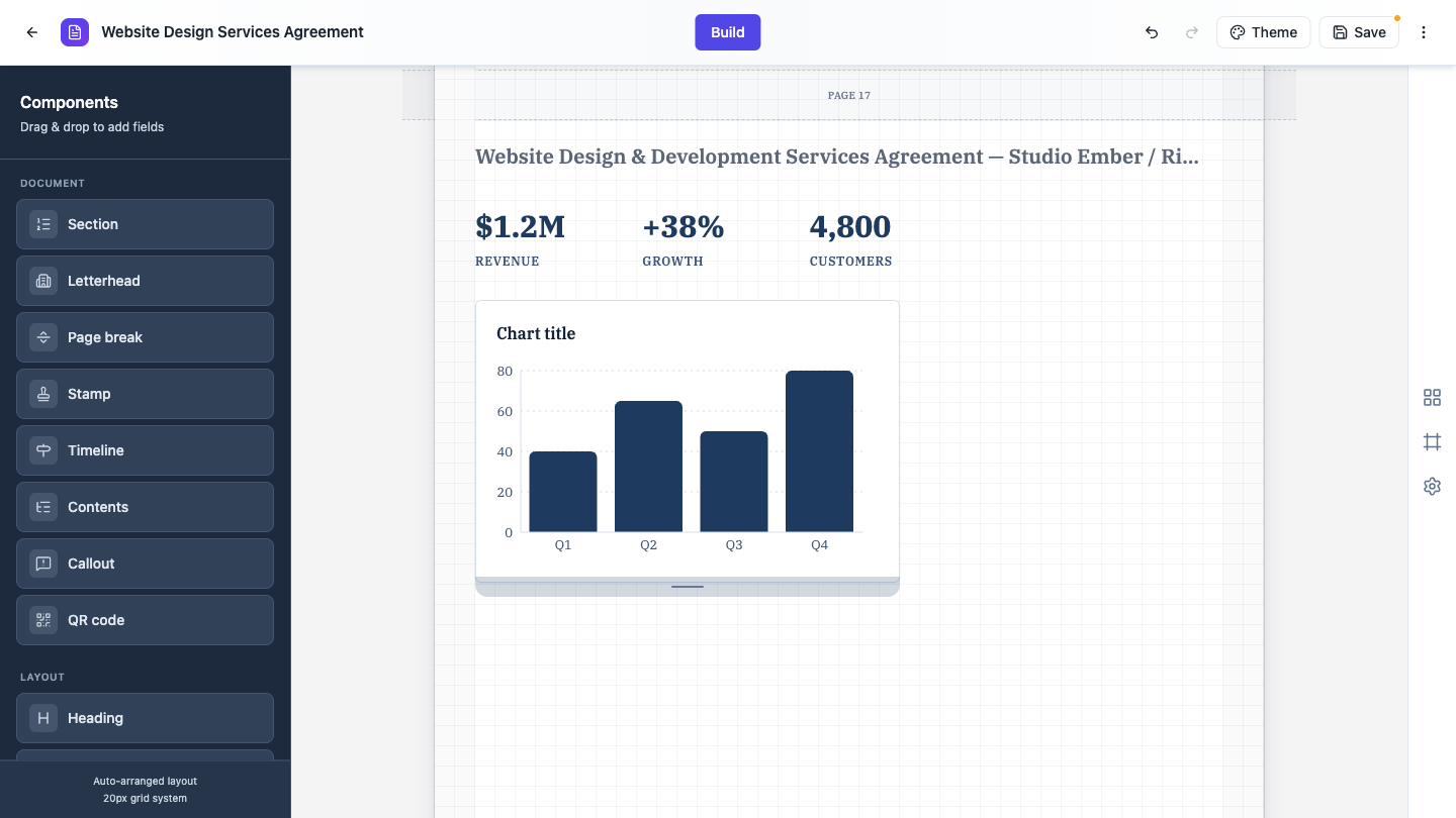 Key Values as a stat grid, with a bar chart below it.
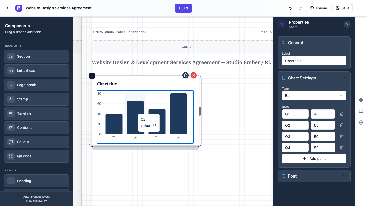 Select a block and click the gear. Chart settings give you the type and the data.
Table is the presentation table: a bordered grid with an accent header row and striped body rows. You edit cells directly on the page, and add or remove rows and columns from the panel. First row is header turns the header styling on and off. It is the one table that repeats its header row when it flows onto a new page.
Banner is a full width title block, filled or tinted. Card is a bordered panel with a title and body, with an optional Shadow. Badge is a small uppercase pill for a status like “Draft” or “Confidential”. Quote is a pull quote with an attribution line, either Soft tint with an accent bar or a filled Card.
List is a simple bulleted or numbered list, and it behaves like a real list editor on the page: Enter splits an item, Backspace at the start merges it back.
Detail List is the richer version, for feature lists and summaries. Two layouts, Stacked list or Grid, two styles, Plain or Filled card, and three markers, Number, Icon or None, with sixteen icons to choose from.
Shape is a plain rectangle, ellipse or line, for a rule or a block of color.
Signature block lays out signing columns, each with a role, a signature rule and label lines like Name, Title and Date. Add up to three parties. It resizes itself as you add lines.
Fields: values you fill in yourself
This group is worth explaining, because it works differently from what the names suggest. These are not form fields that someone else fills in online. You type the value in the builder, and it prints into the PDF. Leave one empty and it prints as a ruled line for someone to complete by hand.
Inline Text is the standout, and the one to learn. You write a sentence in the panel and drop {{blank}} wherever a value belongs. Each token becomes an inline field in the middle of your flowing prose, so you get wording like a legal recital or an authority form rather than a stack of labelled boxes. Each blank can be text, a number, a checkbox, a radio choice or a dropdown, set under Configure Each Blank. Press Enter for new lines and indent with spaces to build hierarchy.
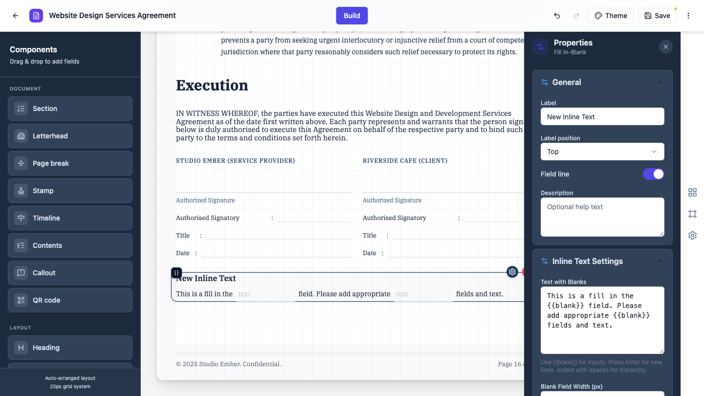 Write the sentence, drop in {{blank}} tokens, and each one becomes an inline field.
The rest are simpler. Short Text, Long Text and Number are labelled values on a ruled line. Full Name splits into title, first, middle and last, and you switch the parts on and off. Address does the same for street, suburb, state and postcode. Table under this group is a plain data grid with a set number of rows and optional row numbering.
Radio Buttons and Checkboxes print as real selection marks with your choice already made, laid out in one, two or three columns. Rating Matrix is a grid of rows against a rating scale. It starts empty, so add your rows and columns in the panel before it shows anything.
Date Picker prints a formatted date, with eleven formats to choose from, and Time Picker prints a time in either 12-hour or 24-hour form. Both start with no label and no line, so they sit inline like ordinary text.
Which blocks flow across pages
Most blocks move whole to the next page rather than being cut in half. The ones that keep flowing are Section, Paragraph, List, Detail List, Table, which repeats its header, and Key Values in the Label / value rows layout.
Everything else, charts, images, stat tiles, quotes, signature blocks, moves down intact. Worth remembering when a tall chart leaves a gap at the bottom of a page: that gap is the engine keeping the chart whole.
Picking the right block
A rough guide. Numbered terms and conditions, use Section. A figure you want noticed, Stat, or Key Values for several. Anything comparative, Chart. Structured rows of data, Table. A warning or a condition to highlight, Callout. Project phases or a payment schedule, Timeline. Wording with values inside the sentence, Inline Text. Signing at the end, Signature block.
New to the builder? Start with Create a document with AI, then lay it out.
Ready to try it yourself?
Start free. Describe what you need and let OneCraft do the first draft.
Get startedMore documents tutorials
- Create a document with AI Describe the document you need, or upload a file to build from, and get it written and laid out on clean A4 pages. Edit every section, restyle it, and download a PDF.
- Lay out a document exactly how you want it How document layout works, and how to control it. Set the spacing for the whole document, adjust page margins, add a logo and footer, force page breaks, and style the text inside a section.