Every form field and when to use it
A tour of the fields you build forms from, text and choice inputs, uploads, signing fields and layout blocks, what each one is for and what settings it gives you.
Forms 7 min read Updated
This guide is a tour of the fields you build forms from: what each one collects, when to reach for it, and what settings it gives you.
Most forms need five or six field types. The rest are there for the day you need a rating grid or a countersigned agreement.
The toolkit
Everything lives in the Components panel on the left, grouped into Layout, Input, Choice, Date/Time, Advanced, Media and Design. Drag a tile onto the canvas to place it, or click it and it drops at the end of the form.
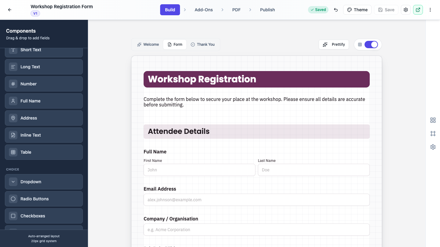 The toolkit, grouped by category. Drag a tile in, or click to add it at the end.
Select a field and click the gear on its top right corner to open the Properties panel. The red X beside it deletes the field. Hold Ctrl or Cmd and click to select several fields at once, or Shift and click for a range, then use the Delete button that appears.
Above the canvas, the Welcome, Form and Thank You tabs switch between the screen people see before they start, the form itself, and the screen after they submit.
The settings every field shares
Open a field’s properties and you get the same three sections, with extras depending on the type.
General holds the Label, an optional Sub-label that sits under the input, a Description for longer help text, and a Placeholder for the greyed hint inside the box.
Font Settings controls the label’s size, family, color and alignment. Short Text also gets Input Value Font Settings, where Font Behavior can be None (Fixed Size), Auto Resize so long answers shrink to fit, or Limit to Space to stop people typing past the field width.
Validation is where Required Field lives. Turn it on and the field is marked with a red asterisk, and the text, number, dropdown, radio, name and address fields will not submit without an answer.
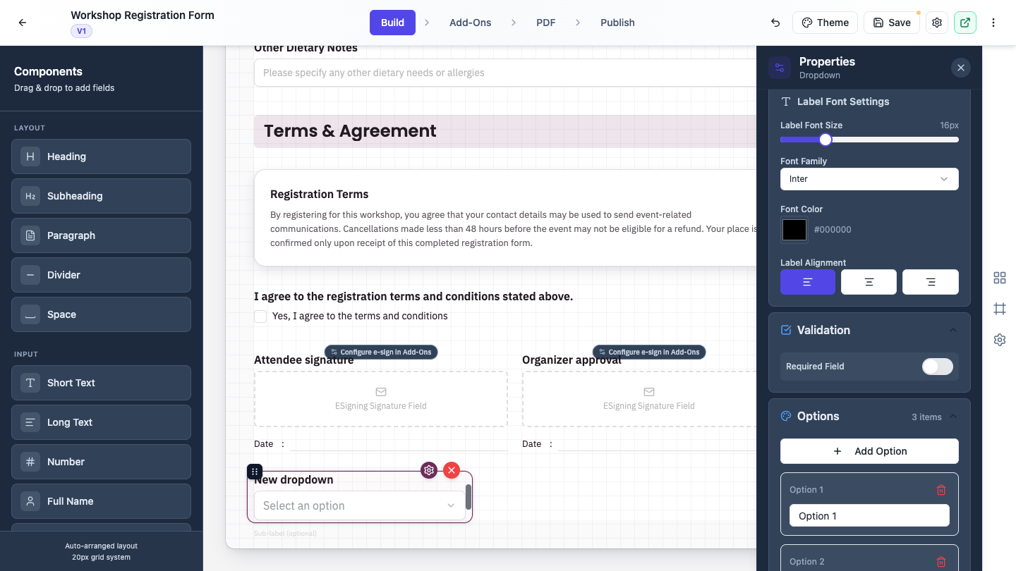 Required Field sits under Validation. Choice fields add an Options list below it.
Input: typed answers
Short Text is a single line, for names, job titles, reference numbers. Long Text is a multi-line box for comments and explanations. Number accepts digits only, and its Validation section adds Min Value and Max Value to bound the answer.
Full Name splits a name into parts so you get clean data instead of one string. Under Full Name Settings, Enable Fields switches Title, First Name, Middle Name and Last Name on and off independently.
Address does the same for a postal address, with Street 1, Street 2, Suburb, State and Postcode. Each row can be switched off, and each can be renamed if your audience calls them something else.
Inline Text is the interesting one. You write a sentence in the panel and drop {{blank}} wherever an answer belongs, so the field reads as prose with gaps rather than a stack of boxes. Each blank can be text, a number, a checkbox, a radio choice or a dropdown, configured under Configure Each Blank. Ideal for declarations and agreement wording.
Table collects repeating rows. Set Number of Rows, name the columns under Table Columns, and switch on Show Row Numbers if the rows need referring to.
Choice: pick from a list
Dropdown for a long list where only one answer applies, Radio Buttons when you want every option visible and only one selectable, Checkboxes when several answers can apply.
All three share an Options section: Add Option to append one, a text box per option, and for radio and checkboxes a Layout Columns setting with 1 Column, 2 Columns or 3 Columns to stop a long list running down the page.
Rating Matrix is a grid, rows of statements against a shared scale. Set Selection Type to Single Choice (Radio) or Multiple Choice (Checkbox), then fill in Column Options (Rating Scale) and Row Items (Questions). It starts empty, so add the rows and columns before it shows anything.
Date and time
Date Picker gives people a calendar. Date Format offers eleven display formats, shown in the dropdown as today’s date so you can see exactly what you are choosing.
Time Picker gives a time input, with Time Format set to 12-hour (1:30 PM) or 24-hour (13:30).
Advanced: uploads and signing
Photo Upload takes a single image. Photo Settings has one control, Maximum File Size (MB), and only image files are accepted.
File Upload takes documents. File Upload Settings gives you Maximum Files, Maximum File Size (MB), and Allowed File Types, which offers Images (PNG, JPG, GIF, etc.) and PDF Documents.
Then the two signing fields, which look similar and do completely different jobs.
Inline Signing is signed by the person filling in the form, right there, before they submit. They draw with a mouse or finger, or type their name in a script font. The signature is saved with the response.
E-Signature is for someone who signs afterwards. The person filling the form usually sees only a card saying a signature will be requested after submission. The signer gets an email with a link to a signing portal. Each E-Signature field represents one signer, so add several for several signers, and set their order. You configure all of that in the Add-Ons tab rather than in the field’s own properties, which is why the field carries a Configure e-sign in Add-Ons badge on the canvas.
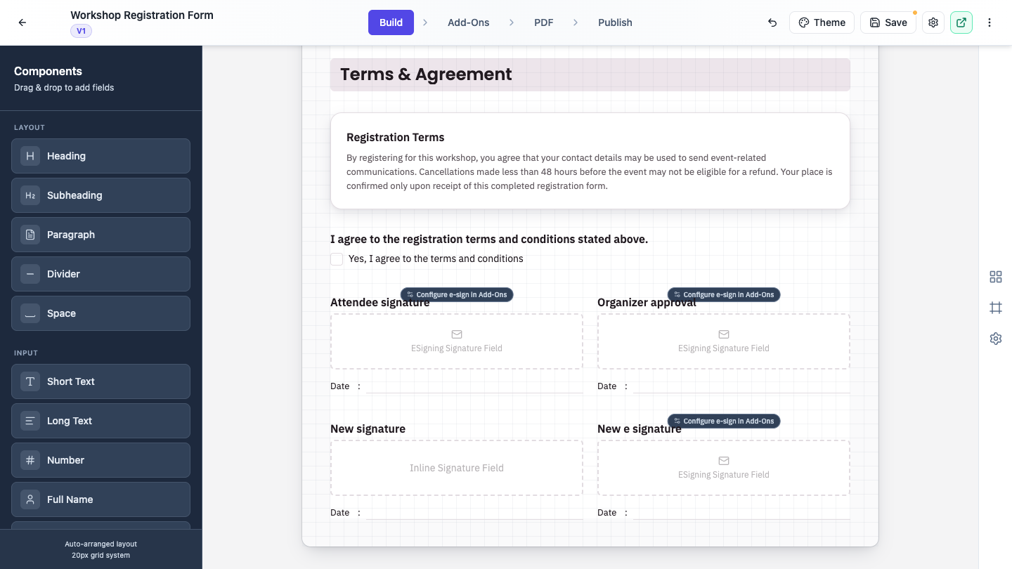 Inline Signing is signed in the form. E-Signature is signed later, by email.
Both types show the same Date: line underneath, which is why they are easy to confuse. Under Signing Fields you can rename those lines or add more, like Name and Title.
For the full signing workflow see Add e-signatures with multiple signers.
Media, Layout and Design
Image and Video display your own media to the person filling the form. Both are upload only, both have a Border Style picker with ten presets that follow your form theme, and Video adds Playback Options for Autoplay, Loop, Muted and Show Controls.
Layout holds Heading, Subheading, Paragraph, Divider and Space, for titles, instructions and breathing room. Headings and subheadings have a Style setting: Plain, Card or Soft tint.
Design holds presentation blocks you would recognize from a document: Banner, Card, Badge, Stat, Chart, Shape, List, Quote, Detail List, Key Values, Table and Signature block. They collect nothing, they just make a form look designed rather than functional. Useful on a landing page style form, or a terms page.
Conversational forms have a shorter list
Conversational forms ask one question per page, so the toolkit is trimmed. The Layout and Media blocks are grouped together under Static, the whole Design group is gone, and E-Signature is not available.
Two field types exist only here: Profile, and Recording.
The left panel becomes a Pages list instead of a canvas. Each page holds one question, or several if you drop more onto it, and you edit one page at a time on the right.
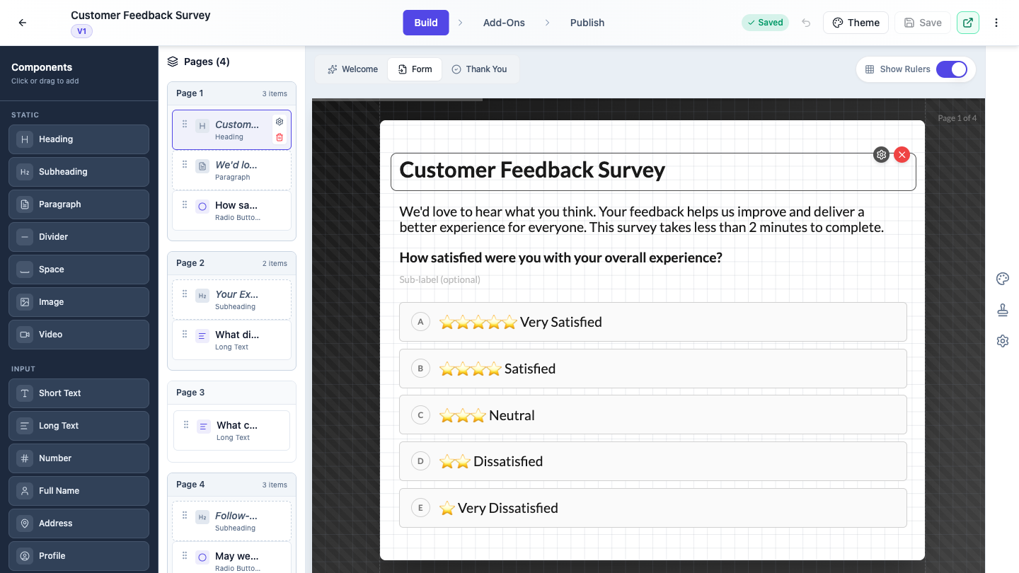 Conversational forms use a Pages list, and group the layout blocks under Static.
For the difference between the two styles, see Classic vs conversational forms.
Picking the right field
A rough guide. One line of text, Short Text. A paragraph, Long Text. One answer from many, Dropdown or Radio Buttons. Several answers, Checkboxes. The same scale applied to several statements, Rating Matrix. A document from the respondent, File Upload. A photo, Photo Upload. Agreement wording with values inside the sentence, Inline Text. Signed on the spot, Inline Signing. Countersigned later by someone else, E-Signature.
New to the builder? Start with Create a form with AI, then come back here to fine tune the fields.
Ready to try it yourself?
Start free. Describe what you need and let OneCraft do the first draft.
Get startedMore forms tutorials
- Add e-signatures with multiple signers Add signature fields to a form, choose how each signer's email is collected, set the order people sign in, and collect signatures that are legally clear, with the date and time on record.
- Automate your form with add-ons Connect webhooks, get instant email alerts for new submissions, and send people to your own page after they submit.
- Classic vs conversational forms Understand the two ways to present a form, all fields on one page or one question at a time, and choose the right one for your audience.