Thistlewood Studio Selected Work

Agency portfolio deck

Eleven slides from Thistlewood Studio, an invented six person wayfinding and environmental graphics studio in Melbourne. Portfolio advice from working designers converges on one point: five strong projects beat twenty scattered ones, and the process is more interesting to a client than the finished image. So this deck shows three projects, goes deep on one, and publishes the outcome that moved less than the studio hoped.

Create a presentation with OneCraft11 slides, read in order

Every slide, in order

The whole deck as it renders, one slide after another. Read it the way the audience would.
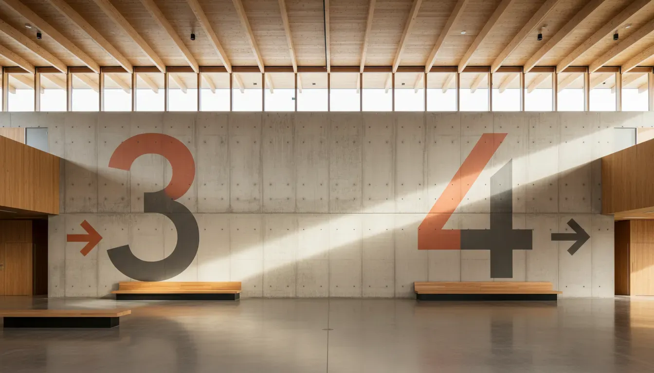
A wide architectural photograph of a bright public building interior, a tall concrete wall carrying oversized painted numerals and directional arrows, polished floor, soft daylight from a clerestory, warm neutral palette, no people, no readable words, no logos

Selected Work

Thistlewood Studio, wayfinding and environmental graphics, Melbourne

Slide 1 · cover · Opens on the work itself rather than on a studio name, which is what a portfolio is for.

Six People

We design the signs, numbers and colour systems that tell people where they are inside large buildings. Six of us, in Collingwood, since 2016. Forty one projects built, mostly hospitals, museums and campuses.

HOW WE PICK WORK

Built, not rendered

We only show work that exists. Every image in this deck was photographed on site after handover.

On the drawings

We work inside the architect documentation set, not alongside it, so signs land where the wall actually is.

Measured after

We go back six months later and time people finding things. Two of the results in this deck are worse than we hoped.

02

Slide 2 · intro · Six lines on what the studio does, so the reader knows what kind of work the next nine slides are.

Three Recent

Built between 2024 and 2026. Each one had a different reason for being hard.

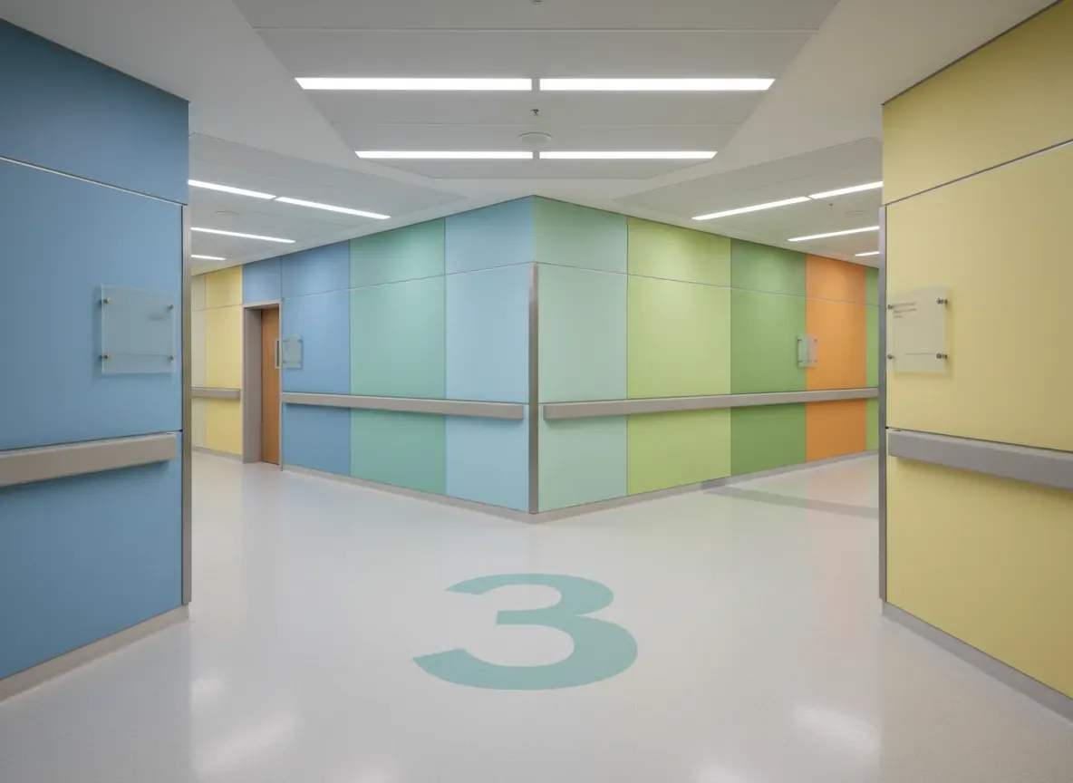
An architectural photograph of a hospital corridor junction with large colour coded wall panels and an oversized floor number, calm pastel palette, soft even lighting, clean minimal signage forms with no readable text, no people, no logos
Marrowfield

A hospital with four entrances and no agreed front door. We made the level number the hero and demoted every department name.

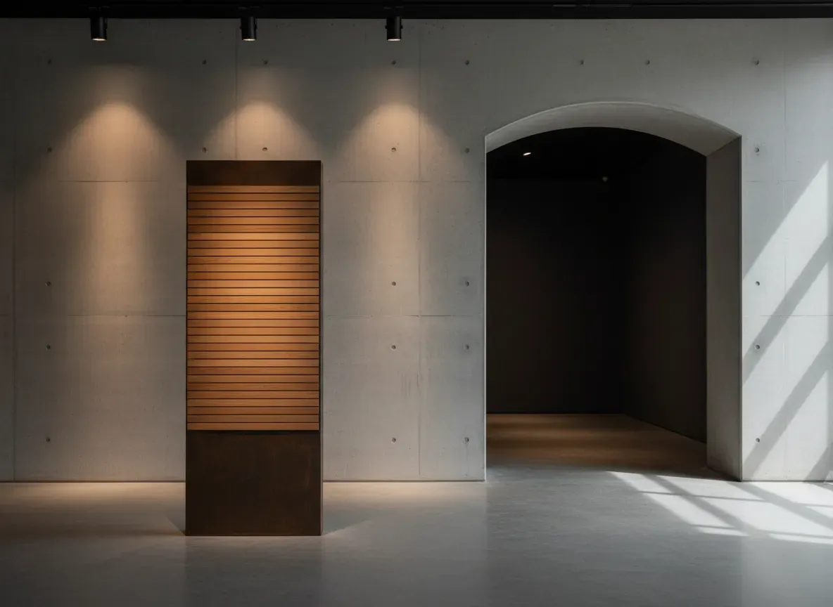
An architectural photograph of a museum gallery entrance with a tall freestanding interpretive panel in warm timber and dark metal, spotlights on a plain wall, dim ambient light, no readable text, no people, no logos
Kellow Museum

A heritage interior where nothing could be fixed to a wall. Every panel is freestanding and weighted, in timber and blackened steel.

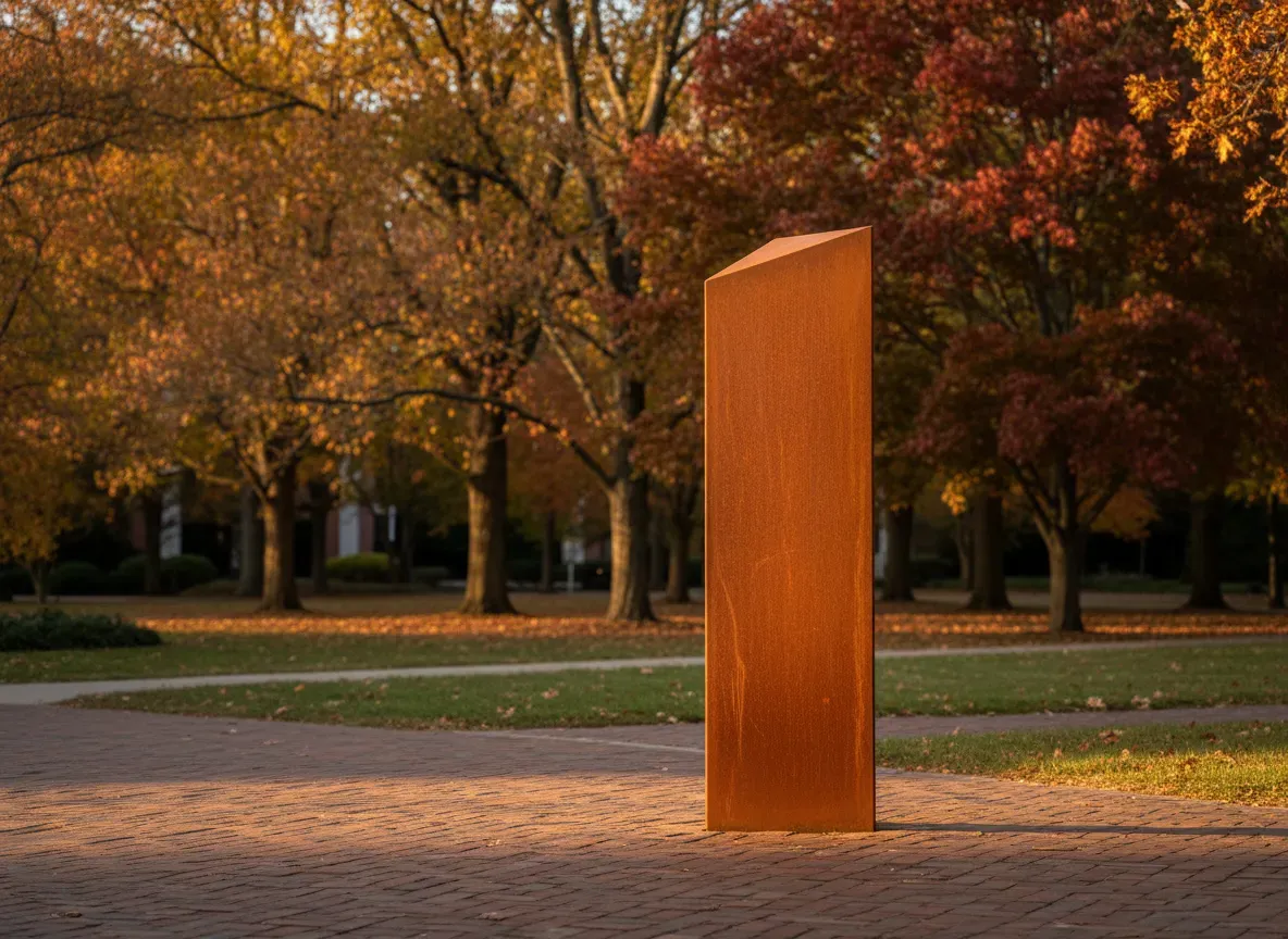
An architectural photograph of an outdoor university campus wayfinding totem in weathered steel standing on a brick path, autumn trees behind, late afternoon light, no readable text, no people, no logos
Ashgrove Campus

Eleven buildings named after donors and known by nobody. We numbered them, and the naming survives only on the plaque.

03

Slide 3 · gallery · Three recent projects at a glance, each with the one thing it had to solve.
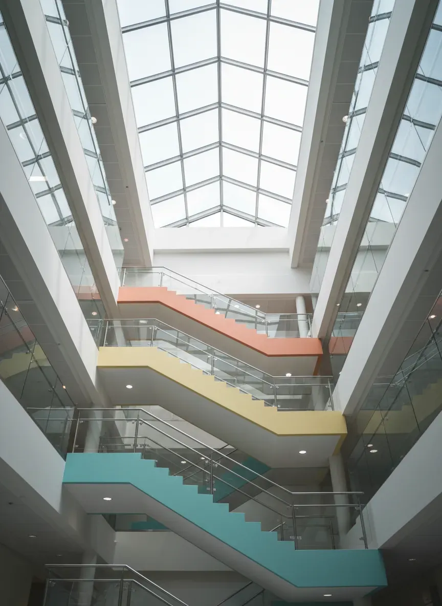
A tall vertical architectural photograph looking up a hospital atrium stairwell, brightly coloured level markers painted on each landing edge, handrails and glass balustrades, natural light from above, calm clinical palette, no people, no readable text, no logos

CASE STUDY

The Hospital That Had Four Front Doors

Marrowfield Health grew by absorbing three buildings over forty years. Patients arrived at whichever door their taxi found, then navigated by department name, and the departments had been renamed twice. Reception was spending a fifth of the day giving directions.

We stopped signing departments in the corridors. The level number became the largest thing on every wall, colour coded per building, and department names now appear only at the department door.

Marrowfield Health, 2024 to 2026. Photographed nine months after handover.

04

Slide 4 · content · One project in depth, told as a problem and a decision rather than a description of the artwork.
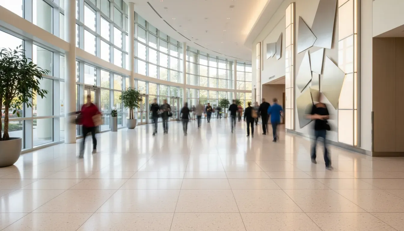
A wide soft focus photograph of a hospital main entrance foyer at midday, blurred movement, pale terrazzo floor and glass, warm indirect light, abstract and calm, no readable text, no logos, no identifiable faces

What Changed At Marrowfield

Measured by timing forty arriving outpatients before the work and forty after, nine months apart.

Median time to find a clinic fell from 7m 40s to 3m 10s

Label

Description

Direction questions at main reception down 44 percent

Label

Description

Missed appointment rate moved 0.4 points, less than we hoped

Label

Description

A wide soft focus photograph of a hospital main entrance foyer at midday, blurred movement, pale terrazzo floor and glass, warm indirect light, abstract and calm, no readable text, no logos, no identifiable faces

05

Slide 5 · metrics · The measured outcome, including the number that did not improve as much as the studio expected.

02

How A Project Runs

Six stages, and the two of them where a wayfinding job usually goes wrong.

06

Slide 6 · divider · Marks the switch from the work to how the studio runs, which is the second thing a client is buying.

Six Stages

Stages two and five are the ones that decide whether the finished thing works.

Walk it

We arrive as a first time visitor, with no plan and no briefing, and get lost on purpose. Everything that follows comes out of those two hours.

Name it

Agree what every space is called, once, with somebody who can decide. Half of all wayfinding failures are naming failures, not design ones.

Strategy

Decide what gets signed and, much harder, what does not. A building with a sign on every door is a building nobody can read.

Design

Type, colour, arrow logic and the sign family, printed at real size and taped to the real wall before anything is approved.

Documents

A location plan and a schedule the fabricator can price without ringing us. This is the deliverable the client keeps for twenty years.

On site

We attend the first day of installation and the snag walk, and we mark up every sign that moved so the record stays true.

07

Slide 7 · timeline · The six stages, in the language of a construction programme rather than a design process.

What You Get

The deliverables list, written the way it appears in our fee proposal.

Location plans

Every sign plotted on the architect floor plans at the right level, with a unique code. This is the document the fabricator prices from and the one facilities keeps for the next twenty years.

Sign schedule

A row per sign: code, type, size, substrate, fixing and the exact message. Nobody guesses a word. Where a message is longer than the sign, we say so before it goes out to tender.

Sign family

Drawn details for each sign type, dimensioned and specified. Fabricators quote against the same drawings, so the prices you get back are actually comparable.

System rules

Type, colour, arrow logic and contrast, written so somebody making a sign in five years still matches. Includes the AS 1428 contrast checks, done rather than referenced.

Install support

We attend the first day of installation and the snag walk. Signs move on site, always. Somebody from the studio needs to be there deciding where they move to.

08

Slide 8 · checklist · What the client actually receives, so a procurement officer can compare it with another quote.

FROM THE CLIENT SIDE

The volunteers at the front desk stopped walking people to their clinic. That is the whole result, really.

Mei Farrow

Facilities Lead, Marrowfield Health

09

Slide 9 · testimonial · One line from a client that is about behaviour rather than about the design.

What It Costs

One fee, four stages, paid against them. Fabrication is contracted separately and we do not take a margin on it.

Full scheme

$96K

fixed, staged

A building of up to 12,000 square metres

Request A Fee

INCLUDES

Site walk and naming workshop
Strategy, design and sign family
Location plans and full schedule
Tender support and install days

10

Slide 10 · pricing · One fee shape, stated plainly, because a portfolio that hides the price gets one more meeting and no brief.
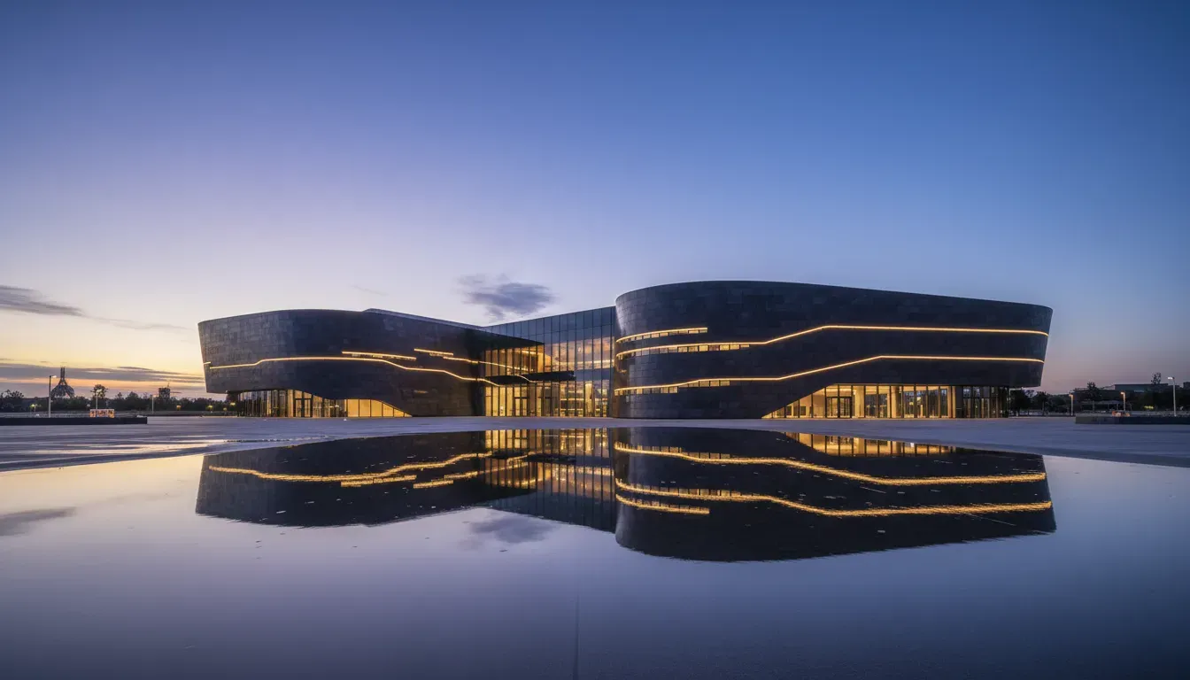
A wide dusk photograph of a modern civic building exterior with illuminated architectural lettering forms on the facade, wet forecourt reflecting the light, deep blue sky, no readable text, no people, no logos

Come And See One

Photographs are the weakest way to judge this work. Marrowfield and the Kellow are both open to the public, and one of us will happily walk you round either of them on a weekday morning.

studio@thistlewood.example · Collingwood, Melbourne

11

Slide 11 · closing · Ends on the invitation a portfolio can actually make, which is to come and look at something built.

The structure

What each slide is doing, so you can reuse the order even with different content.

Slide 1cover
Opens on the work itself rather than on a studio name, which is what a portfolio is for.
Slide 2intro
Six lines on what the studio does, so the reader knows what kind of work the next nine slides are.
Slide 3gallery
Three recent projects at a glance, each with the one thing it had to solve.
Slide 4content
One project in depth, told as a problem and a decision rather than a description of the artwork.
Slide 5metrics
The measured outcome, including the number that did not improve as much as the studio expected.
Slide 6divider
Marks the switch from the work to how the studio runs, which is the second thing a client is buying.
Slide 7timeline
The six stages, in the language of a construction programme rather than a design process.
Slide 8checklist
What the client actually receives, so a procurement officer can compare it with another quote.
Slide 9testimonial
One line from a client that is about behaviour rather than about the design.
Slide 10pricing
One fee shape, stated plainly, because a portfolio that hides the price gets one more meeting and no brief.
Slide 11closing
Ends on the invitation a portfolio can actually make, which is to come and look at something built.

What makes this deck work

It publishes the result that disappointed

Three measured outcomes, and the third says the missed appointment rate moved less than the studio hoped. A portfolio that only carries wins reads as selection; one that carries a disappointing number reads as measurement.

The deliverables are procurement ready

Five items written the way they appear in the fee proposal, including the sign schedule and the location plans. A creative portfolio that a procurement officer can compare against another quote is doing two jobs at once.

The close asks for a walk, not a meeting

The final slide says photographs are the weakest way to judge this work and offers to walk a prospect round a finished building. It is the one call to action that only a studio with built work can make.

Questions people ask

How many projects should be in a portfolio deck?

Around five, shown properly. Working designers consistently advise that five strong cohesive projects land harder than twenty scattered ones, and that you should only include work you can talk about confidently without prompting.

Should a portfolio show process or only finished work?

Both, and the process is often the differentiator. Reviewers say they want the sketches, the rejected routes and the reasoning. The standard agency case study is criticised for being biased toward the visual outcome and silent on what was considered and dropped.

Should a portfolio deck include a price?

This one does, as a single fixed fee for a defined building size. A portfolio that hides the number usually earns one more meeting and no brief, because the client still has to find out before they can shortlist.

PDF deck or a website for a studio portfolio?

Keep both, and keep versions. Practitioners recommend an email friendly PDF with a contents page and links, a tablet version, and role specific edits that cut disciplines the reader did not ask about.

Build your own in about a minute

The button below opens the generator with this use case already described. Change the wording to match your own, generate, then edit anything you like.

Make my agency portfolio deck

Other presentation examples

Want the steps in the builder? Read Make a presentation with AI, then export it to PowerPoint or PDF. For everything this generator can do, see the presentation maker.