Southern Rivers Landcare FY25 report
Annual report cover slide with the period, author and version
An annual report cover has to date itself, because the same deck is read months later by people who were not in the room. This one belongs to Southern Rivers Landcare, a fictional catchment group reporting on the year to 30 June 2025.
What is on the slide
- Left column
- Southern Rivers as a small wordmark, then Annual Report FY25 as a two line display title, then the period: 1 July 2024 to 30 June 2025.
- Author block
- Prepared By, then Tess Wardle, Chair, set low in the white column so the title has room above it.
- Right panel
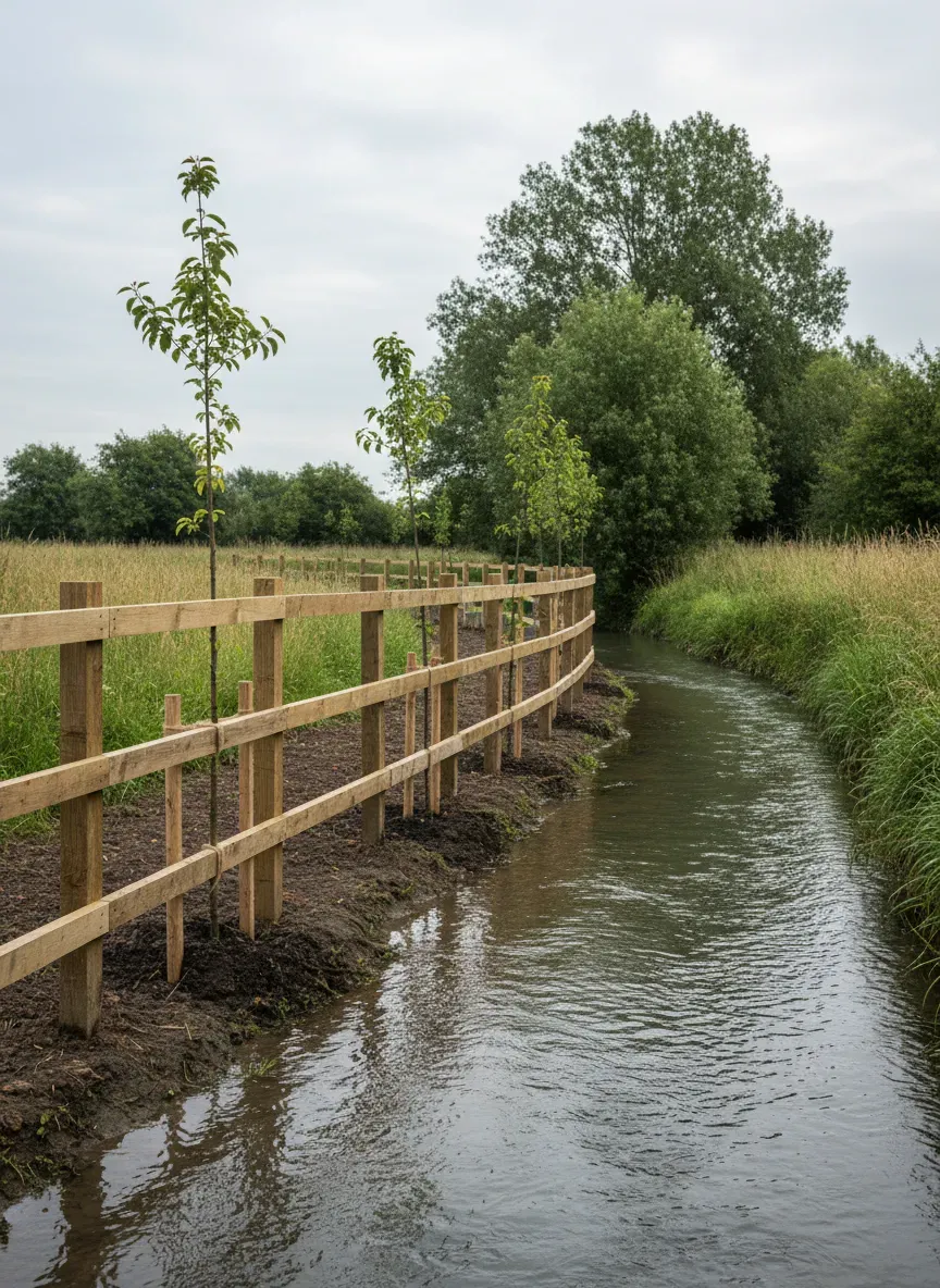
- A full height brand panel holding one photograph that bridges the seam: new post and wire fencing along a revegetated creek through open farmland.
- Date line
- October 2025 and v1.2, set small at the foot of the brand panel.
When this is the right slide
A metadata panel cover suits an annual report where the same file circulates for a year and every later reader needs the period, the author and the version without opening the deck.
What to swap it for
Cover: Editorial Pill + Icon Metadata. Swap to the editorial pill cover for a lighter look when the report is a short update rather than a formal year end document and the version history does not matter.
What this slide shows
The slide splits into a white left column and a full height brand panel at the right. In the column, a small wordmark reads Southern Rivers, then the title Annual Report FY25 runs across two lines at display size. Under it, the reporting period is written out in full: 1 July 2024 to 30 June 2025. Low in the same column sits a small label reading Prepared By with Tess Wardle, Chair beneath it. The brand panel on the right carries one photograph with softly rounded corners, bridging the seam between the white and the colour: new timber post and wire fencing running along a revegetated creek, with young plantings behind it and open farmland beyond. At the foot of the panel, set small and light, is the date line October 2025 with the version, v1.2. The layout has no slot for a distribution list, so who the report went to is not on this cover.
When this is the right slide
Use it when a report will outlive the meeting it was written for. Annual reports, funding acquittals, programme reviews and anything that goes to a members' meeting all circulate for months, and every later reader arrives without context. The metadata column answers what period, by whom and which version before the reader scrolls. It is the right shape when the organisation has one genuine photograph of its work, because the panel is large and an empty or generic image weakens the whole cover. It is the wrong slide for an internal update that will be read once and deleted, where the version line is noise, and wrong for a document with several joint authors, since the column holds one name. A board pack that has to look deliberately plain is better served by a typographic cover with no imagery at all.
How to adapt it
First, write the period in the format the audience uses and then spell it out underneath. FY25 in the title and 1 July 2024 to 30 June 2025 below it covers both readers, and it also stops the deck being mistaken for last year's when both are open in the same folder. Second, treat the version line as part of the document control, not as decoration. October 2025 and v1.2 tells a reader that an earlier version existed, which matters when figures were restated; if the report is final and will not be revised, say Final rather than inventing a number. Third, choose a photograph that shows the work rather than the organisation. A fence line, a planting, a building under way or a service being delivered all carry evidence; a group photograph at a launch does not. If no honest photograph exists, move to a cover that carries no image, because a stock picture on an annual report is the first thing a sceptical member will point at.
What makes this slide work
The period is written in full, not as a year
1 July 2024 to 30 June 2025 sits directly under the title, so a reader in another country or another sector does not have to know what FY25 means locally. The title carries the short form for the people who use it daily and the line underneath removes the ambiguity for everyone else, which costs one line and prevents a recurring question.
The author is a person and a role
Tess Wardle, Chair tells a reader who stands behind the numbers and who to ask about them. Prepared by the committee names nobody, and a report with no accountable author is quietly harder to challenge, which is the opposite of what an annual report is for. The Prepared By label above the name keeps the pattern readable at a glance.
The photograph shows the work the report covers
New post and wire fencing running beside a revegetated creek is the physical output of a catchment group's year, so the picture is evidence rather than decoration. A stock boardroom scene on the same panel would say nothing about the organisation, and readers who know the work would notice the gap immediately.
Questions people ask
What belongs on an annual report cover slide?
The organisation, the document type, the reporting period, the author and the version. Five facts, and they should all be readable without opening the deck. Anything about performance belongs inside: a cover that leads with a result invites the reader to treat the rest as supporting material for a conclusion that has already been drawn.
Should the cover show the financial year or the calendar dates?
Both. The short form in the title is what people inside the organisation say, and the full dates underneath remove the ambiguity for anyone outside it. Financial years differ by country, and an annual report is exactly the sort of document that gets read by a funder, an auditor or a member who does not share the convention.
How does a report cover differ from a pitch cover?
A pitch cover sells a claim to a room that is present; a report cover files a document for readers who are not. That is why this one carries a period, an author and a version rather than a tagline. The same deck may be printed, emailed and archived, so the cover doubles as the front matter of a record.
Where should the version number go?
On the cover, small, near the date. It costs one line and it prevents the most common circulation error, which is two people commenting on different drafts. If the document has a formal approval step, note the approval date rather than the print date, because that is the version a later reader will need to cite.
Is a photograph necessary on a report cover?
No, but a real one helps. The picture should show the work the report covers, so a catchment group shows fencing and plantings while a training provider shows a classroom. If the only available images are generic, drop the panel and use a typographic cover, which reads as deliberate rather than as a gap someone filled with stock.
How many slides should follow this cover?
That is set by the report, not by the cover, but an annual review usually runs a contents slide, then one slide per programme with its own numbers, then finances. The cover's job is to stop the reader having to guess which year they are looking at, and every later slide can then assume the period is known.
Build your own in about a minute
The button below opens the generator with this use case already described. Change the wording to match your own, generate, then edit anything you like.
Make one like thisOther slide examples
Quarterly review cover slide with the quarter as an accent word
A quarterly review cover has one job beyond naming the meeting, which is to make the quarter and the confidentiality unmistakable. This one opens an internal review at Lumen Ledger, a fictional accounting software company, for the quarter to 31 March 2027.
Company profile cover slide that says what the firm does
A company profile cover should say what the business does in the line under its name, because a name alone tells a new reader nothing. This one opens a capability deck for Brightwater Accounting, a fictional firm that does bookkeeping and tax for trades.
Magazine style cover slide with a nameplate and teasers
A magazine style cover turns the opening slide into a contents preview, so people know within a second whether the session covers the thing they came for. This one opens the monthly all hands at Kindred Care, a fictional care provider.
Want the steps in the builder? Read Add, reorder and restructure slides, then Change your presentation's theme, fonts and colours. For everything this generator can do, see the slide maker.
Written and checked by the OneCraft team. Last checked .