Trail hiking app
Bento grid slide with five feature cards and images
A bento grid slide lives or dies on the pictures, because five cards with five stock photos of nothing in particular is five times the noise of a plain list. This one belongs to Trail, a fictional hiking app, and each photograph shows the thing the card is about rather than a mood.


What is on the slide
- Section title
- What Trail Does, with the line: five things the app does on a walk, in the order a walker reaches them.
- Card 01, Offline Maps
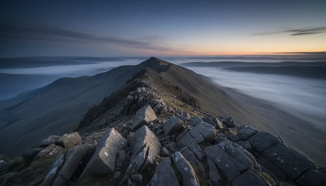
- The whole track downloads before you leave the car park, so no signal means no problem. Photograph: a rocky ridge above low cloud.
- Card 02, Check In
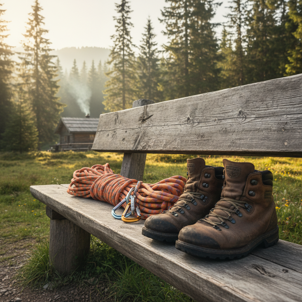
- Set a return time and two contacts get your last known point if you have not checked in. Photograph: boots and a coiled rope on a trailhead bench.
- Card 03, Trail Grades
- Every track carries a grade of one to five, with the steepest section and its surface named. Photograph: bare alpine rock.
- Cards 04 and 05
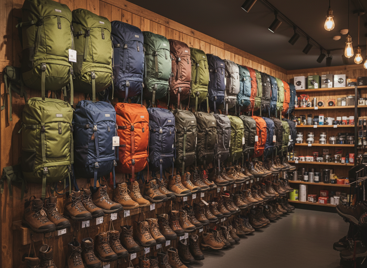
- Weather: the forecast for the ridge rather than the town below it, refreshed at six each morning. Packs: a kit list built from the grade, the forecast and how long you plan to be out.
When this is the right slide
A five card bento grid suits a feature slide when every card has a photograph that shows the feature itself and the five sit in an order the audience can follow.
What to swap it for
Context: Bento Grid of 5 Text Cards. Swap to the text bento when no real photographs exist for the five cards, since placeholder imagery costs more credibility than the grid gains from having pictures.
What this slide shows
A short section title reads What Trail Does, with a single framing line saying these are five things the app does on a walk, in the order a walker reaches them. Below sits a three by two bento grid holding five cards, the sixth cell left open. Each card carries a zero padded numeral, a heading of one or two words, a tight description, and a portrait photograph cropped into the right of the card. Card 01, Offline Maps, says the whole track downloads before you leave the car park, so no signal means no problem, beside a photograph of a rocky ridge above cloud. Card 02, Check In, says set a return time and two contacts get your last known point if you have not checked in, beside worn boots and a coiled rope on a trailhead bench. Card 03, Trail Grades, says every track carries a grade of one to five with the steepest section and its surface named, beside bare alpine rock. Card 04, Weather, says the forecast is for the ridge rather than the town below it and refreshes at six each morning, beside a tent on a saddle at first light. Card 05, Packs, says the kit list is built from the grade, the forecast and how long you plan to be out, beside a wall of packs in an outdoor store.
When this is the right slide
Use it when five features carry equal weight and each one has a picture that means something: product lines, market segments, case study vignettes, or the parts of an app a user meets in order. It suits a consumer product deck, a launch slide or an investor overview where the audience has never seen the product. It is the wrong slide when no real photographs exist, because five placeholder images are worse than no images, and a text bento gives the same rhythm without them. It is also wrong when one of the five dominates the story, since equal cards say equal weight, and wrong when the descriptions need more than about 110 characters, because the text column inside each card is narrow and the type shrinks fast.
How to adapt it
First, choose the photographs before writing the cards. If a feature has no image that shows it, either the feature is abstract and belongs on a text layout, or the card is describing a benefit rather than a thing. Second, crop for the card shape, not for the photograph. Each image lands in a tall frame about 240 by 311, so a wide landscape loses its edges and a subject sitting in the left third disappears. Third, keep the headings to one or two words and let the description carry the detail, because a three word heading wraps and knocks the card out of line with its neighbours. If the five features really need images and longer copy, split into two slides of three and two rather than shrinking the type on all five.
What makes this slide work
One photograph answers one card
A ridge above cloud for offline maps, because that is where the signal goes. Boots and rope on a trailhead bench for the check in. Bare alpine rock for trail grades. A tent on a saddle at first light for the ridge forecast. A wall of packs in a store for the kit list. None of the five is a generic outdoor scene, so a reader who looks only at the pictures still learns the order of the features.
The cards are ordered the way a walk happens
Download the map, tell someone where you are going, check the grade, check the weather, pack. The subtitle says so in one line: five things the app does on a walk, in the order a walker reaches them. Ordering by the user journey rather than by importance means the reader never has to ask why card three sits between card two and card four.
The empty sixth cell is the layout, not a mistake
Five cards sit in a three by two grid, so one cell is deliberately left open and the asymmetry is what makes the grid read as a bento rather than as a table. Adding a sixth card to fill it would lose that, and the slide would become a six up grid with smaller images and no focal point.
Questions people ask
What is a bento grid on a slide?
A grid of cards of uneven weight, named after a partitioned lunch box, where the asymmetry is the design. On this layout five cards fill a three by two grid and the sixth cell stays open. The open cell gives the eye somewhere to rest and stops the slide reading as a spreadsheet of six equal boxes.
How many cards should a bento grid slide carry?
Four to six. Five is the sweet spot for a three by two grid because the empty cell creates the asymmetry. Four works in a two by two with one cell doubled, and six fills the grid and loses the bento effect. Above six the images become too small to read at the back of a room.
What makes a good image for a bento card?
A single subject that names the card, shot so it survives a tall crop of roughly 240 by 311. Wide landscapes lose their edges, and anything with text in it becomes unreadable. If the only available picture is a mood shot of people smiling in an office, the card is better as text than as a photograph nobody can decode.
How long should each card description be?
Up to about 110 characters, which is one or two short sentences in a narrow column. Longer copy shrinks until the card becomes a paragraph with a picture beside it. Anything that needs a number, a caveat and a date is not a bento card, and belongs in a list layout where each line has the full slide width.
When should a bento grid be split into two slides?
Split when more than six features matter, or when two of them need a longer explanation than a card can hold. A common pattern is three cards on the first slide and two plus a screenshot on the second. Splitting also lets each half take its own heading, which is more useful than one heading covering seven unrelated things.
Does every card need a number?
Only when the order matters. Here the numerals carry the sequence of a walk, so 01 through 05 are doing work. For five features with no natural order, drop the numerals: they suggest a ranking the slide does not mean, and the first question from the room will be why card five is last.
Build your own in about a minute
The button below opens the generator with this use case already described. Change the wording to match your own, generate, then edit anything you like.
Make one like thisOther slide examples
Product benefits slide with 2x2 icon cards beside a photo
A benefit becomes believable the moment it carries a number, because a measured claim can be checked and an adjective cannot. This slide gives four reasons to buy the Nook standing desk, a fictional product, with a measurement in every heading.
Strategic priorities slide with three themes and five columns
A strategy slide fails when it lists initiatives without saying what they are in service of, so the themes have to sit above the work rather than beside it. This one covers a 2027 plan for Westport Health District, a fictional regional health service, with three themes and five funded workstreams.
Presenter introduction slide with two photo cards
A presenter introduction slide should not repeat the cover, which already carried the name and the talk title, so the job left is to tell the room what the next twenty minutes will actually contain. This one belongs to a fictional keynote by Dr Mae Okafor and uses its two photo cards to name the two case studies before either one starts.
Want the steps in the builder? Read Add and generate images in slides, then Add, reorder and restructure slides. For everything this generator can do, see the slide maker.
Written and checked by the OneCraft team. Last checked .