Dr Mae Okafor, nutrition keynote
Presenter introduction slide with two photo cards
A presenter introduction slide should not repeat the cover, which already carried the name and the talk title, so the job left is to tell the room what the next twenty minutes will actually contain. This one belongs to a fictional keynote by Dr Mae Okafor and uses its two photo cards to name the two case studies before either one starts.


What is on the slide
- Eyebrow and name
- KEYNOTE, SESSION 4, then the presenter name Dr Mae Okafor at display size, with no biography and no repeat of the talk title.
- Card one, Ward Meals
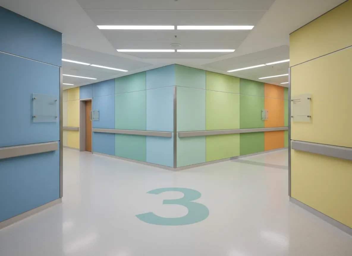
- Northgate Hospital cut plate waste from 34% to 19% by taking orders in the hour before service, not the day before. Photograph: a hospital corridor.
- Card two, The $3.10 Lunch
- Kelso Primary rebuilt its canteen menu to a $3.10 cost line without dropping a single fresh item from the plate. Photograph: a plated meal.
- Image frame
- A tall 560 by 900 frame down the left. In a real deck this holds the speaker photograph; here it carries a stage photograph, because the presenter is fictional.
When this is the right slide
A presenter frame with two photo cards suits the slide after the cover when the talk is built from exactly two examples and each one deserves its own picture and headline figure.
What to swap it for
Profile: Headshot Left, Bio Right. Swap to the headshot and bio layout when the audience does not know the speaker and the introduction has to establish credentials before the content begins.
What this slide shows
The left third is a tall rounded frame holding a photograph of a vintage microphone on a stand under a warm spotlight. The right two thirds open with a small uppercase eyebrow, KEYNOTE, SESSION 4, then the name Dr Mae Okafor at display size. Under the name sit two stacked cards, each with its own photograph on the left edge, an icon, a heading and one sentence. The first card, Ward Meals, shows a hospital corridor and says Northgate Hospital cut plate waste from 34% to 19% by taking orders in the hour before service rather than the day before. The second card, The $3.10 Lunch, shows a plated meal and says Kelso Primary rebuilt its canteen menu to a $3.10 cost line without dropping a single fresh item from the plate. Nothing on the slide lists qualifications, previous roles or publications, and nothing repeats the talk title from the cover.
When this is the right slide
Use it as the second slide of a keynote or a conference session, after a cover that has already carried the speaker name and the title. It suits a talk built from two examples, which is the most common shape for a twenty to thirty minute session. It is the wrong slide when the presenter genuinely needs a biography, for example at an event where the audience has never heard of them and credibility has to be established before the content: a headshot with a bio column does that job and gives the text room. It is also wrong for a panel, where four speakers need equal space, and wrong when the talk has five sections rather than two, since two cards cannot be stretched to carry five.
How to adapt it
First, cut anything the cover already said. If the cover carried the name, the title and the event, this slide should carry the structure of the talk instead, and the presenter can say the rest out loud in the ten seconds it takes to walk to the lectern. Second, put a number in each card, because a case study named without a figure sounds like an anecdote and the audience will wait for the proof rather than listening. Third, choose photographs that show the setting of each case study, not the subject of the talk in general. A hospital corridor and a plated meal tell the room these are two different settings; two pictures of food would make the two cards look like the same story told twice.
What makes this slide work
It promises the talk rather than describing the speaker
The only words about the presenter are the eyebrow, KEYNOTE, SESSION 4, and the name. Everything else on the slide is about what is coming: a hospital that moved plate waste from 34% to 19%, and a school canteen rebuilt to a $3.10 cost line. An audience that has already read the name on the cover gets new information here instead of a second reading of the same line.
The two cards carry the numbers the talk will land on
34% to 19%, and $3.10. Naming both figures in the introduction means the audience hears them twice and knows which two claims the talk will have to prove. It also gives the presenter a natural structure: the rest of the session is two case studies, and the slide has already told the room there are exactly two.
The tall frame carries a stage rather than a face
The presenter here is fictional, so no portrait of her can honestly exist. The frame takes a photograph of a microphone under a spotlight instead, which is what the slot is for in a real deck and which does not pretend to be a person. In a real deck this is where the speaker photograph goes, cropped to a tall 560 by 900 frame.
Questions people ask
What should a presenter introduction slide contain?
Whatever the cover did not. If the cover carried the name, the title and the event, this slide should carry the structure of the session: what is coming, in what order, and the two or three numbers the talk will land on. A second reading of the speaker name is the most common waste of a slide in any conference deck.
Does a speaker need a photograph on this slide?
It helps at an event where the audience has not met them, because a face makes the person findable afterwards. It matters less in a short internal session. The frame here is a tall portrait crop of about 560 by 900, so a wide headshot loses both sides and a group photograph loses everyone except the person in the middle.
How much biography belongs on a slide like this?
Almost none. Qualifications, previous roles and publication counts belong in the conference program, which the audience has already read. If credibility genuinely has to be built in the room, that is a different layout with a bio column, and even then three lines does more than ten because nobody reads a slide while a person is speaking.
Why put the case studies in the introduction?
Because it tells the audience how long the talk is and where it is going, which is the one thing a room wants to know in the first minute. Naming two case studies also commits the presenter to two, so a session that drifts into a third is visibly off plan, both to the speaker and to the chair.
When should this be split into two slides?
Split when there are more than two examples, or when one case study needs its own setup. A talk with four cases is better served by an agenda layout listing all four, followed by a divider before each one. Two cards cannot be stretched, and shrinking the photographs to fit three makes all three too small to read.
How should this slide be presented out loud?
Say the two figures and stop. The audience can read the name, so speaking it is wasted time. Naming 34% to 19% and $3.10 in the first fifteen seconds gives the room two hooks, and every later slide can be pinned back to one of them. The slide should be on screen for under a minute.
Build your own in about a minute
The button below opens the generator with this use case already described. Change the wording to match your own, generate, then edit anything you like.
Make one like thisOther slide examples
Team capabilities slide with six pillars beside a photo
A capabilities slide is a list of claims until each capability carries evidence, which is why buyers skim them and remember nothing. This one belongs to Fathom Data, a fictional consultancy of 24 people, and every capability names how many clients it has actually been delivered for.
Company values slide with four pillars and a foundation band
Values written as single words cannot be kept or broken, which is why a values slide is only useful when each value is a sentence about behaviour. This one belongs to Kindred Care, a fictional home care provider, and gives every value four commitments a client could hold the company to.
Service packages slide with three packages and their inclusions
A service packages slide answers a different question from a pricing table: not what does it cost, but which of these is mine. This one belongs to Verge Web Studio, a fictional web agency, and gives each of its three packages four inclusions and a closing line naming the business it suits.
Want the steps in the builder? Read Add and generate images in slides, then Present your slides with speaker notes and a pen. For everything this generator can do, see the slide maker.
Written and checked by the OneCraft team. Last checked .