Videos
Video fonts
Unlike a document, a video does not pair a display face with a body face. One family runs everything, from a five word headline set at 240 pixels down to the caption pill at 26. That is a constraint, and it changes which typefaces are worth choosing.
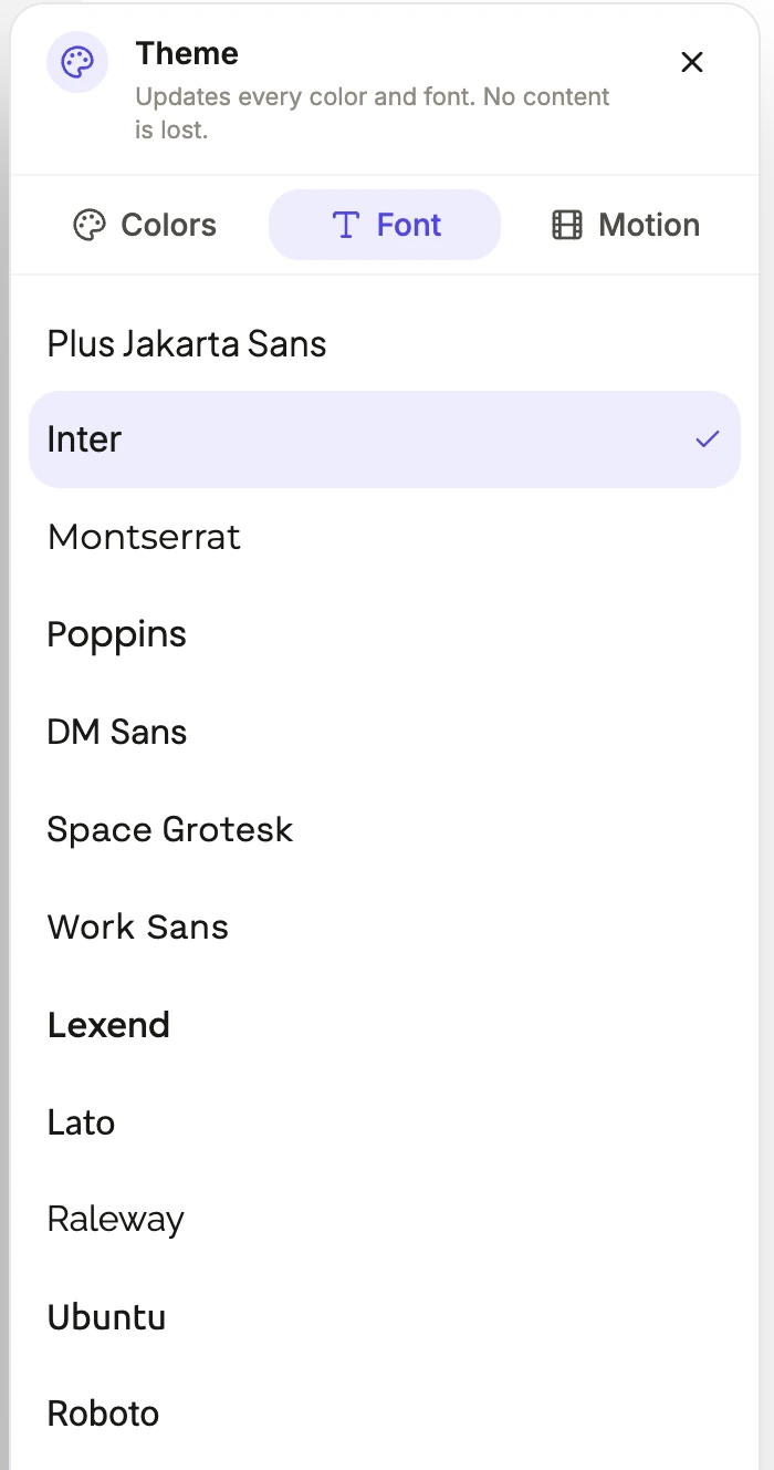
Eighteen sans faces
Plus Jakarta Sans, which is the default, Inter, Montserrat, Poppins, DM Sans, Space Grotesk, Work Sans, Lexend, Lato, Raleway, Ubuntu, Roboto, Mulish, PT Sans, Open Sans, Source Sans 3, IBM Plex Sans and Outfit. These are the workhorses. A promo headline set at two hundred pixels or more wants a face with a tight, even weight distribution, which is why Space Grotesk, Outfit and Montserrat show up so often in the looks.
Eight serifs and one condensed display
Playfair Display, Merriweather, Lora, Cormorant Garamond, Libre Bodoni, Gilda Display, Crimson Text and IBM Plex Serif, plus Big Shoulders, which is a tall condensed face. Serifs earn their place on anything that should read considered rather than urgent: a law firm, a bookshop, a gallery, a heritage brand. Cormorant Garamond and Gilda Display in particular have the fine strokes that need large type, which a video happily provides.
Why one family, not a pair
In the catalogue every entry sets the display face and the body face to the same family. A video has very little text on screen at once, usually a headline and one supporting line, so a second typeface adds a contrast the eye does not need and a risk that two faces disagree in the half second a scene is up. Weight, size and colour carry the hierarchy instead.
Loaded properly, not requested at render time
Each family is loaded through Remotion's Google Fonts loader, and the render waits for the font to finish loading before it draws a frame. That matters because a font that arrives late produces the classic fallback flash, and in a video that flash is baked into the file rather than being a momentary glitch in a browser.
How it works, in three steps
Step 1
Start from the look
Every look already pairs a typeface with its palette, so switching look is the fastest way to change the typography sensibly.
Step 2
Override on the font tab
The theme panel has a separate font tab, so you can keep a look's colours and swap only its typeface.
Step 3
Check the longest line
Find the scene with the most words and look at it in both formats. A face that reads well wide can wrap badly in the narrow frame.
The full walkthrough with screenshots is in the guide Make a promo video with AI voiceover.
Limits worth knowing
- One family applies to the whole video. There is no separate headline and body typeface, and no per scene font.
- The catalogue is 27 Google families. Uploading your own font file is not supported.
- Font size is set per slot in the inspector, with a per format override, but the family is a document wide setting.
- Captions use the body font, which is the same family, at 26 pixels in landscape and 30 in vertical, and that size is fixed.
Questions people ask
Can I use my brand typeface?
Only if it is one of the 27. There is no font upload, so the practical approach is picking the closest match from the catalogue, which usually comes down to choosing between a geometric sans, a neutral sans and a serif.
Does the font change the layout?
It can shift line breaks, because a wider face takes more room on the same headline. Layouts are built with generous boxes, but it is worth glancing at your longest scene after a font change.
Which font for a tutorial?
Something plain and highly legible at small sizes, since a walkthrough carries instruction lines rather than headlines. IBM Plex Sans, Inter and Lexend all hold up well, and Lexend was designed for reading ease.
Are the fonts free to use commercially?
They are Google Fonts families, which are open licensed, and they are loaded and rendered into the exported video. Check the specific family's licence if you also intend to use it in print or on a website.
Make your own video
The button opens the generator with this use case already described. Change the wording to match yours, generate, then edit anything you like.
Create a video with OneCraftRelated pages
Landscape video maker
Vertical took the feeds, but it did not take everything. A watch page, a television, an in-stream ad, a LinkedIn desktop feed, a page embed, a screen at the back of a trade stand and any video that is mostly a screenshot are all still landscape problems, and they are the ones where a 16:9 master earns its keep.
Logo watermark on video
A watermark here is not a corner bug stamped over the whole video. It appears after the opening scene, holds through the middle at partial opacity, and fades out before the closer, because those two scenes are already carrying the brand and a mark on top of a wordmark reads as a mistake.
AI voice options
There are two different voice pickers here and they work at different scales. When a video is generated, the director chooses from eight characters, four styles across two genders. In the builder afterwards, every voice Google offers is searchable per scene. Most people only need the first.
More finished work of this kind is on the video examples hub.
Written and checked by the OneCraft team. Last checked .