Riverbend Council park designs
Photo comparison slide example with two captioned options
A photo comparison slide works when the picture carries the difference and the caption carries the numbers, so the audience is not asked to judge a design from adjectives. This one belongs to Riverbend Council, a fictional council choosing between two designs for one park.
What is on the slide
- Title
- Riverbend Council, Two Park Designs, over two photo cards of equal size.
- Option A, The Lawn
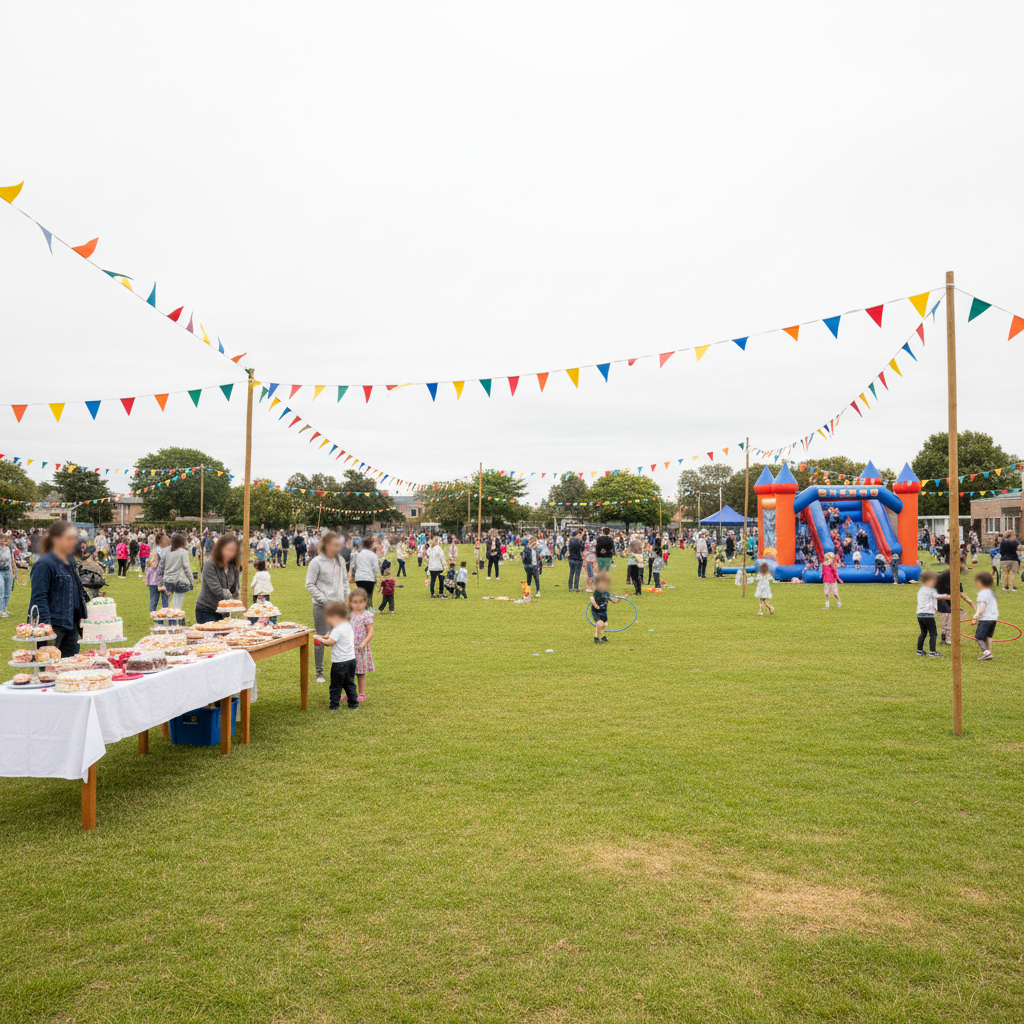
- A photograph of an open grass reserve during a community event, with bunting, stalls and a crowd. Caption: $1.42M build, 380 at one event, 22 shade trees.
- Option B, Garden Rooms
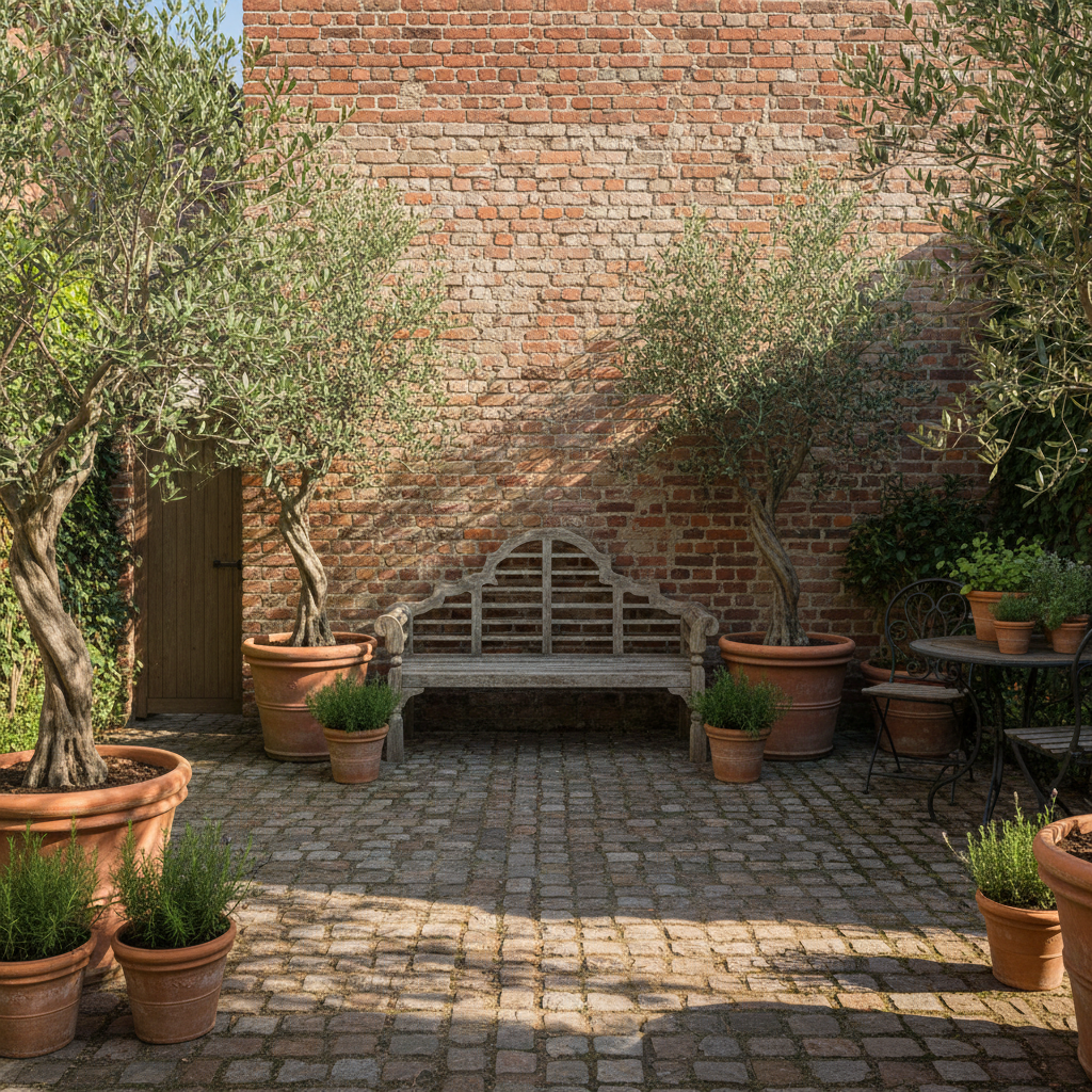
- A photograph of a walled courtyard garden with potted planting, a timber bench and a paved floor. Caption: $1.86M build, 140 at one event, 61 trees and shrubs.
- What the pairing shows
- The same three measures appear in the same order under both photographs, so the comparison reads across rather than down.
When this is the right slide
Two equal photo cards with one measured caption each suit a comparison where the look of the option is most of the argument and the numbers only have to be present, not explained.
What to swap it for
Comparison: Before / After Split. Swap to the before and after split when the two things are the same place at two points in time and the story is a change rather than a choice between two designs.
What this slide shows
A centred title reads Riverbend Council, Two Park Designs, and two photo cards of identical size sit below it. The left card carries a photograph of an open grass reserve in use, with bunting strung between poles, a trestle table of cakes, a jumping castle and a crowd of families spread across the grass. Its caption reads Option A, The Lawn, then $1.42M build, 380 at one event, 22 shade trees. The right card carries a photograph of a walled courtyard garden: a clipped brick wall, two mature potted olives, a timber bench and a paved floor with planted pots along its edge. Its caption reads Option B, Garden Rooms, then $1.86M build, 140 at one event, 61 trees and shrubs. Each caption is a single line under a short bold label, which is what this layout gives, so the three measures are written as one compact list rather than as three separate lines of text.
When this is the right slide
Use it when the difference between two options is visible and a description would be slower than a photograph. Two site designs, two shopfront treatments, two packaging routes, two ward layouts: in each case the audience forms a view from the image in about a second and then wants two or three numbers to check it against. The layout is also useful in public consultation, where a written specification excludes people who do not read plans. It is the wrong slide when no honest photograph exists for one of the options, because a rendered image beside a real one is not a fair comparison and an audience will say so. It is equally wrong when the decision turns on figures rather than form, since a two column table holds far more numbers per square inch than a caption under a picture.
How to adapt it
First, fix the caption structure before writing either caption, then fill the same slots on both sides. Three measures in one order is enough, and any measure that only exists for one option belongs in the spoken commentary or the report. Second, choose photographs at the same time of day, the same season and roughly the same distance from the subject. A sunny afternoon on one side and an overcast morning on the other reads as a preference even when none was intended, and in a consultation setting that becomes a complaint. Third, keep each caption to one line. The card gives a single line of about eighty characters under the label, so $1.42M build, 380 at one event, 22 shade trees fits while a full sentence about staging and drainage does not. If the two options need a paragraph each, a stacked panel layout gives them room, and if the pair is the same place before and after a change, the before and after split is the layout that says so.
What makes this slide work
The two captions carry the same three measures
Build cost, people at one event and planting count appear in that order under both photographs. Because the order is fixed, the audience reads down one caption and then across, and the $440,000 difference in cost lands next to the 240 person difference in capacity. Captions that describe different things under each picture force the reader to hold two shapes in mind at once, and the comparison quietly fails.
The photographs differ in the way the designs differ
One shows an open reserve full of people at a community event, the other a quiet walled courtyard with potted planting and a bench. The pictures argue the same point the numbers do: one option is for crowds and one is for small groups. A pair of photographs that both show empty grass would leave the caption doing all the work, and the layout would be wasted.
Nothing on the slide names a preference
Neither card is larger, neither is labelled recommended, and the captions state cost and capacity without an adjective. For a council choosing between designs that is the honest structure, because the trade off between a $1.42M reserve for 380 people and a $1.86M garden for 140 is a political judgement, not a technical one, and the slide is there to put it in front of the people making it.
Questions people ask
How much text should sit under each photograph?
One line of about eighty characters, holding two or three measures. The picture is doing the describing, and a paragraph under it competes with the image rather than supporting it. If the option needs a paragraph, the slide is really a two panel comparison with a small image, which is a different layout and a different reading order.
Do both photographs have to show the same kind of scene?
They have to be comparable, not identical. Same season, similar light and a similar distance from the subject is the standard. One option photographed in use and the other empty is the most common failure, because a crowd reads as popularity. If only one option can be shown in use, say so out loud when presenting it.
Can a rendering be compared against a photograph?
Not on the same slide without labelling both. A render flatters, and an audience that spots the difference will discount the comparison. If one option exists and the other does not, either render both to the same standard or use photographs of a comparable site elsewhere and say where they were taken.
When should this be split into two slides?
Split when each option needs its own evidence, such as a cost breakdown, a shade study or a traffic count. Give each design a slide with its photograph and its figures, then bring the two captions back together on a summary slide. Trying to carry the evidence here pushes the captions past the single line the cards hold.
What chart, if any, belongs beside a photo comparison?
None on this slide, and usually a simple paired bar on the next one. Cost against capacity for two options is four numbers, which a caption states faster than a chart plots. Save the chart for the measure with several values, such as annual maintenance across ten years, where the shape of the line is the argument.
How should a photo comparison slide be presented out loud?
Stay quiet for a moment and let people look, then read the three measures for the left option and the same three for the right in the same order. Do not narrate the photographs; the room can see them. Close by naming the trade off in one sentence, which here is $440,000 more for a quieter park that holds 240 fewer people.
Build your own in about a minute
The button below opens the generator with this use case already described. Change the wording to match your own, generate, then edit anything you like.
Make one like thisOther slide examples
Problem solution slide with three paired problems
A problem solution slide fails when it lists problems on the left and features on the right, because nothing on the right answers anything in particular on the left. This one belongs to Kerbside, a fictional kerbside charging business, and every fix sits directly opposite the problem it solves.
Pros and cons slide on a balance scale with a verdict
A pros and cons slide that counts points always favours whichever side had more writing time, so each point has to be weighted with a cost, a time or a number. This one belongs to Fathom Data, a fictional consultancy deciding whether to take a Brisbane office, and closes with a verdict rather than a tie.
Problem bridge solution slide with three numbered steps
A problem and solution slide asks an audience to accept a jump, and one that has heard the same promise before will not make it, which is what the middle column is for. This one belongs to Northgate Council, a fictional council, and the bridge names the three steps that took a minor works permit from fourteen days to three.
Want the steps in the builder? Read Add and generate images in slides, then Add, reorder and restructure slides. For everything this generator can do, see the slide maker.
Written and checked by the OneCraft team. Last checked .