Presentations
Comparison slides
Comparison is the single largest family in the library, because most business arguments are two sided. The layouts differ by what kind of two sided claim you are making, and picking the wrong kind is what makes an audience argue with the slide instead of the point.
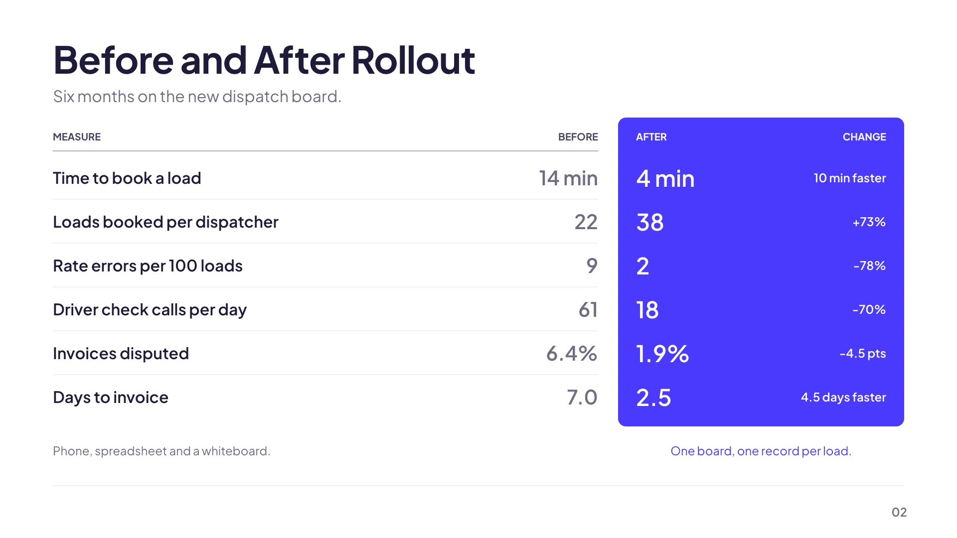
Before and after, when time is the axis
A split, stacked panels, vertical pills, a table, or metric panels showing the numbers on each side. These say the same thing changed, and their labels carry the dates or the states. The metric panel version is the strongest of them because it forces a figure on each side and an improvement label between, which turns an assertion into a measurement.
Problem and solution, when causation is the claim
A straight problem versus solution split, three problem and solution pairs with icons, and a problem, bridge, solution layout with a middle column for the mechanism. That middle column is the honest one: a slide that puts a problem beside a solution with nothing in between is asking the audience to trust a leap. If you can name the bridge, use the layout that has room for it.
Pros and cons, when the decision is still open
Arrows, a balance scale, tick and cross rows, and a big verdict pair that ends with a stated conclusion. The verdict layouts matter more than they look: a pros and cons slide with no verdict leaves a room to reach its own conclusion, which is fine when you want a discussion and a mistake when you were supposed to be recommending something.
Us and them, when someone else is in the frame
Two columns with a versus circle, opposing bands, two product feature cards, a competitive landscape table, a tick and cross feature matrix, and a competitor scatter on two axes. The matrix layouts are where a competitive slide gets credible, because listing eight rows with honest ticks on both sides reads as an assessment while listing four rows you win reads as marketing.
Swapping between them keeps your content
All forty three are offered for the comparison purpose, so the layout picker offers every one of them drawn with your own two lists already in place. That means you can write the argument once and then test it as a split, as a table and as a verdict pair, which is a faster way to find out whether your comparison is actually two sided than staring at the first layout it landed on.
How it works, in three steps
Step 1
Name what kind of comparison it is
Time, causation, decision or competitor. Each one has its own set of layouts and its own failure mode.
Step 2
Keep both sides the same length
Four items against seven reads as a stacked deck. If one side genuinely has more, say so in words rather than by imbalance.
Step 3
Try two layouts before settling
The picker draws each candidate with your content in it, so comparing layouts costs one click each.
The full walkthrough with screenshots is in the guide Add, reorder and restructure slides.
Limits worth knowing
- Comparison layouts hold two sides. For three or more options, use the three option trade off cards or a matrix layout.
- The two sides are text lists. Nothing computes a difference or a percentage change between them.
- Tick and cross marks are icons you set per row, not a calculated result.
- Item counts are fixed per layout, so a layout built for five rows will not take a seventh.
See it on a finished piece
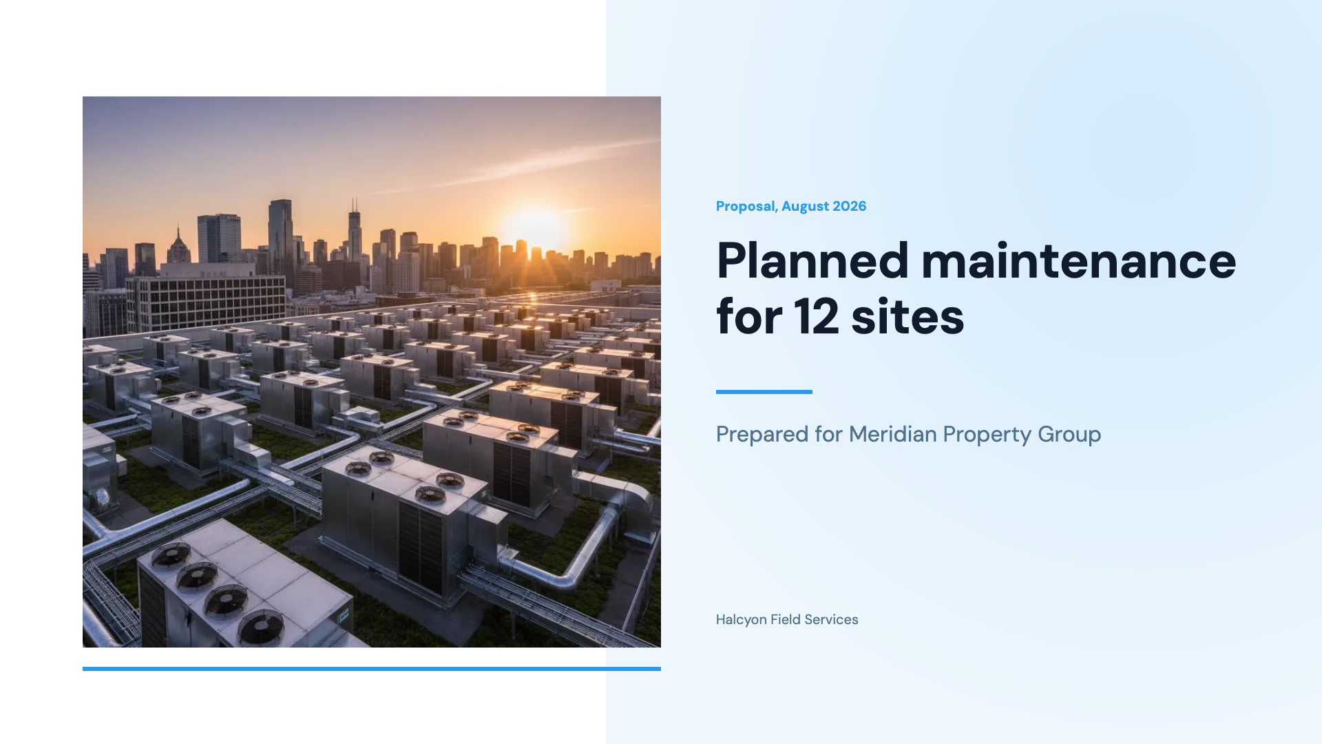


Slide examples
Finished single slides on this layout, each one built from a real template and written out in full.
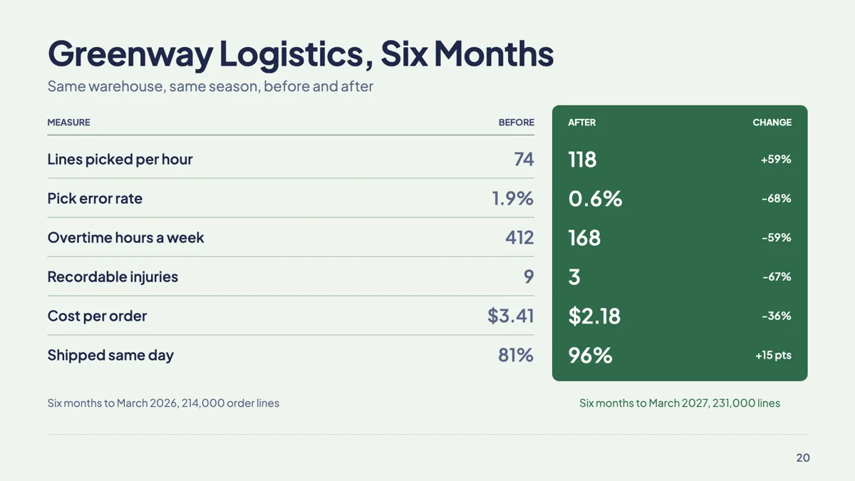
Before after metrics slide with six matched measures
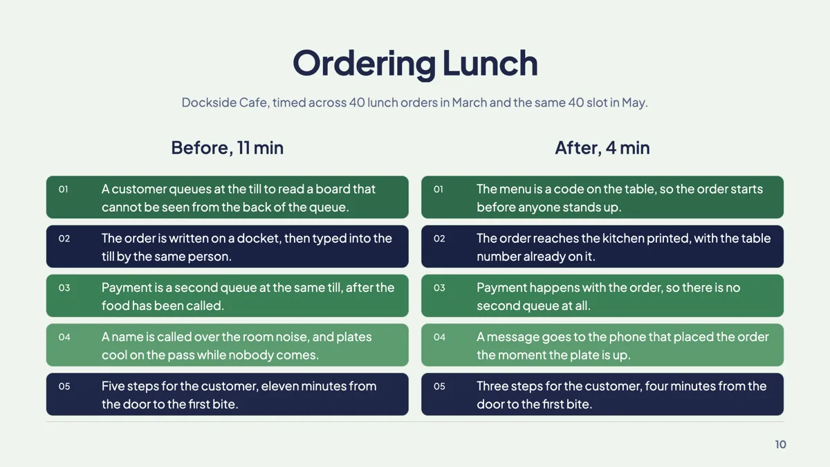
Before and after slide example with two matched columns
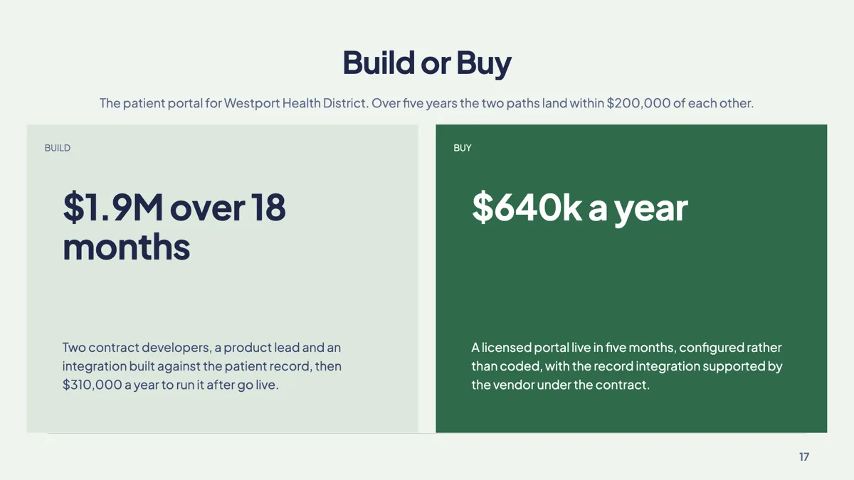
Build vs buy slide with one costed verdict a side
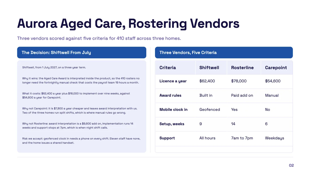
Callout comparison table slide with a verdict and the evidence
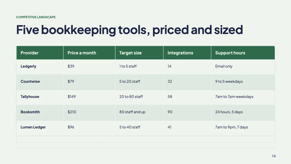
Competitive landscape slide with four rivals in a table
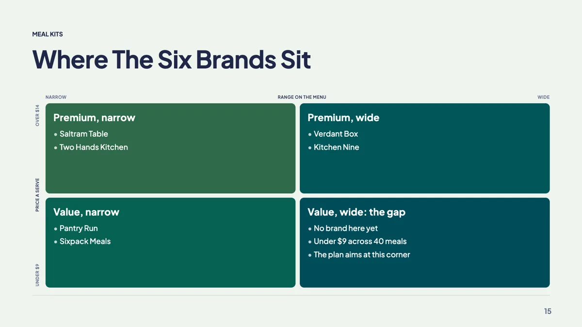
Competitor positioning slide with six brands on two axes
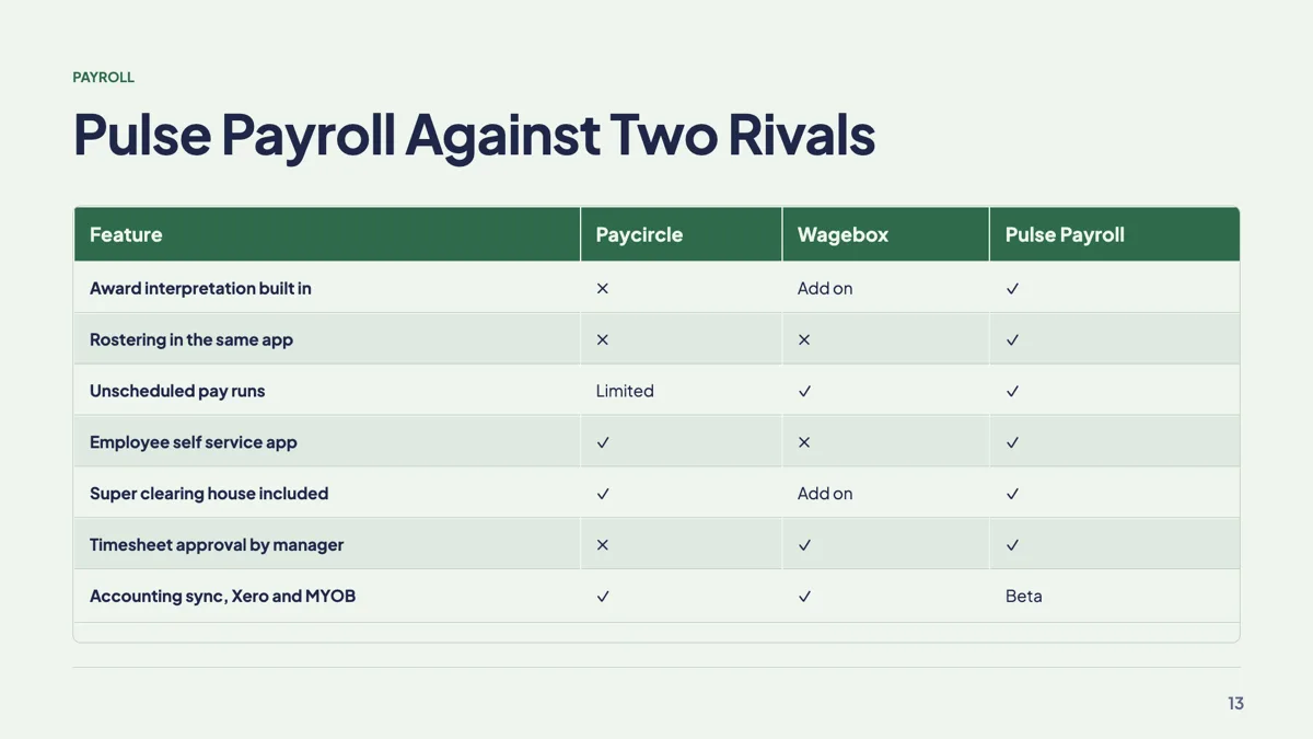
Feature comparison slide with a tick and cross matrix
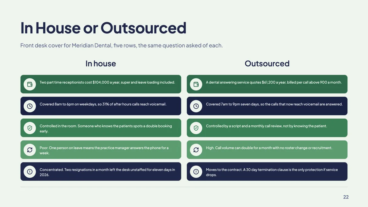
In house vs outsourced slide with five matched rows
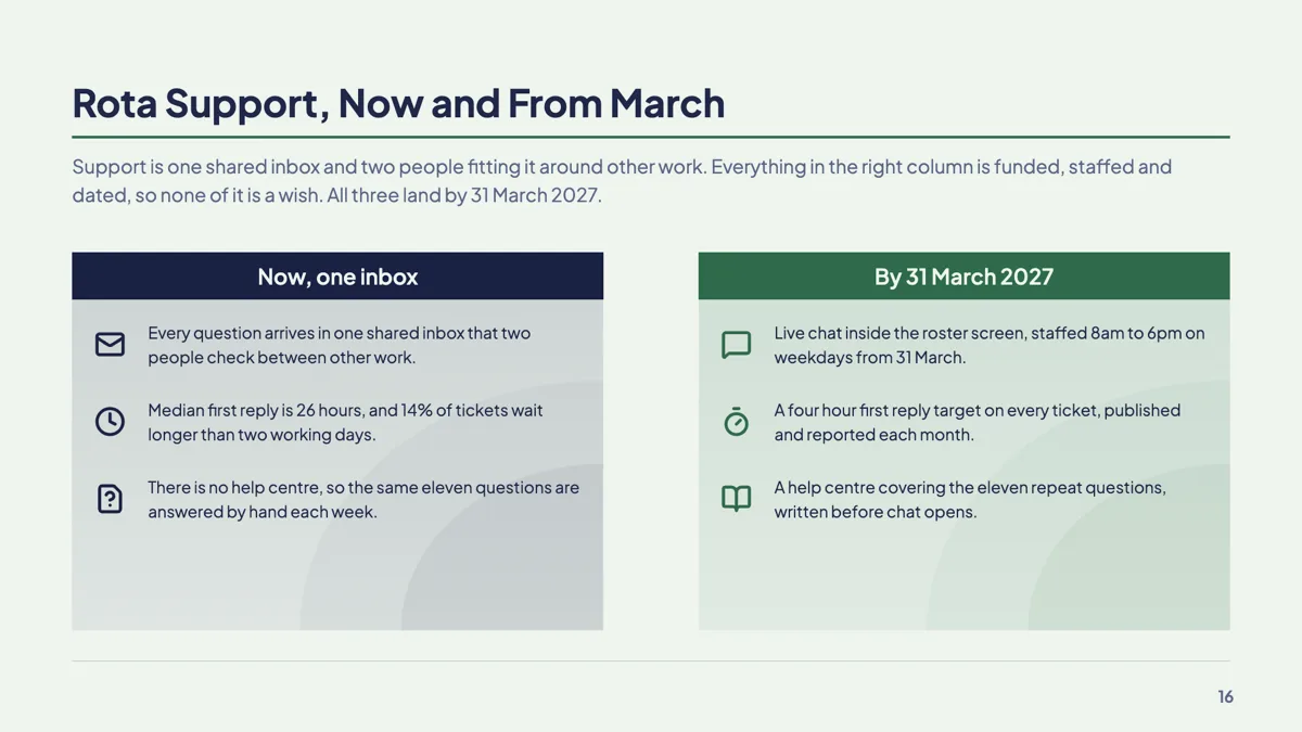
Now vs next slide with two icon columns
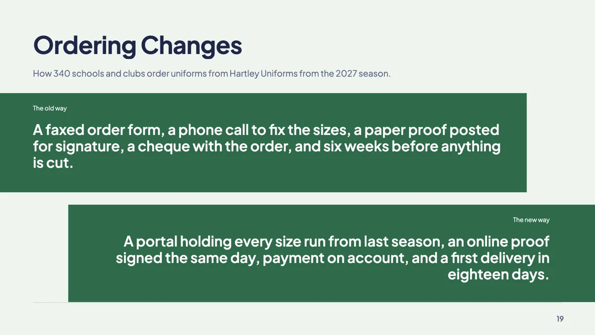
Old way new way slide on two opposing bands
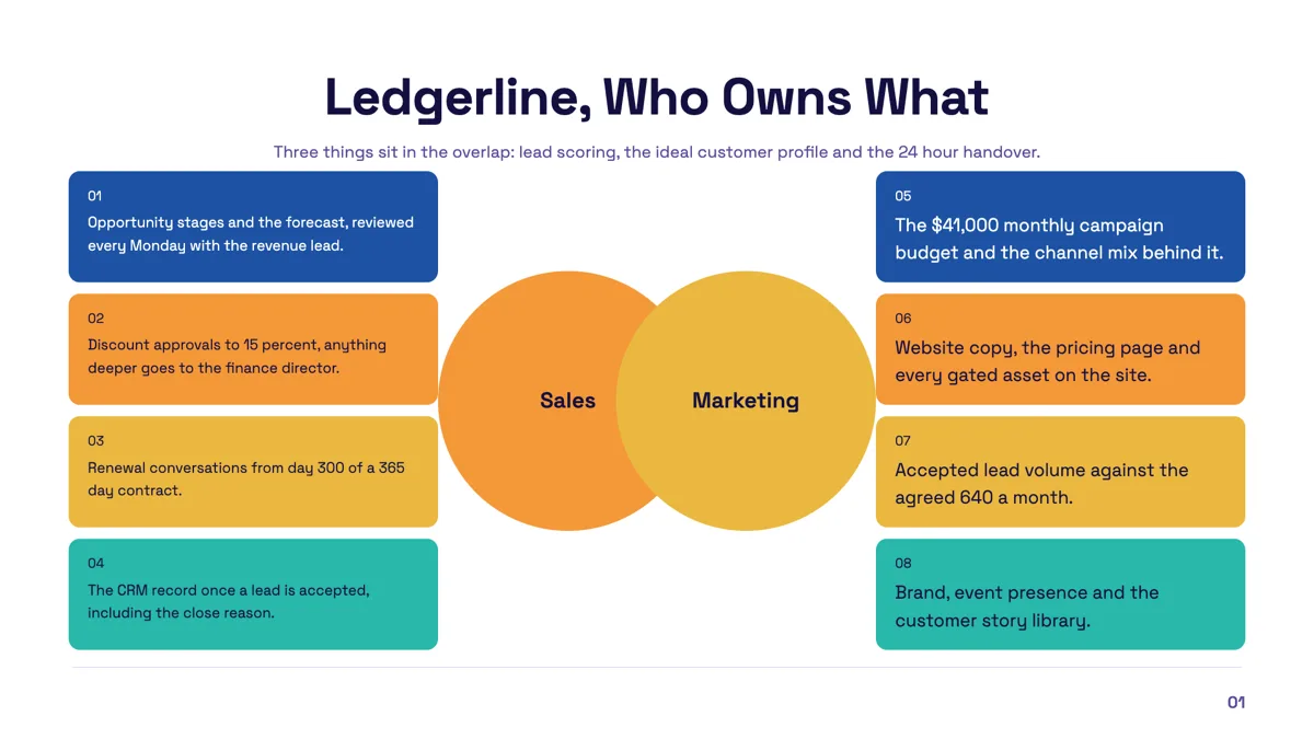
Overlap slide example with two circles and side lists
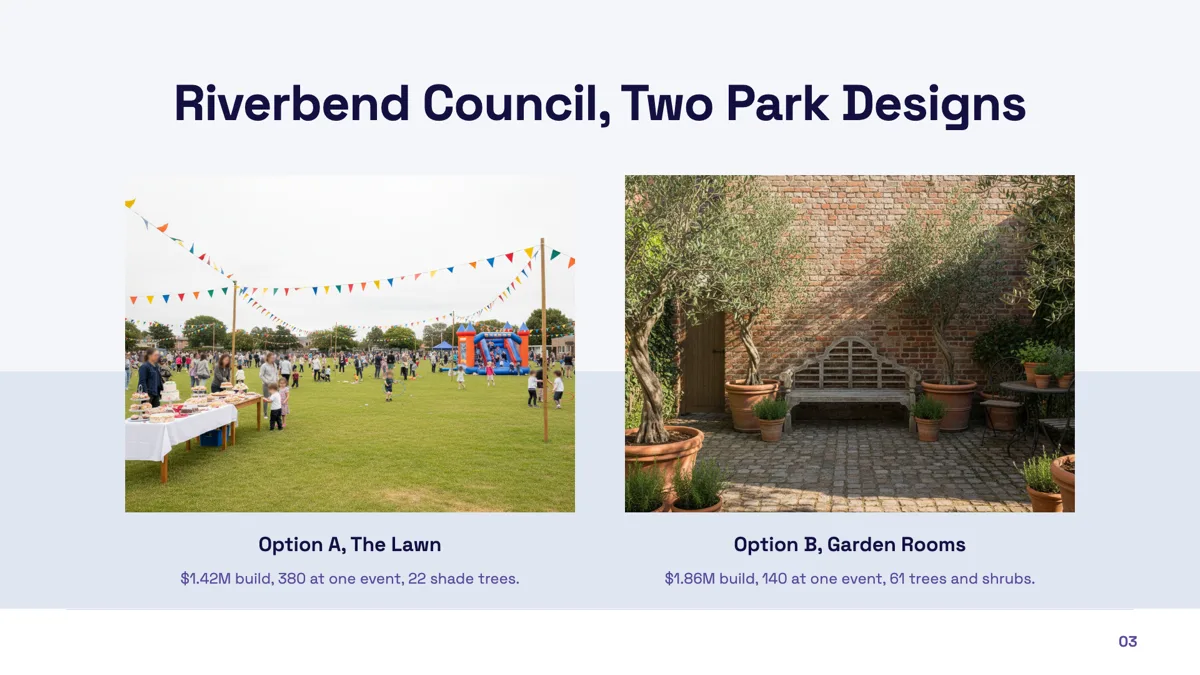
Photo comparison slide example with two captioned options
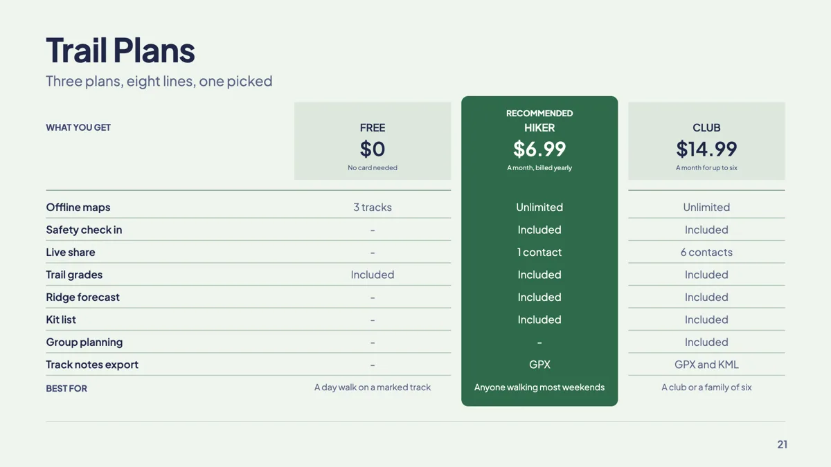
Plan comparison slide with one plan recommended
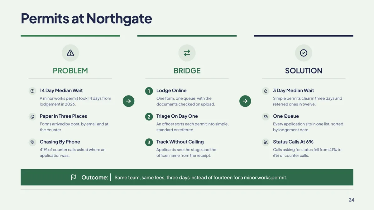
Problem bridge solution slide with three numbered steps
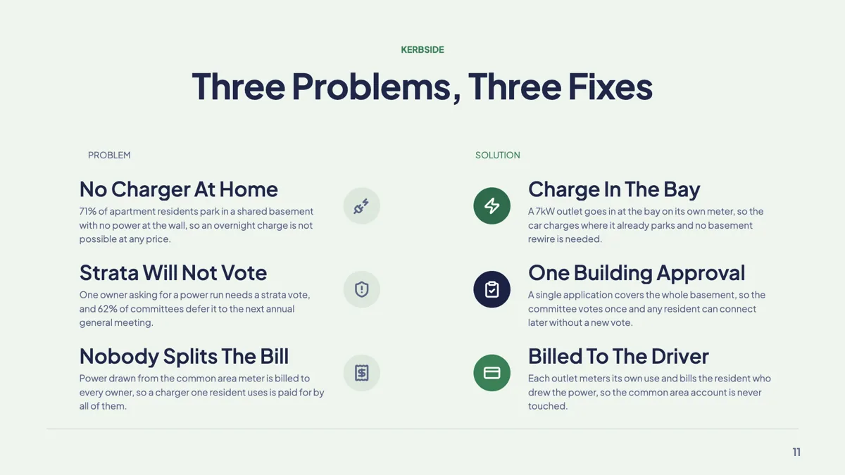
Problem solution slide with three paired problems
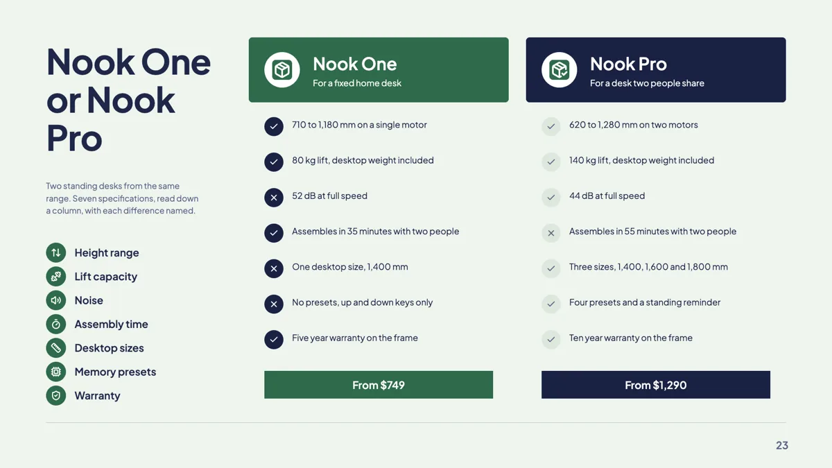
Product vs product slide with two feature cards
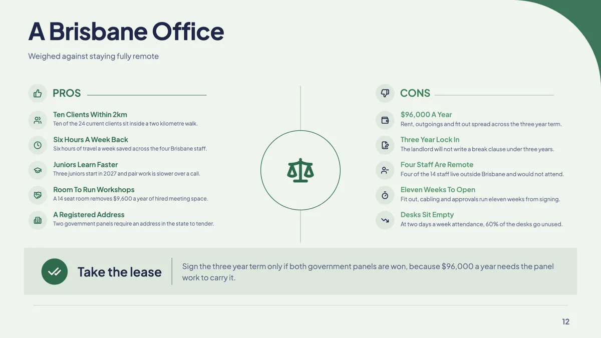
Pros and cons slide on a balance scale with a verdict
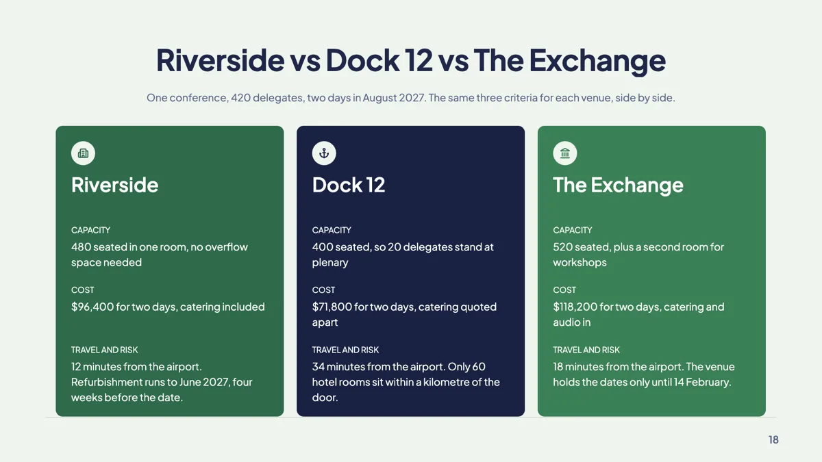
Three options slide with trade off cards
Questions people ask
Can I compare three things?
Yes, but not with the two sided layouts, which hold exactly two sides. Use the three option trade off cards, the three tier detail columns, or a feature matrix, all of which sit in the same comparison family. Give each option the same criteria in the same order, so the audience can read across the row instead of hunting for the matching point.
Which layout should I use for a competitor slide?
A tick and cross feature matrix or the competitive landscape table, and fill in the rows where the competitor wins as well as the ones where you do. A comparison you win on every row reads as marketing rather than analysis. Eight honest rows with a few crosses on your side earn more trust than four rows chosen because you win them.
Does anything calculate the improvement between before and after?
No. The metric panels give you a place to write the figure on each side and an improvement label between them, but the number is yours to work out and type in. Check it before you present, for example 42 minutes down to 18 is a 57 percent cut, because a wrong percentage on a before and after slide is the first thing a sharp audience spots.
Can I switch layouts after writing the content?
Yes. All forty three layouts are offered for the comparison purpose, so the picker renders each one with your own two lists already in it, and picking one carries the content across. Write the argument once, then try it as a split, a table and a verdict pair. If a layout holds fewer rows than you wrote, trim the lists to what matters most.
Make your own presentation
The button opens the generator with this use case already described. Change the wording to match yours, generate, then edit anything you like.
Create a presentation with OneCraftRelated pages
Table slides
A table earns its place on a slide when the audience will compare values rather than read sentences. The component is deliberately plain: a header band, rows, an optional bold first column, and widths you drag. Knowing its constraints is what stops you designing a table it cannot draw.
Three pillars slides
A pillars slide claims that a thing rests on a small number of supports, and it is only convincing if each support carries a sentence rather than a word. Thirty three layouts hold that shape, from three full colour panels to bento grids, temple diagrams and a seven item numbered row.
Key takeaway slides
A takeaway slide is the one people photograph, so it has to be readable out of context and short enough to be remembered. Seven layouts carry that job, the smallest of the writing roles: a single statement, a recap of bullets, three numbered insights, a manifesto, a pull quote and a card built to be screenshotted.
More finished work of this kind is on the presentation examples hub.
Written and checked by the OneCraft team. Last checked .