Presentations
Table slides
A table earns its place on a slide when the audience will compare values rather than read sentences. The component is deliberately plain: a header band, rows, an optional bold first column, and widths you drag. Knowing its constraints is what stops you designing a table it cannot draw.
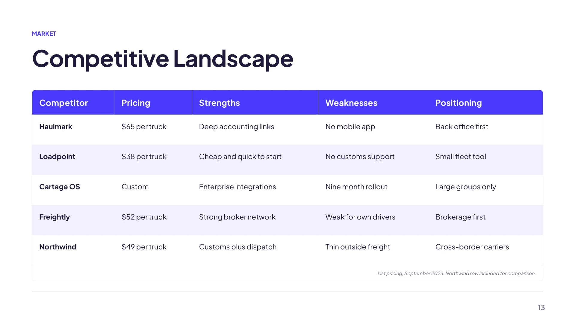
Eight columns, twenty rows, and neither is a target
Those are the ceilings for a table you build yourself, and the inspector shows your count against them as you add. They are not goals. Four to six columns is comfortable at 1920 by 1080 and six to ten rows is what an audience can scan while you talk. A table at the ceiling is a table that belongs in an appendix or a spreadsheet you send afterwards.
The styling is done for you
The header row takes the brand colour with contrasting text, alternate rows take a faint tint, borders take the divider colour, and all of it comes from theme tokens so a theme swap restyles every table in the deck. There is a first column emphasis setting that renders the leftmost column bold, which is what turns a grid of numbers into a set of labelled rows.
Every cell is left aligned
This is the constraint worth planning around, because there is no per column alignment control. Numbers sit against the left edge of their column like text does. Two things help: drag the column dividers so a numeric column is only as wide as its widest value, and keep the number format consistent down the column so the digits line up by accident rather than by setting.
Widths are dragged, and double click resets
Grab the divider in the header between two columns and drag. The widths persist with the slide. Double clicking a divider clears the stored widths and returns the table to content driven automatic layout, which is the same gesture a spreadsheet uses and the fastest way out of a table you have made worse.
The caption is a real field
Below the table there is an optional caption, right aligned and separated by a rule. It is the correct home for the things that would otherwise clutter a header: the units, the period the figures cover, the source, or the note that one column excludes tax. Putting those in the caption keeps the column headings to one or two words, which is what keeps the table narrow.
How it works, in three steps
Step 1
Decide the columns before anything else
The column set is the design. Four to six reads well on a slide, and each extra one costs width everywhere.
Step 2
Turn on the first column emphasis
Bolding the leftmost column is what makes each row a labelled thing rather than a line of values.
Step 3
Drag the widths, then caption it
Narrow the numeric columns, then put the units and the period in the caption rather than the headers.
The full walkthrough with screenshots is in the guide Add charts, maps and diagrams to slides.
Limits worth knowing
- Twenty rows and eight columns is the ceiling for a table you add yourself.
- Every cell is left aligned. There is no per column alignment setting, so numbers do not right align.
- Cells hold plain text. There is no formula, no total row and no cell merging.
- A table does not split across two slides. If it will not fit, it needs cutting, not shrinking.
See it on a finished piece



Slide examples
Finished single slides on this layout, each one built from a real template and written out in full.
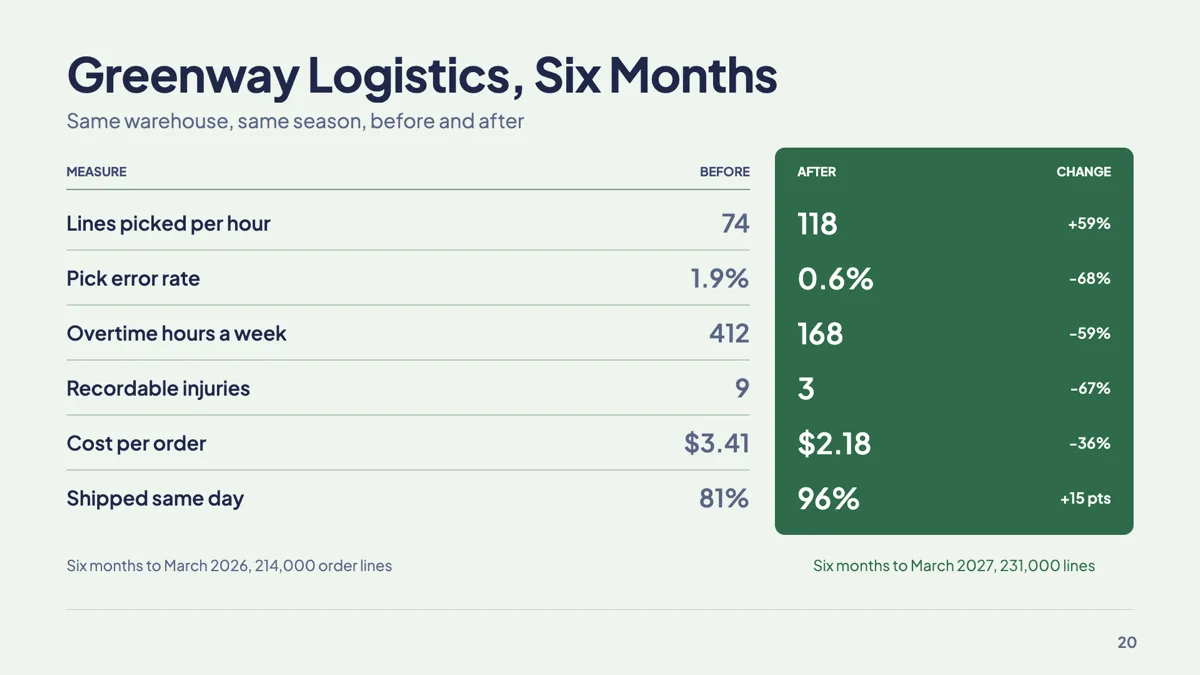
Before after metrics slide with six matched measures
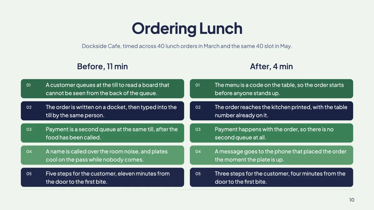
Before and after slide example with two matched columns

Build vs buy slide with one costed verdict a side
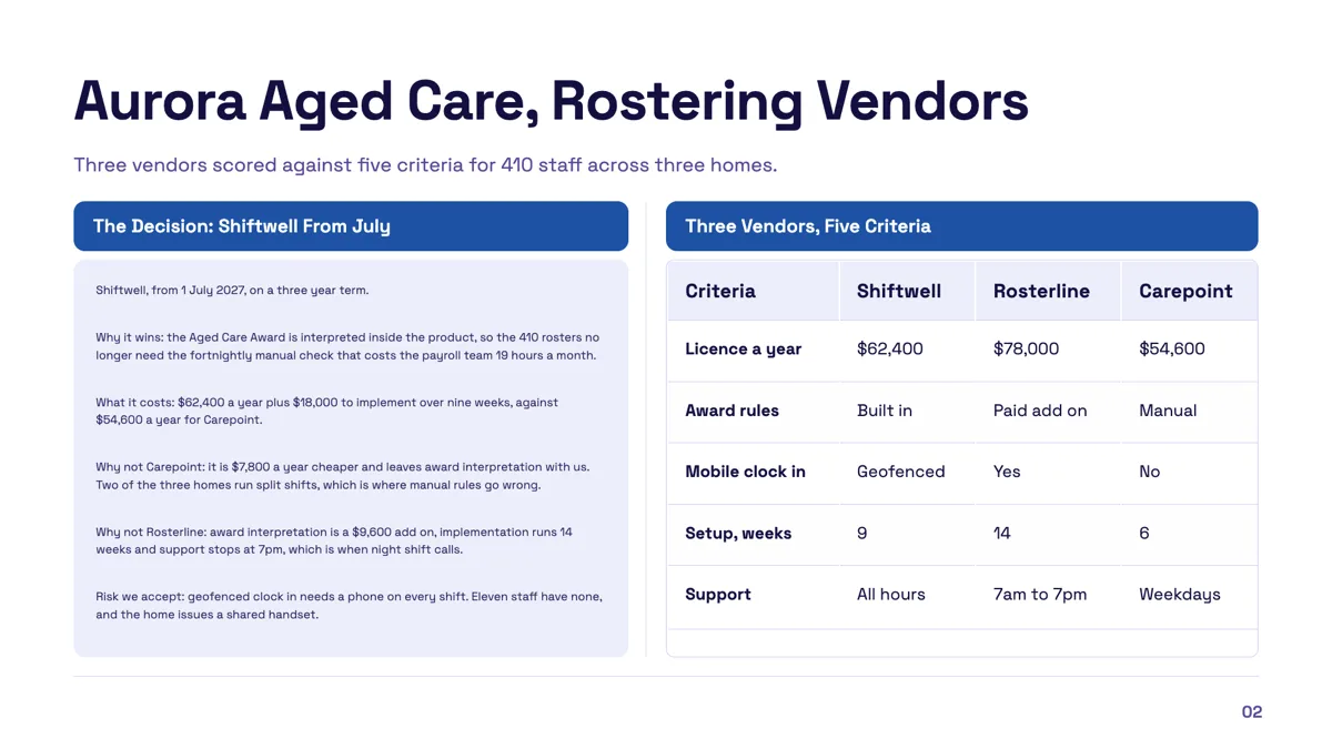
Callout comparison table slide with a verdict and the evidence
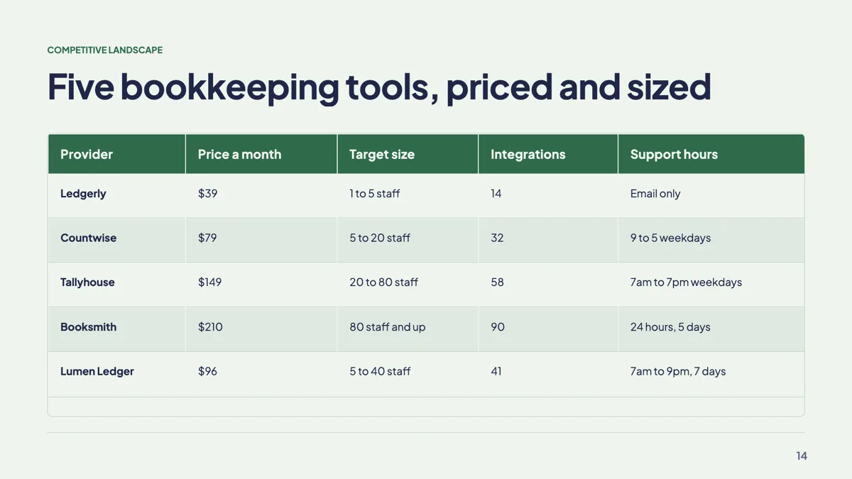
Competitive landscape slide with four rivals in a table
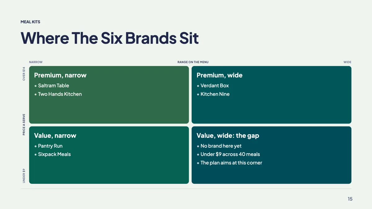
Competitor positioning slide with six brands on two axes
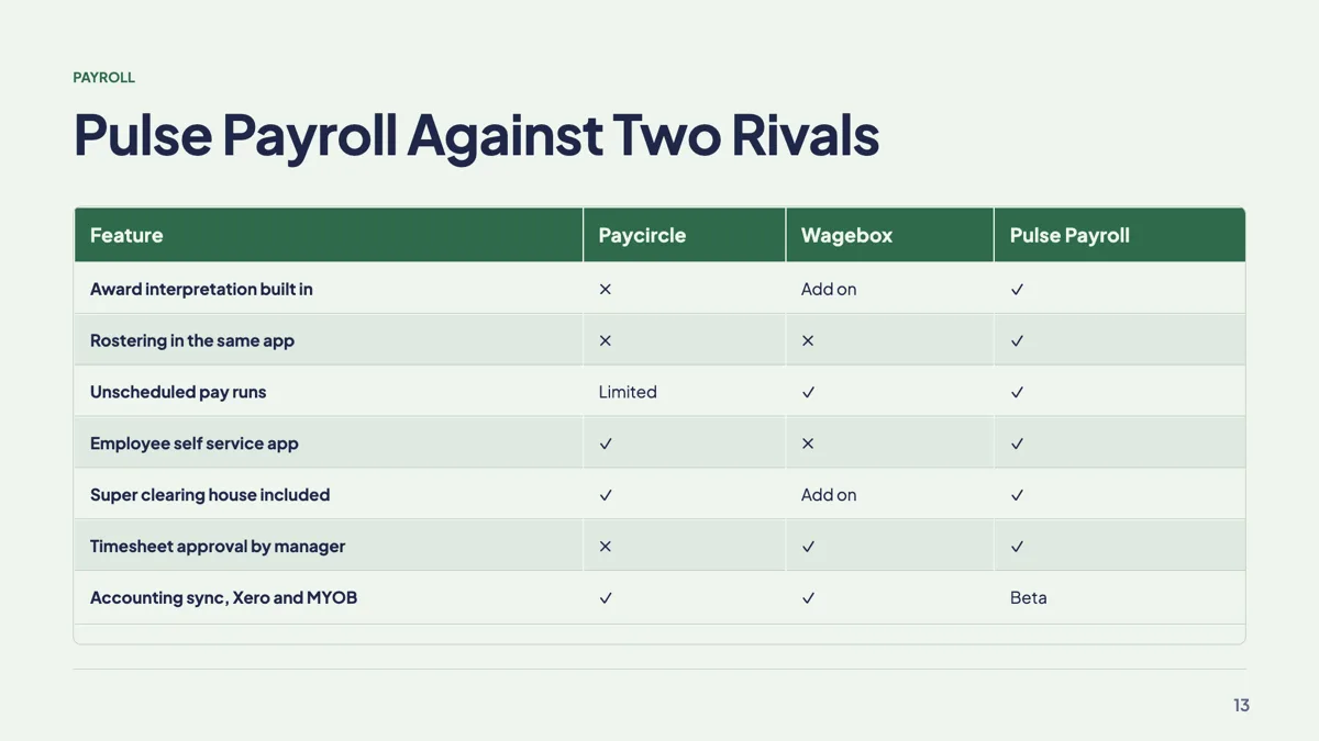
Feature comparison slide with a tick and cross matrix
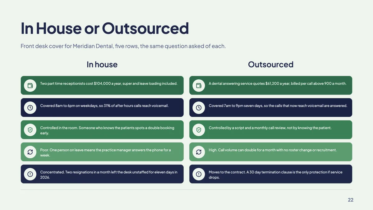
In house vs outsourced slide with five matched rows

Now vs next slide with two icon columns
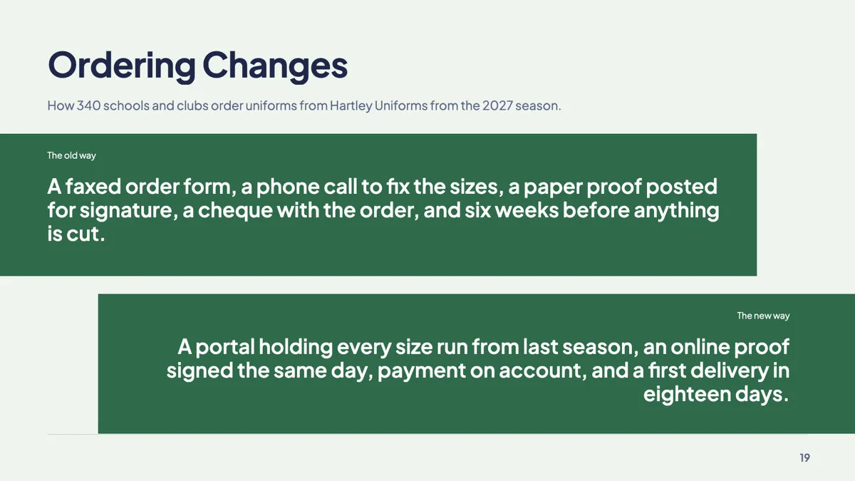
Old way new way slide on two opposing bands

Overlap slide example with two circles and side lists

Photo comparison slide example with two captioned options
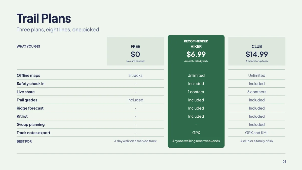
Plan comparison slide with one plan recommended
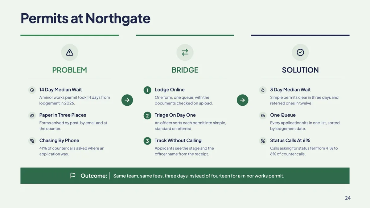
Problem bridge solution slide with three numbered steps
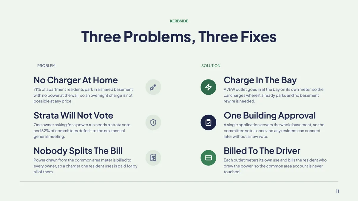
Problem solution slide with three paired problems
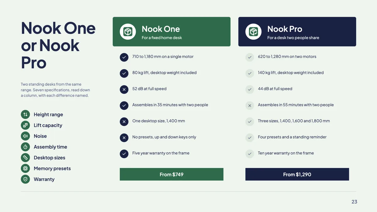
Product vs product slide with two feature cards
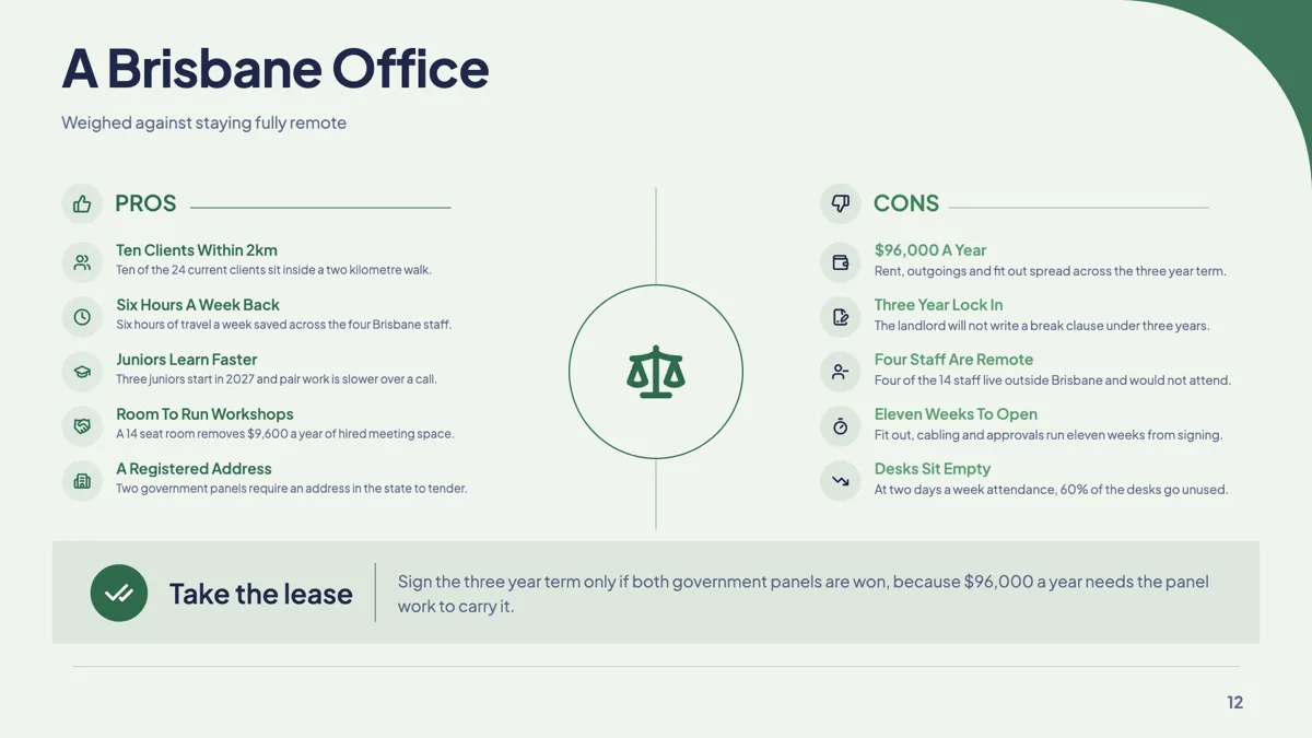
Pros and cons slide on a balance scale with a verdict
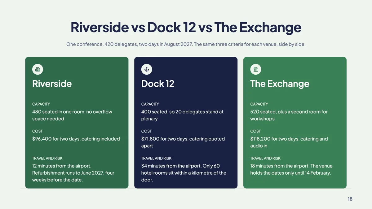
Three options slide with trade off cards
Questions people ask
Can I right align a column of numbers?
No. Alignment is left for every cell and there is no setting for it. Narrow the column by dragging its divider and keep the number format consistent, which achieves most of the same effect.
Does the table calculate totals?
No. Every cell is text you type, including any total. There are no formulas and no summary row.
How do I undo a column width I dragged badly?
Double click the divider. That clears the stored widths and returns the table to automatic layout based on its content.
Do tables survive the PowerPoint export?
In the editable PowerPoint export, yes. Tables come out as real PowerPoint tables you can edit, rather than as a picture.
Make your own presentation
The button opens the generator with this use case already described. Change the wording to match yours, generate, then edit anything you like.
Create a presentation with OneCraftRelated pages
Chart slides
A chart here is a small spreadsheet plus a choice of how to draw it. Categories down one side, one or more named series of numbers, and a render kind you can change at any time. The numbers never move when the drawing does.
Data tables in a document
A table is the right block whenever the reader will compare values rather than read sentences. Rates, line items, schedules and specifications all belong in one, and prose about them does not.
Comparison slides
Comparison is the single largest family in the library, because most business arguments are two sided. The layouts differ by what kind of two sided claim you are making, and picking the wrong kind is what makes an audience argue with the slide instead of the point.
More finished work of this kind is on the presentation examples hub.
Written and checked by the OneCraft team. Last checked .