Documents
Data tables in a document
A table is the right block whenever the reader will compare values rather than read sentences. Rates, line items, schedules and specifications all belong in one, and prose about them does not.
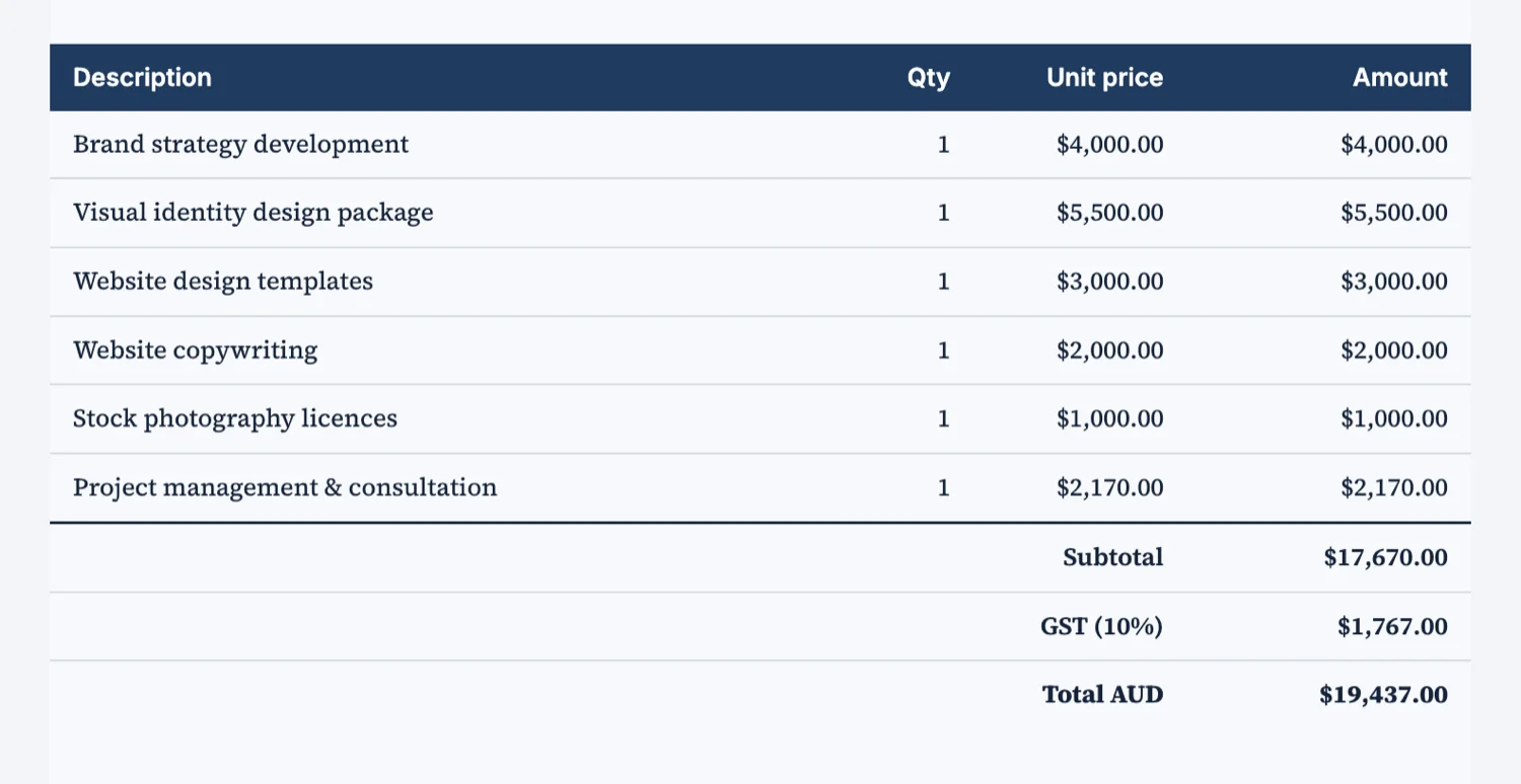
Three kinds of row
A header row names the columns. Ordinary rows carry the values. A summary row carries the totals and is set apart so the eye finds it without hunting. Where a table is long, a section row can break it into groups, which is what turns forty undifferentiated rows into four readable blocks.
Columns of numbers align right
Money, quantities and percentages line up on their right edge so the digits stack and the eye can compare magnitudes down the column. Text aligns left. This is the single change that makes a rate table look professional, and getting it wrong is the single most common table mistake.
At a page break
A table that fits on one page is kept whole and moved down if it has to be. A table too tall for any page is split across the break rather than shrunk, and the parts stay in reading order. That means a long table does not force a half empty page above it, which is what happens in tools that refuse to split.
When not to use a table
Two values are not a table, they are a sentence or a pair of key values. A table with one column is a list. And a table used to lay out a page rather than to hold data will fight the theme, because it is styled as data. Use the container block for layout and the table for values.
Numbers align right, and nothing adds up
A table is content, not a spreadsheet. Numeric columns are set right aligned with tabular figures so the digits line up down the column, which is what makes a total readable at a glance. What the table will not do is calculate: there are no formulas and no total row that recomputes, so every total in the document is a number somebody typed. Check them the way you would check a figure in a paragraph.
Tables in the CSV world
This block is for showing rows a reader looks at, not for collecting rows somebody fills in. If you need people to enter tabular data, that is a form with a table input, and the answers come back as rows in the responses. Putting a blank table in a document and asking people to type into the PDF is the one thing this block is not for.
How it works, in three steps
Step 1
Name the columns first
The column set is the design. Four to six columns is comfortable on A4.
Step 2
Right align the numbers
Money, quantities and percentages on the right, text on the left.
Step 3
Add a summary row if there is a total
A total buried as an ordinary row is a total nobody finds.
The full walkthrough with screenshots is in the guide Every document component and when to use it.
Limits worth knowing
- Tables hold values you write. They do not calculate totals for you.
- A table too tall for a page is split across the break rather than scaled down.
- Very wide tables are constrained by the A4 page, so keep the column count sensible.
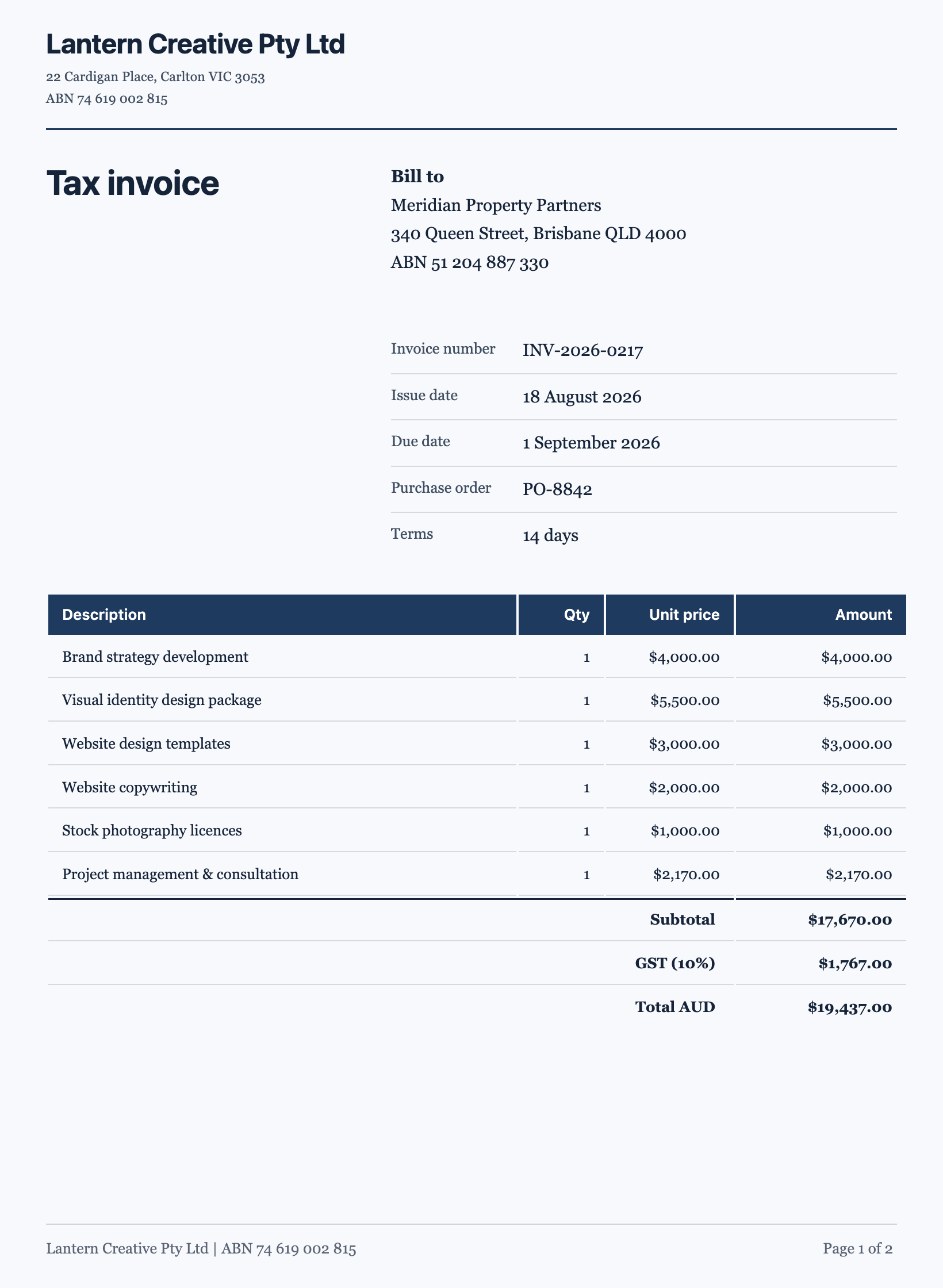
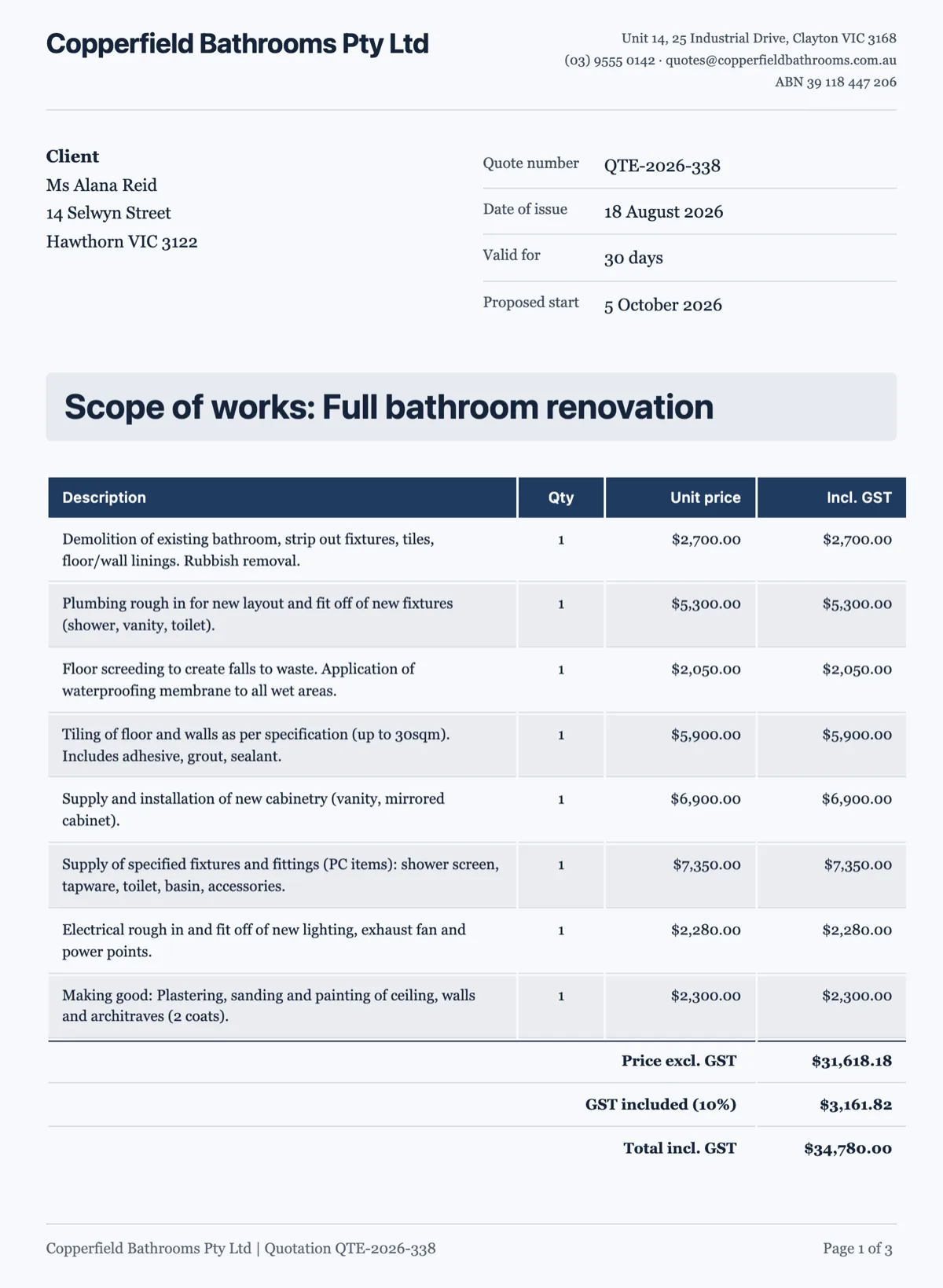
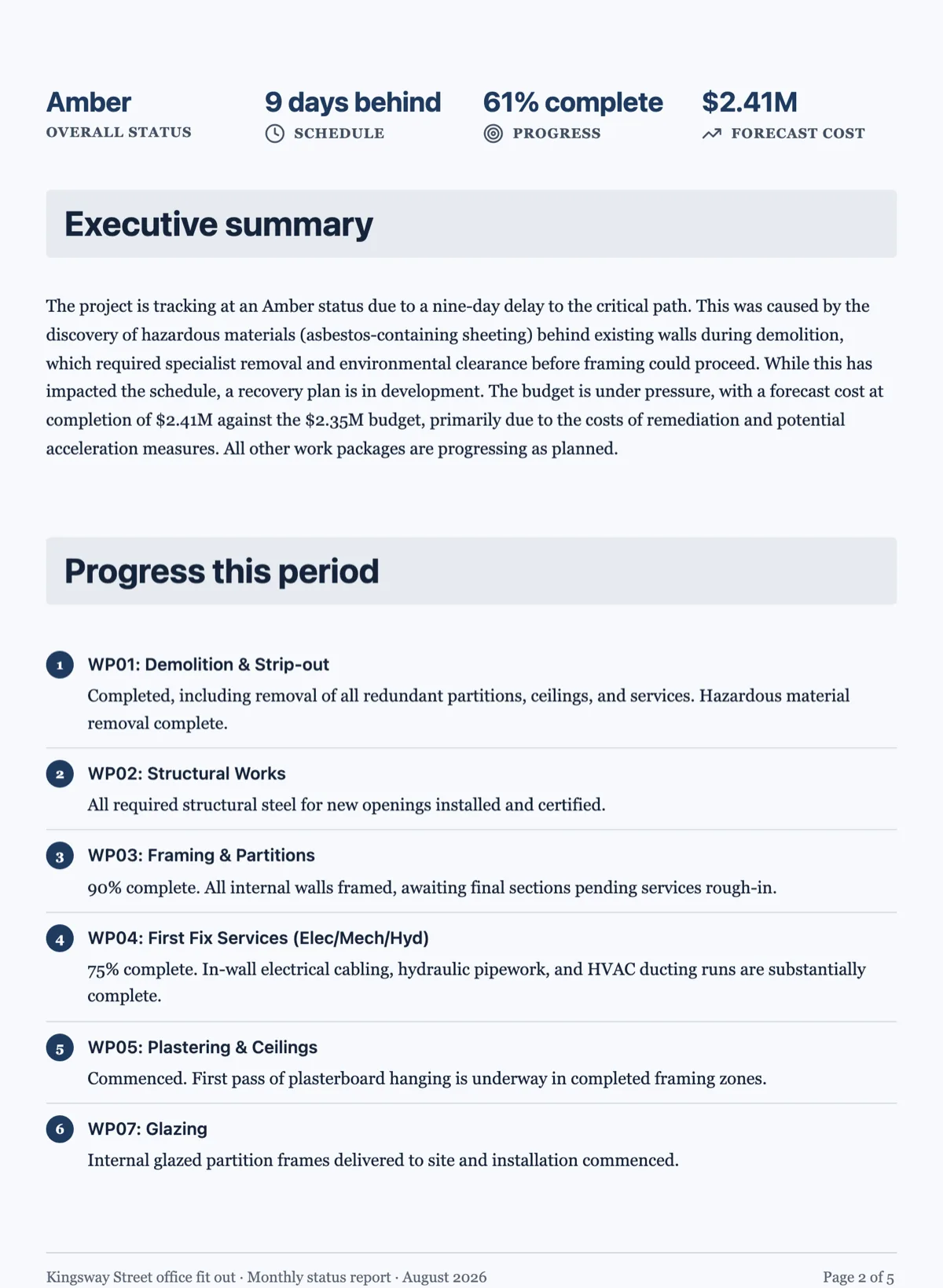
See it on a finished piece
Questions people ask
Does the table add up my totals?
No. Every value in the table is one you wrote, including the total. The summary row exists to make the total findable and to set it apart visually, not to compute it. Treat a total in a table the way you would treat a figure in a sentence: check it against the source before the document goes out.
What happens if a table runs past the bottom of a page?
If the whole table could fit on a page, it moves down to that page rather than being split. If it is genuinely taller than a page, it splits at the break in reading order and carries on. That is the same rule every block follows, which is why a page never ends with two orphaned rows when it could have moved the table.
How many columns can I use?
About six on A4 portrait before the type has to shrink past comfortable reading, and four or five is the number that actually reads well. If you need more, ask whether two tables would say it better, or whether the page should be landscape. A wide table that nobody can read is worse than two narrow ones.
How many columns fit on A4 portrait?
Four to five columns of ordinary text is the comfortable limit on a portrait page, and six is possible when several of them are short numbers. Past that the type has to shrink to fit and the table stops being readable at arm's length. A table with ten columns usually wants to be two tables, or the page wants to be landscape.
Can the AI chat edit a cell?
Yes, for the wording. The chat can rewrite the text in a data table's cells, as well as text in a container cell, so asking it to shorten every description in a price table works. What it cannot do is change the table's structure, such as its column widths or alignment. Check the numbers after any chat edit, because it rewrites text rather than recalculating anything.
Make your own document
The button opens the generator with this use case already described. Change the wording to match yours, generate, then edit anything you like.
Create a document with OneCraftRelated pages
Document letterhead
A letterhead is the sender-identity band at the top of the first page. It belongs on documents that speak for somebody, and it is deliberately kept off the ones that do not.
Table slides
A table earns its place on a slide when the audience will compare values rather than read sentences. The component is deliberately plain: a header band, rows, an optional bold first column, and widths you drag. Knowing its constraints is what stops you designing a table it cannot draw.
Charts in a document
A chart earns its place when the shape of the data is the point. Six types are available, they take the document theme colours, and the honest advice is that most documents need fewer charts than they contain.
More finished work of this kind is on the document examples hub.
Written and checked by the OneCraft team. Last checked .