Documents
Charts in a document
A chart earns its place when the shape of the data is the point. Six types are available, they take the document theme colours, and the honest advice is that most documents need fewer charts than they contain.
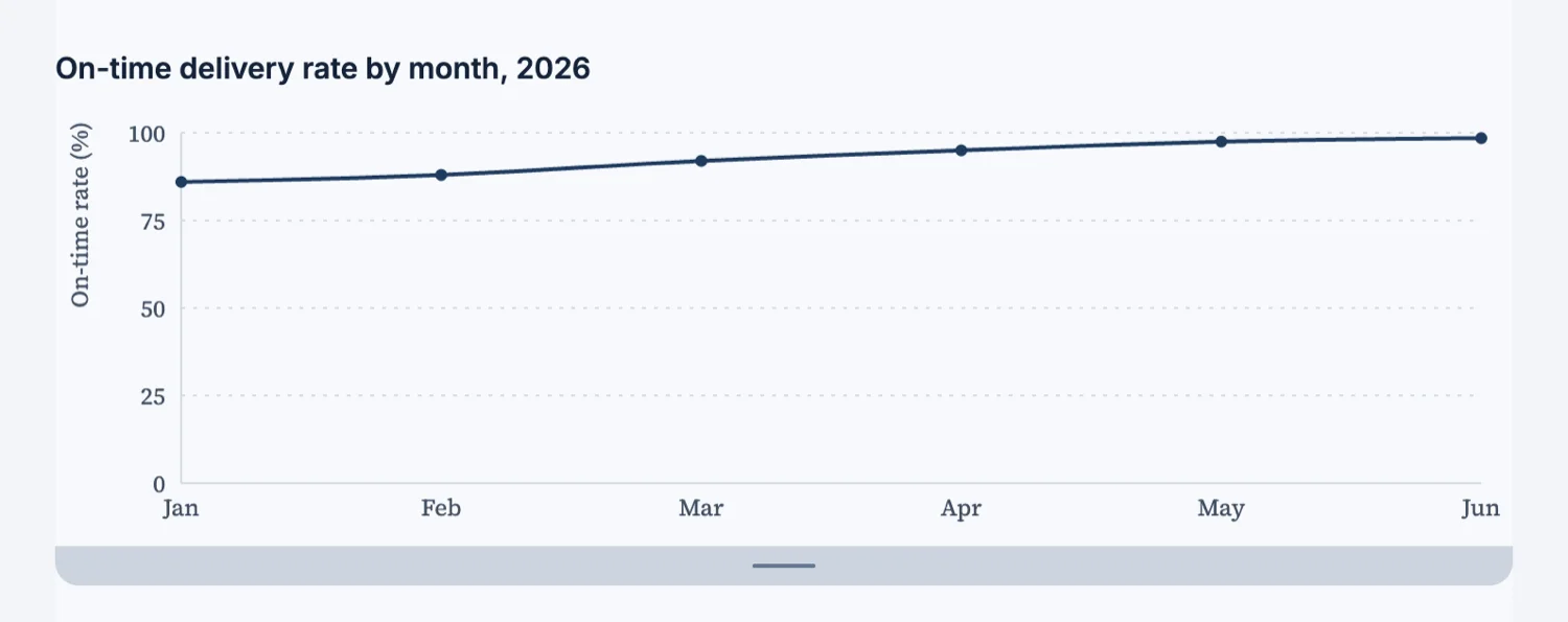
The six types and what each is for
Bar compares categories. Horizontal bar does the same when the labels are long, which is most of the time in a business document. Line shows a value over time. Area does the same when the volume underneath matters. Pie and donut show parts of a whole, and they only work with a handful of slices, so if you have nine categories use a bar chart instead.
One message per chart
A chart that shows three things shows nothing. Decide the single sentence the chart is making, then check that the chart makes it without the caption. If it needs the caption to be understood, the caption is the content and the chart is decoration.
They take the theme
Charts are drawn in the document theme colours rather than a fixed palette, so switching the theme restyles them with everything else and a document does not end up with one section in somebody else’s brand colours.
When a table beats a chart
When the reader needs the actual numbers, which in an invoice, a budget or a rate card is always. A chart is for shape and a table is for values. Reports that carry both usually want the chart for the trend and the table for the detail, in that order.
Label it so it survives being photocopied
A chart in a document is read on paper as often as on screen, and often in black and white. That rules out colour as the only way to tell two series apart, and it rules out a legend far from the data. Label the series on the chart where you can, put the units in the axis title rather than assuming them, and check the chart still makes its point when the colour is gone.
How it works, in three steps
Step 1
Write the sentence first
Say what the chart proves. If you cannot, you want a table.
Step 2
Pick the type from the data
Categories to bars, time to a line, parts of a whole to a pie only when there are few slices.
Step 3
Caption it with the finding
A caption that repeats the axis labels is wasted. Say what the reader should take away.
The full walkthrough with screenshots is in the guide Every document component and when to use it.
Limits worth knowing
- Six chart types: bar, horizontal bar, line, area, pie and donut.
- Charts are drawn from the values you supply; there is no live data connection.
- Charts take the document theme colours rather than a palette of their own.
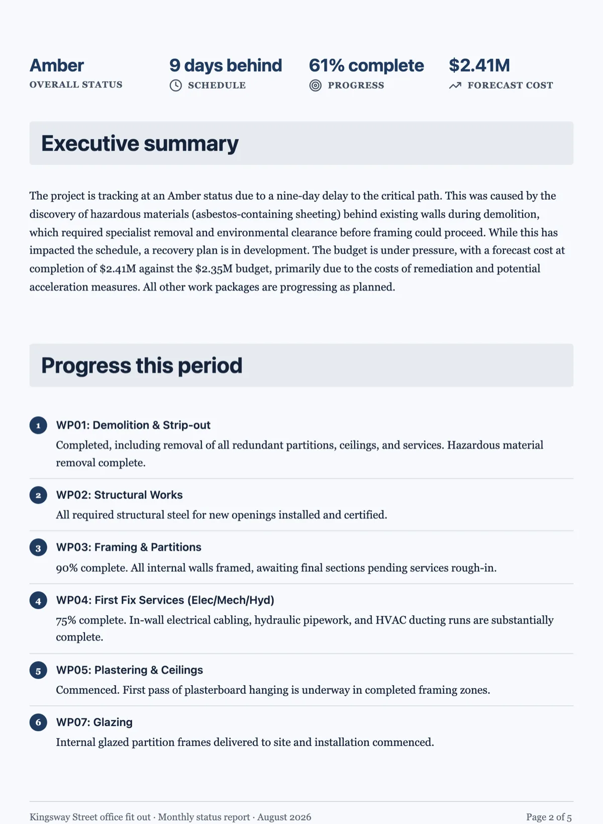
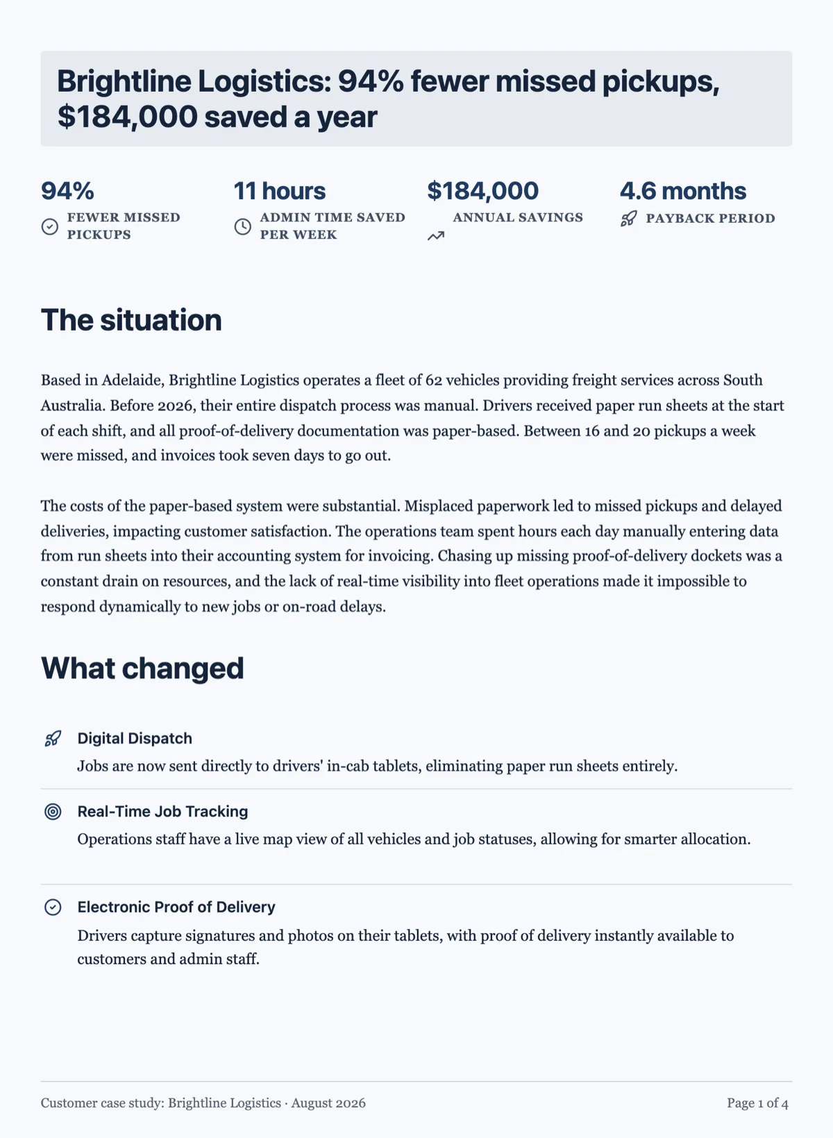
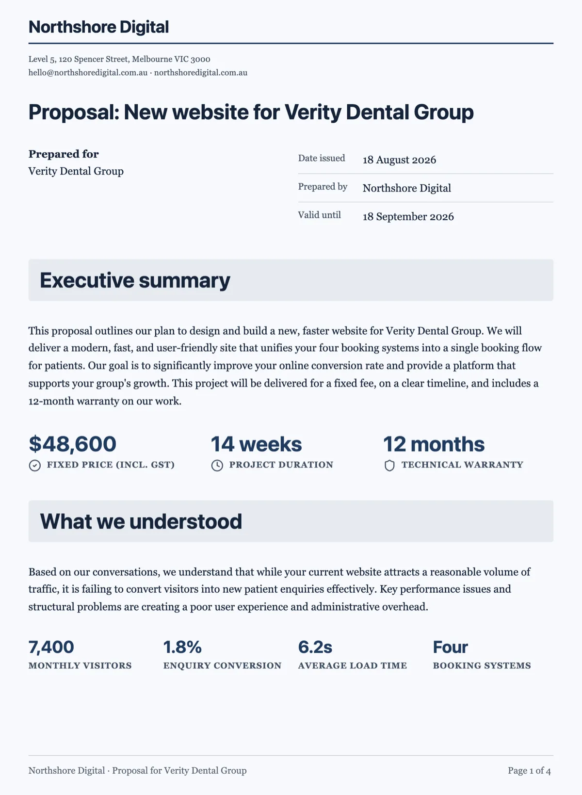
See it on a finished piece
Questions people ask
What chart types are available?
Six: bar, horizontal bar, line, area, pie and donut.
Can a chart pull live data?
No. It draws the values in the document, so it is a snapshot rather than a dashboard.
Should I use a pie chart?
Only with a few slices where the parts genuinely make a whole. Past about five categories a bar chart is easier to read.
Make your own document
The button opens the generator with this use case already described. Change the wording to match yours, generate, then edit anything you like.
Create a document with OneCraftRelated pages
Data tables in a document
A table is the right block whenever the reader will compare values rather than read sentences. Rates, line items, schedules and specifications all belong in one, and prose about them does not.
Document cover page
A cover is a separate designed sheet before the content, and it is added only to documents a reader would expect to open on one. There are seven layouts, and the choice says as much as the words on it.
Flyer with a chart
Charts belong on a flyer far less often than people put them there, but when the message is a number moving, one chart does the work of a paragraph. Here it is a block you insert, type figures into, and then flip between ten shapes until one of them actually reads.
More finished work of this kind is on the document examples hub.
Written and checked by the OneCraft team. Last checked .