Presentations
Chart slides
A chart here is a small spreadsheet plus a choice of how to draw it. Categories down one side, one or more named series of numbers, and a render kind you can change at any time. The numbers never move when the drawing does.
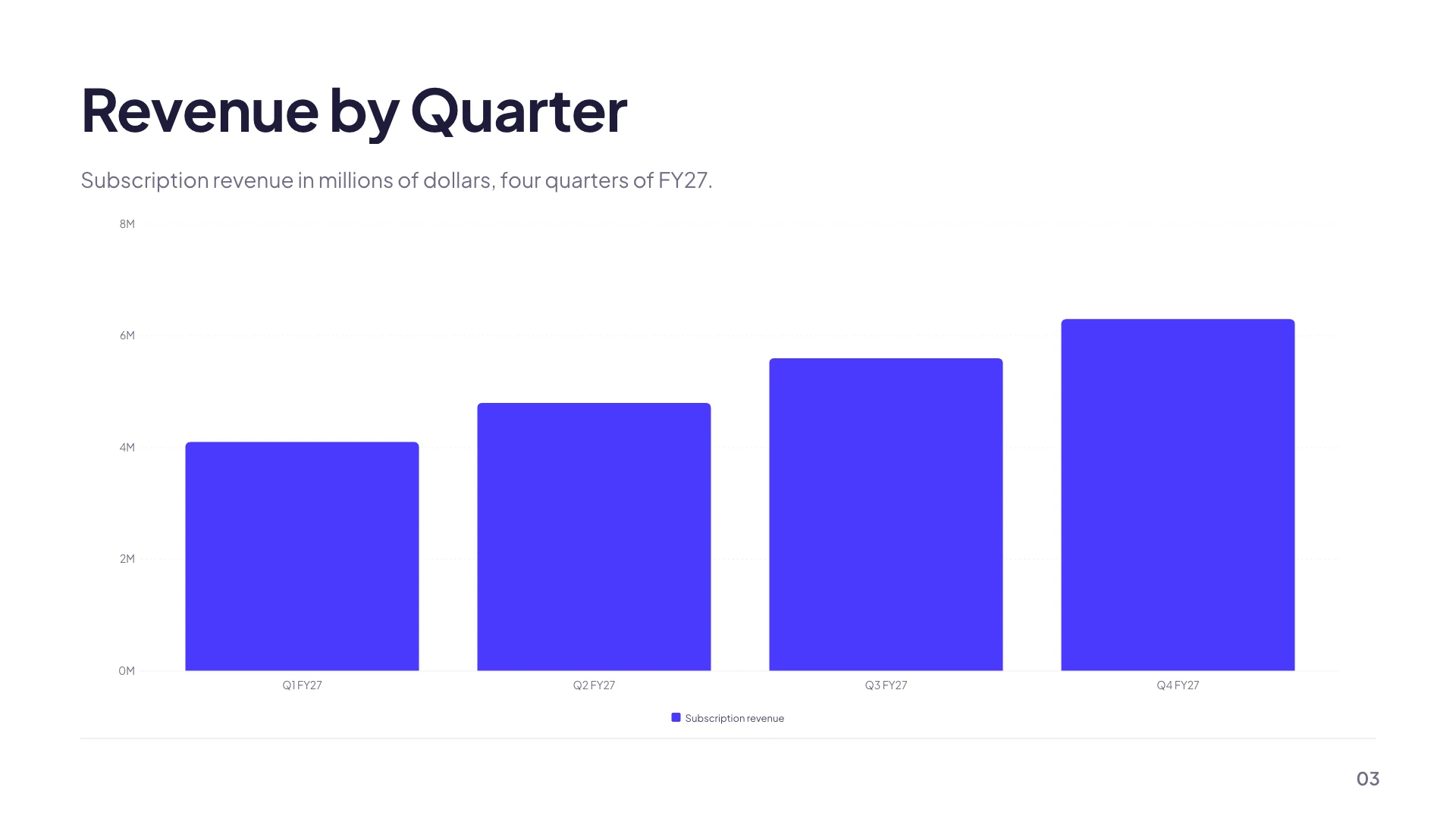
Ten kinds, one shape of data
Columns and Bars are the same numbers turned ninety degrees. Stacked puts several series in one column. Line and Area draw a trend, Area filling underneath it. Pie and Donut split a whole. Radar plots one series across several axes. Waterfall shows sequential deltas rather than absolute values. Waffle draws a ten by ten dot matrix, which reads a percentage more honestly than a pie does at a distance.
The grid is the source of truth
Selecting a chart opens a data editor with the category labels along one axis and a named series of values against them. You add and remove categories and series, and set an optional unit that is appended when values are labelled. Because all ten kinds read the same normalised shape, switching from a column chart to a donut is a one click render change, not a re-authoring job.
How many kinds you are offered depends on where the chart came from
A chart that arrived as part of a layout offers only the three or four kinds that layout was designed to hold, because a design built around a wide horizontal bar chart does not survive being turned into a radar. A chart you drop on a slide yourself from the element library offers all ten, since it owns its own space and can be resized.
Series colours come from the palette
Each series takes the next colour in a fixed four step ramp: the brand colour, the secondary, the accent, then muted ink. In themes whose three brand colours sit close together, two series can end up looking similar, so check a grouped chart on the theme you are actually using. A swatch beside each series in the inspector overrides the ramp when you need one bar to stand apart. In spectrum and outline colour modes the series spread across the palette's accent range; in matching and dark they hold the brand colour so a bar cannot disappear into its own background.
Axis labels stay readable over anything
The axis and gridline colours are computed against whatever is actually behind the chart on that slide, not against the page background, so a chart sitting on a coloured panel gets darker or lighter axes automatically. That is why a chart dragged onto a brand coloured band does not end up with grey text on a mid blue field.
How it works, in three steps
Step 1
Click the chart
The inspector opens with the render kind picker on top and the data grid under it.
Step 2
Type the numbers
Edit the category labels and the values in place. Add series for a comparison, add categories for more periods.
Step 3
Try two render kinds
The same data as columns and as a line often reads very differently. Switching costs nothing.
The full walkthrough with screenshots is in the guide Add charts, maps and diagrams to slides.
Limits worth knowing
- Charts hold numbers you type. There is no spreadsheet link, no formula and no live data source.
- A chart that came with a layout offers only that layout's three or four kinds. Drop one from the element library to get all ten.
- Layouts cap how many categories their chart accepts, typically five, eight or twelve.
- In an editable PowerPoint export nine of the ten become real PowerPoint charts. Waffle has no native equivalent and exports as a picture.
See it on a finished piece



Slide examples
Finished single slides on this layout, each one built from a real template and written out in full.

Campaign results slide with three hero stats and a verdict
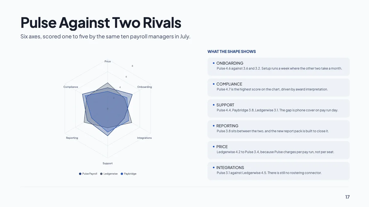
Competitor benchmark slide drawn as a radar on six axes
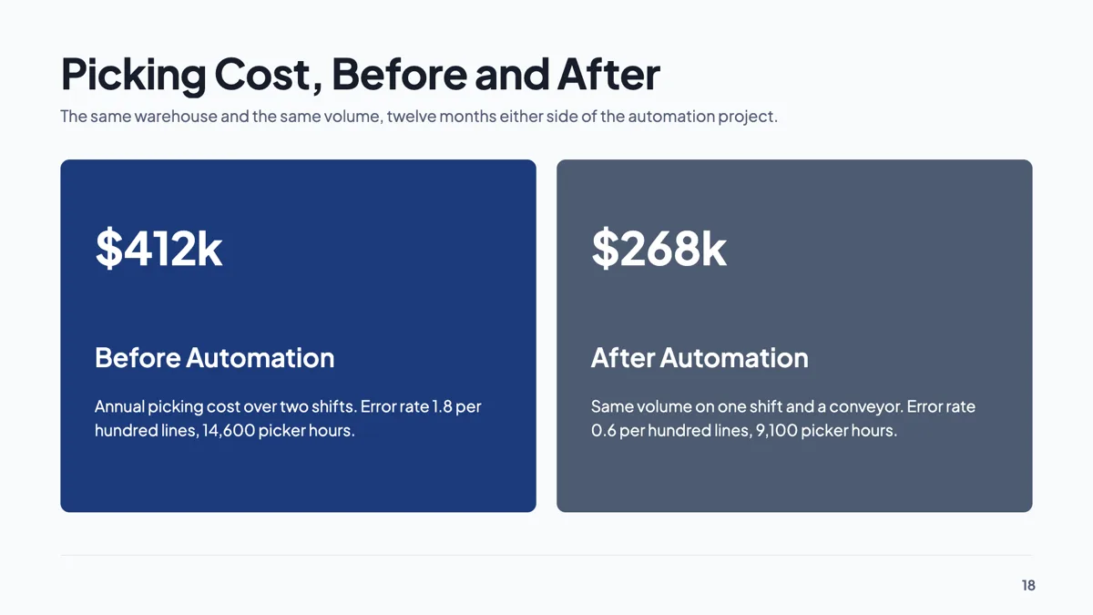
Cost savings slide with two hero panels, before and after
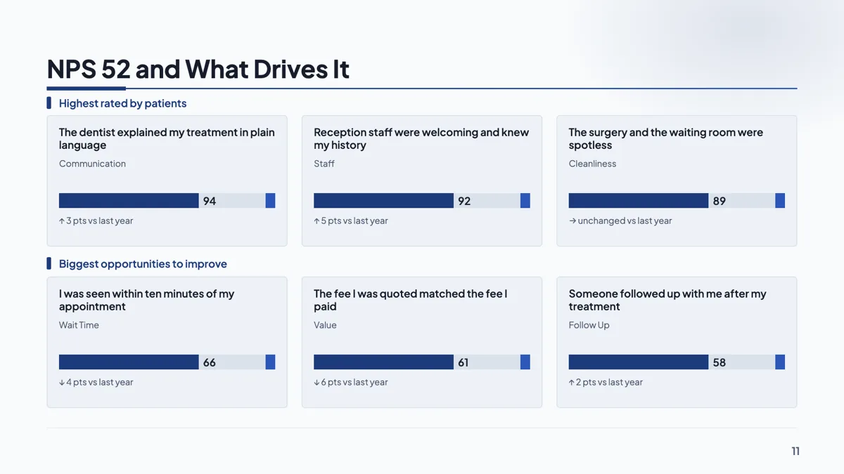
Customer satisfaction slide with NPS 52 and its six drivers
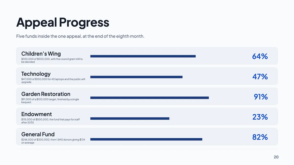
Fundraising progress slide with five funds against targets
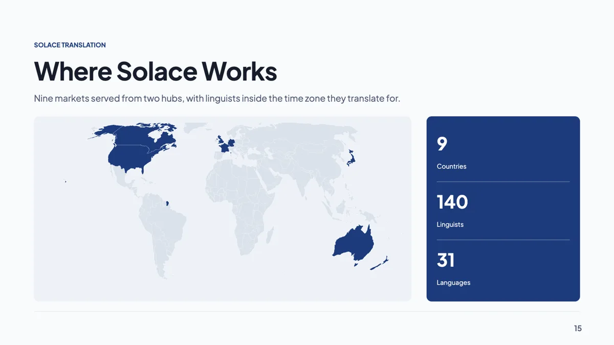
Global presence slide with nine countries highlighted on a map
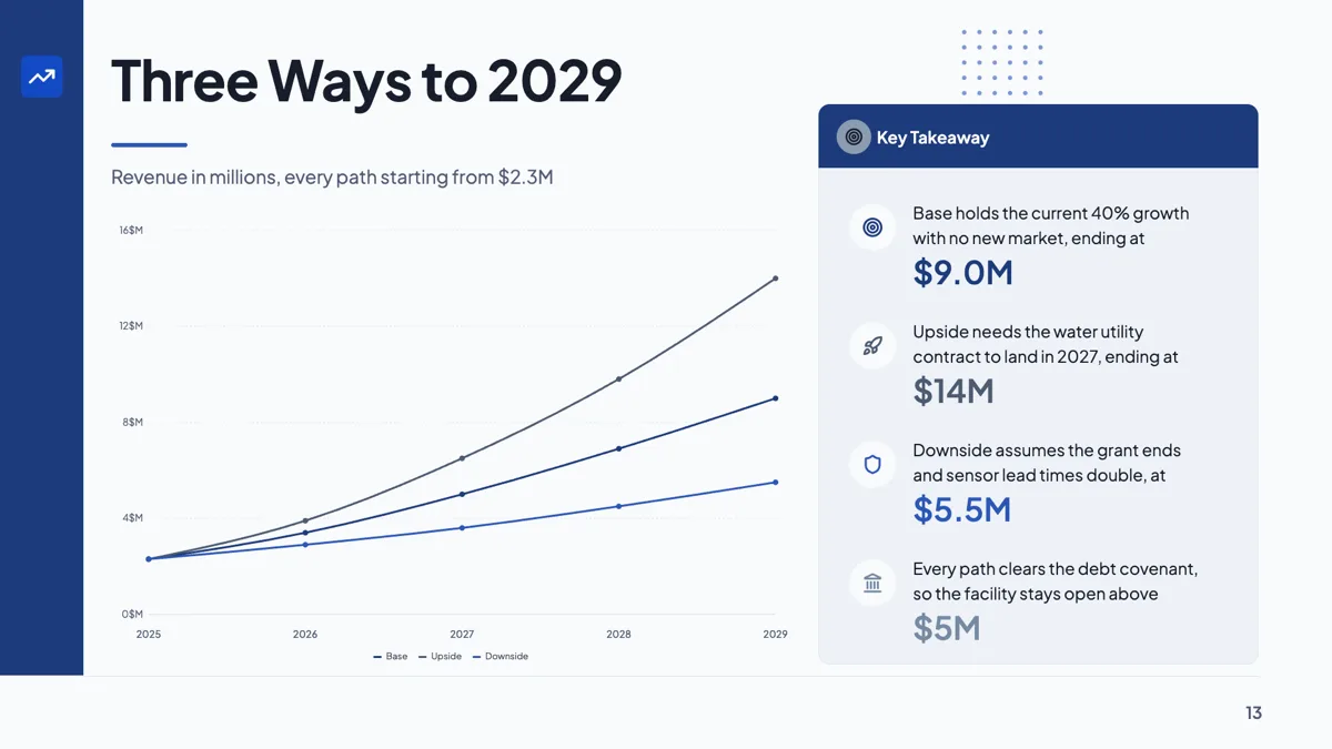
Growth scenarios slide with base, upside and downside to 2029
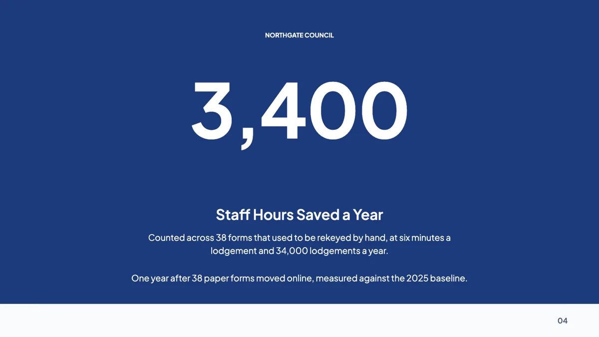
Hero number slide built on one figure, 3,400 hours saved

Market share slide drawn as a donut with five slices
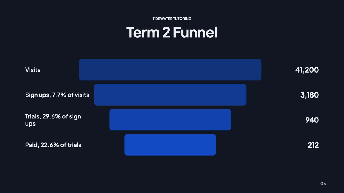
Marketing funnel slide with four steps from visit to paid
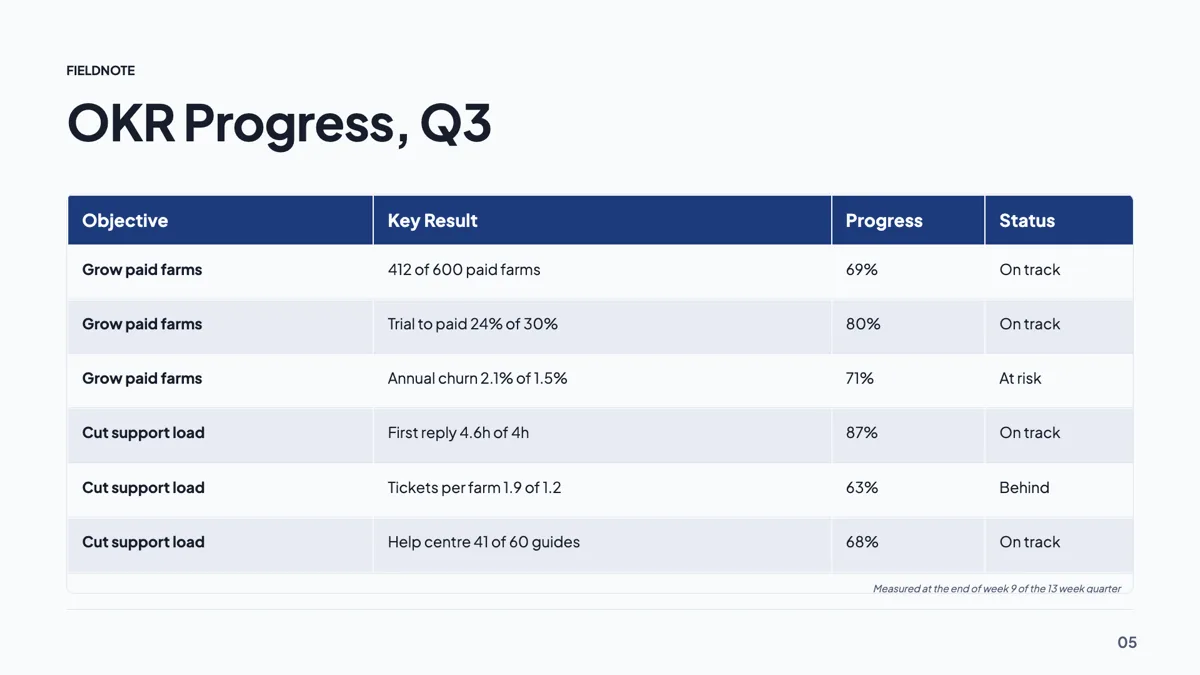
OKR progress slide example with two objectives and six key results

Product usage slide with six engagement stat cards
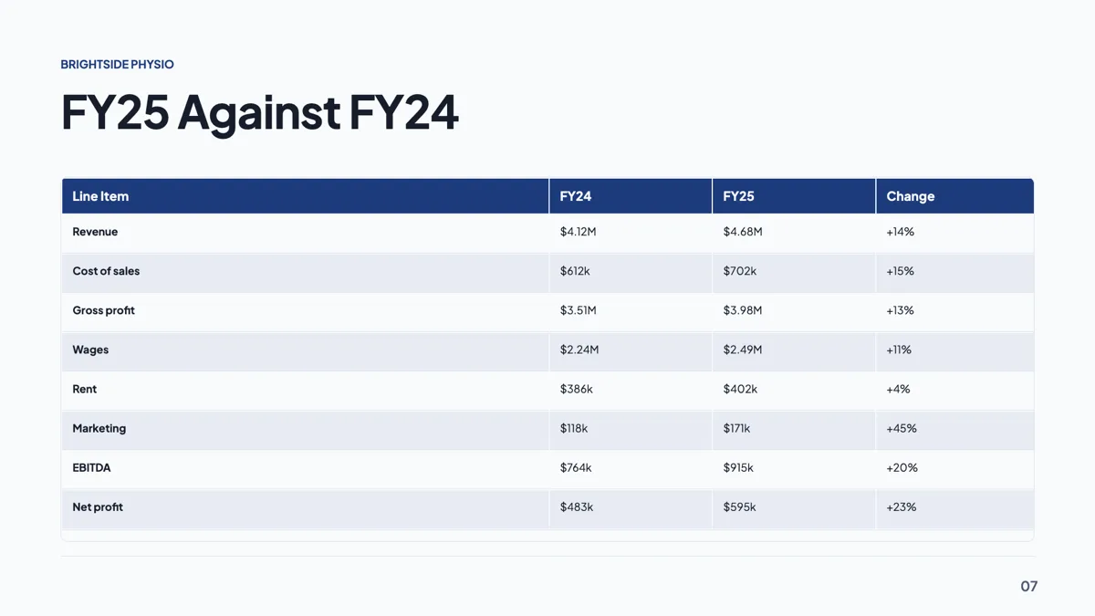
Profit and loss slide with eight lines and a change column
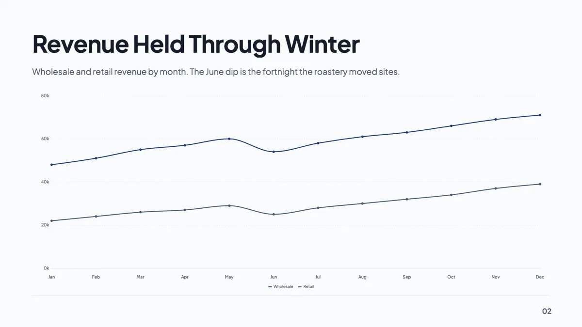
Revenue trend slide with twelve months on one line chart
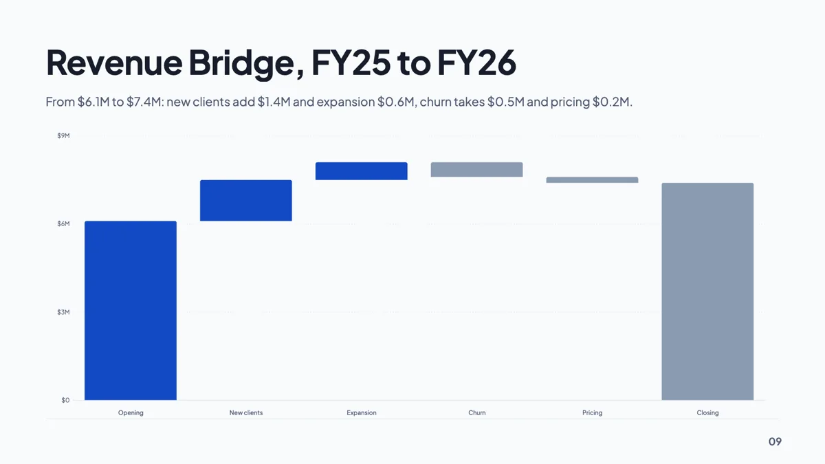
Revenue waterfall slide bridging $6.1M to $7.4M
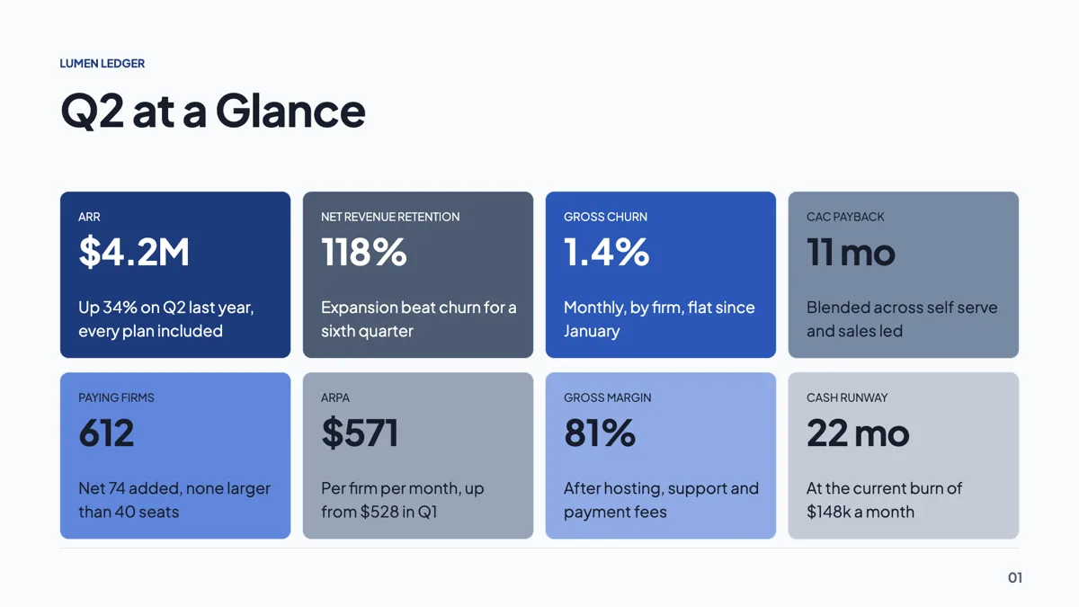
SaaS KPI slide example with eight numbers on one wall
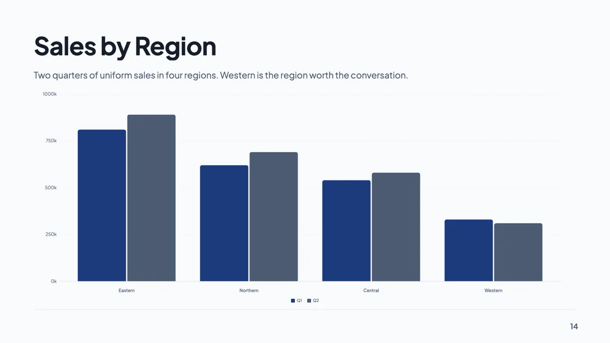
Sales by region slide with four regions on vertical bars
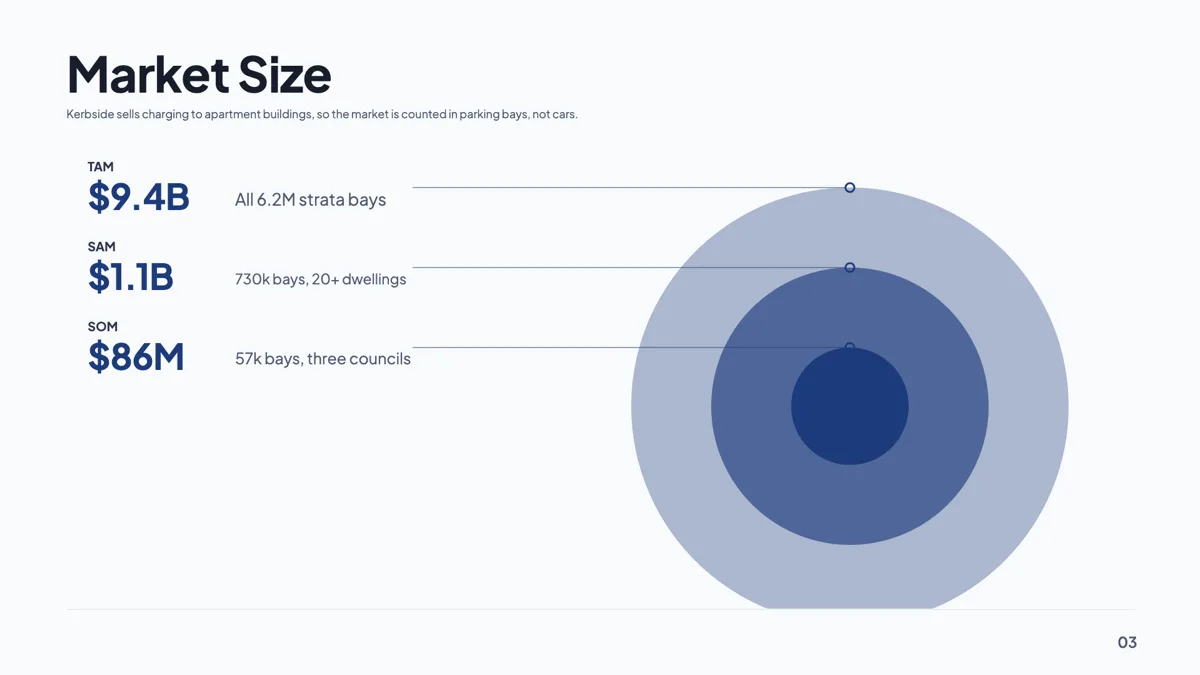
TAM SAM SOM slide example with the three numbers sourced
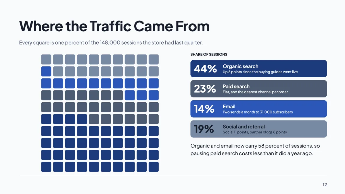
Website traffic slide with sources drawn as a waffle of 100
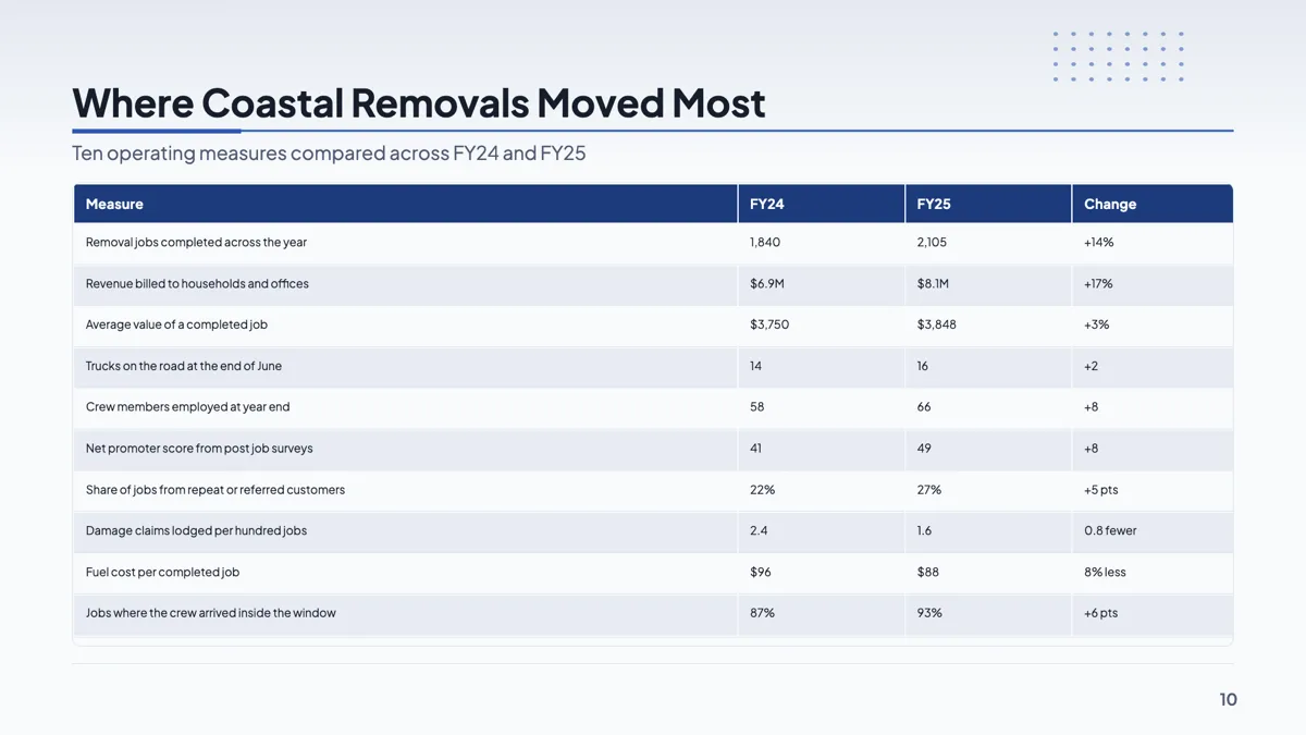
Year over year growth slide with ten metrics in one table
Questions people ask
Can I paste data in from a spreadsheet?
Not as a block. Values are typed into the grid cell by cell. For a large table of numbers, a table slide is usually the better shape anyway.
Does changing the chart kind lose my data?
No. All ten kinds read the same categories and series, so the render kind is a display setting rather than a different chart.
How do I get a specific brand colour on a series?
Use the swatch next to that series name in the data editor. It overrides that series only and leaves the rest tracking the theme.
Can I put a chart on a slide that did not come with one?
Yes. The element library has a tile for each of the ten kinds, and the chart you drop lands with sample data you then replace.
Make your own presentation
The button opens the generator with this use case already described. Change the wording to match yours, generate, then edit anything you like.
Create a presentation with OneCraftRelated pages
Metrics slides
Numbers fail on slides for one of two reasons: there are too many to read, or there is one and it arrives without context. The 34 metrics layouts split cleanly along that line, between hero figures with a narrative and grids or tables that hold six, eight or ten values at once.
Table slides
A table earns its place on a slide when the audience will compare values rather than read sentences. The component is deliberately plain: a header band, rows, an optional bold first column, and widths you drag. Knowing its constraints is what stops you designing a table it cannot draw.
A client list for proposals and invoices
A client list for proposals saves typing the same name, email and address into every quote and invoice. It also makes sure the right person gets each email and the right details print on each invoice.
More finished work of this kind is on the presentation examples hub.
Written and checked by the OneCraft team. Last checked .