Presentations
Metrics slides
Numbers fail on slides for one of two reasons: there are too many to read, or there is one and it arrives without context. The 34 metrics layouts split cleanly along that line, between hero figures with a narrative and grids or tables that hold six, eight or ten values at once.
One number, and the story around it
Four layouts exist for a single figure: a hero number on its own, a hero stat with a narrative column beside it, two side by side billboard panels, and a stat with a headline framing. Use them when the figure is the message and the audience will remember nothing else from the slide. The paired panel version is the honest choice when a number only means something against a second one, because it gives both the same size rather than burying the comparison in a caption.
Grids, when there are six to ten figures
Six stat cards in a three by two grid, eight KPI cards in a four by two dashboard wall, ten cells on a tinted ramp and a two row card set with score bars cover the dense end. These are at a glance slides: an uppercase label, a large number and a short delta line such as a year on year percentage. They work in a review where the audience already knows what each metric is, and fail in a pitch where every number needs explaining.
Tables, when the figures have to be checked
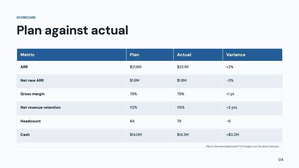
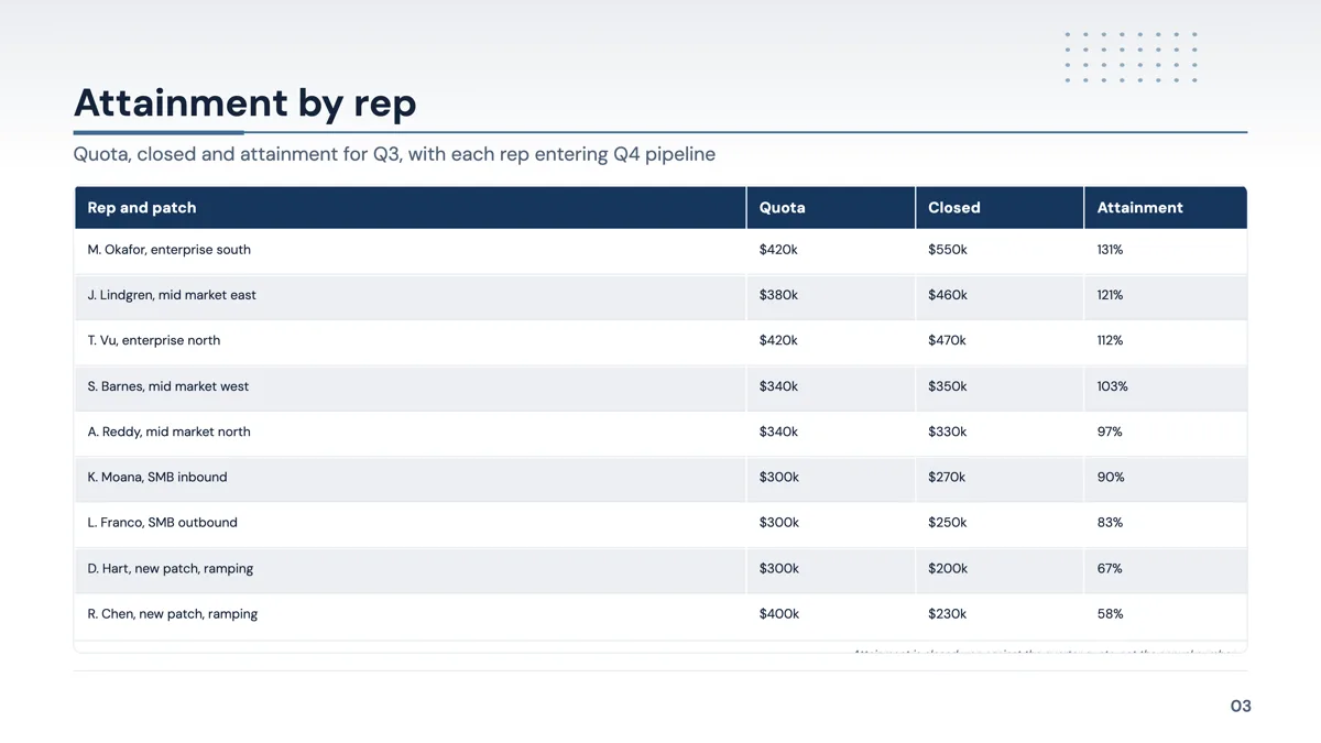
Four of the 34 are tables: a KPI scorecard with metric, target, actual, variance and status, an OKR tracker, a profit and loss grid and a year over year comparison of up to ten rows. A table slot grows to 20 rows and 8 columns, the first column can act as a row header and widths are dragged on the header row. Every cell is left aligned and there is no per column alignment control, so a column of currency will not sit flush right.
Charts, and how many kinds a slot offers
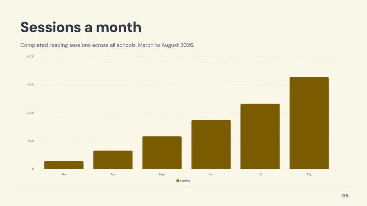
Ten chart kinds are drawn by the runtime: vertical bar, horizontal bar, stacked column, line, area, pie, donut, radar, waterfall and waffle. A chart that arrives as part of a layout offers only that layout's allowed kinds, which is three or four across the chart bearing templates, while a chart dropped in from the element library carries all ten. Series colours are remapped under the spectrum and outline colour modes and keep the brand colour under matching and dark, so a series cannot be painted into the background and vanish.
How the AI picks this slide
The outline names a role for each slide before anything is written, and metrics is picked when the brief contains figures to report rather than a claim to argue. The fill then writes only the labels and the text, using the numbers from your description: it is instructed not to invent statistics, and it does not choose the layout, the colours or the chart type. If the brief has no numbers in it, you will get a pillars or content slide instead, which is usually the right answer.
How it works, in three steps
Step 1
Add the slide from the library
From Library at the top of the slide rail, then set the Role filter to metrics. Thirty four layouts come back, plus five more that list metrics as a secondary role.
Step 2
Count your figures first
One or two figures goes to a hero layout, six to ten to a grid, anything that has to be checked line by line to a table.
Step 3
Write the label before the number
Each card takes an uppercase label, the value and a short delta line. The label is what makes the number mean something a week later.
Step 4
Try the alternatives in the layout panel
The layout flyout in the left rail lists every metrics design with your own content already drawn in, so a swap is a comparison rather than a guess.
The full walkthrough with screenshots is in the guide Add charts, maps and diagrams to slides.
Limits worth knowing
- Card counts are fixed by the layout: a six card grid holds six, not seven, so a different layout is the way to add one.
- Tables cap at 20 rows and 8 columns, and every cell is left aligned with no per column alignment setting.
- A chart that comes with a layout offers only that layout's allowed kinds, usually three or four of the ten.
- Nothing is linked to a spreadsheet. Figures are typed into the slide and do not update themselves.
See it on a finished piece

Questions people ask
How many metrics layouts are there?
Thirty four templates carry metrics as their primary role, which is the largest role in the library, and five more list it as a secondary role. They cover hero numbers, stat grids, dashboards, four tables and ten chart types.
Should I use a chart or a table?
A chart when the shape of the change is the point, a table when the audience will check the figures. The scorecard and year over year tables exist for the second case, and a table can carry 20 rows, far more than a chart stays readable with.
Can I show a trend and a target on one chart?
Use a multi series line, which takes one to four series over six to twelve time buckets with a legend. The target is a second series, typed like the first. There is no separate target line setting.
What happens to charts in a PowerPoint export?
In the editable PPTX export, nine of the ten chart kinds map to a real PowerPoint chart object. Waffle has no native mapping and stays a picture. The plain PowerPoint export places one rendered image per slide instead.
Can the AI update the numbers later?
The assistant can change the value in a slot, so it can retype a figure you give it, and every change arrives as a preview you apply or discard. It has no access to your data and will not source a number itself.
Why did my number shrink on the slide?
Text fits itself to the slot after mount, so a long value or label is scaled down rather than overflowing. If a figure has to stay large, shorten the label or move to a layout with fewer cells.
Make your own presentation
The button opens the generator with this use case already described. Change the wording to match yours, generate, then edit anything you like.
Create a presentation with OneCraftRelated pages
Chart slides
A chart here is a small spreadsheet plus a choice of how to draw it. Categories down one side, one or more named series of numbers, and a render kind you can change at any time. The numbers never move when the drawing does.
Presentation themes
The theme panel lists ninety nine entries: eighty eight colour palettes, twenty one hand built themes, and the ten places where a hand built theme takes over a palette's name. Picking one restyles the whole deck immediately, including charts, tables and diagrams.
Checklist slides
A checklist slide says here is what has to be true, and its layout quietly says whether the order matters. Thirteen templates cover the range, from five full width rows to a ten card grid and a five step numbered process on a connector track.
More finished work of this kind is on the presentation examples hub.
Written and checked by the OneCraft team. Last checked .