Videos
Video colour themes
A look is three decisions bundled into one: a colour palette, a typeface and whether the video is light or dark. They are bundled because the three go wrong together. A serif on a neon palette in dark mode is a specific mistake, and a preset is how you avoid making it by accident.
The ten dark looks
Cascade, which is the default, on Inter. Noir on Space Grotesk. Aurora on Outfit. Cornflower on Plus Jakarta Sans. Terracotta on Montserrat. Deep Sea on IBM Plex Sans. Daybreak on Lexend. Rosewood on Lora. Foundry on Montserrat. Boreal on Work Sans. Dark suits promos, product launches and anything that will be watched in a feed at night, and it is where the glow and depth effects in the scene library read best.
The eleven light looks
Enterprise on Plus Jakarta Sans. Signal on IBM Plex Sans. Parchment on Lora. Linen on DM Sans. Soft Mint on Lexend. Reverie on Outfit. Blossom on Poppins. Dune on Work Sans. Retro Pop on Poppins. Cerulean on DM Sans. Gallery on Space Grotesk. Light suits tutorials, corporate updates and anything embedded on a white page, and it is the mode a walkthrough of a light interface should be in so the screenshot does not float on black.
Light mode is a mechanical reskin, not a second design
Worth knowing because it explains the odd result you sometimes get. Every scene is authored dark, and light mode is produced by restyling it: panels and backgrounds are swapped for their light equivalents and text tokens are inverted. Most scenes survive that cleanly. A few, particularly ones leaning on glow, look better dark, and the fastest fix is to pick a different scene rather than to fight the palette.
The palette rules the looks follow
The looks have no palettes of their own. Each one pairs a palette from the same 88 the slides use with one typeface and one mode. Gradients appear only as deliberate duotone or tonal presets, never as a full strength colour wash. That is why the looks read as a set rather than as twenty one unrelated colour schemes, and why a video restyled from one to another usually still works without any further editing.
How it works, in three steps
Step 1
Set the colour in the brief
The generator has a colour picker with a swatch strip for each option, so the video comes back in the palette you chose rather than in the default.
Step 2
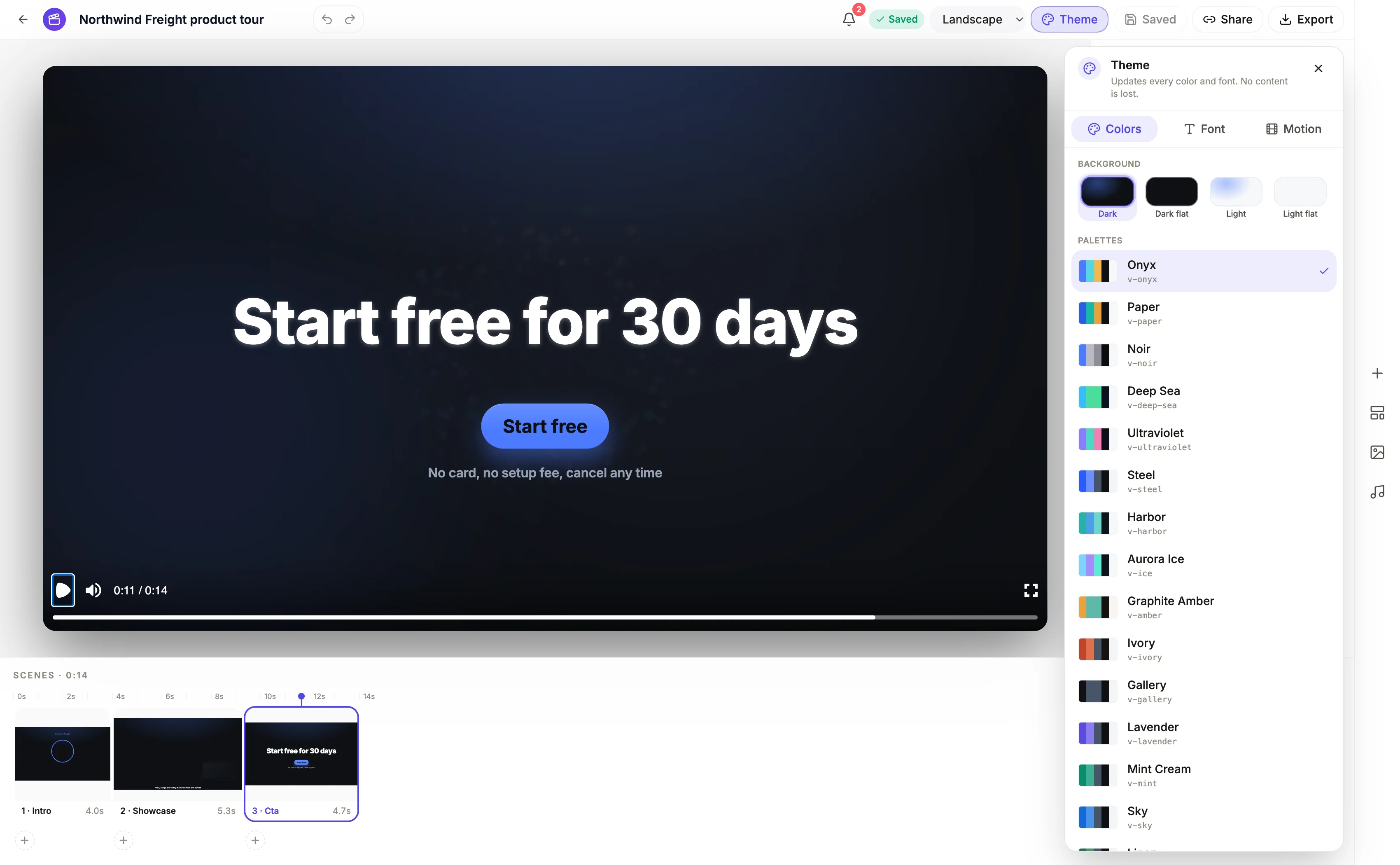
Switch look in the theme panel
The panel has three tabs: Colors, which also holds the Dark and Light switch, Font, and Motion for the pace. Changing one leaves the others where they were.
Step 3
Judge it on the busiest scene
Not the opener. Look at a feature list or a chart scene, because that is where a palette either holds together or falls apart.
The full walkthrough with screenshots is in the guide Make a promo video with AI voiceover.
Limits worth knowing
- Looks are presets, not a locked pair. Changing the palette after picking a look leaves the typeface and mode where they were.
- The colour picker in the generator and the theme panel offers 88 palettes, the same set the slides use, and the 21 looks are built on 20 of them.
- There is no custom palette editor here. You choose from the built in set, or a brand saved in Settings, rather than entering hex values here.
- Scenes are authored dark, so light mode is derived. A scene that depends on a glow will read weaker in light mode.
Questions people ask
Can I use my brand colours?
Yes, through a saved brand. Brands you create in Settings, on the Brand tab, appear in a Your brand group above the palettes in the theme panel, and picking one applies a palette built from that brand's colours. There is no hex editor inside the video builder itself. The corner watermark is set separately, as a wordmark or a logo entered by URL.
Does changing the look change the layout?
No. Scenes, timing, copy and images are untouched when you switch looks. Only the colours, the typeface and the light or dark treatment change, which is why restyling is safe to do late, even after the narration is final. The one thing to recheck is any scene that leans on a glow, because it reads weaker once a light look is applied.
Which look should a tutorial use?
A light one, usually, and Enterprise or Signal in particular, both clean sans serif looks. A walkthrough is mostly screenshots of light interfaces, and putting those on a dark canvas makes every screen glow like a lightbox. If your product itself runs in dark mode, flip that advice and pick a dark look so the screenshots sit in a matching frame.
Why do all the looks feel restrained?
Deliberately. The palettes hold to a near neutral canvas with one accent and capped glows, because the scenes carry a lot of motion and a saturated background under moving type is hard to read. Gradients appear only as deliberate duotone or tonal presets, never as a full strength wash, so the product and the words stay the loudest things on screen.
Make your own video
The button opens the generator with this use case already described. Change the wording to match yours, generate, then edit anything you like.
Create a video with OneCraftRelated pages
Flyer colour themes
A theme is not a background colour. It is a palette, a type scale and a set of geometry rules that every element on the flyer reads from, which is why choosing a different one repaints the headline, the panels, the icons, the chart series and the borders in one move rather than one box at a time.
Video fonts
Unlike a document, a video does not pair a display face with a body face. One family runs everything, from a five word headline set at 240 pixels down to the caption pill at 26. That is a constraint, and it changes which typefaces are worth choosing.
Form welcome screens
The welcome screen is the only part of a form some people ever see. It has one job, which is to make starting feel small, and it does that with a clear title, one line of context and an honest estimate of how long this will take.
More finished work of this kind is on the video examples hub.
Written and checked by the OneCraft team. Last checked .