Forms
Form welcome screens
The welcome screen is the only part of a form some people ever see. It has one job, which is to make starting feel small, and it does that with a clear title, one line of context and an honest estimate of how long this will take.
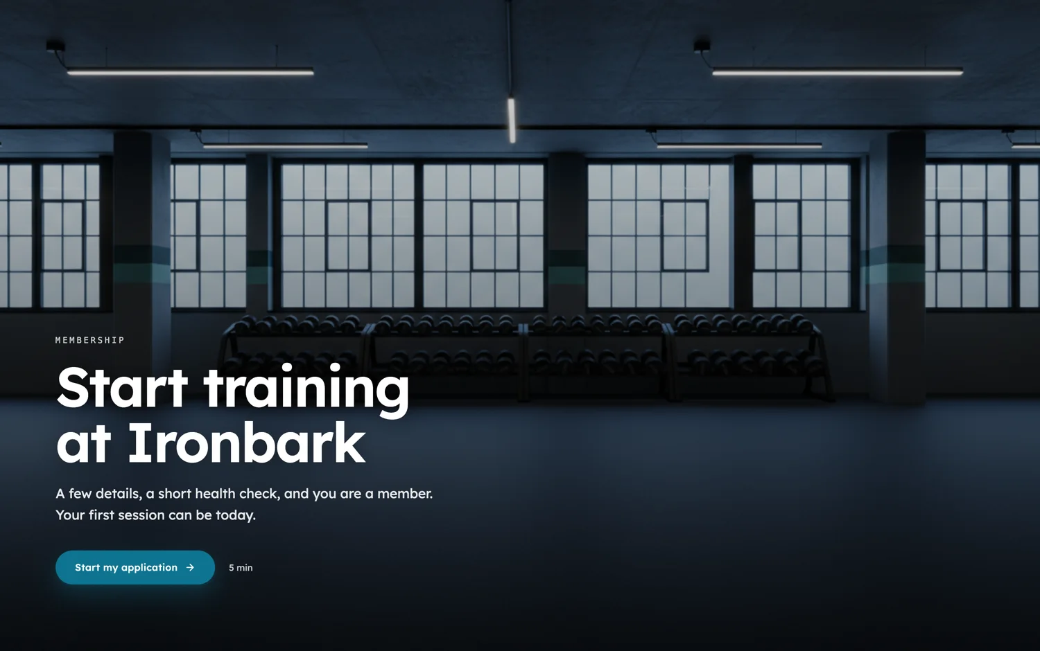
The four pieces of copy
An eyebrow, which is a tiny uppercase tag above the headline and is where the category goes. A title, which should name the thing rather than greet anyone. A description of one or two lines saying what happens after they submit. And an estimated time, which is the field that does the most work and the one people most often leave blank.
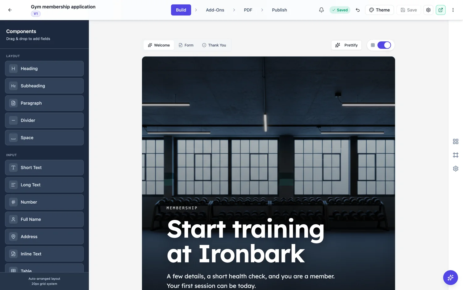
Be honest about the time
An estimate that is short by half is worse than no estimate at all, because the person who believed it abandons at the point they realise. Count the fields, allow about eight seconds each for simple ones and thirty for anything that needs thought, then round up. "About four minutes" on a form that takes four minutes builds more trust than "one minute" on the same form.
Ten layouts, and what they are for
Editorial, split, centered, card, document, overlay, minimal, stat, masthead and poster. Split puts an image beside the text and is the workhorse for anything consumer facing. Minimal and centered suit internal forms where a photo would be odd. Document suits forms that are really paperwork. Stat is for when a number is the reason to start, like how many people have already signed.
Classic forms can have one too
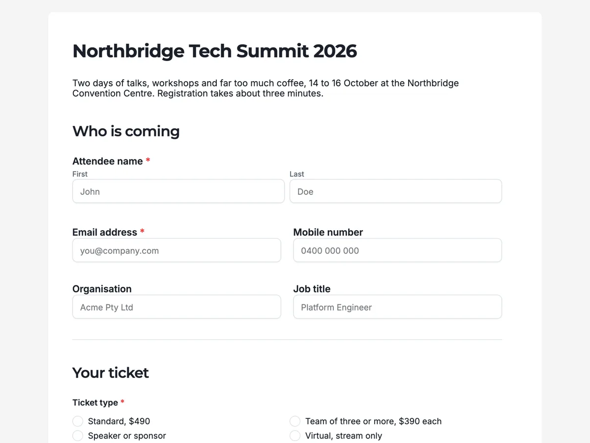
Welcome screens are on by default for conversational forms and off by default for classic ones, but a classic form can have one. It is worth turning on whenever the form is long, is being sent to strangers, or needs a sentence of context before the first field makes sense.
How it works, in three steps
Step 1
Turn it on and pick a layout
Split for consumer facing forms, minimal or centered for internal ones.
Step 2
Write four short pieces
Eyebrow, title, one line of description, and an estimated time you have actually checked.
Step 3
Add an image if it earns its place
Split and overlay layouts take an image on either side. A photo that shows the thing beats a stock illustration of a person at a laptop.
The full walkthrough with screenshots is in the guide Design your welcome and thank-you screens.
Limits worth knowing
- A welcome screen is one screen. There is no multi-step introduction.
- The image position setting applies to the split layout.
- Turning a welcome screen on for a classic form adds a step before the fields, which is a cost as well as a benefit.
See it on a finished piece
Questions people ask
Do welcome screens reduce completions?
They add a click, and they usually pay for it by removing the people who were never going to finish and reassuring the people who were. On a short internal form, skip it.
What should the estimated time say?
The truth, rounded up. Count the fields, allow about eight seconds each for easy ones and thirty for anything that needs thought.
Can a classic form have a welcome screen?
Yes. It is on by default for conversational forms and off by default for classic, but you can turn it on.
Make your own form
The button opens the generator with this use case already described. Change the wording to match yours, generate, then edit anything you like.
Create a form with OneCraftRelated pages
Custom thank you page after a form submit
The thank-you screen is the one moment you have somebody’s full attention and nothing left to ask them for. Most forms waste it on the word Thanks. It can tell them what happens next, and send them somewhere useful.
Redirect after a form submission
To redirect after form submission, turn on the Post-Submit Redirect add-on and enter a URL: once the answers are saved, the respondent sees a brief submitted message and is sent there about a third of a second later, skipping the thank-you screen. If the next step is optional, or the confirmation matters, a button on the thank-you screen is the better tool, and it can also move people on after a delay you set.
AI images in forms
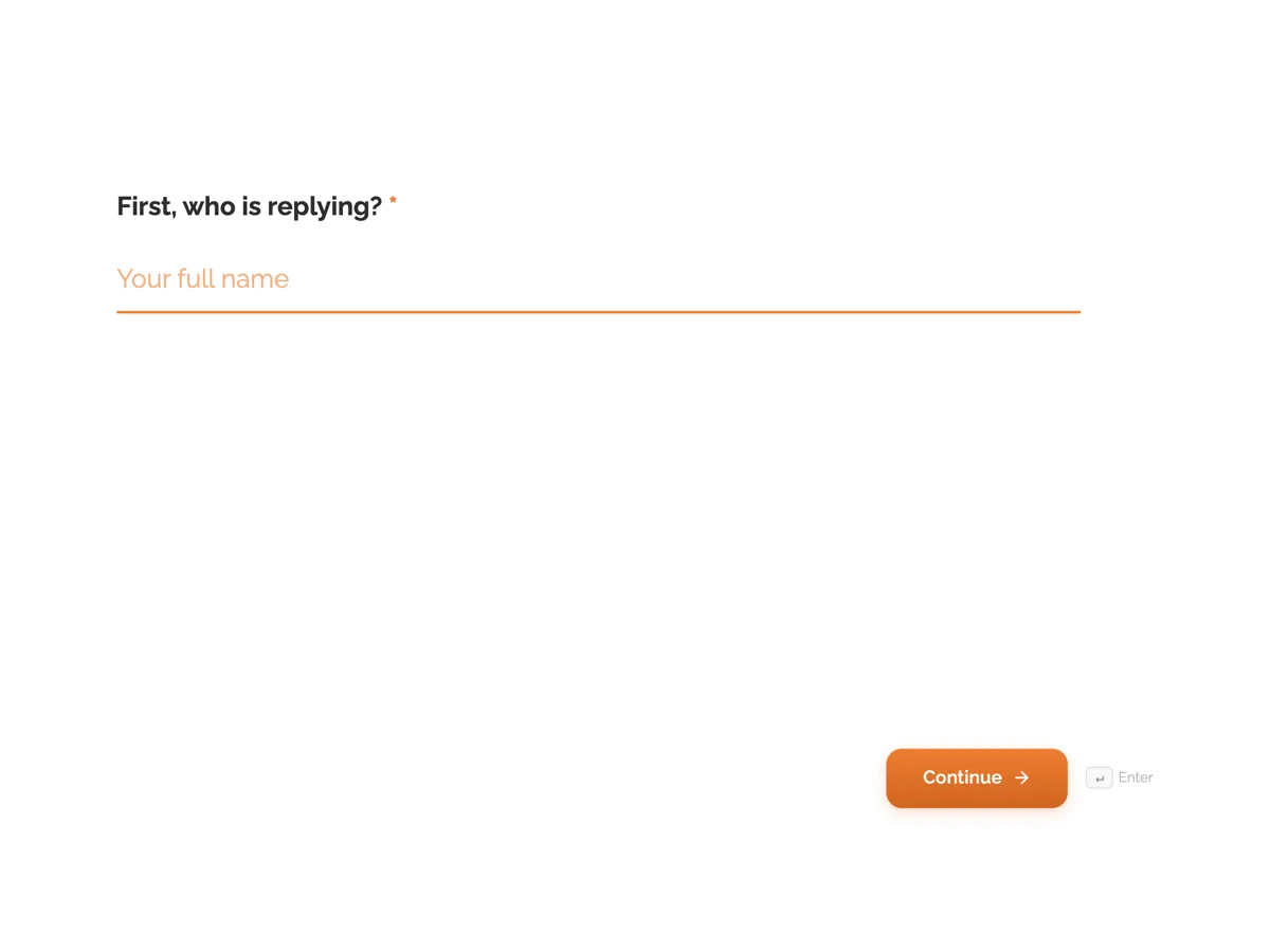
Conversational forms have real space for pictures: a split layout gives half the screen to an image. Rather than hunting for a photo that fits, describe the one you want and it is made at the shape the slot needs.
More finished work of this kind is on the form examples hub.
Written and checked by the OneCraft team. Last checked .