Forms
Custom thank you page after a form submit
The thank-you screen is the one moment you have somebody’s full attention and nothing left to ask them for. Most forms waste it on the word Thanks. It can tell them what happens next, and send them somewhere useful.
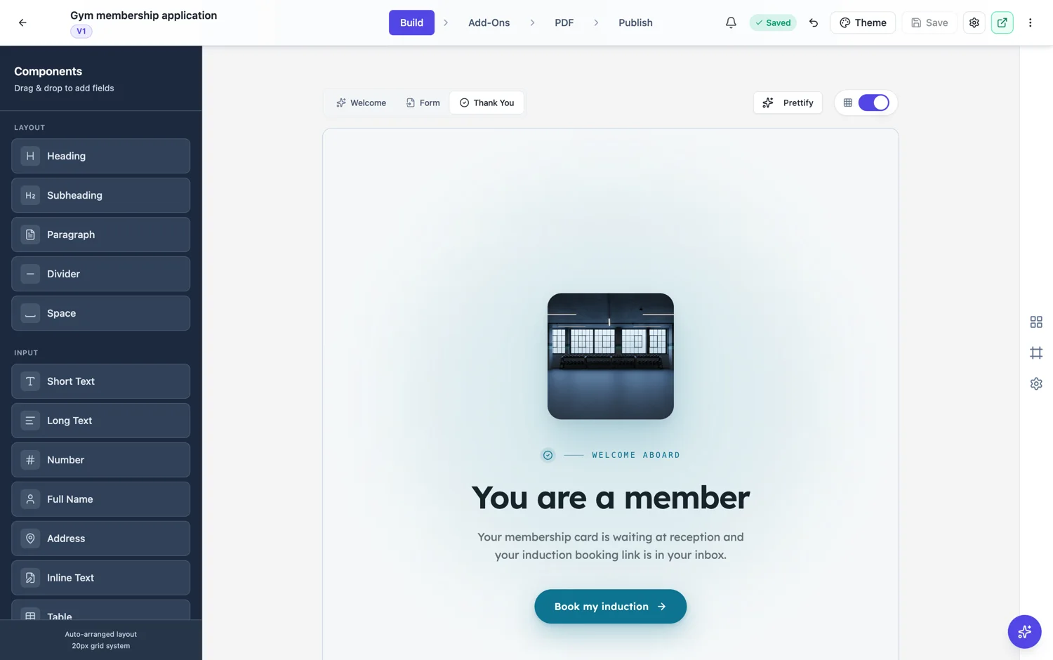
Say what happens next
The single most useful sentence on a thank-you screen is when the person will hear from you and how. "We reply within one working day, by email" answers the question they are actually holding. Without it, the good outcome is that they wonder, and the bad one is that they submit the form again an hour later.
Four layouts
Editorial, split, centered and card. Centered is the default and it is fine for most forms. Split takes an image and suits a consumer facing confirmation. Card reads as a receipt, which works when the submission was an order or a booking. Editorial suits a longer message, such as an explanation of what happens over the next week.
Confetti, and when it is wrong
There is a confetti toggle. It is right for a signup, a registration or a competition entry, and it is badly wrong for an incident report, a complaint or a bereavement notification. It is one checkbox, so it gets left on by accident on exactly the forms where it should not be. Check it on anything serious.
A button, or a redirect, or both
A button with a URL sends people somewhere by choice. A timed redirect sends them automatically after a number of seconds you set, and setting that number to zero turns it off. Use the button when the next step is optional, and the redirect when the form was a step inside a longer flow and there is somewhere they need to be.
How it works, in three steps
Step 1
Write what happens next
When they will hear from you and how. One sentence, specific.
Step 2
Pick a layout and check the confetti
Centered by default. Turn confetti off on anything serious.
Step 3
Add a button or a redirect
Button for an optional next step, timed redirect when they need to be somewhere else.
The full walkthrough with screenshots is in the guide Design your welcome and thank-you screens.
Limits worth knowing
- A redirect of zero seconds, or no redirect value at all, means no automatic redirect.
- The redirect only runs when a button URL is set.
- The thank-you screen is the same for everyone. It does not change based on their answers.
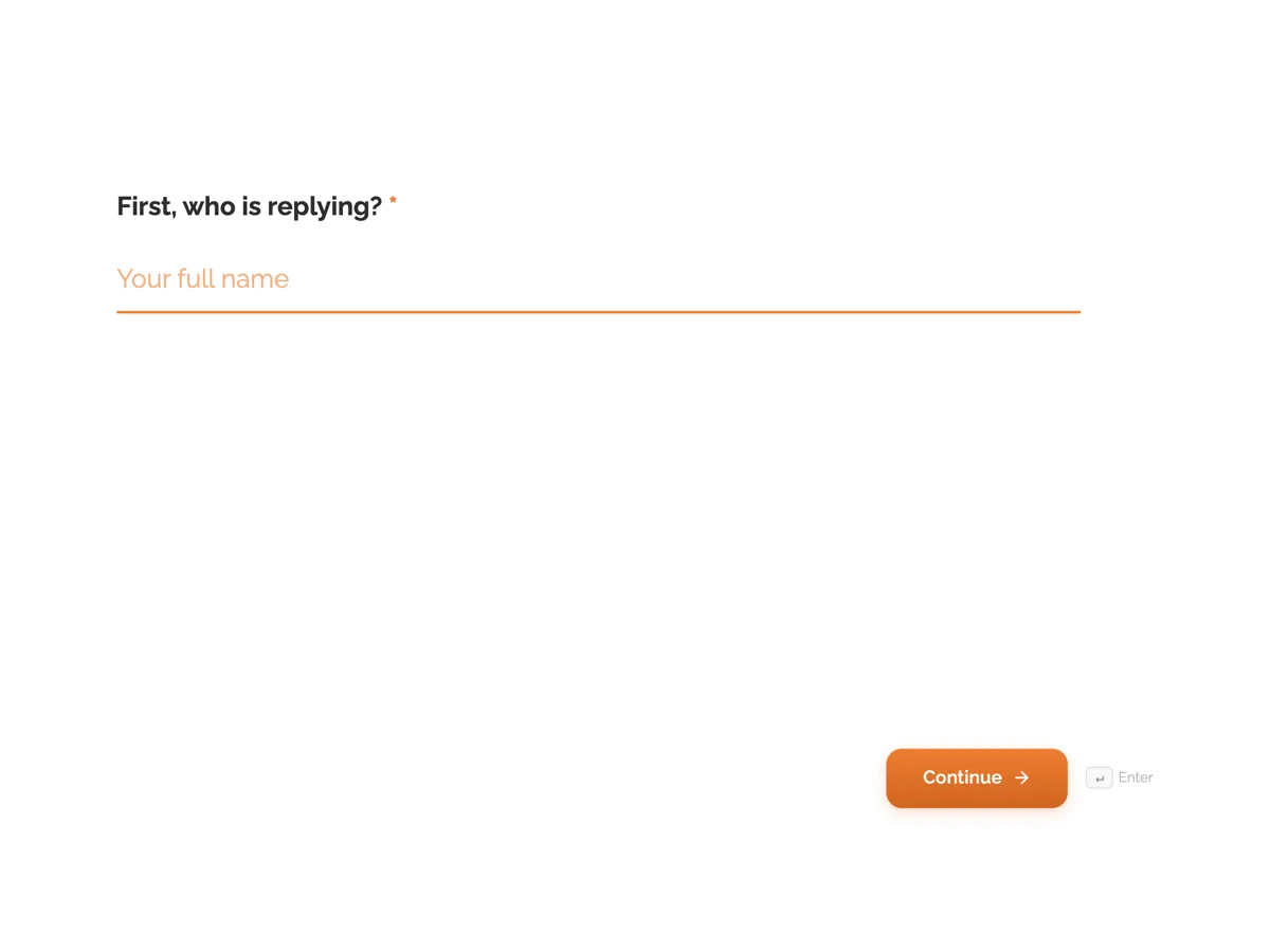
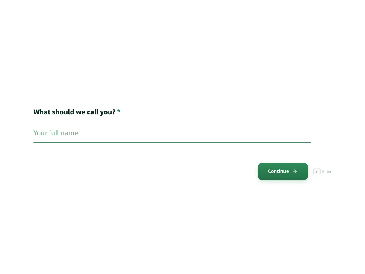
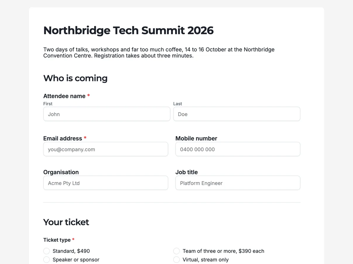
See it on a finished piece
Questions people ask
Can I send people to my own page after they submit?
Yes, either with a button they click or with a timed redirect that takes them automatically after the number of seconds you set.
Can the thank-you message change based on the answers?
No. One screen serves every submission, so write it for everybody who might submit.
Should I turn confetti on?
For signups, registrations and competition entries, yes. For complaints, incidents or anything sensitive, definitely not.
Make your own form
The button opens the generator with this use case already described. Change the wording to match yours, generate, then edit anything you like.
Create a form with OneCraftRelated pages
Form welcome screens
The welcome screen is the only part of a form some people ever see. It has one job, which is to make starting feel small, and it does that with a clear title, one line of context and an honest estimate of how long this will take.
Auto arrange form fields
A form that has been edited by hand for an hour drifts. Fields sit two pixels out, gaps vary, and the whole thing looks slightly wrong without any single thing being wrong. Prettify re-spaces it in one action.
Sticky submit button
A submit button can sit at the end of the form or stay pinned to the bottom of the screen. It is a small setting with a real effect on long forms, where the end of the page is a long way from where somebody finishes.
More finished work of this kind is on the form examples hub.
Written and checked by the OneCraft team. Last checked .