Forms
Sticky submit button
A submit button can sit at the end of the form or stay pinned to the bottom of the screen. It is a small setting with a real effect on long forms, where the end of the page is a long way from where somebody finishes.
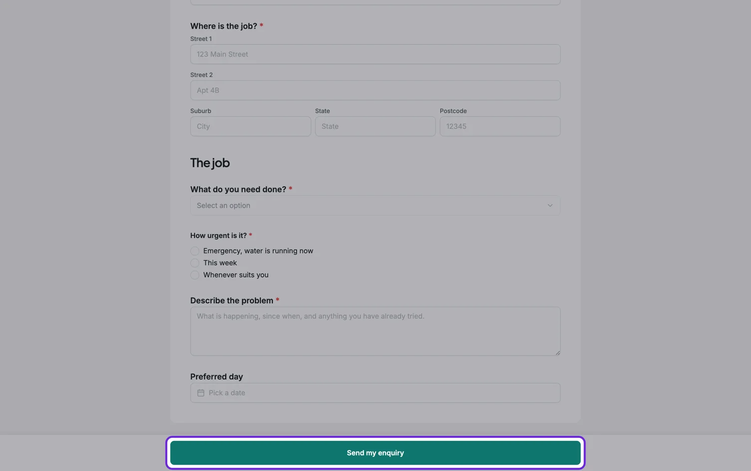
The two modes
Scroll puts the button at the end of the form, where it has always been. Sticky pins it to the bottom of the viewport so it is visible from the first field onward. The setting is on the form, so it applies everywhere the form is shown.
When sticky helps
Long forms on phones. Somebody who fills in the last field and then has to scroll past a footer to find the button will sometimes just stop. Sticky removes that gap entirely. It also helps on forms where most fields are optional, because a respondent who has answered the two they care about can act on that immediately.
When sticky hurts
Short forms, where a permanently visible button is a bar of screen you paid for and did not need. And forms with a serious declaration at the end, where you actively want somebody to reach the bottom and read the statement before they can submit. Making the button reachable from the top of that kind of form is the wrong help.
It is not a replacement for shortening the form
If the button being far away is a real problem, that is a signal about the form rather than about the button. Consider paginated mode, which caps how much anybody sees at once, or cutting fields. Sticky is the cheap fix and the other two are the real ones.
How it works, in three steps
Step 1
Look at the form on a phone
If the last field and the button are more than a screen apart, sticky is worth turning on.
Step 2
Set the submit button mode
Scroll or sticky, set once on the form.
Step 3
Leave it off for declarations
When the end of the form carries a statement people must read, make them get there.
The full walkthrough with screenshots is in the guide Every form field and when to use it.
Limits worth knowing
- One setting for the whole form.
- A sticky button takes a strip of screen on every device, including small phones.
- It does not change validation. A required field still blocks submission.
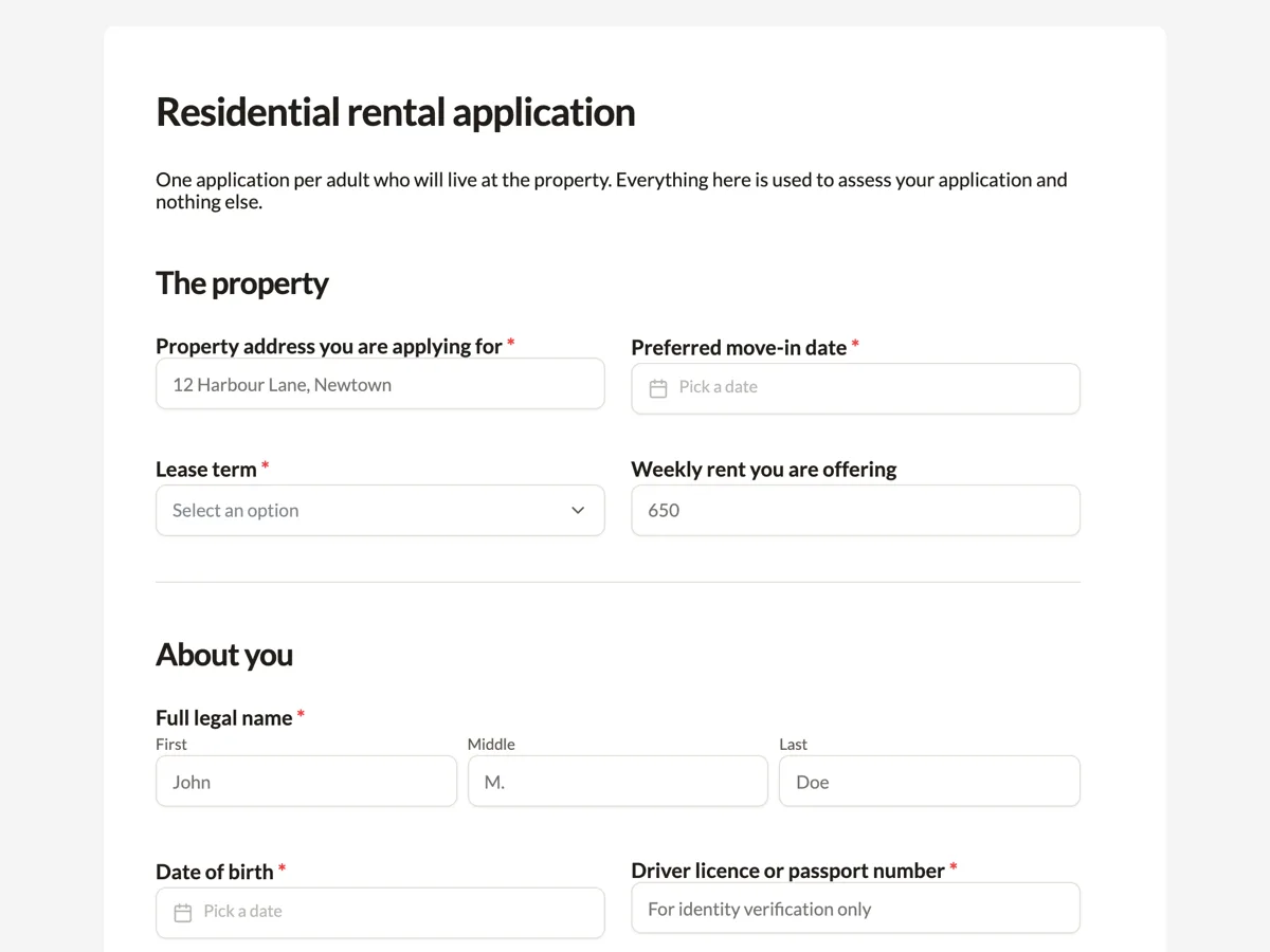
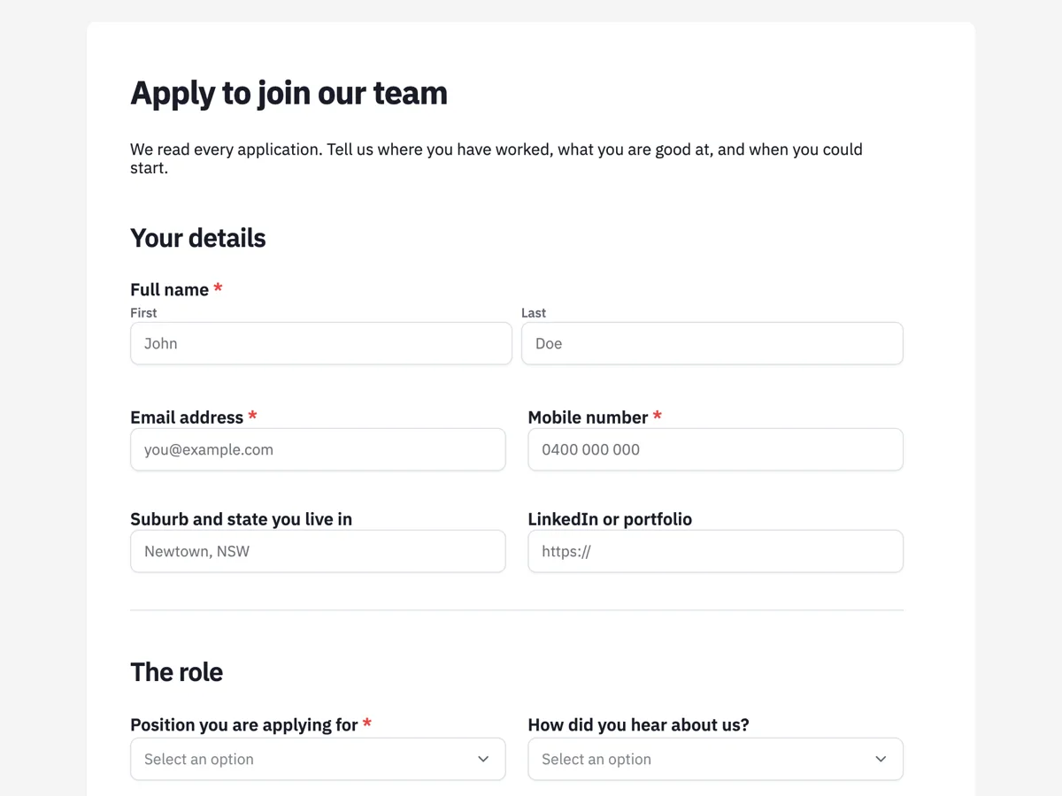
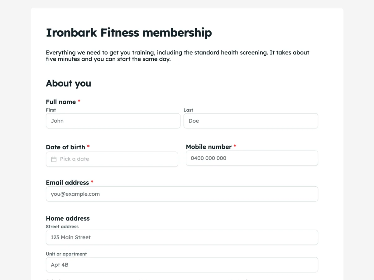
See it on a finished piece
Questions people ask
Does a sticky button increase submissions?
On long forms filled in on phones it removes a real point of friction. On short forms it costs screen space and gains nothing.
Can somebody submit before filling the form in?
They can press the button, and validation still stops the submission and points at the missing required fields.
Should I use it on a form with a declaration at the end?
No. There you want people to reach the bottom, read the statement and then find the button.
Make your own form
The button opens the generator with this use case already described. Change the wording to match yours, generate, then edit anything you like.
Create a form with OneCraftRelated pages
Single column form layout
A classic form can be laid out freely on a canvas or forced into one column at full width. The second option looks plainer on a laptop and is almost always better on a phone, which is where most forms are actually filled in.
Custom thank you page after a form submit
The thank-you screen is the one moment you have somebody’s full attention and nothing left to ask them for. Most forms waste it on the word Thanks. It can tell them what happens next, and send them somewhere useful.
Multi step form builder
This multi step form builder turns a classic form into a wizard with one setting: switch the layout mode to paginated and the form splits into steps, with Back and Next buttons, a thin progress bar along the top and a Page X of Y badge. The canvas splits into sheets, no field is ever cut across a break, and nothing has to be rebuilt.
More finished work of this kind is on the form examples hub.
Written and checked by the OneCraft team. Last checked .