Forms
Single column form layout
A classic form can be laid out freely on a canvas or forced into one column at full width. The second option looks plainer on a laptop and is almost always better on a phone, which is where most forms are actually filled in.
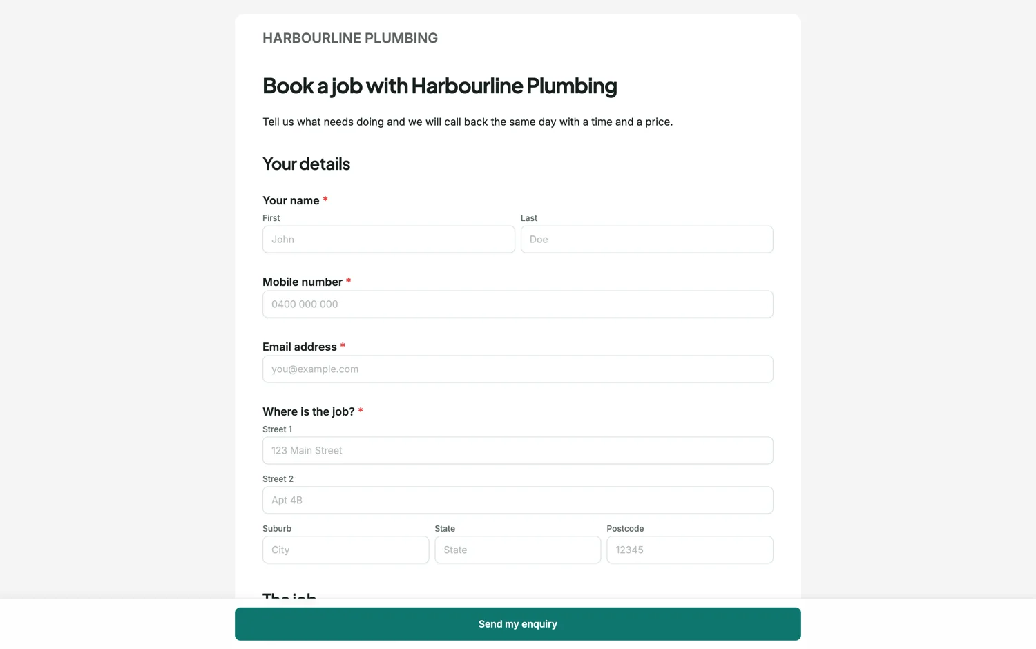
What the two modes do
Flow is the free canvas: you place fields anywhere, side by side, at any width. Single column takes the same fields, ignores their x positions, and stacks them in the order of their y position at full content width. Dragging in single column mode means dropping a field above or below another rather than anywhere on the page. Nothing about the fields changes, so you can switch back and forth.
Why one column wins on a phone
Two fields side by side on a 1200px canvas become two very narrow fields on a 390px screen, and the eye has to zigzag rather than run down. Single column removes both problems at once. It also fixes the subtle one: with a single column there is never any doubt about which label belongs to which box, because there is only one box on the line.
When flow earns its keep
Short paired fields that people read as one thing. First name and last name. Suburb, state and postcode. Quantity and unit. Putting those on one row shortens the form visually without making anyone hunt. The rule of thumb is that fields share a row only if a person would say them in the same breath.
The third option
If the form is long, single column can feel like an endless scroll. Paginated mode splits the same canvas into sheets with Back and Next, which keeps every field full width while capping how much a respondent sees at once. That is usually the right answer for anything over about fifteen fields.
How it works, in three steps
Step 1
Set the layout mode
Single column is a form level setting on a classic form. The canvas redraws immediately so you can see the order.
Step 2
Fix the order, not the positions
In single column mode the vertical order is all that matters. Drag a field above or below another to move it.
Step 3
Check it at phone width
Open the preview and narrow the window. Anything that still looks cramped needs a shorter label rather than a wider box.
The full walkthrough with screenshots is in the guide Every form field and when to use it.
Limits worth knowing
- Single column is a classic form setting. Conversational forms are already one question per screen.
- Switching to single column ignores the x positions you set in flow mode. Switching back restores them.
- Field width settings are overridden in single column mode, which uses the full content width.
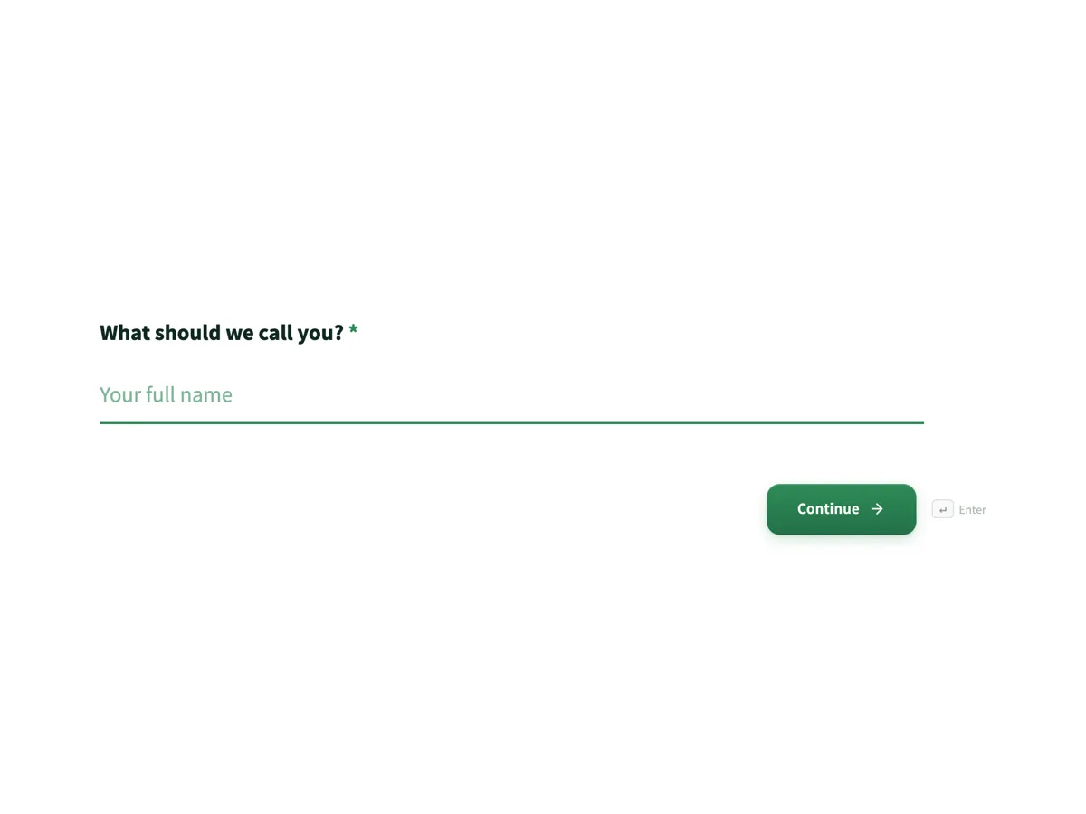
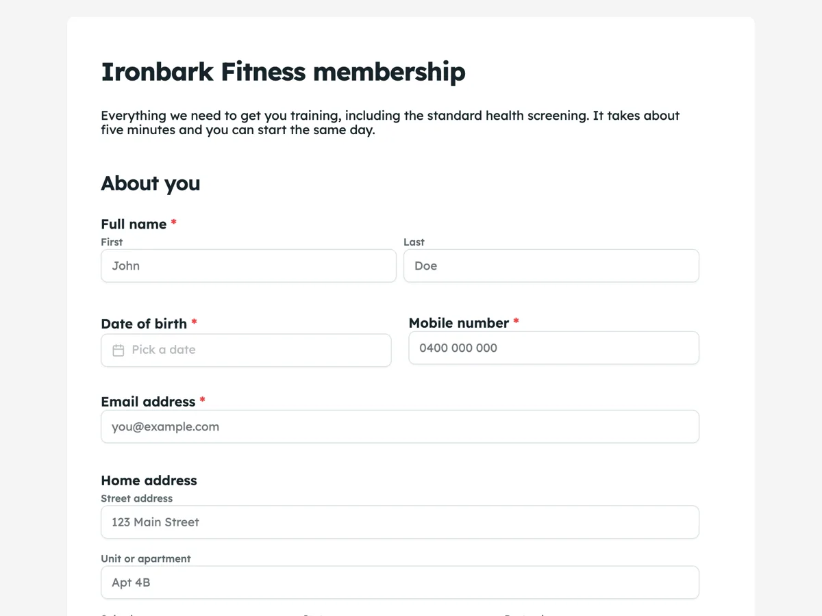
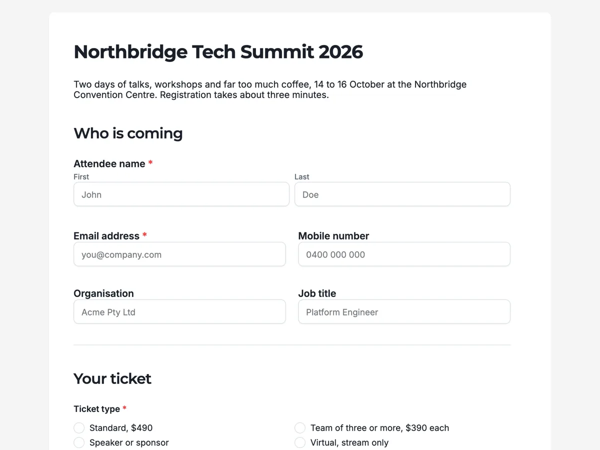
See it on a finished piece
Questions people ask
Does single column make my form longer?
Taller on a laptop, yes. On a phone it is the same height it was always going to be, because two columns collapse anyway. If the length bothers you, use paginated mode rather than going back to two columns.
Can I put first name and last name on one line?
In flow mode, yes. There is also a full name field that collects title, first, middle and last as one component, which is usually neater than two fields side by side.
Which mode should I start from?
Single column for anything a stranger fills in on a phone. Flow when the form is printed, or when you are laying out a document-like form with headings and blocks.
Make your own form
The button opens the generator with this use case already described. Change the wording to match yours, generate, then edit anything you like.
Create a form with OneCraftRelated pages
Multi step form builder
This multi step form builder turns a classic form into a wizard with one setting: switch the layout mode to paginated and the form splits into steps, with Back and Next buttons, a thin progress bar along the top and a Page X of Y badge. The canvas splits into sheets, no field is ever cut across a break, and nothing has to be rebuilt.
Sticky submit button
A submit button can sit at the end of the form or stay pinned to the bottom of the screen. It is a small setting with a real effect on long forms, where the end of the page is a long way from where somebody finishes.
Update a live form without breaking its link
Once a link is out in the world you cannot take it back, which makes editing a live form feel risky. It is not: saving only writes the draft, and the link keeps serving the last published version until you deliberately publish again.
More finished work of this kind is on the form examples hub.
Written and checked by the OneCraft team. Last checked .