Documents
Custom document theme
When none of the ten presets is your brand, you have two routes: describe the look in a sentence and let it generate one, or set the colour tokens yourself. Most people should start with the first.
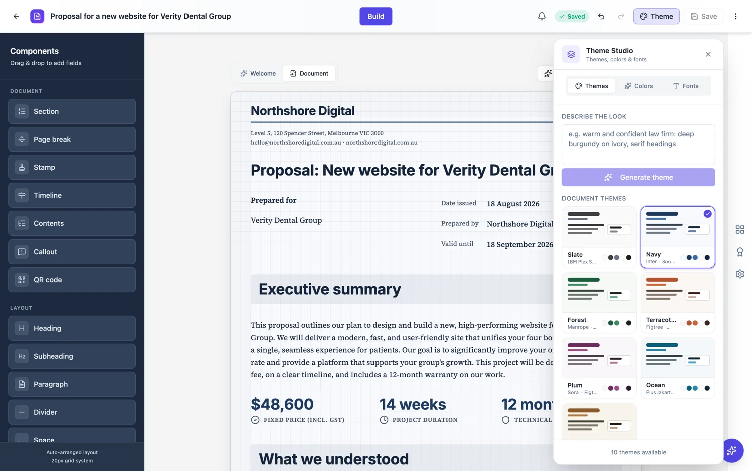
Describe it first
The generate box takes a sentence naming the kind of organisation, the colours and the feel: a warm and confident law firm, deep burgundy on ivory, serif headings. It produces a full token set, which is far more than most people would set by hand, and it keeps the lightness relationships that stop a document breaking. Adjust from there.
The tokens that actually matter
Primary is your accent: section bands, chart lines, emphasis. Background is the paper. Foreground is body text. Muted and card are the two surfaces that tables, callouts and panels sit on. Get those five right and the rest follow. The most common mistake is making muted too close to the background, which flattens every table on the page.
Two fonts, not five
A theme carries a heading font and a body font. That is the whole typographic system, deliberately. A document with three or four typefaces looks assembled rather than designed, and a serif body with a sans heading, or the reverse, covers almost every professional register.
Check it on a real document
Judge a theme on a page that has a table, a callout and a chart on it, not on a page of paragraphs. Those three are where a colour set fails, because they depend on the surfaces and the borders rather than on the text colour.
Build it once, use it everywhere
The reason to spend twenty minutes on a theme is that you never spend them again. Every proposal, report and agreement you generate afterwards can start on brand, which removes the step where somebody recolours a document by hand the afternoon before it goes out. That is also the argument for keeping one theme rather than three: a firm with a single document look is recognisable, and a firm with three is not.
How it works, in three steps
Step 1
Describe the look
Organisation, colours, feel. One sentence is enough to generate a full token set.
Step 2
Adjust the five tokens that matter
Primary, background, foreground, muted and card.
Step 3
Test on a page with a table and a chart
Prose hides colour problems. Blocks reveal them.
The full walkthrough with screenshots is in the guide Create a document with AI.
Limits worth knowing
- A theme carries one heading font and one body font.
- Themes apply to the whole document.
- Keep a dark theme’s muted and card surfaces lighter than its background, or tables stop being readable.
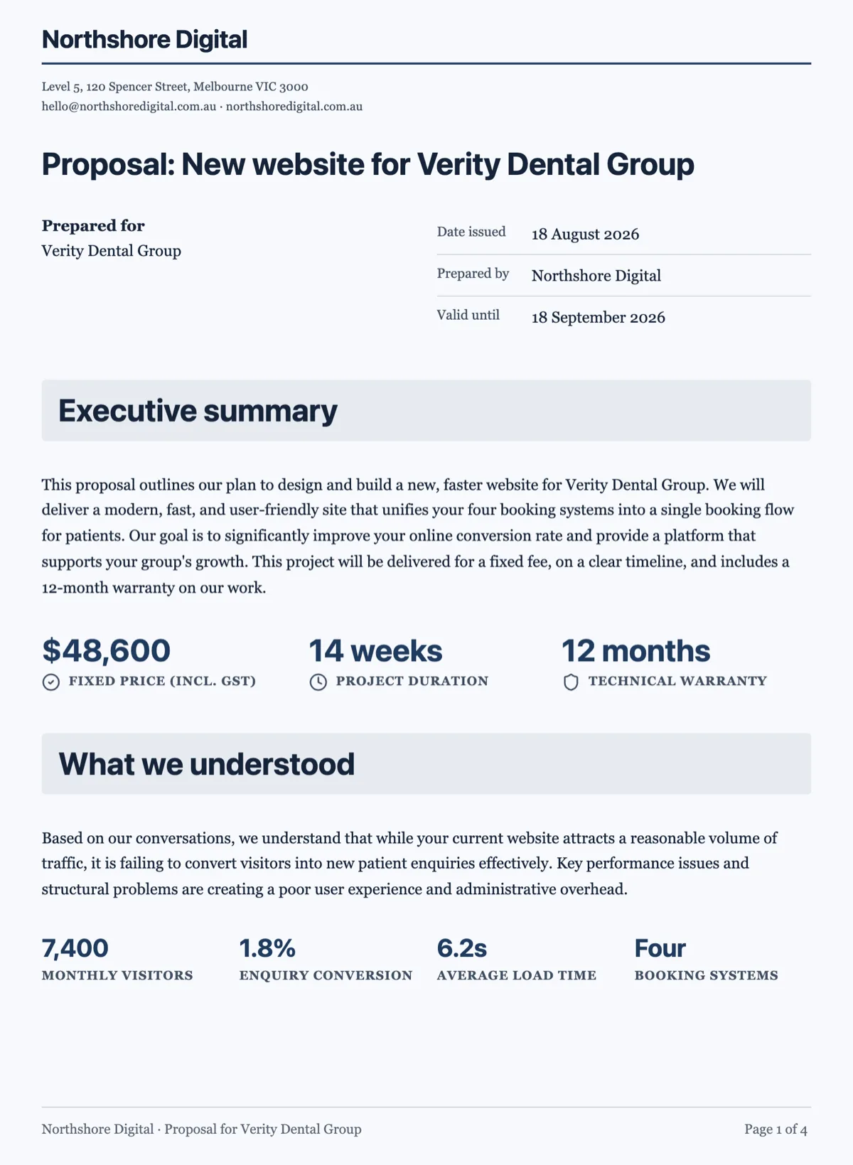
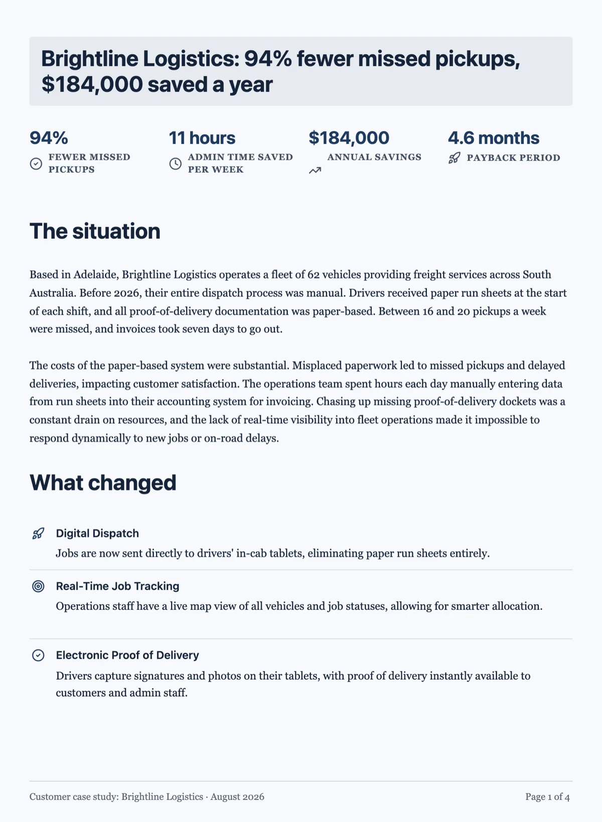
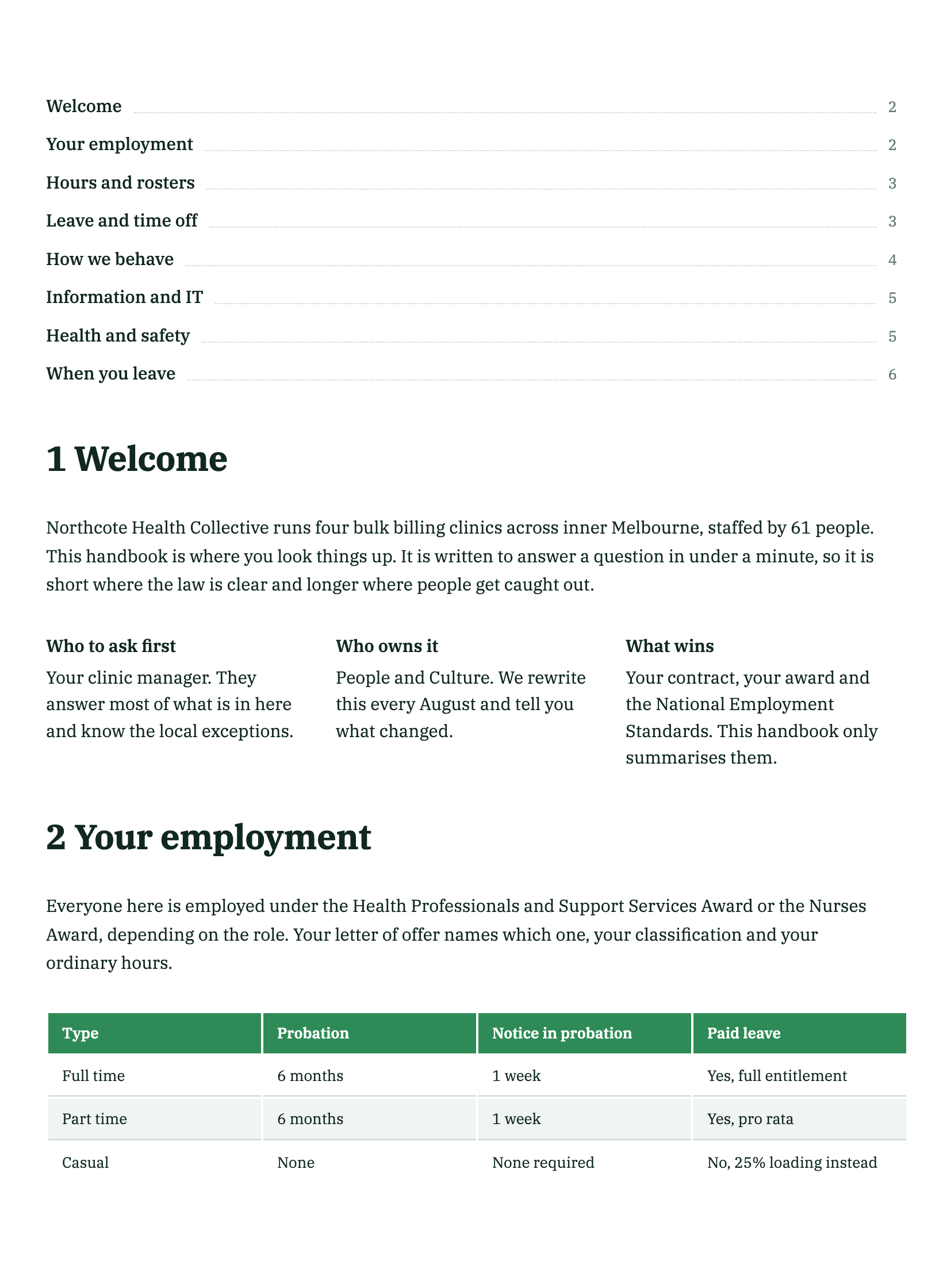
See it on a finished piece
Questions people ask
Can I generate a theme from my brand description?
Yes. Theme Studio has a box that takes a sentence about the look and produces a full theme, which you can then edit.
Which colours should I set by hand?
Primary, background, foreground, and the two surfaces, muted and card. The rest follow from those.
Can I use three fonts?
A theme carries two, a heading and a body. That is a constraint worth keeping.
Make your own document
The button opens the generator with this use case already described. Change the wording to match yours, generate, then edit anything you like.
Create a document with OneCraftRelated pages
Document theme colours
A theme is a set of colour tokens and two fonts, and every block on the page reads from it. Switching theme restyles the headings, the tables, the charts and the callouts together rather than one at a time.
Form themes and colours
A theme restyles the whole form at once: background, form surface, input borders, focus colour, buttons and type. There are 12 for classic forms and 25 for conversational ones, and you can change your mind after every one of them.
Build a custom form theme
When the palettes are close but not right, build the theme yourself. Theme Studio, the builder's theme panel, has Themes, Colors and Fonts tabs, and its Create Custom Theme card opens a theme builder in a new tab. The builder saves the result to your account and puts it alongside the built-in themes on every form you make afterwards.
More finished work of this kind is on the document examples hub.
Written and checked by the OneCraft team. Last checked .