Forms
Build a custom form theme
When the palettes are close but not right, build the theme yourself. Theme Studio, the builder's theme panel, has Themes, Colors and Fonts tabs, and its Create Custom Theme card opens a theme builder in a new tab. The builder saves the result to your account and puts it alongside the built-in themes on every form you make afterwards.
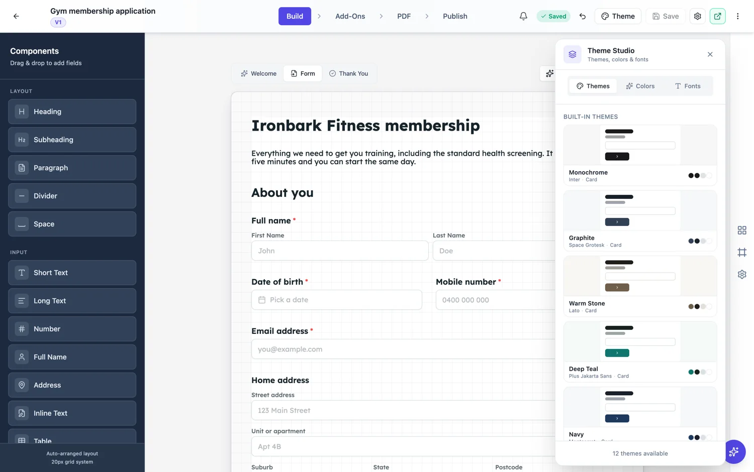
The custom theme builder's sections
Layout sets how the form sits on the page and how wide it runs. Background sets what is behind the form. Colours sets the accent, its hover state, the text colours, the input background and border, and the form surface. Typography sets the heading and body faces and their sizes. Effects covers the finishing: corner radius, shadow and the treatment on inputs. A live preview sits beside them.
Start from a theme, not from nothing
The fastest route is to open a built-in theme that is close, change the four or five colours that are wrong, and save it under your own name. Starting from a blank theme means making thirty decisions, most of which have a right answer you can borrow.
The colours that actually matter
Three do most of the work. The accent, which is your buttons and your focus rings. The text primary, which decides how hard the form is to read. And the input border, which should be a neutral grey at rest and your accent only on focus. Making the border your brand colour at rest is the single most common mistake, and it makes every form look like it is in an error state.
Reuse is the point
A saved theme is available on every form you build afterwards, which is what makes the setup time worth it. Build it once when you start, then every registration form, feedback survey and enquiry form you make is on brand without another decision.
How it works, in three steps
Step 1
Open a close built-in theme
Pick the one whose layout you want, then edit rather than starting blank.
Step 2
Set accent, text and border
Those three carry the look. Keep the input border neutral at rest and use the accent only on focus.
Step 3
Save and reuse
A saved theme sits with the built-in ones on every form you build after it.
The full walkthrough with screenshots is in the guide Build your own form theme.
Limits worth knowing
- A custom theme belongs to your account. It is not shared with people you send the form to.
- Classic and conversational themes are separate. A theme built for one does not apply to the other.
- Theme Studio styles the form. It does not change the fields or the layout mode.
See it on a finished piece
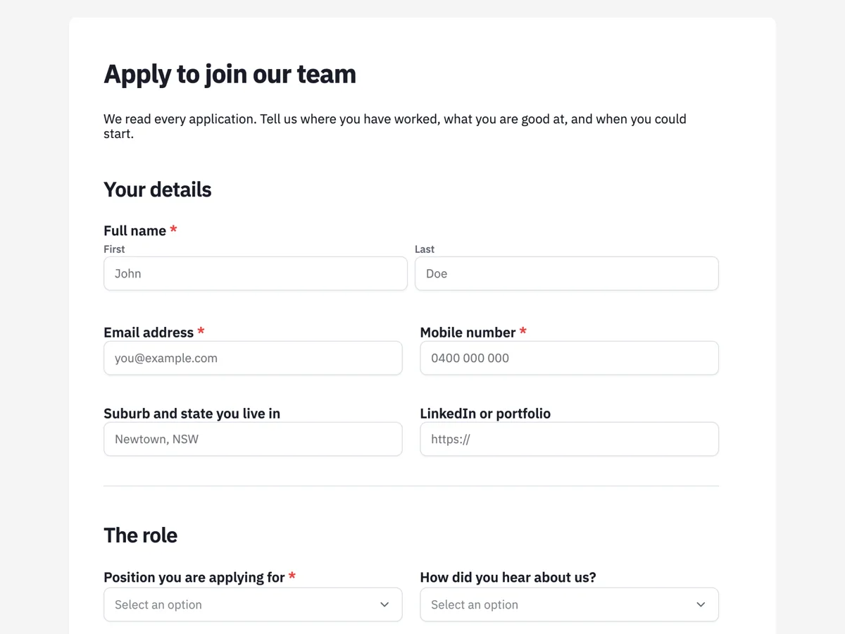
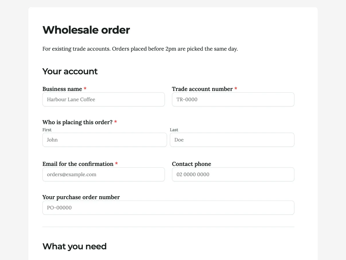
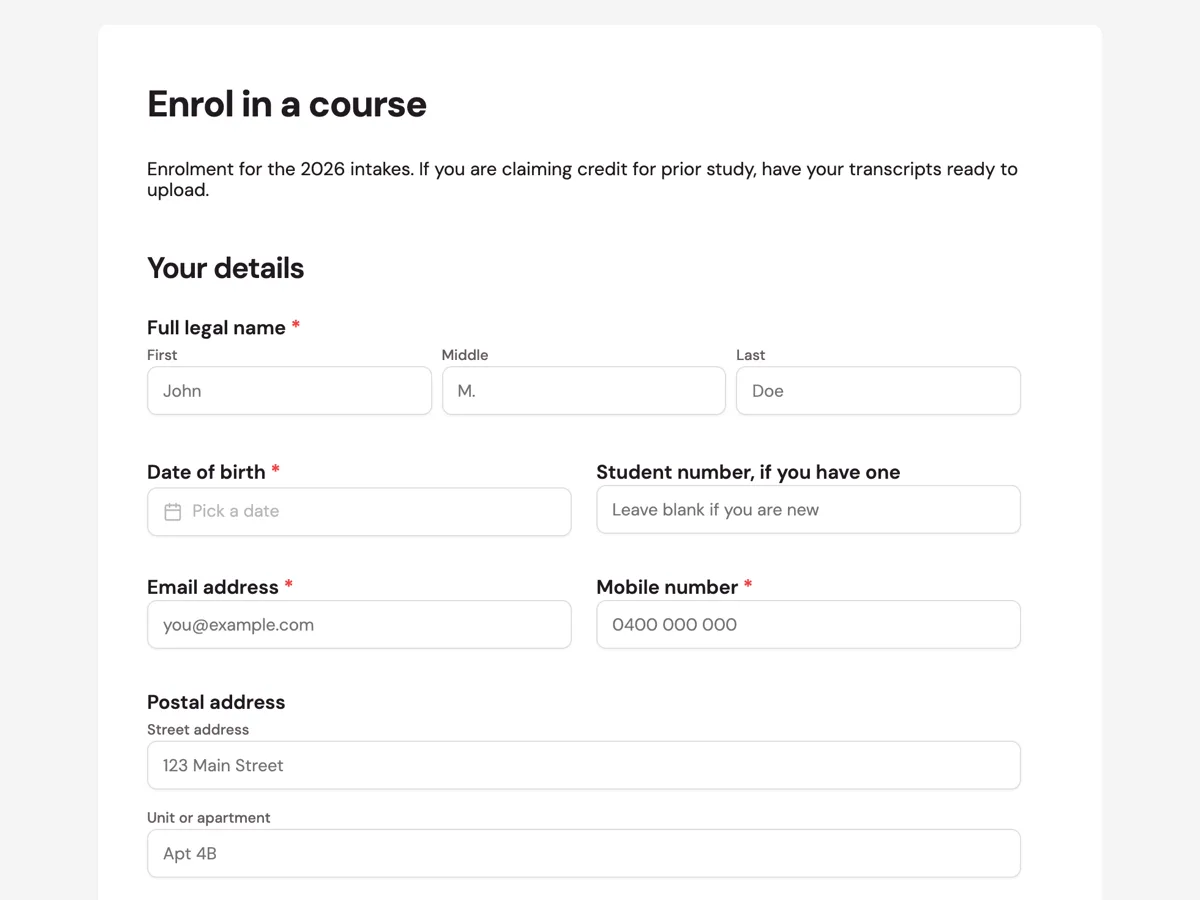
Questions people ask
Do I have to build a theme to use my brand colours?
No. Apply the closest of the twenty two palettes over any theme first, and only build a custom theme if you need exact colours or want to reuse them everywhere.
Can I use a custom theme on more than one form?
Yes, that is the point of saving it. It appears alongside the built-in themes on every form you build afterwards.
What is the most common mistake?
Making the input border your brand colour at rest. Borders should be neutral grey until focused, otherwise every field looks like it has an error.
Make your own form
The button opens the generator with this use case already described. Change the wording to match yours, generate, then edit anything you like.
Create a form with OneCraftRelated pages
Form themes and colours
A theme restyles the whole form at once: background, form surface, input borders, focus colour, buttons and type. There are 12 for classic forms and 25 for conversational ones, and you can change your mind after every one of them.
Add your logo to a form
A form on a link, sent by email, arrives with no context. A logo answers the question the respondent is actually asking, which is whether this is really from you, before they type anything.
Flyer colour themes
A theme is not a background colour. It is a palette, a type scale and a set of geometry rules that every element on the flyer reads from, which is why choosing a different one repaints the headline, the panels, the icons, the chart series and the borders in one move rather than one box at a time.
More finished work of this kind is on the form examples hub.
Written and checked by the OneCraft team. Last checked .