Flyers
Flyer fonts
A flyer does not use a heading font and a body font. It uses one family, and the theme's type scale does the rest: nineteen named sizes from a display headline down to a footer line, each with its own weight. Changing the font changes one thing and the whole page follows.
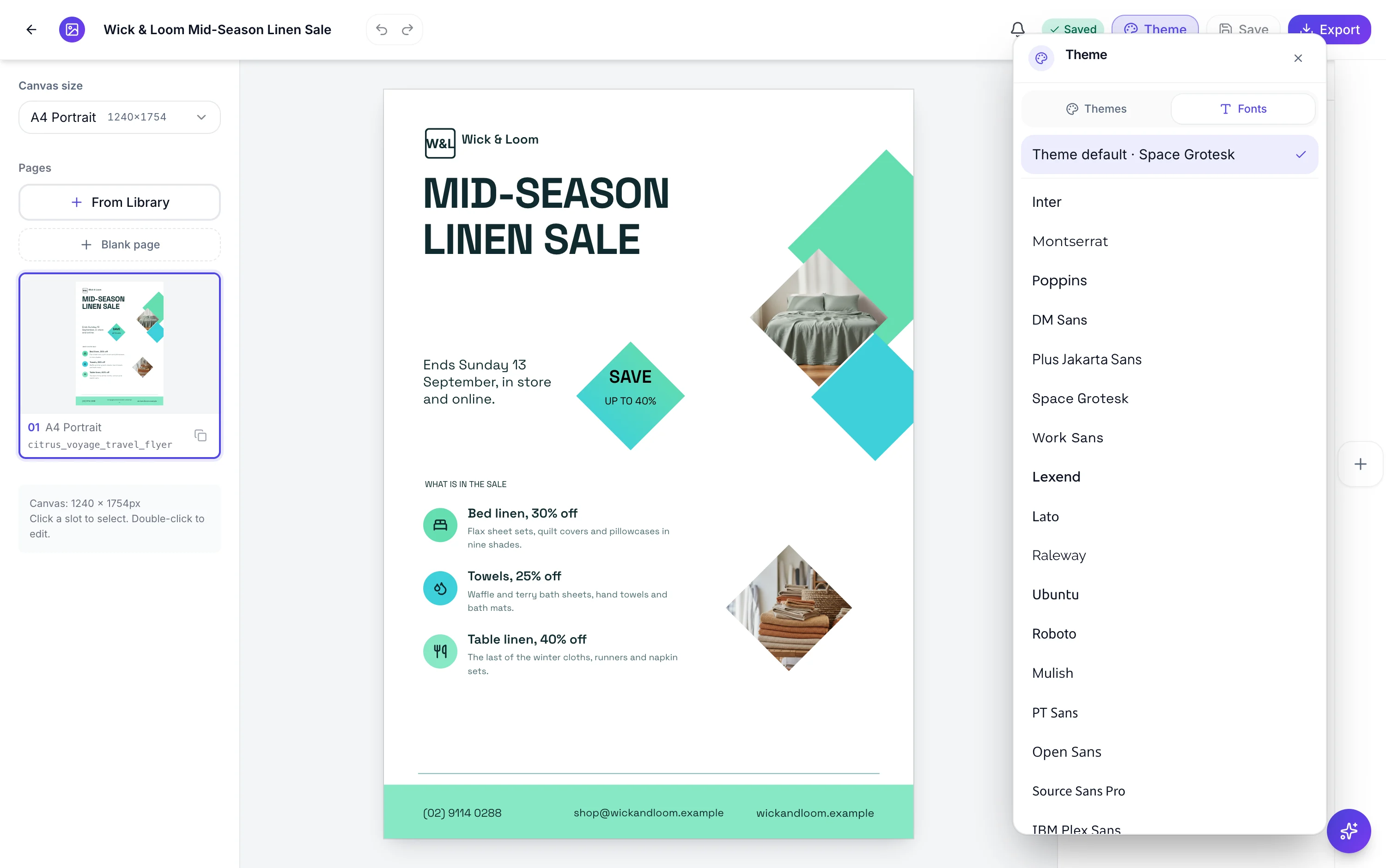
Twenty seven families, eighteen sans and nine serif or display
Inter, Montserrat, Poppins, DM Sans, Plus Jakarta Sans, Space Grotesk, Work Sans, Lexend, Lato, Raleway, Ubuntu, Roboto, Mulish, PT Sans, Open Sans, Source Sans Pro, IBM Plex Sans and Outfit on the sans side. Playfair Display, Merriweather, Lora, Cormorant Garamond, Libre Bodoni, Gilda Display, Crimson Text, IBM Plex Serif and Big Shoulders Display on the serif and display side.
The picker previews every row in its own family
The Fonts tab sits beside Themes in the same panel. The first row is Theme default with the current family named after it, then the twenty seven. Each row renders in the font it names, so you are reading the letterforms rather than a label. Opening the tab loads the whole catalogue at four weights, so previews are real rather than approximated.
One family, nineteen sizes
The theme's type scale names every size the design can use, from display and h1 through subtitle, body, caption, eyebrow and page number. A design assigns each slot a name from that scale rather than a pixel value, so swapping the family keeps every relationship intact. That is why a serif substitution does not break a layout built with a sans.
Overriding one block
The inspector's Text style section carries its own Font control listing Theme default plus the same twenty seven. Use it when a single headline wants a display face and the rest of the flyer does not. It stores the family stack on that element rather than a font id, which is what keeps it independent of the global choice.
A global change clears the per element ones
Choosing a new font in the Fonts tab strips every per element font override on every page and at every canvas size first. That is deliberate, so the global choice actually wins rather than being ignored by whichever blocks you had customised. If you want a display headline and a different body face, set the global font first and then override the headline.
How it works, in three steps
Step 1
Open the Theme control, then the Fonts tab
Themes and Fonts are two tabs in the same panel.
Step 2
Pick a family and watch the canvas
It applies immediately across every page. Theme default returns you to the theme's own family.
Step 3
Override a single block if you need to
Select the element, open the inspector, and use the Font control inside Text style.
The full walkthrough with screenshots is in the guide Change a flyer's colours and fonts with themes.
Limits worth knowing
- Twenty seven families, all from Google Fonts. You cannot upload your own font file.
- A flyer uses one family throughout; there is no separate heading and body pairing.
- Setting the global font clears every per element font override on the whole flyer.
- Sizes come from named scale steps, not a free pixel field. You choose a step, not a number.
- Non Latin scripts fall back to the browser's own font, since the catalogue families are Latin.
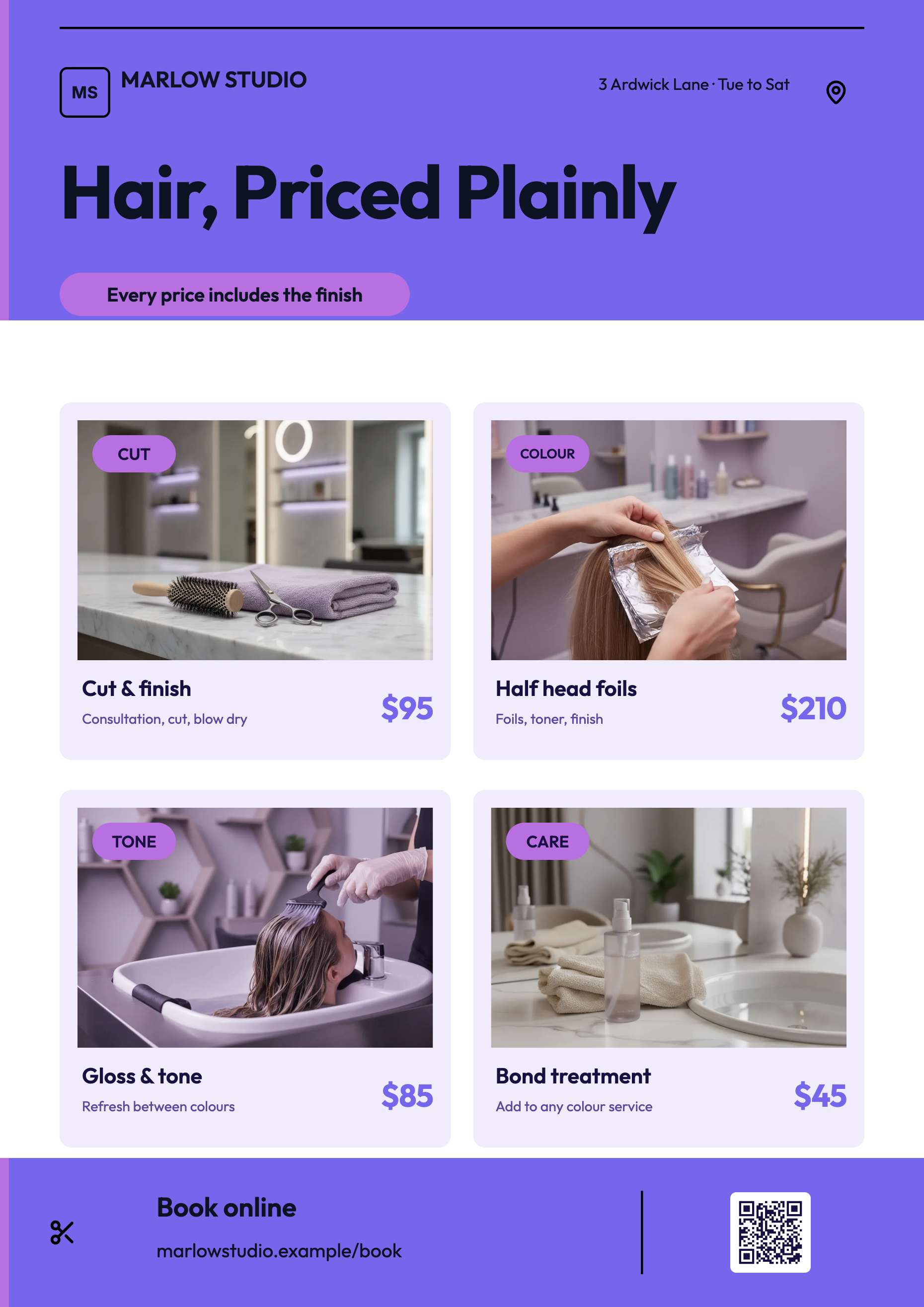
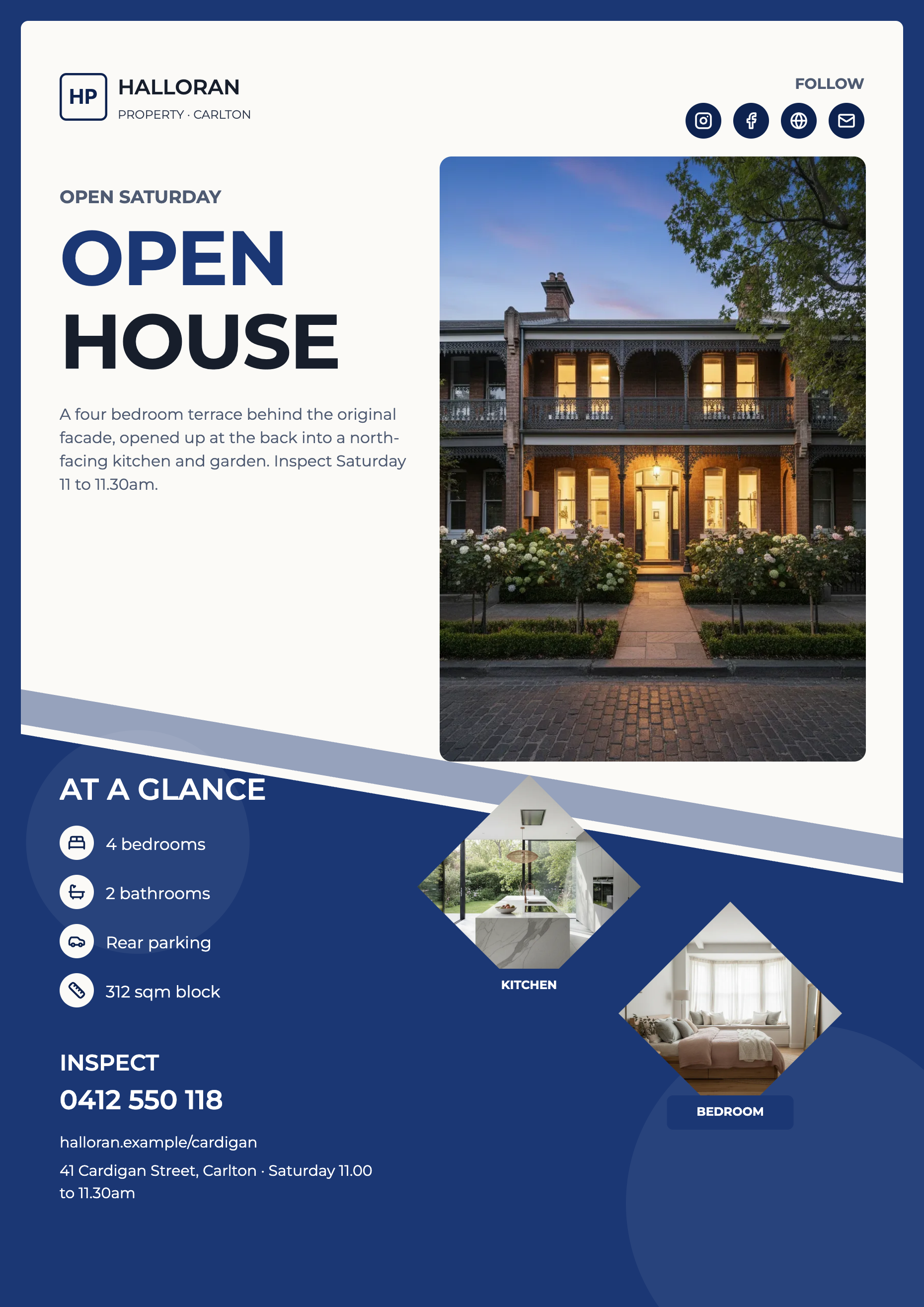
See it on a finished piece
Questions people ask
Can I upload a brand font?
No. The twenty seven catalogue families are the whole set, and they are loaded from Google Fonts at four weights each.
Why can I not type an exact point size?
Because slots reference a named step in the theme's type scale rather than a pixel value. The Size control lists each step with its pixel size and weight beside it, so you can see what you are choosing.
My headline got smaller when I added words. Why?
Text blocks shrink to fit their slot rather than overflowing. On a print sized flyer that is barely visible; on a Facebook cover it is the difference between readable and not, so shorten the words rather than hunting for a size control.
Which font prints best at poster size?
The higher contrast display faces, Playfair Display, Libre Bodoni and Gilda Display, look expensive large and get thin small. The grotesques, Inter, Work Sans and Lexend, stay legible at both, which is why they suit a flyer carrying prices and phone numbers.
Make your own flyer
The button opens the generator with this use case already described. Change the wording to match yours, generate, then edit anything you like.
Create a flyer with OneCraftRelated pages
Video fonts
Unlike a document, a video does not pair a display face with a body face. One family runs everything, from a five word headline set at 240 pixels down to the caption pill at 26. That is a constraint, and it changes which typefaces are worth choosing.
Presentation fonts
There is one font control that matters and it sits at deck level. Choosing a family there overrides whatever the theme brought with it and applies to every text box on every slide, which is almost always what you want and is certainly what a consistent deck needs.
Flyer in another language
The Language field is not a translation toggle. It is passed to the writer before a single word exists, with an instruction to write natively in that language and not to translate jargon literally. The result reads like it was written by somebody who speaks it, because it was never written in English first.
More finished work of this kind is on the flyer examples hub.
Written and checked by the OneCraft team. Last checked .