Presentations
Presentation fonts
There is one font control that matters and it sits at deck level. Choosing a family there overrides whatever the theme brought with it and applies to every text box on every slide, which is almost always what you want and is certainly what a consistent deck needs.
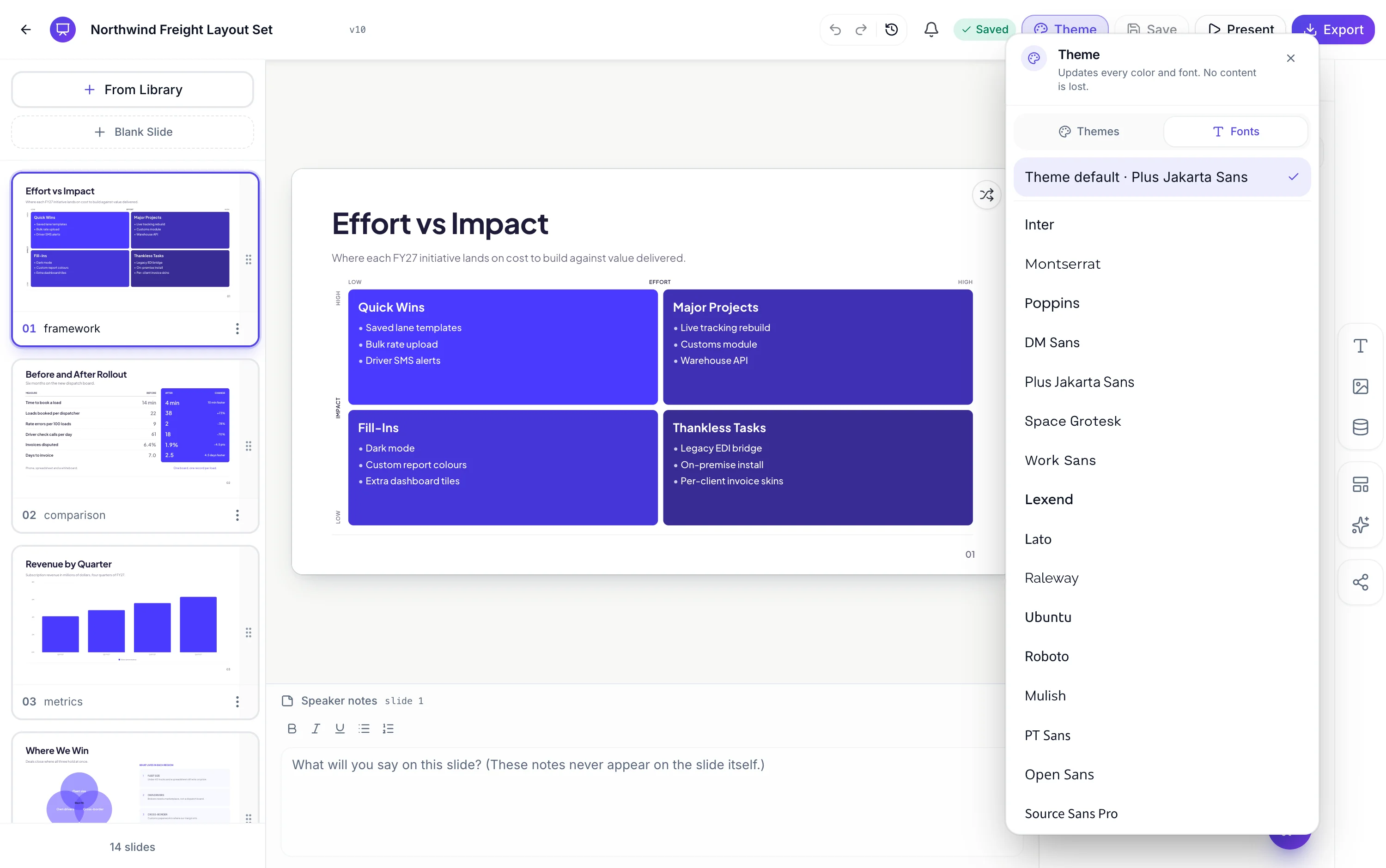
Twenty seven families, plus the theme's own
The Fonts tab lives beside Themes in the same panel. The first row is Theme default, which names whichever family the current theme brought, and below it sit forty two Google families: twenty five sans serif from Inter and Roboto through Plus Jakarta Sans, Space Grotesk, Lexend and Outfit, and seventeen serif or display faces including Playfair Display, Merriweather, Lora, Cormorant Garamond, Libre Bodoni and Big Shoulders Display. Every row previews itself in its own typeface.
Sizes are a ramp, not numbers you type
Behind the family sits a nineteen step ramp: display at 110 pixels, h1 at 80, h2 at 46, body at 24, eyebrow at 20, and named classes for bylines, captions, page numbers and footer text. Each class carries its own weight as well as its size. Changing the family swaps the typeface across all nineteen and leaves the relationships between them intact, which is why a deck does not lose its hierarchy when you change fonts.
Pairing is decided for you, deliberately
There is no separate heading font and body font control at deck level. One family runs everything, with the ramp's weight differences doing the work that a second family would otherwise do. A display face at 110 pixels and 700 weight against body copy at 24 and 400 is already a strong contrast, and adding a second family on top of that is where amateur decks usually go wrong.
Overriding a single text box
When you genuinely need one exception, select the text and the inspector gives you a Font dropdown carrying the same twenty seven plus Theme default. That override is stored against the slot rather than the deck, so it survives a deck level font change and a theme swap. Use it for a wordmark or a pull quote, not for a third of the deck.
Text shrinks before it overflows
Every text box measures itself and searches for the largest size that fits its box, so a longer heading in a wider face comes back smaller rather than spilling out. Siblings in a row of cards share one computed size so they line up rather than each finding its own. This is what stops a font change from quietly breaking the layout of a deck you already finished.
How it works, in three steps
Step 1
Open the Fonts tab
Same panel as Themes in the left rail, second tab along.
Step 2
Pick a family and look at a dense slide
A slide with a table or a long list is where a face either holds up or does not.
Step 3
Override only where you must
Select the one text box and use the inspector's Font dropdown. Reset by choosing Theme default.
The full walkthrough with screenshots is in the guide Change your presentation's theme, fonts and colours.
Limits worth knowing
- 42 families, all from Google Fonts. Uploading your own typeface is not supported.
- One family for the whole deck. There is no separate heading and body pairing control.
- Sizes come from the theme's nineteen class ramp, not from a free numeric field.
- A font override is stored on its text box. It survives a layout swap when the new layout has a box with the same id; content with no matching box is parked until you swap back.
See it on a finished piece
Questions people ask
Can I upload a brand typeface?
No. The catalogue is twenty seven Google families plus whatever the theme supplies. Pick the closest match and carry the brand with your logo and palette instead.
Why is there no separate heading font?
Because one family across a nineteen step size and weight ramp already produces the contrast a deck needs, and a second family is the most common way a deck starts looking homemade.
Does changing the font change my slide layouts?
No. Boxes stay where they are and the text inside them shrinks to fit if the new face runs wider. The layout is fixed, the type adapts.
Do fonts survive the export?
Yes. Exports are rendered on the server with the fonts loaded, so the PDF and the PowerPoint carry the typeface you chose.
Make your own presentation
The button opens the generator with this use case already described. Change the wording to match yours, generate, then edit anything you like.
Create a presentation with OneCraftRelated pages
Flyer fonts
A flyer does not use a heading font and a body font. It uses one family, and the theme's type scale does the rest: nineteen named sizes from a display headline down to a footer line, each with its own weight. Changing the font changes one thing and the whole page follows.
Video fonts
Unlike a document, a video does not pair a display face with a body face. One family runs everything, from a five word headline set at 240 pixels down to the caption pill at 26. That is a constraint, and it changes which typefaces are worth choosing.
Presentation themes
The theme panel lists ninety nine entries: eighty eight colour palettes, twenty one hand built themes, and the ten places where a hand built theme takes over a palette's name. Picking one restyles the whole deck immediately, including charts, tables and diagrams.
More finished work of this kind is on the presentation examples hub.
Written and checked by the OneCraft team. Last checked .