Presentations
Pricing slides
A pricing slide is a short form with strict fields, and the reason so many look amateur is that the copy was written before the fields were known. Tier names get twenty characters. Prices get twelve. Feature lines get sixty. Write to those and the slide designs itself.
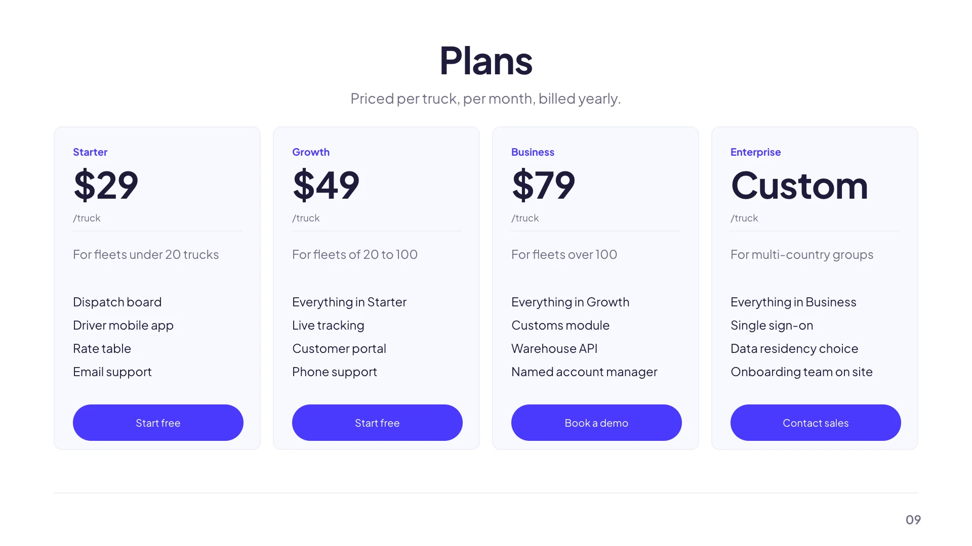
Nine layouts, chosen by tier count
A single plan hero and a single featured card for one offer. A free versus pro binary and a two tier hero for two. Three tier cards for the classic ladder. A four tier ladder when a business column is genuinely separate. Then a detailed plan table, a feature comparison table and a budget line sheet for when the features matter more than the prices. Pick by how many tiers you actually have, not by which looks nicest.
Every field has a character budget
Tier name twenty characters, so Professional fits and Professional Plus does not. Price twelve, which covers a formatted currency string or the words Free and Custom. Billing period sixteen, for per month, per seat or one time. Tagline eighty, for who this tier is for. Each feature line sixty, which is three to six words. The call to action label twenty. Those budgets are enforced when the AI writes and are the reason a generated pricing slide does not overflow.
The featured plan comes from the layout
There is no most popular toggle. Emphasis is designed into specific layouts: the two tier hero features its second card, the single featured card centres one plan. The three tier card layout deliberately does not emphasise a middle tier, and its own description says to pick a different layout if you need that. So the decision is which layout, made once, rather than a setting you flip afterwards.
Keep the feature count identical across tiers
Card layouts hold four feature lines per tier, and some hold five. A tier with two lines beside a tier with four leaves a visible hole, because the cards are equal height by construction. If a cheaper tier genuinely has fewer features, write the missing lines as the limits, not as blanks. Up to five hundred seats, email support only, no API access. That is more useful to a buyer anyway.
When to use a table instead of cards
Cards sell. Tables compare. If the buyer's real question is which of these fourteen features do I get, cards force you to pick four per tier and lose the rest. The feature comparison table and the detailed plan table hold far more rows with tick marks per column, and both are still filed under pricing so you can swap to one without retyping the tier names and prices.
How it works, in three steps
Step 1
Count your tiers first
One, two, three or four. That single number eliminates most of the nine layouts immediately.
Step 2
Write to the budgets
Twenty characters for a tier name, twelve for a price, sixty per feature line. Draft in those lengths, not in prose.
Step 3
Choose the layout that emphasises the right plan
Emphasis is built into the layout, so if you want a plan featured, pick a layout that features one.
The full walkthrough with screenshots is in the guide Add, reorder and restructure slides.
Limits worth knowing
- There is no most popular badge to switch on. Emphasis comes from choosing a layout that has it.
- Card layouts hold four feature lines per tier, five on some. Longer lists need one of the table layouts.
- Prices are typed text, not numbers. Nothing calculates an annual discount or a per seat total.
- There is no currency setting. Write the symbol into the price string yourself.
See it on a finished piece

Questions people ask
How do I mark a plan as most popular?
By choosing a layout that features one, such as the two tier hero or the single featured card. There is no toggle, and the three tier card layout deliberately does not emphasise its middle column.
Can I show more than four features per tier?
Not on a card layout. Swap to the feature comparison table or the detailed plan table, which are filed under the same purpose so your tier names and prices carry across.
Does it work out annual pricing from monthly?
No. Every price is a string you write, so an annual figure and any discount have to be typed.
What goes in the billing period field?
Sixteen characters covering per month, per year, per seat or one time. Leave it blank for a one off price and the layout closes the gap.
Make your own presentation
The button opens the generator with this use case already described. Change the wording to match yours, generate, then edit anything you like.
Create a presentation with OneCraftRelated pages
Sale badge on a flyer
A sale badge is a small promise: new, half price, this weekend only. Two elements do that job here, a badge and a chip, and they are pill shaped text blocks that take their colour from the theme rather than stickers you drag off a shelf. That has consequences worth knowing before you place one.
Key takeaway slides
A takeaway slide is the one people photograph, so it has to be readable out of context and short enough to be remembered. Seven layouts carry that job, the smallest of the writing roles: a single statement, a recap of bullets, three numbered insights, a manifesto, a pull quote and a card built to be screenshotted.
Presentation fonts
There is one font control that matters and it sits at deck level. Choosing a family there overrides whatever the theme brought with it and applies to every text box on every slide, which is almost always what you want and is certainly what a consistent deck needs.
More finished work of this kind is on the presentation examples hub.
Written and checked by the OneCraft team. Last checked .