Presentations
Q&A slides
The slide that says Questions? in the middle of an empty screen is doing one job badly. There are six layouts here, and the useful ones do a second job: they give the room something to ask about, or they leave your contact details on screen while people are still looking.
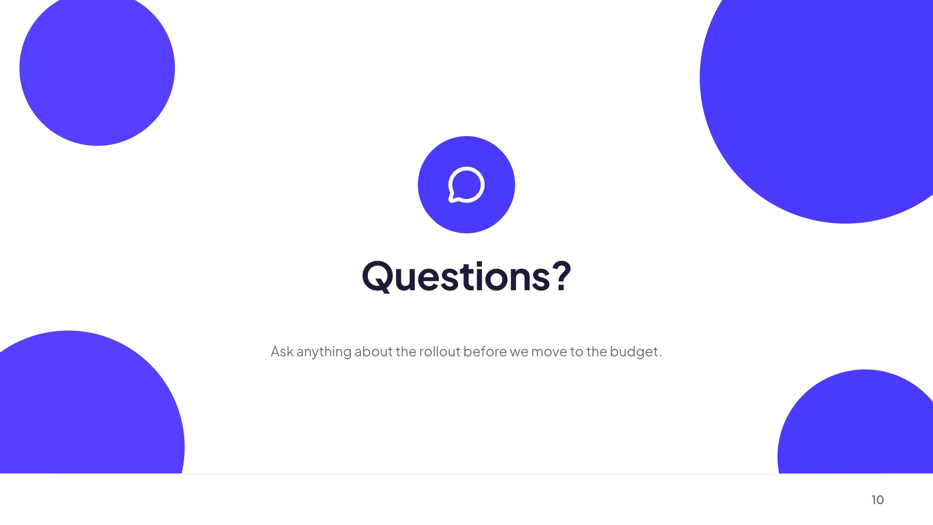
Six layouts, and only two of them are just a word
A centred questions pause and an oversized typography hero are the minimal ones: a large Questions or Q&A, an icon, and a supporting line of up to eighty characters. A minimal split adds a second column. Then a prompt wall grid, a discussion and contact split, and a contact card stack, all of which put something useful on screen alongside the invitation.
The prompt wall solves the silence
A grid of starter questions on screen is the single most effective fix for a room that has none. It works because reading a question somebody else might ask lowers the cost of asking your own, and because it signals which parts of the talk you are willing to go deeper on. Three to six prompts is the useful number, written as real questions rather than topic headings.
The contact split keeps working after the talk
One column invites discussion, the other lists channels: an email address, a team, a documentation link, an office hours time. This is the layout to use when your deck will be shared afterwards, because the Q&A slide is the one people scroll back to when they think of the question two days later. An empty Questions? slide gives them nothing at that point.
It is not the closing slide
The question break is a mid presentation pause, described in the product as being distinct from the slides that wrap up a deck. Closing layouts carry a title, a call to action, contact lines, a signoff and a byline with a name and role. If your slide is the last one, use a closing layout. If it is an intermission before the next section, use this one, and put a closing slide after it.
Keep the headline short on purpose
The title field is capped at twenty characters, which is Questions?, Q&A, Over to you or Your turn and nothing longer. The supporting line takes eighty. That tightness is right: the slide is a signal to change mode in the room, and a paragraph on it defeats the purpose of putting something enormous on screen.
How it works, in three steps
Step 1
Pick a layout with room for content
The prompt wall or the discussion and contact split, unless you genuinely want a blank pause.
Step 2
Write three to six starter questions
Real questions in the audience's words, not topic labels. They lower the cost of asking the first one.
Step 3
Add a closing slide after it
The question break is an intermission. The deck should still end on a closing layout with the ask and your contact details.
The full walkthrough with screenshots is in the guide Add, reorder and restructure slides.
Limits worth knowing
- The headline is capped at twenty characters and the supporting line at eighty.
- Six layouts are available under this purpose, one of which is really a contact card stack.
- There is no question collection. Nothing on the slide gathers questions from the audience.
- Starter questions are text you write. They are not generated from the deck's content.
See it on a finished piece
Questions people ask
Should the Q&A slide be the last one?
Usually not. The question break is a pause, and the deck should still end on a closing slide carrying your ask, contact lines and signoff.
Can the audience submit questions on the slide?
No. Nothing collects input. If you want submitted questions, build a form and put its link or a QR code on the contact side of the slide.
What should the starter questions be?
Three to six real questions phrased the way somebody in the room would ask them. Topic headings do not have the same effect, because the point is to make the first question feel cheap.
Why is the title limited to twenty characters?
Because it renders as large display type. Questions?, Q&A and Over to you all fit, and anything longer would be shrunk to the point where the size stopped meaning anything.
Make your own presentation
The button opens the generator with this use case already described. Change the wording to match yours, generate, then edit anything you like.
Create a presentation with OneCraftRelated pages
Closing slides
The last slide stays on screen through the questions, which is the argument against a bare thank you. Eleven layouts are filed under the closing role, and they range from an oversized thank you to a contact grid of four and a written conclusion with a supporting paragraph.
Comparison slides
Comparison is the single largest family in the library, because most business arguments are two sided. The layouts differ by what kind of two sided claim you are making, and picking the wrong kind is what makes an audience argue with the slide instead of the point.
Intro slides
The slide after the cover has to give the audience a reason to keep listening, which is a different job from naming the deck. Eleven layouts are filed under the intro role, covering why now arguments, manifesto statements, company overviews and split openers with a photograph.
More finished work of this kind is on the presentation examples hub.
Written and checked by the OneCraft team. Last checked .