Flyers
Twitter header maker (X)
1500 by 500 is the widest canvas in the set at exactly three to one. Nothing about that shape behaves like a flyer. It is a banner, it is read in passing above a profile, and the designs drawn for it treat it that way: one statement, one mark, and a lot of considered empty space.
Three to one wants one idea
Five hundred pixels of height minus the room a wide layout leaves for breathing space is not enough for a hierarchy. The header designs are built around a single line of type with a supporting mark or logo, and that is the correct amount. A header that tries to be a poster ends up with everything at the same visual weight.
The avatar covers the lower left
A profile picture is drawn as a circle overlapping the bottom left of the header, and the surrounding page chrome eats a little more of the bottom edge. The builder shows no guide for it, so the discipline is yours: keep the left third clear of anything that has to be read, and place the statement centre or right.
Every client crops it differently
The visible slice of a header changes between the web app, a phone and an embedded profile card. Height is trimmed more often than width. Treat the top and bottom fifths as expendable and keep the message in the middle band, which is the region that survives every crop.
Wide artwork, not a wide photograph
Image slots on this canvas ask the generator for a 21 by 9 or 16 by 9 frame, so a header photograph is composed as a panorama rather than centre cut from a portrait. If you are uploading your own, crop it to three to one first. An upload is cropped to fill the slot, so anything at the top and bottom of your original goes.
It carries across from the cover canvas
If you already built a Facebook cover, switch the page's size to Twitter Header and the design's own 1500 by 500 layout is swapped in with your words carried across. The two are the only banner shaped canvases in the set, so they suit the same content, and going between them takes one click rather than a rebuild.
How it works, in three steps
Step 1
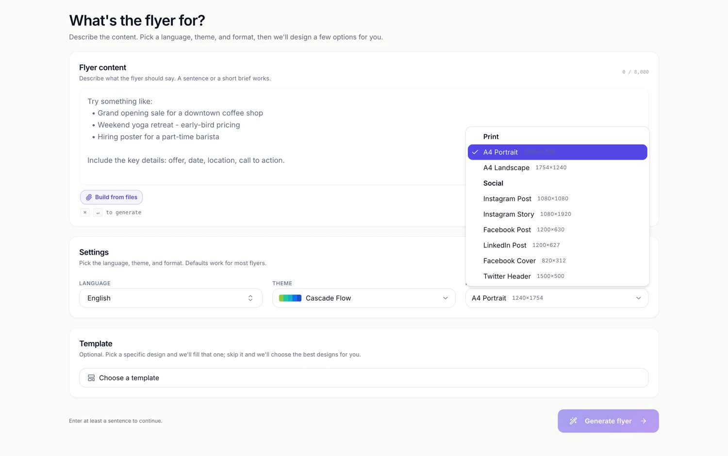
Set Format to Twitter Header
Under Social, showing 1500 by 500. It is the last entry in the list.
Step 2
Write one line
Who you are or what you do. A second line is usually the one that makes the first unreadable.
Step 3
Leave the left third alone
The avatar and the page chrome take it. Put the statement in the middle or on the right.
The full walkthrough with screenshots is in the guide Resize one flyer for every social size.
Limits worth knowing
- The canvas is fixed at 1500 by 500. The export doubles it to 3000 by 1000, and there is no other size control.
- No guide is drawn for the avatar position or for the crop each client applies.
- Uploaded pictures are cropped to fill the slot, so a portrait photo loses its top and bottom.
- Image exports take the page you are viewing, so select the header page before exporting.
See it on a finished piece
Questions people ask
How much of the header will actually show?
Roughly the middle band. Height is the dimension clients trim, and the bottom left is taken by the avatar, so a message that lives centre and slightly high survives everywhere.
Can I use my Facebook cover image here?
Not as the same file, since 820 by 312 and 1500 by 500 are different shapes. Switch the page's canvas size instead and the design's native header layout is used with your content.
PNG or JPG?
PNG when the header is type on flat colour, which most of them are. JPG when it is a photograph, since the file is much smaller and the platform re-encodes it anyway.
Is there a header design with room for a tagline and a website?
Some of the wide layouts carry a second line and a small contact strip. Browse the template picker with the format set to Twitter Header to see which ones do before you generate.
Make your own flyer
The button opens the generator with this use case already described. Change the wording to match yours, generate, then edit anything you like.
Create a flyer with OneCraftRelated pages
Facebook cover maker
820 by 312 pixels is the smallest canvas in the set and by some distance the most abused by the platform that shows it. Desktop, mobile and the page card each crop it differently, so a cover is designed around the part that always survives rather than around the whole rectangle.
Instagram post maker
Square is the shape that punishes a stretched poster the most. A one to one canvas has neither the height of a story nor the width of a banner, so a design has to be recomposed for it rather than resized into it, and that is what makes a square post look intentional.
Flyer size guide
Eight canvases, two for print and six for social, each with a fixed pixel size you can see in the dropdown before you commit. This page is the reference: the numbers, where they come from, and which of them are close enough to share a design.
More finished work of this kind is on the flyer examples hub.
Written and checked by the OneCraft team. Last checked .