Flyers
Instagram post maker
Square is the shape that punishes a stretched poster the most. A one to one canvas has neither the height of a story nor the width of a banner, so a design has to be recomposed for it rather than resized into it, and that is what makes a square post look intentional.
Square is a recomposition, not a crop
All 259 designs in the library have an Instagram Post file of their own, drawn at 1080 by 1080. That matters more here than at any other size, because taking a tall poster to a square by cropping either loses the top and bottom or shrinks everything to fit. Neither is what happens. The square version rearranges the same components into a square grid.
The feed shows it small
A 1080 pixel square renders a few centimetres wide on a phone and smaller still in a grid of nine. The practical consequence is a hard ceiling on how many distinct pieces of information can live on it. One headline, one supporting line, one price or date and one call to action is a full square. A fifth element is the one nobody reads.
Type size is the whole game
Text blocks shrink to fit their slot rather than overflowing it, so a long headline quietly gets smaller until it fits. On A4 that is invisible; on a square in a feed it is the difference between legible and not. If a headline has gone small, the fix is fewer words, not a bigger box, and you can see the effect immediately on the canvas.
Square images are generated square
Image generation snaps to the aspect of the slot it fills, and one to one is one of the eight ratios available, so a square hero comes back composed for a square rather than centre cropped from a wide photograph. Uploads are cropped to fill the slot, so if you are supplying the picture yourself, crop it square first and you keep control of what stays in frame.
Export as PNG for flat colour, JPG for photographs
Both export the page you are looking at. PNG holds the edges of type and flat colour panels without artefacts, which suits the bold, graphic square designs. JPG at quality 95 is smaller and is the better choice when the square is mostly one large photograph with a little text over it.
How it works, in three steps
Step 1
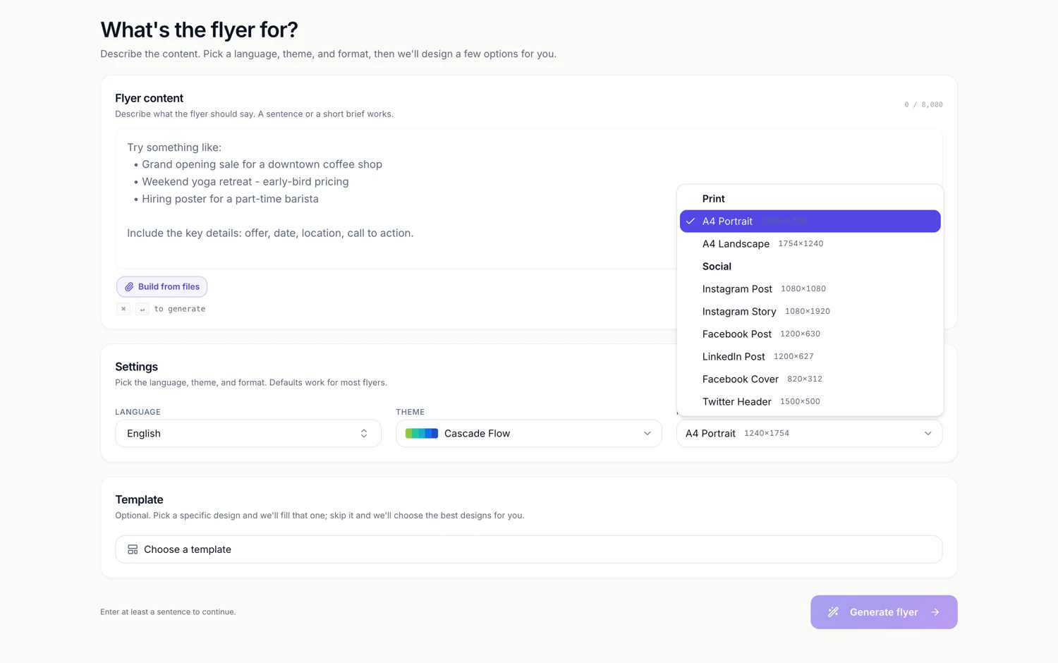
Set Format to Instagram Post
Under the Social heading, showing 1080 by 1080 beside it.
Step 2
Cut the message to four elements
Headline, one supporting line, the number or date, and what to do next. Anything more is being read by nobody.
Step 3
Check the type at thumbnail size
Zoom the canvas out until it is roughly a feed thumbnail. If the headline has stopped reading, shorten it.
The full walkthrough with screenshots is in the guide Resize one flyer for every social size.
Limits worth knowing
- One canvas per page, so a carousel is built as several pages and exported one image at a time.
- PNG and JPG export only the active page. There is no batch image export.
- Text shrinks to fit its slot, so an over long headline gets quietly smaller rather than warning you.
- An uploaded image is cropped to fill its slot; it is never letterboxed.
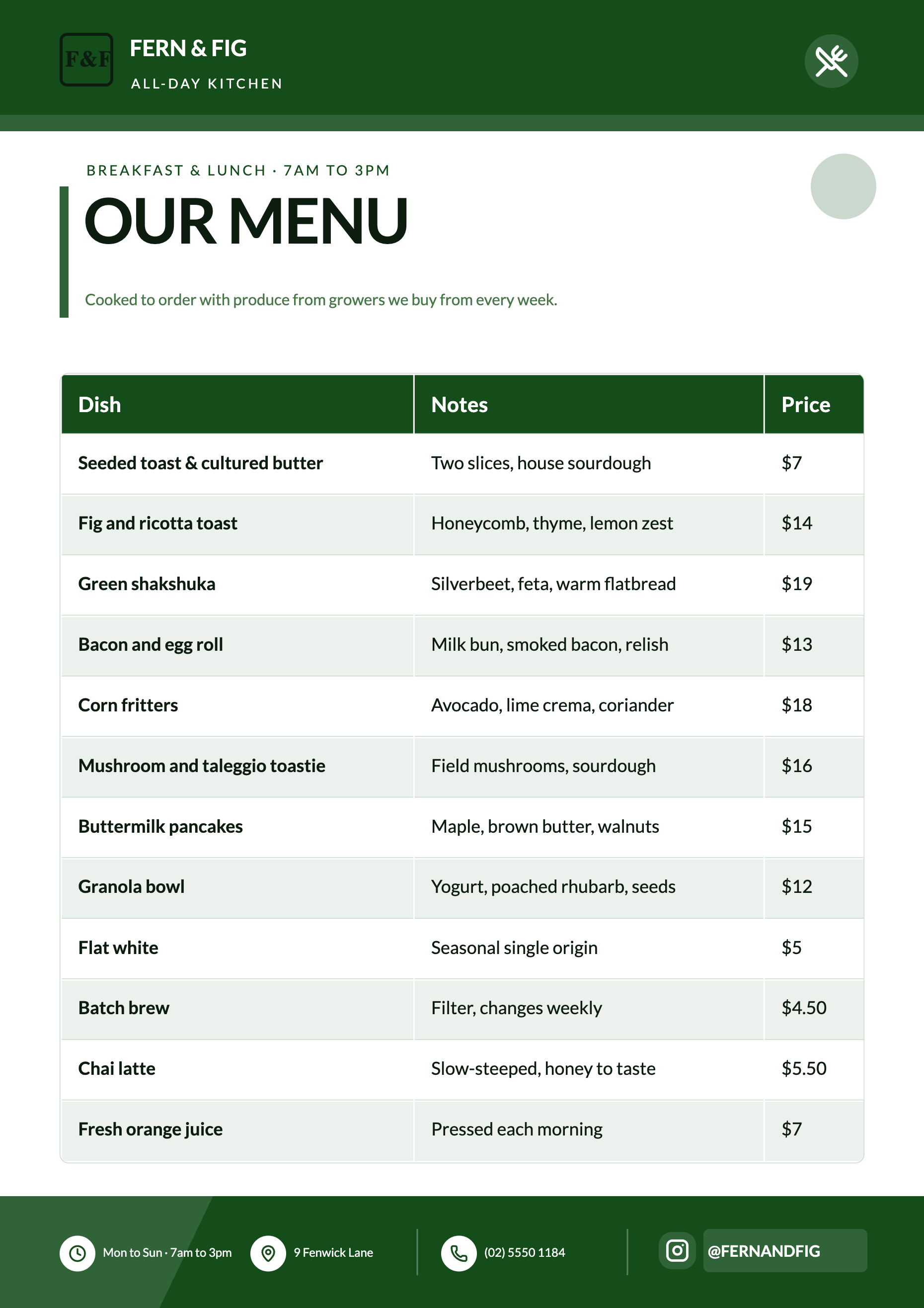
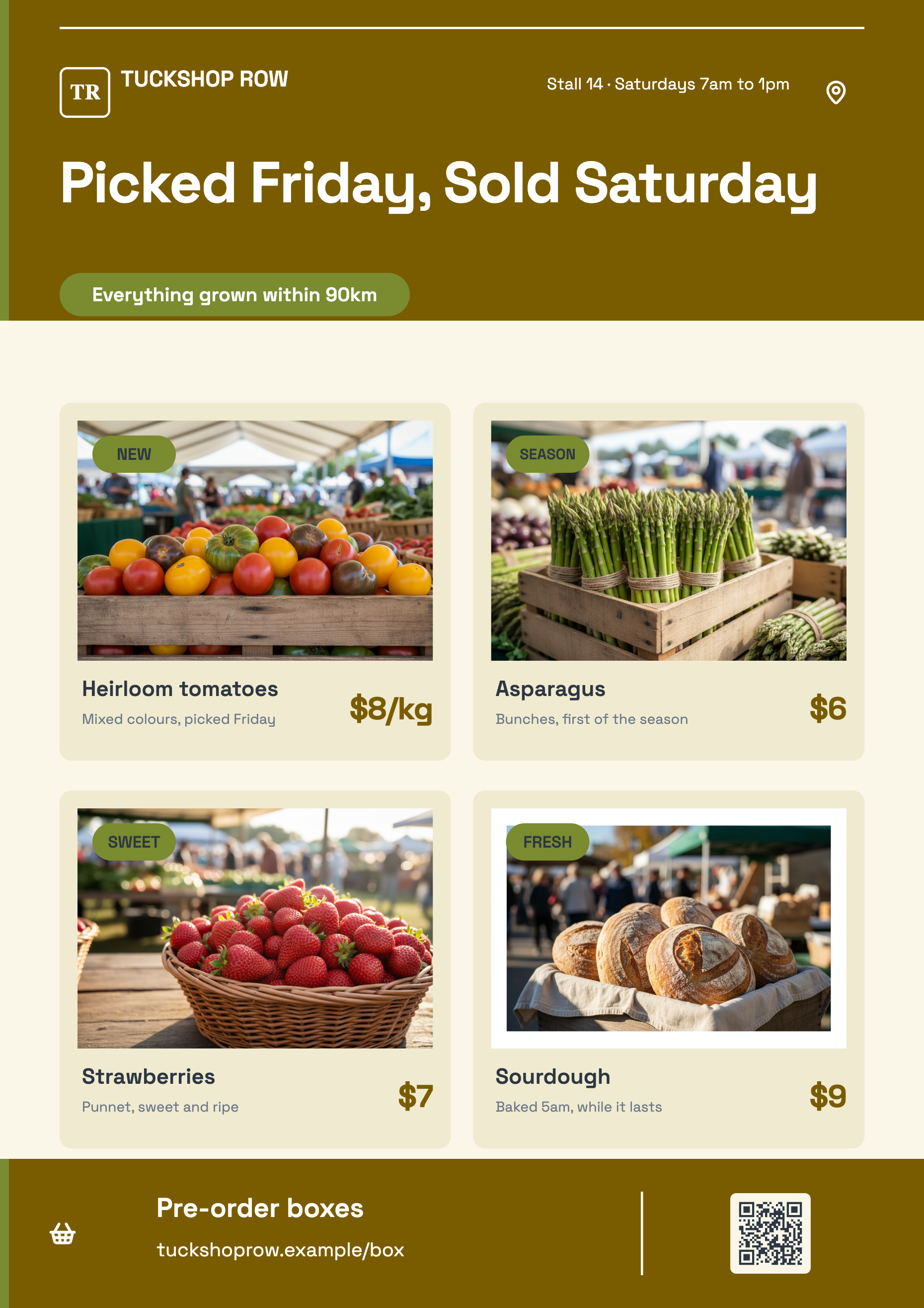
See it on a finished piece
Questions people ask
Can I build a carousel?
Yes, as several square pages in one flyer. There is no carousel export though, so you export each page as its own PNG by selecting it and exporting again.
Is 1080 by 1080 still the right size?
It is the square canvas the designs are drawn at, and squares still display cleanly wherever a feed accepts them. For a taller feed crop, use the Instagram Story canvas instead.
Why did my headline get smaller when I typed more?
Text slots shrink to fit rather than spilling out of their box. It is what keeps a generated design from breaking, and it is also the signal that your headline is too long for the space.
Can I reuse the same design as an A4 poster?
Yes. Switch the page's canvas size to A4 Portrait and the design's A4 layout is swapped in with your words carried over.
Make your own flyer
The button opens the generator with this use case already described. Change the wording to match yours, generate, then edit anything you like.
Create a flyer with OneCraftRelated pages
Instagram story flyer maker
A story is nine by sixteen and it fills a phone. That shape gives you more vertical room than any other canvas here and almost no horizontal room, which changes what a design can do: things stack, they do not sit side by side.
Resize a flyer for social media
Resizing here does not mean scaling. Change the canvas and the builder looks for that design's layout drawn natively for the new shape, swaps it in, and then works out which of your words belong in which of its slots. Understanding that matching step is what makes the result predictable.
Facebook post design
1200 by 630 is a landscape band roughly one and nine tenths as wide as it is tall. That shape is the reason a Facebook graphic never behaves like a poster: there is width to spare and only 630 pixels of height, so the design is a headline with support rather than a page of content.
More finished work of this kind is on the flyer examples hub.
Written and checked by the OneCraft team. Last checked .