Flyers
Facebook post design
1200 by 630 is a landscape band roughly one and nine tenths as wide as it is tall. That shape is the reason a Facebook graphic never behaves like a poster: there is width to spare and only 630 pixels of height, so the design is a headline with support rather than a page of content.
630 pixels of height is two or three lines
Once a design has given a headline the size it needs to read in a feed, what is left underneath is a supporting line and a strip. That is the honest budget. Wide designs at this size therefore put the picture on one side and the words on the other, rather than stacking, because stacking runs out of room almost immediately.
It is also the link preview shape
1.91 to 1 is the ratio social platforms use for the image on a shared link card, which is why this canvas is useful beyond a single post. A graphic built here will crop sensibly when it is pulled in as a preview, and one built at A4 will not. Keep the important content away from the extreme left and right in case a client trims the sides.
Wide means side by side
The wide layouts are where two column arrangements actually work: image beside text, a stat block next to a headline, a logo band along one edge. If you started in A4 and switch a page to this canvas, expect the arrangement to change character rather than simply flatten, because the wide file was drawn as a wide composition.
Photographs need to be wide too
A hero slot on this canvas asks the image generator for a sixteen by nine or three by two frame, which is a landscape photograph composed as one. If you upload instead, the picture is cropped to fill, so a portrait shot of a person on a wide slot will keep the middle and lose their head and feet. Crop before you upload and you decide what survives.
One design serves LinkedIn as well
The LinkedIn canvas is 1200 by 627, three pixels shorter, and it reuses the same wide layout file. So a design that works here works there, and switching a page between the two is a formality rather than a re-layout. It is the only pair in the set that shares artwork.
How it works, in three steps
Step 1
Set Format to Facebook Post
Under Social, showing 1200 by 630. Change the format before choosing a template, since the picker filters on it.
Step 2
Write one headline and one line
The canvas is short. A second supporting sentence usually pushes the type below a readable size.
Step 3
Export as JPG or PNG
Image exports take the page you are viewing, so select this page first if the flyer has others.
The full walkthrough with screenshots is in the guide Resize one flyer for every social size.
Limits worth knowing
- 630 pixels of height is a hard ceiling. Long copy shrinks to fit rather than expanding the canvas.
- Image exports cover the active page only. PDF is the format that carries every page.
- There is no text overlay percentage checker; judging how much type is on the image is up to you.
- Uploaded photographs are cropped to fill their slot, not fitted inside it.
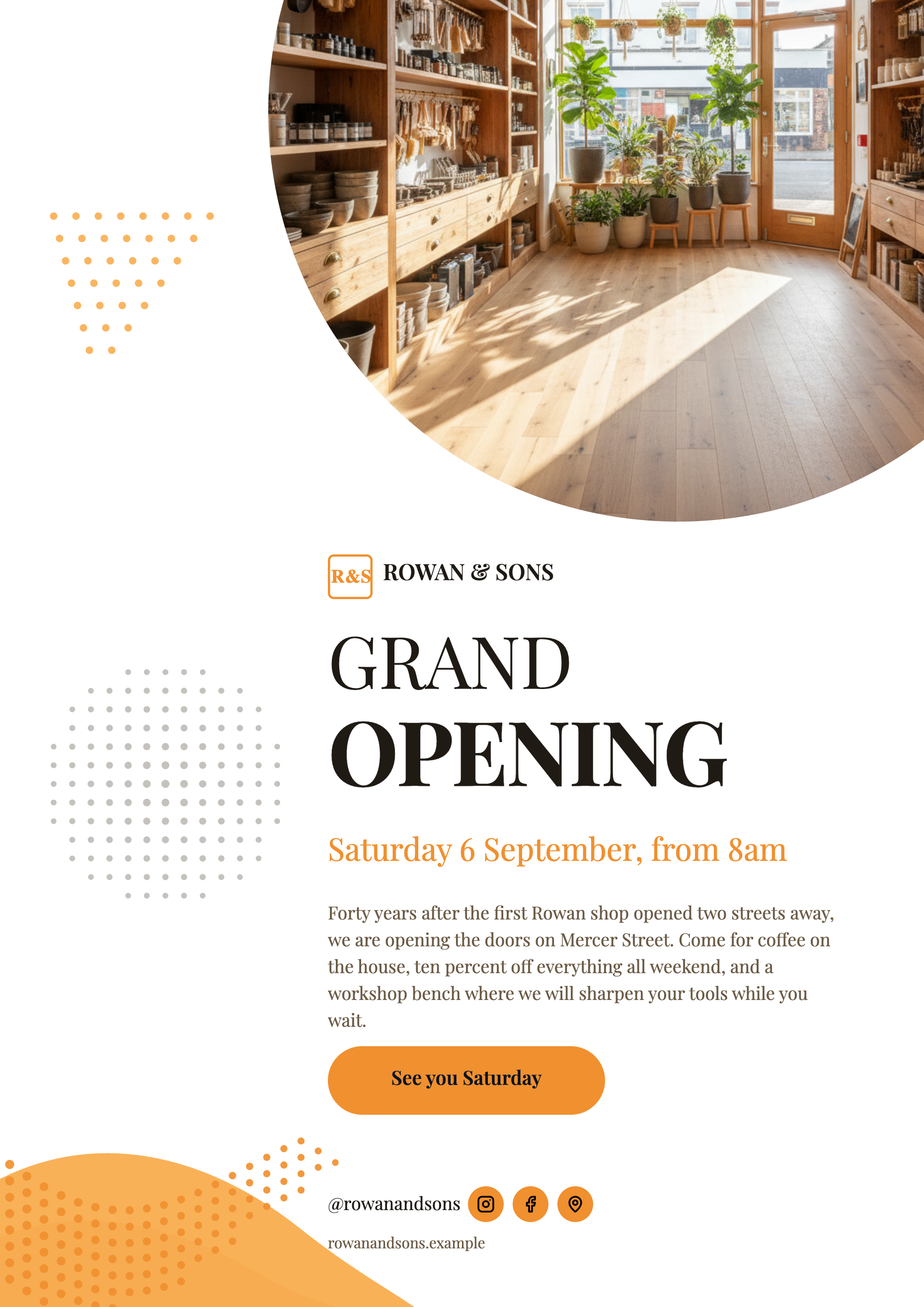
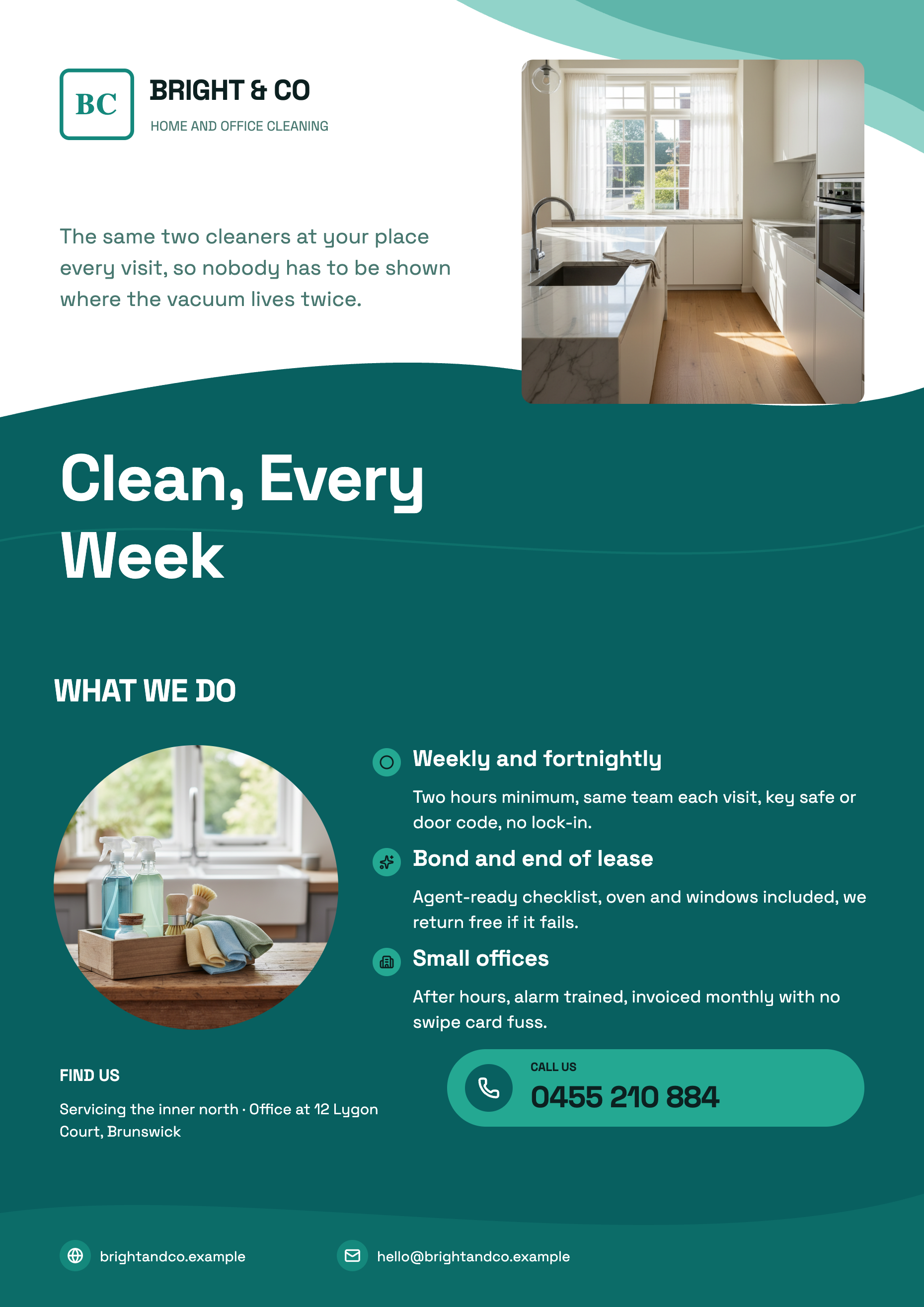
See it on a finished piece
Questions people ask
Will this size work as a shared link image?
It is the right shape for one, at 1.91 to 1. Keep the essential content away from the far left and right edges, since some clients trim the sides of a preview card.
Can I use the same graphic on LinkedIn?
Yes. LinkedIn's canvas is 1200 by 627 and shares this design file, so switching between the two is effectively free.
Why does my A4 design look so different here?
Because the wide version is its own layout, drawn for a landscape band rather than derived from the portrait one. That is the point: it is composed for the shape rather than squashed into it.
JPG or PNG?
JPG at quality 95 for anything photographic, since the file is smaller and the difference is invisible. PNG when the design is flat colour with hard edged type.
Make your own flyer
The button opens the generator with this use case already described. Change the wording to match yours, generate, then edit anything you like.
Create a flyer with OneCraftRelated pages
LinkedIn post design
The canvas is 1200 by 627 and the constraint is not really the pixels, it is the register. A LinkedIn feed rewards material that looks like it came out of a company rather than out of a sale, and most of that impression is decided by the theme and the blocks you choose, not by the layout.
Instagram story flyer maker
A story is nine by sixteen and it fills a phone. That shape gives you more vertical room than any other canvas here and almost no horizontal room, which changes what a design can do: things stack, they do not sit side by side.
Turn a price list into a flyer
A price list is easy to write and hard to lay out. The awkward part is not the design, it is arithmetic: a flyer slot holds a fixed number of rows, and your list almost certainly has more than that. Knowing the budget before you start decides whether you get a menu or a mess.
More finished work of this kind is on the flyer examples hub.
Written and checked by the OneCraft team. Last checked .