Websites
Dark mode website: one switch, every palette, readable contrast
A dark mode website uses a dark background with light text, which suits photography, nightlife, music and premium products. Done badly it is hard to read; done well every colour pair is retuned for the dark background rather than simply inverted.
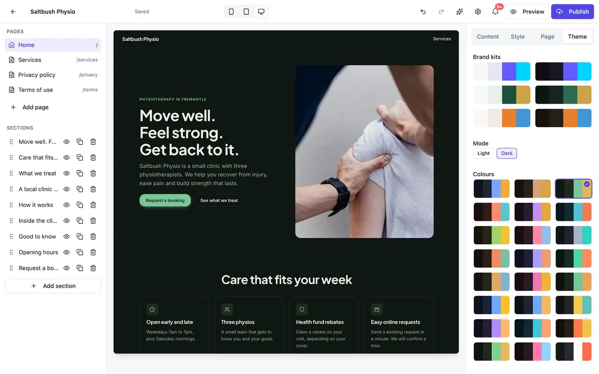
How the switch works
The Theme tab has a Mode choice of Light or Dark. Each of the 24 curated palettes is designed in both modes, so switching keeps your chosen palette and swaps in its dark set of colours: background, surfaces, text, brand, accent and borders. Brand kits come in light and dark versions too. The whole site changes, every page at once, and Undo puts it back.
Contrast is checked, not hoped for
Every text and background pair the site draws, in every palette and both modes, is held to WCAG AA contrast, and focus rings to 3 to 1, by an automated test. That is why dark palettes use slightly lifted greys and softened brand colours rather than pure black and full brightness: pure white on pure black glares, and saturated colours vibrate on dark grounds.
Dark palettes to start from
Eight palettes are designed dark first, such as Midnight, Charcoal, Nightfall, Deep sea, Ember, Moss, Noir rose and Graphite, and the light first ones have dark versions as well. Several templates ship dark: the band link page, the photographer portfolio, the conference and food festival sites and the coaching landing page.
Visitors do not get a toggle
Dark mode here is your design choice for the site, not a visitor setting. The published site shows the mode you chose to everyone and tells the browser which it is, so form controls and scrollbars match. It does not follow the visitor device setting or offer a light and dark switch in the menu.
When dark is the wrong choice
Long reading, such as policies, menus with many items or detailed service descriptions, is easier on a light background for most people in daylight. Food and products often look better on light grounds too. Choose dark when the photos and the mood carry the site, and keep text short.
How it works, in three steps
Step 1
Open the Theme tab
In the builder, open Theme in the right hand panel.
Step 2
Choose Dark
Press Dark under Mode; the palette or brand kit swaps to its dark colours.
Step 3
Check and publish
Look at the phone and desktop previews, adjust the palette if needed, then publish.
Limits worth knowing
- Mode applies to the whole site; pages cannot have different modes.
- There is no visitor toggle and no automatic switch from the device setting.
- Custom colours outside the curated palettes are not offered in the Theme tab.
- Photos are not adjusted for dark mode; choose images that suit a dark page.
Questions people ask
Can visitors switch between light and dark?
No. The mode is part of the site design and every visitor sees the one you chose. If your audience is split, pick the mode that suits your content and photos; light is the safer default for sites with a lot of reading, dark for image led sites.
Does dark mode save battery?
On phones with OLED screens a mostly dark page uses less power than a bright one, but the saving on a short website visit is small. Choose dark mode for how the site looks and reads, not for battery, and make sure photos and buttons still stand out.
Will my brand colour work on a dark background?
Brand kits are converted into light and dark sets of colours, so the brand colour is adjusted for contrast in dark mode. If your brand colour is very dark, such as navy, the dark version lifts it so buttons stay visible. Check buttons and links in the preview after switching.
Can one section be dark on a light site?
Each section has a background setting in the Style tab: page, soft, tinted, brand colour or a photo. A brand colour or photo background gives a strong contrast band within a light site. There is no separate dark background option per section, so a deep brand colour is the way to get a dark strip.
Is dark mode bad for SEO?
No. Search engines read the text and structure, not the colours. What matters is that text is readable, which the contrast checks cover, and that the page is fast. A dark site can rank exactly as well as a light one.
Do photos look different in dark mode?
Photos are shown as they are; nothing is darkened or filtered. Bright photos with white backgrounds can look like glowing boxes on a dark page, so prefer images with darker or natural backgrounds, or a photo background on a section with the text over it. Product shots on white suit light mode better.
Make your own website
The button opens the generator with this use case already described. Change the wording to match yours, generate, then edit anything you like.
Create a website with OneCraftRelated pages
Brand kit for your website: your colours, light and dark, in one click
A brand kit is a saved set of your logo, colours and fonts that every design tool can reuse. On a website it should do one thing well: turn three brand colours into a full, readable theme, so buttons, backgrounds and text all feel like you without picking each shade.
Embed a YouTube or Vimeo video on your website
Embedding a video means showing a YouTube or Vimeo player on your page so visitors watch without leaving. Done carelessly, a player loads megabytes of script before anyone presses play; done well, the page shows a still and loads the player on the click.
Export website code: the whole project, one zip
Exporting website code means downloading the source files that produce the site, so you can read them, keep a copy or host the site somewhere else. It matters most as an exit route: knowing you can leave makes it easier to stay.
More finished work of this kind is on the website examples hub.
Written and checked by the OneCraft team. Last checked .