Classic form
Contact form template
A contact form template needs a name, an email, the message and very little else, plus a clear line on when a reply will arrive. This one has eight fields, five of them required, and the two doing the real work are the subject dropdown that routes the message and the introduction that prints the reply time before anyone writes. It states the phone number rather than hiding behind the form, and it does not sign anyone up to anything. Classic, because eight short fields on one screen is faster than eight screens.
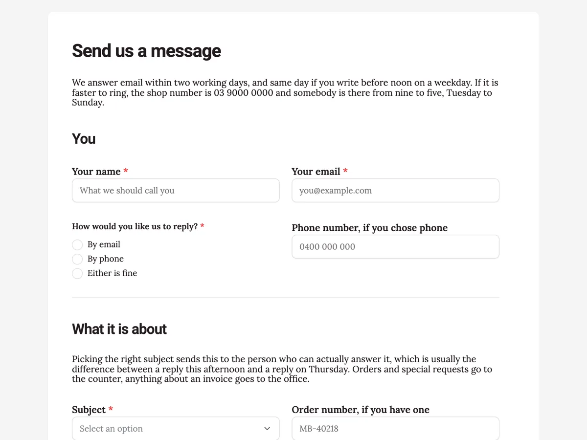
The form itself
A static copy of the finished form, exactly as it renders. Nothing here can be filled in or submitted, so read it as a reference and build your own from the button above.
Every field, and what it collects
The complete field list, in the order respondents meet it.
- Your nameShort textRequired
- Your emailShort textRequired
- How would you like us to reply?Single choiceRequired
- Options: By email · By phone · Either is fine
- Phone number, if you chose phoneShort text
- SubjectDropdownRequired
- Options: An order I have already placed · Finding or ordering a book you do not have · Events and the reading group · Selling us second hand books · Accounts and invoices · Working here · Something else
- Order number, if you have oneShort text
- Your messageLong textRequired
- A photo or screenshot, if it helpsFile upload
- One file, PDF or photo, under 10 MB. A photo of a damaged spine, a screenshot of an order confirmation, a picture of the book you are after. Optional, and most messages do not need one.
You
What it is about
What each field on this contact form does
The You section takes the name, the email and how the person would like the reply, then an optional phone field whose label says it is only for people who chose phone. The What it is about section opens with a short paragraph explaining that the subject decides who reads the message, then the subject dropdown with seven options, an optional order number, the message itself and an optional attachment. A closing paragraph says the address is used to answer this message and nothing else, and that messages are kept for a year so an older thread can be found. Five fields are required and three are optional, and every optional one says in its label when it is worth filling in.
Why the reply time sits in the introduction
Most contact forms say nothing about when a reply will come, so the person writes, waits an hour and then rings, and the shop answers the same question twice. Printing the reply time in the introduction, before any field, sets the expectation while someone is still deciding whether the form is the right channel. The same introduction gives the phone number and the opening hours, so an urgent question goes straight to the counter. The thank you screen repeats the promise, which is the moment the person is most likely to wonder whether anything happened.
How to adapt this contact form
For a service business, replace the order number with a booking reference and rename the subject options after the people who answer them, not the departments on the org chart. For a larger team, turn on an email alert so each message reaches a shared inbox, or send submissions to a help desk through a webhook. Keep the attachment optional, and keep the closing paragraph about the address, because saying plainly that nobody is being subscribed is the line that makes people use their real email.
What makes this form work
The subject dropdown is doing routing, not decoration
Seven options that map to the person who can actually answer, with a line above the field saying so. It is the one extra field on this form that saves more time than it costs, because the alternative is a message read by somebody who has to forward it.
It says out loud that nobody is being subscribed
A closing paragraph explaining the address is used to answer this message and nothing else, with the newsletter pointed at a separate sign up. Consent for marketing has to be its own decision, and a contact form that quietly harvests addresses is the reason people use throwaway ones.
The attachment is optional and explained
One file, and a description listing the three things worth attaching: a damaged spine, an order confirmation, a photo of the book somebody wants. A file upload is one of the few classic fields whose help text a respondent sees, so it is the right place to say that most messages need nothing.
Questions people ask
How many fields should a contact form have?
Three to five required fields is the usual research backed answer, with anything else optional and clearly labelled. This form has eight, but only five are required: name, email, reply preference, subject and message. The phone, order number and attachment are there for the people who need them. Job title, company size and "how did you hear about us" earn nothing, and they belong nowhere near a contact form.
Should the form be the only way to contact you?
No, and usability research is consistent on it: people expect a phone number, an email address and a postal address on a contact page, and hiding them behind a form is one of the most common complaints recorded in testing. This form prints the shop number and the opening hours in its own introduction, so the form is one option rather than a wall.
How do you stop spam without a CAPTCHA?
There is no CAPTCHA on a published form, and that is a defensible position rather than a gap. Image and audio challenges are documented barriers for people who are blind or have a cognitive disability, and the accessible alternatives are all invisible to the user. If a public form attracts junk, the stronger lever here is access control: a secret key, a login requirement, or restricting the form to your own domain.
Where should the reply time go?
On the form, before the button, not in the confirmation email. It sets an expectation while somebody is deciding whether to write at all, and it stops the follow up message three hours later. This one says it in the introduction, repeats it on the thank you screen, and names the alternative for anything urgent.
Should a contact form ask how somebody wants to be contacted?
Only if you will honour it. This form asks, then offers an optional field labelled "Phone number, if you chose phone". Everyone sees that field, and the label tells email repliers to skip it. Asking the question and replying by email anyway is worse than not asking, because the respondent has told you a preference and watched you ignore it.
Is a file upload worth adding to a contact form?
For anything that goes wrong visually, yes. This form offers one optional photo or screenshot at the end. File upload accepts between one and ten files at up to 100 MB each, with images and PDF as the two allowed types, so a screenshot of an error saves an entire round of questions.
Build your own in about a minute
The button below opens the generator with this use case already described. Change the wording to match your own, generate, then edit anything you like.
Make one like thisOther form examples
Repair request form with photos and warranty check
A repair request form gives a service team what it needs to book a repair: which product, its serial number, what is wrong and whether the warranty covers it. This one adds optional photos of the fault, a proof of purchase upload for warranty claims, and a choice between dropping the appliance off and a courier pickup.
Hotel booking form for a direct reservation request
A direct hotel booking form has to do what a booking site does, minus the payment page, and it has to be clear that the stay is not confirmed until somebody replies. This one takes the dates, the room type with the nightly rate on each option, the bed configuration and the requests, and says plainly that no card number belongs in a web form.
Dog boarding booking form with feeding and medication tables
A dog boarding booking form has to prove each dog is vaccinated and tell the kennel exactly how to feed and medicate it, because staff will do both without the owner there. This one takes the certificate as an upload, sets feeding and medication out as tables, and has the owner sign an emergency vet consent with a dollar limit.
Want the steps in the builder? Read Control who can fill in your form, then Automate your form with add-ons. For everything this generator can do, see the form maker.
Written and checked by the OneCraft team. Last checked .