Flyers
Add text and shapes to a flyer
Every design arrives finished, but a flyer usually needs one more thing: a price, a disclaimer, an extra card, a QR alternative. The element panel is where that comes from, and it holds sixty seven items grouped into thirteen sections.
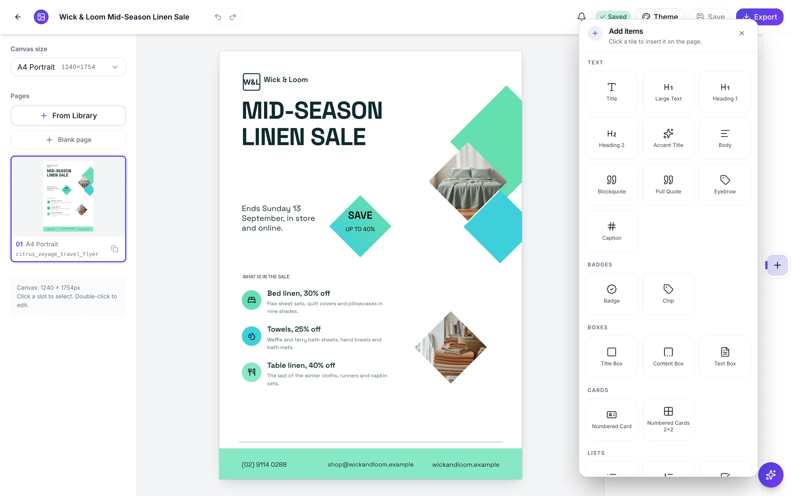
The thirteen sections
Text has ten, from a title and two heading levels down to an eyebrow and a caption. Badges has two, Boxes three, Cards two and Lists seven, including a checklist, a steps list and a pros and cons pair. Stats has three, Callouts eight, Image and icon two. Then the data blocks: Charts ten, Diagrams twelve, Matrices three, Tables three, and Timeline and map two.
Clicking a tile places it, immediately
There is no dragging from the panel to the canvas. A click inserts the element in the centre of the page you are on, selects it and closes the panel, so the next thing you do is move it. Each element arrives at a sensible default size for its kind: a badge at 220 by 56, a chart at 880 by 520, a table sized to its row count.
Positioning is manual, and nothing snaps
Drag an element to move it, use the eight handles around it to resize, or nudge with the arrow keys at one pixel a press and ten with Shift held. There are no alignment guides, no grid, no snapping and no distribute controls. The smallest you can drag a block down to is 24 by 24 pixels. Select several and they move together as one undo step.
You can delete the design's own blocks too
Anything the template shipped can be removed as well as anything you added, and both go in the same click. The difference is under the surface: your elements leave the page, while a template's block is marked hidden so undo can bring it back. In practice both behave the same and both are reversible.
Icons come from the whole Lucide set
The icon element opens with a curated shortlist of one hundred and thirty five so the panel is instant, and typing searches the entire library behind it. Icons are drawn as vector strokes coloured from theme tokens, which is why they recolour with the flyer instead of staying whatever colour they were picked in.
How it works, in three steps
Step 1
Open Add items
The plus button on the right rail. The panel lists the thirteen sections in order.
Step 2
Click a tile
It lands in the middle of the current page, already selected. The panel closes so the canvas is clear.
Step 3
Drag it, then nudge it
Rough position by dragging, exact position with the arrow keys. Shift plus arrow moves ten pixels at a time.
The full walkthrough with screenshots is in the guide Add charts and diagrams to a flyer.
Limits worth knowing
- Elements are inserted by clicking a tile, not by dragging from the panel onto the canvas.
- No snapping, alignment guides, grid, rulers, group or distribute tools.
- No rotation. Everything sits square to the page.
- Elements cannot be smaller than 24 by 24 pixels.
- There is no QR code tile, so a QR code only exists on the designs that ship one.
- Inserted elements belong to the page they were added to, not to the whole flyer.
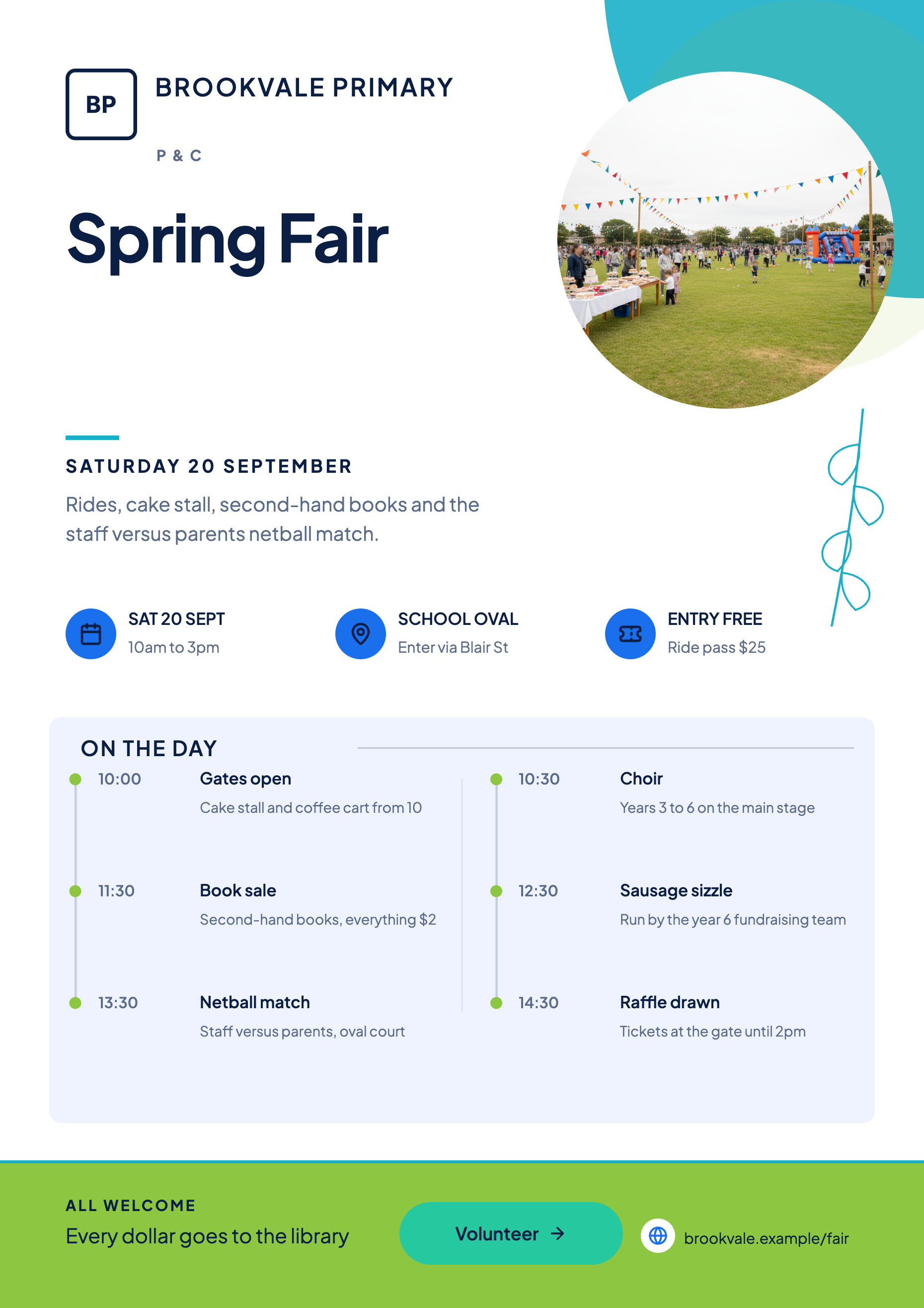
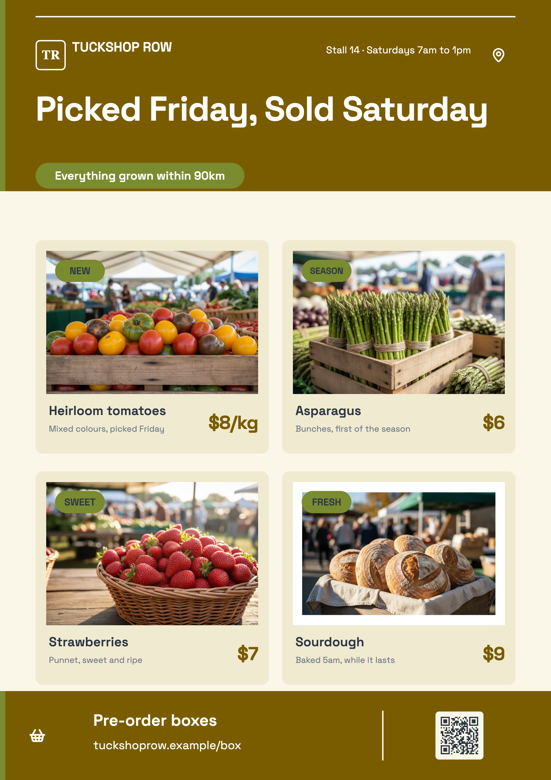
See it on a finished piece
Questions people ask
Can I drag an element from the panel onto the page?
No. Clicking the tile inserts it in the centre of the current page and selects it, and you move it from there.
How do I line two elements up exactly?
By the numbers, using arrow key nudging. There are no alignment guides, so matching an edge already in the design and counting keypresses is the reliable method.
Can I delete something the design came with?
Yes, and undo brings it back. Template blocks are hidden rather than destroyed, which is why removing one is always reversible.
Do elements I add carry over when I change canvas size?
They stay on the page, and their per size styling is remembered separately for each canvas. Check the position after a size change, since the layout underneath them has been redrawn.
Make your own flyer
The button opens the generator with this use case already described. Change the wording to match yours, generate, then edit anything you like.
Create a flyer with OneCraftRelated pages
Flyer with a map
Most people searching for a map on a flyer want the corner their shop is on. That is not what this block does. It is a world map you colour country by country, which is the right tool for showing reach and the wrong tool for showing an address, and the difference is worth five minutes before you build.
Flyer with a price table
A table is the right block whenever a reader will compare one line against another: services against prices, sizes against costs, sessions against times. It is the wrong block when there are only two values, and knowing which side of that line you are on saves a lot of layout work.
Edit flyer text with AI
The in canvas assistant does exactly two things: it replaces the value of a slot, and it renames the flyer. That is a narrow scope, and it is narrow on purpose. Everything it writes is checked against the design's own character budgets before it reaches your canvas.
More finished work of this kind is on the flyer examples hub.
Written and checked by the OneCraft team. Last checked .