Flyers
Flyer with a price table
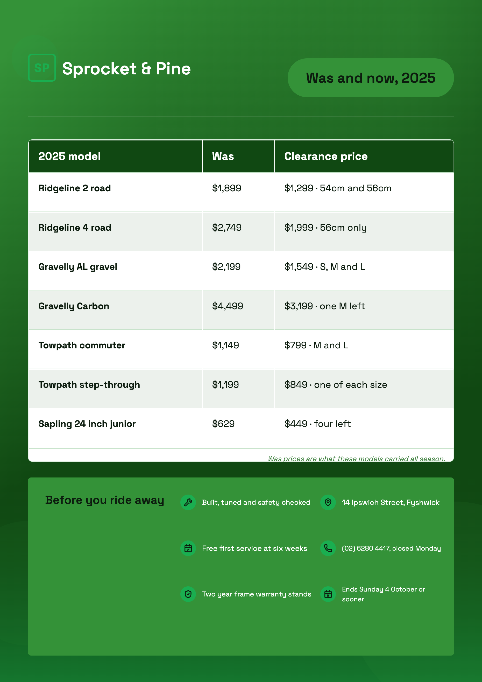
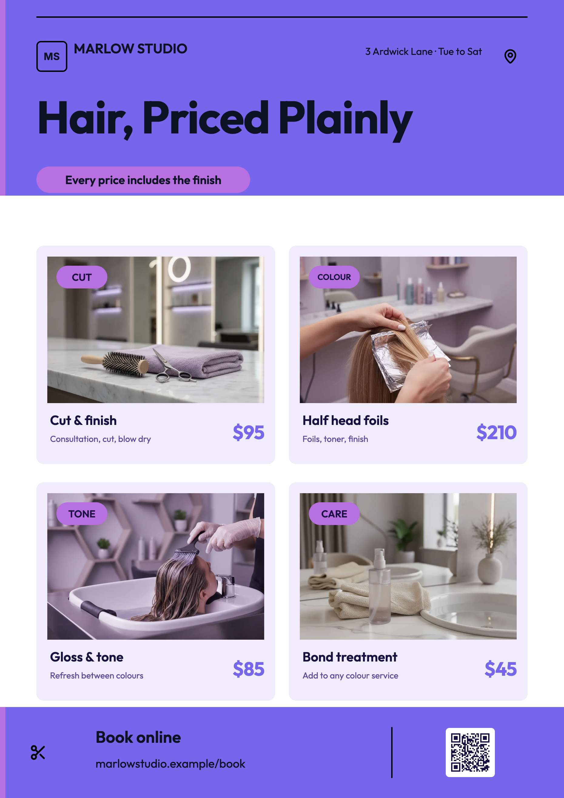
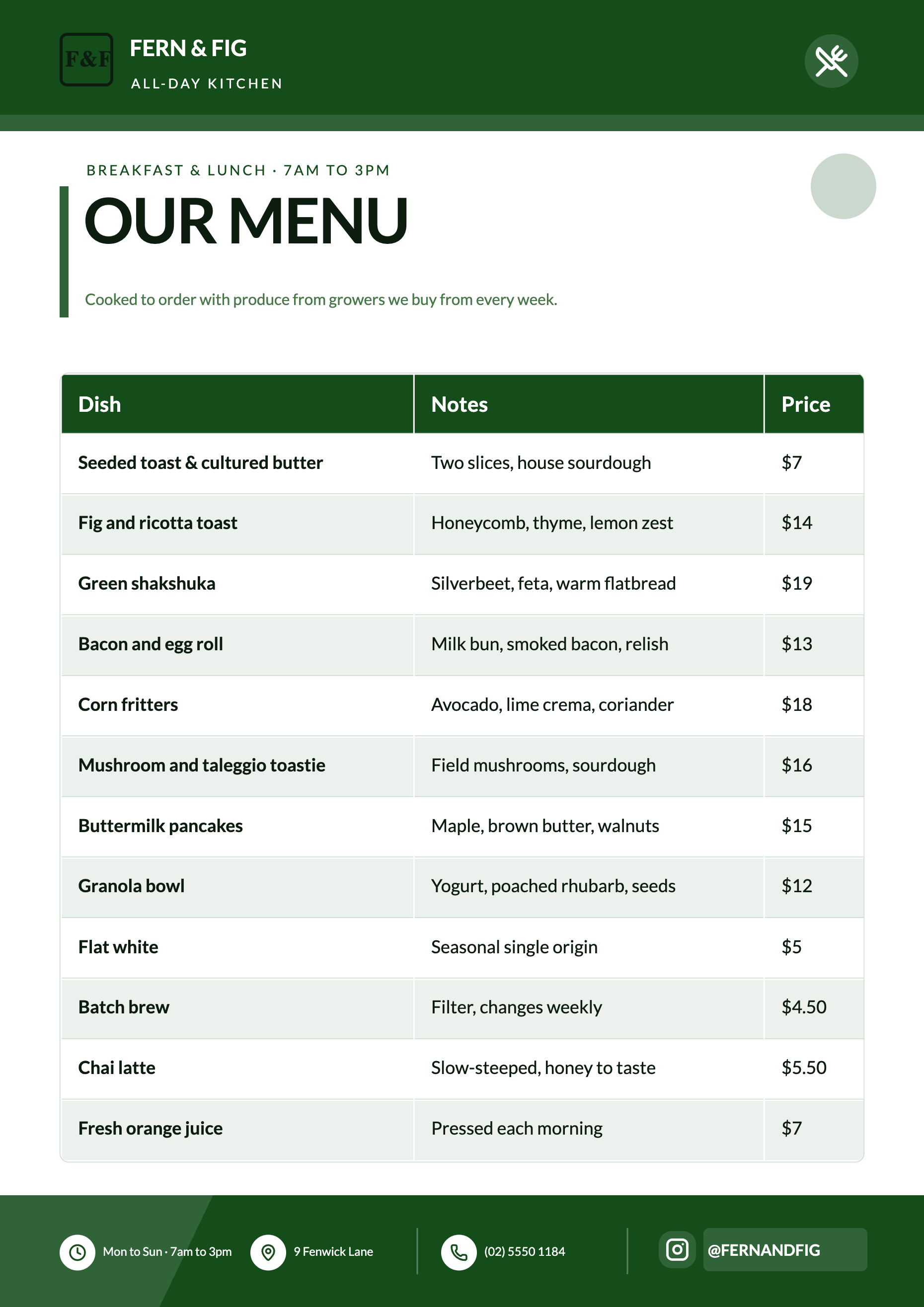
A table is the right block whenever a reader will compare one line against another: services against prices, sizes against costs, sessions against times. It is the wrong block when there are only two values, and knowing which side of that line you are on saves a lot of layout work.
Three starting shapes, then grow it
The element panel offers a two by two, a three by three and a four by four. Which you pick barely matters, because the inspector adds and deletes columns and rows freely afterwards. What it does set is the block's height on the canvas, which grows with the row count, so a four row table lands taller than a two row one.
The theme paints it, not you
An inserted table arrives with its header band on the brand colour and its header text in the colour guaranteed to read against it, alternate rows on a tinted surface and hairline dividers between them. All four are theme tokens, so changing the theme repaints the whole table. There is no fill or border control in the inspector to override any of it.
Every cell is left aligned
There is no per column alignment setting and none is coming from the design either. Money, quantities and dates sit left, the same as text, which means a column of prices will not stack on its decimal point. The workaround is to keep the price column narrow, so the figures start close together, or to write prices at a consistent width.
Column widths are dragged, not typed
In edit mode a resize grip appears between each pair of headers. Drag it and the widths are stored as proportions rather than fixed pixels, so they hold when the table is resized and when the page changes canvas size. It is the one piece of table geometry you control directly, and it is worth spending a minute on: a wide service column and a narrow price column reads far better than four equal ones.
The caption is where the fine print goes
A table has an optional caption that renders italic and right aligned under the last row in the muted ink colour. It is the natural home for prices include GST, valid until 30 June or minimum charge applies, which otherwise ends up crammed into a cell and diluting the numbers around it.
How it works, in three steps
Step 1
Insert a table and name the columns
The column set is the design. Two or three columns is comfortable on a flyer read from a distance.
Step 2
Add rows and type the values
Each row has a delete control beside it, and each column has one above it, so pruning is as quick as adding.
Step 3
Drag the widths and add a caption
Give the label column the room and the price column the minimum. Put the conditions in the caption.
The full walkthrough with screenshots is in the guide Add charts and diagrams to a flyer.
Limits worth knowing
- Every cell is left aligned and there is no alignment control, so numbers do not right align.
- Nothing is calculated. A total is a row you type.
- Table colours come from theme tokens with no fill, stripe or border override in the inspector.
- Column widths are set by dragging, not by entering a number.
- A table that outgrows its block does not paginate; you resize the block or split the content across two tables.
See it on a finished piece
Questions people ask
Can I right align the price column?
No. There is no alignment setting for a flyer table. Narrowing the price column so the figures start close to each other is the practical substitute.
How many rows fit on a flyer?
As many as the block is tall enough to show. The block grows as you add rows only at the moment of insertion, so after that you drag it larger yourself or shorten the list.
Will it total my prices?
No. Type the total as its own row. The table is a layout block, not a spreadsheet.
Does the table restyle when I change theme?
Completely. The header fill, header text, alternating row tint and dividers are all tokens, so the table follows the palette without any rework.
Make your own flyer
The button opens the generator with this use case already described. Change the wording to match yours, generate, then edit anything you like.
Create a flyer with OneCraftRelated pages
Sale badge on a flyer
A sale badge is a small promise: new, half price, this weekend only. Two elements do that job here, a badge and a chip, and they are pill shaped text blocks that take their colour from the theme rather than stickers you drag off a shelf. That has consequences worth knowing before you place one.
Flyer with a map
Most people searching for a map on a flyer want the corner their shop is on. That is not what this block does. It is a world map you colour country by country, which is the right tool for showing reach and the wrong tool for showing an address, and the difference is worth five minutes before you build.
Turn a price list into a flyer
A price list is easy to write and hard to lay out. The awkward part is not the design, it is arithmetic: a flyer slot holds a fixed number of rows, and your list almost certainly has more than that. Knowing the budget before you start decides whether you get a menu or a mess.
More finished work of this kind is on the flyer examples hub.
Written and checked by the OneCraft team. Last checked .