Presentations
Add a logo to slides
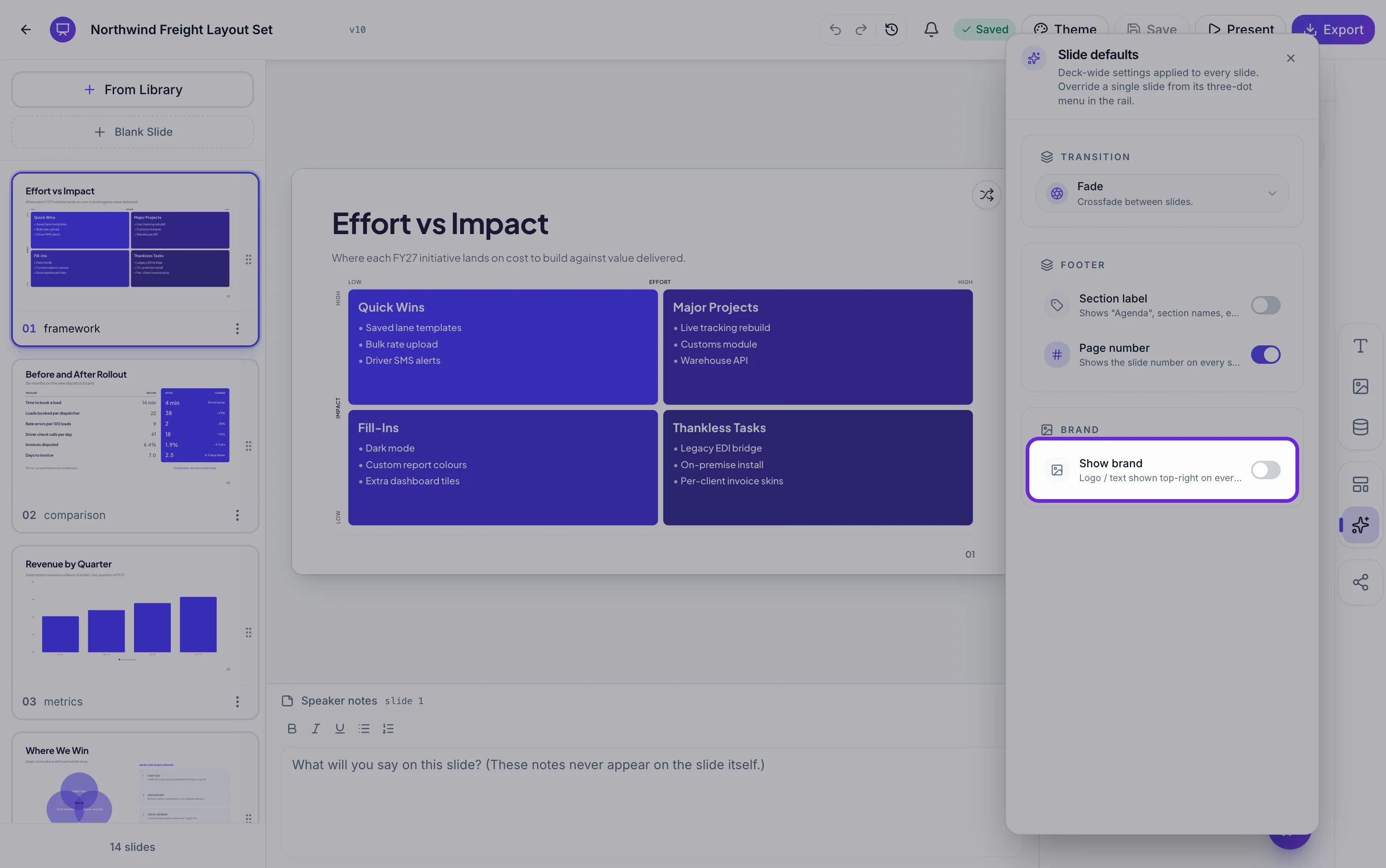
One control puts your brand mark on the deck. It lives in the same panel as the transition and footer settings, applies at deck level, and offers exactly the decisions worth making: what to show, how big, and on how many slides.
Logo, text, or both
Three modes. Logo shows the image you upload. Text shows a wordmark you type, which is useful when your brand is a name rather than a mark, or when the logo file is not to hand. Both puts the image beside the text. Switching modes does not delete anything, so you can upload a logo, try text only, and go back.
Two sliders, and they matter more than they look
Width runs from 80 to 700 pixels and height from 32 to 260, on a canvas 1920 pixels wide. A horizontal logo starts at 360 by 72 and a vertical one at 180 by 112, so switching the orientation setting changes the starting size as well as the arrangement. Set it once and look at your busiest slide, because a logo that reads well over a cover can be overbearing over a dense table.
First slide or all slides
The scope control decides whether the brand mark appears only on slide one or on every slide in the deck. Cover only is the right answer more often than people expect, particularly for a deck you are presenting yourself, where the audience already knows who you are after the first ten seconds. Every slide earns its place when the deck will be forwarded, printed or read without you.
Where it sits, and why it never collides
Top right, inset 48 pixels from the top and 64 from the right, layered above the footer and marked so it never intercepts a click. It does not move and cannot be dragged, which is deliberate: the layouts were designed knowing something might sit there, so the top right corner is kept clear across the catalogue. If you need a mark somewhere else on one slide, drop an image element on that slide instead.
A soft shadow for logos on photographs
There is a single shadow toggle for the logo, and its one real job is a white or light logo sitting over a photograph or a mid tone panel, where it would otherwise disappear at the edges. Leave it off everywhere else. Upload takes JPEG, PNG, WebP and GIF up to 10 MB, and a PNG with a transparent background is what you want here.
How it works, in three steps
Step 1
Open the slide defaults panel
Same panel as the transition and footer settings, in the left rail. Turn on Show brand.
Step 2
Upload and size it
A transparent PNG works best. Set the orientation first, then the width and height sliders.
Step 3
Choose the scope
First slide for a deck you present yourself. All slides for one that will be forwarded or printed.
The full walkthrough with screenshots is in the guide Make a pitch presentation with AI.
Limits worth knowing
- The position is fixed at the top right. It cannot be moved to another corner.
- One logo per deck. There is no second mark for a partner or client brand.
- Scope is first slide or all slides. There is no per slide on and off.
- Logo uploads take JPEG, PNG, WebP and GIF up to 10 MB. No SVG.
See it on a finished piece



Questions people ask
Can I put the logo in the bottom left?
No. The brand mark is anchored top right across every layout, which is what keeps it from colliding with content. For a mark elsewhere on one slide, drop an image element on that slide.
Can I upload an SVG?
No. JPEG, PNG, WebP and GIF are accepted. A transparent PNG at a generous size is the practical equivalent.
Should I show it on every slide?
Only if the deck will be read without you. If you are presenting it live, the cover carries the branding and every slide after that is just repetition.
How do I add a client logo as well as ours?
The brand setting holds one mark. Put the second one on the cover as an image element, or use a profile layout, some of which carry a row of client logos.
Make your own presentation
The button opens the generator with this use case already described. Change the wording to match yours, generate, then edit anything you like.
Create a presentation with OneCraftRelated pages
Logo watermark on video
A watermark here is not a corner bug stamped over the whole video. It appears after the opening scene, holds through the middle at partial opacity, and fades out before the closer, because those two scenes are already carrying the brand and a mark on top of a wordmark reads as a mistake.
Add your logo to a flyer
A logo slot is a different kind of box from a photo slot. It shows an uploaded image if there is one, and a monogram built from your name if there is not, and there is no generate button on it at all.
Framework slides
A framework slide borrows a structure the audience already knows, so the argument arrives half understood. Twenty three layouts carry named models, from SWOT and PESTEL to Porter's five forces, Ansoff, the Kano model and a fishbone, each with the cell labels already in place.
More finished work of this kind is on the presentation examples hub.
Written and checked by the OneCraft team. Last checked .