Presentations
Org chart slides
An org chart on a slide is not the org chart. It is the part of the structure the audience needs for the next ten minutes, which is almost never the whole company. The component is built for that: three levels, capped, and readable from the back.
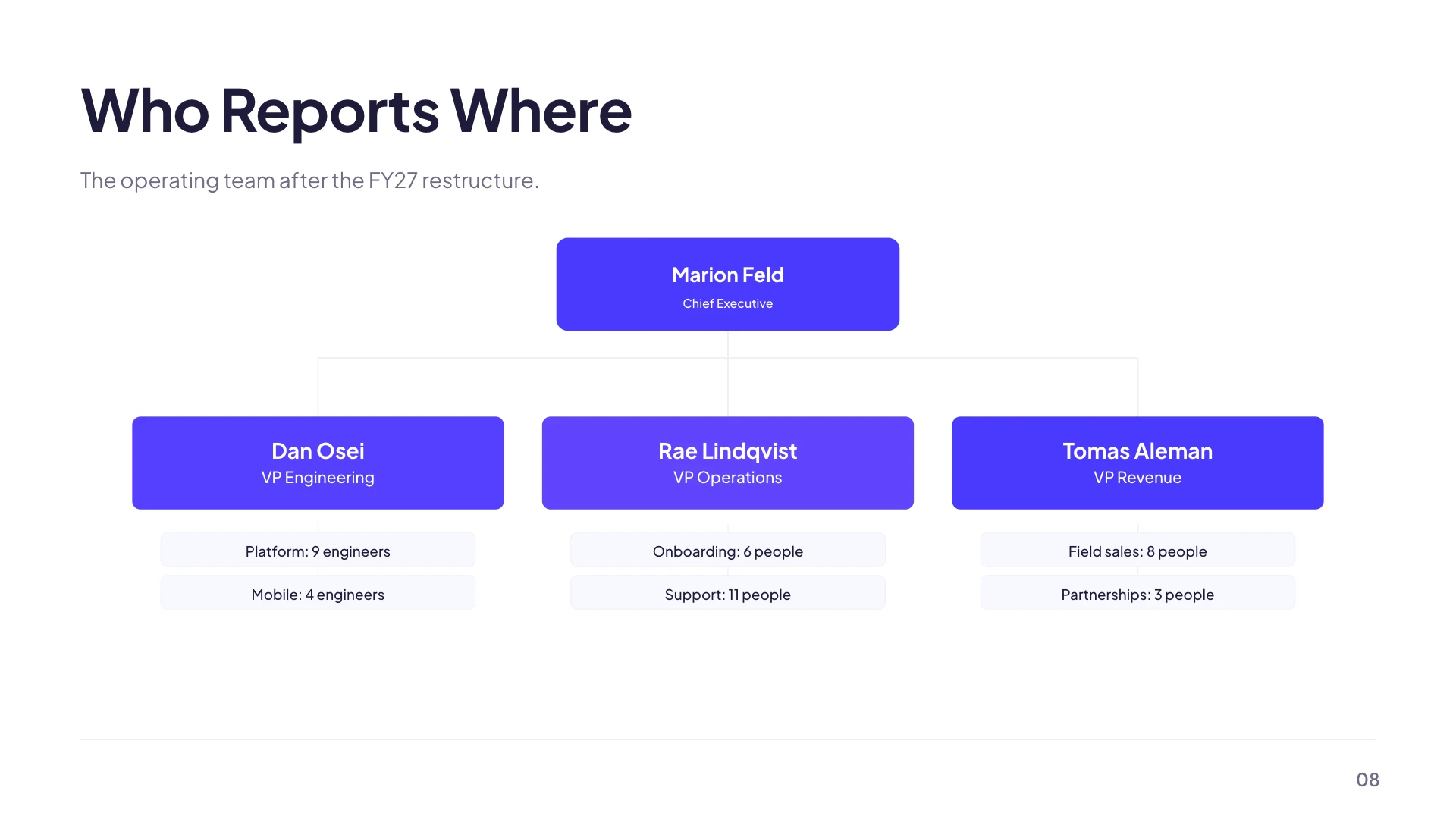
Three levels, and the numbers that matter
A root box at the top, a row beneath it holding up to six boxes, and under each of those up to four small pills. That is the shape. Beyond six in the middle row the extras are not drawn, and beyond four leaves under a box the same applies, so the caps are worth knowing before you type a division with nine teams in it.
It resizes itself as you cut people
The middle row divides the available width between however many boxes it has, so three boxes are wide and six are narrow. The type scales with the box width rather than staying fixed, which means deleting a team does not leave a gap, it makes the survivors bigger and more legible. That is the opposite of what most chart tools do and it rewards trimming.
Fill the root or the chart says nothing
The org chart is one of the shapes that carries a hub, and the editor exposes it as a Root node field with its own label and description. Leave it empty and you have a row of teams floating under an empty box. Put the division, the function or the person at the top in it and the reporting line becomes the claim the slide is making.
For a big organisation, show the slice
Two hundred people do not go on a 16 by 9 slide at a readable size, and shrinking the type until they do is how a deck loses a room. Pick the branch that matters, put the rest behind a single box labelled with a count, and if somebody asks, that is what the appendix or the linked document is for. Alternatively run two slides, one for the shape of the company and one for the team in question.
When you want faces instead of boxes
There are ten layouts filed under profile built for people rather than structure: single person bios with a headshot, name, position and biography sections, and team grids that hold a set of members with optional advisers and client logos. If your slide is really introducing the team rather than explaining who reports to whom, that family is the better fit and the org chart is the wrong component.
How it works, in three steps
Step 1
Add the org chart
Either the Grouping: Org Chart layout from the library, or the Org Chart tile from the element library's Diagrams section.
Step 2
Name the root
The Root node field in the inspector. Division, function or person, whichever the slide is actually about.
Step 3
Trim to six
Six boxes in the middle row is the ceiling and four is more readable, because the boxes get wider and the type grows with them.
The full walkthrough with screenshots is in the guide Add charts, maps and diagrams to slides.
Limits worth knowing
- Three levels only: root, a row of up to six, and up to four leaves under each.
- Boxes beyond those caps are not drawn. Nothing warns you, so count before you paste.
- There is no photo in an org chart box. For headshots use one of the ten profile layouts instead.
- Three library layouts, all filed under the tree purpose, are org charts: the org chart and the wide org chart with six reports draw the real diagram and are fixed to it, while the four column departments layout uses numbered hex columns instead of connected boxes.
See it on a finished piece


Questions people ask
How many people fit on one org chart slide?
One root, six in the second row and four under each of those, so thirty one boxes at the absolute maximum. Half that is readable from the back of a room. For a larger team, show the branch that matters and put the rest behind a single box labelled with a head count, then keep the full chart for the appendix or a linked document.
Can I show a fourth level?
No. The renderer draws three levels: a root, a row of up to six, and up to four leaves under each. A deeper structure needs a second slide that repeats one branch as its own root, or a tree layout showing that branch in detail. Starting each extra slide from the manager of the branch keeps the reporting line clear across the pair.
Can I put photographs in the boxes?
Not in the org chart, whose boxes and pills hold text only. The profile family of layouts is built for headshots, names, roles and short biographies, and there are ten of them, from single person bios to team grids with optional advisers. If the slide is introducing people rather than explaining who reports to whom, that family is the better fit.
Does deleting a team make the others bigger?
Yes. The middle row splits the available width between whatever boxes remain, and the type size scales with the box width rather than staying fixed, so trimming genuinely improves legibility. Three teams get wide, easy to read boxes where six get narrow ones. Cutting a team you do not need to discuss is the quickest way to make the rest readable.
Make your own presentation
The button opens the generator with this use case already described. Change the wording to match yours, generate, then edit anything you like.
Create a presentation with OneCraftRelated pages
Diagram slides
A diagram here is a list of labelled items and a decision about how to arrange them. Twelve arrangements are available and they all read the same list, so a funnel becomes a pyramid without you retyping anything.
Flowchart slides
A flowchart is the one diagram where the connections carry as much meaning as the boxes. This component treats them that way: nodes and connections are separate lists, positions are computed for you, and then you move things until it reads.
Slide page numbers and section labels
The strip along the bottom of most slides carries two pieces of navigation: a section label on the left telling the audience where they are, and a page number on the right telling them how far in. Both are supplied automatically and one of them is worth editing.
More finished work of this kind is on the presentation examples hub.
Written and checked by the OneCraft team. Last checked .