Presentations
Timeline slides
Time on a slide has more than one honest shape. A run of milestones wants a rail. A set of phases with detail under each wants columns. A history with unequal gaps wants a vertical list. Twenty layouts cover those cases, and choosing badly is what makes a timeline unreadable.
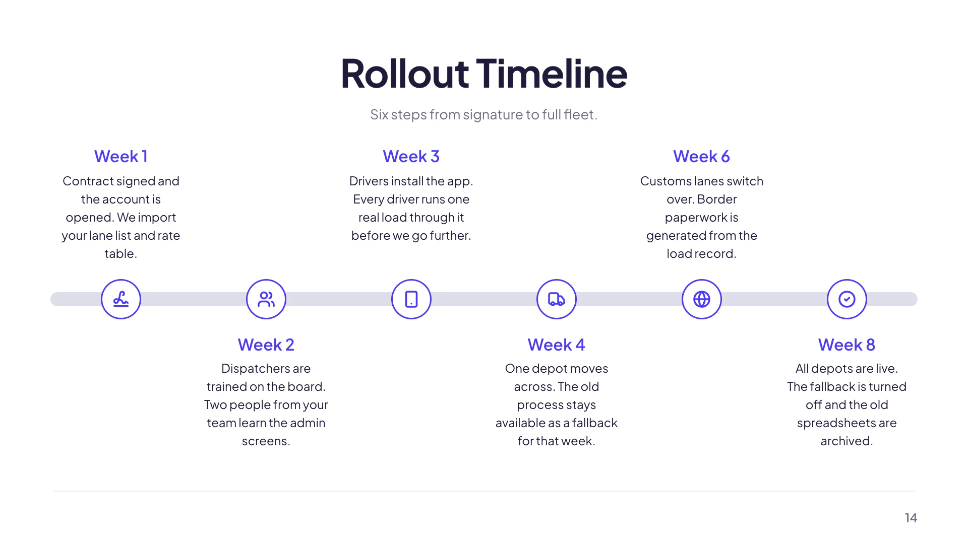
Horizontal rails, for four to seven milestones
A line across the slide with points on it, sometimes alternating above and below, sometimes numbered, sometimes as a road or a staircase climbing left to right. This family reads instantly and holds four, five, six or seven points depending on the layout. Past seven the labels collide, which is why no layout in the family offers more.
Vertical rails, for uneven gaps and longer text
A dotted rail down the left with entries beside it, or phases stacked as rows. Vertical is the better shape when each entry needs a sentence rather than three words, and when the intervals are not even, because a horizontal rail implies equal spacing whether or not that is true. Company histories and project retrospectives usually belong here.
Quarter columns, for a plan rather than a history
Four columns, one per quarter, each holding a stack of bullets. This is the shape for what we will do rather than what happened, because it lets each period carry several parallel items instead of a single milestone label. A phased development table and a quarterly roadmap table do the same job in a grid where the rows are workstreams.
How a timeline differs from a Gantt
A timeline puts one thing at each point in time. A Gantt puts bars that span several periods and overlap each other. If nothing in your plan runs concurrently, a timeline is clearer and gives you far more room for words. If two phases genuinely overlap, and showing the overlap is the point, a Gantt is the right component. Four of the twenty timeline layouts are Gantts for exactly that reason.
Write the labels as outcomes
Phase 2 tells the audience nothing. Pilot with three stores tells them what will be true when the point is reached. The layouts give each point a short heading and a description line, and the discipline that makes a timeline useful is putting the outcome in the heading and the caveat in the description, rather than the other way round.
How it works, in three steps
Step 1
Count your periods first
Four to seven goes horizontal. More than seven, or long text per entry, goes vertical.
Step 2
Pick the layout from the library
Twenty are filed under timeline. The picker draws each one with your own content in it.
Step 3
Name the points as outcomes
What is true when the point is reached, not what stage the project is at.
The full walkthrough with screenshots is in the guide Add charts, maps and diagrams to slides.
Limits worth knowing
- Horizontal layouts top out around seven points. There is no layout for a fifteen milestone rail.
- Points are evenly spaced. The layout cannot represent a two year gap as wider than a two month one.
- A timeline point is a single item. For overlapping phases you need one of the four Gantt layouts.
- The number of points a layout holds is fixed by that layout, so adding an eighth means swapping to a different one.
See it on a finished piece

Slide examples
Finished single slides on this layout, each one built from a real template and written out in full.
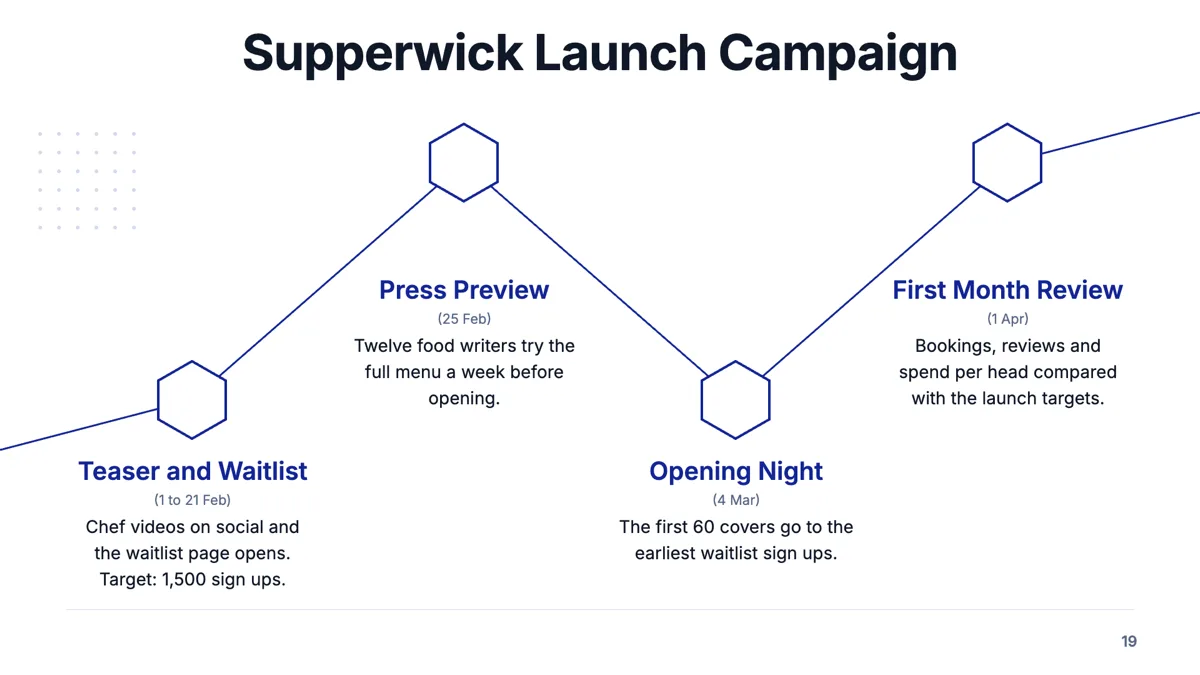
Campaign timeline slide with four launch milestones and their dates
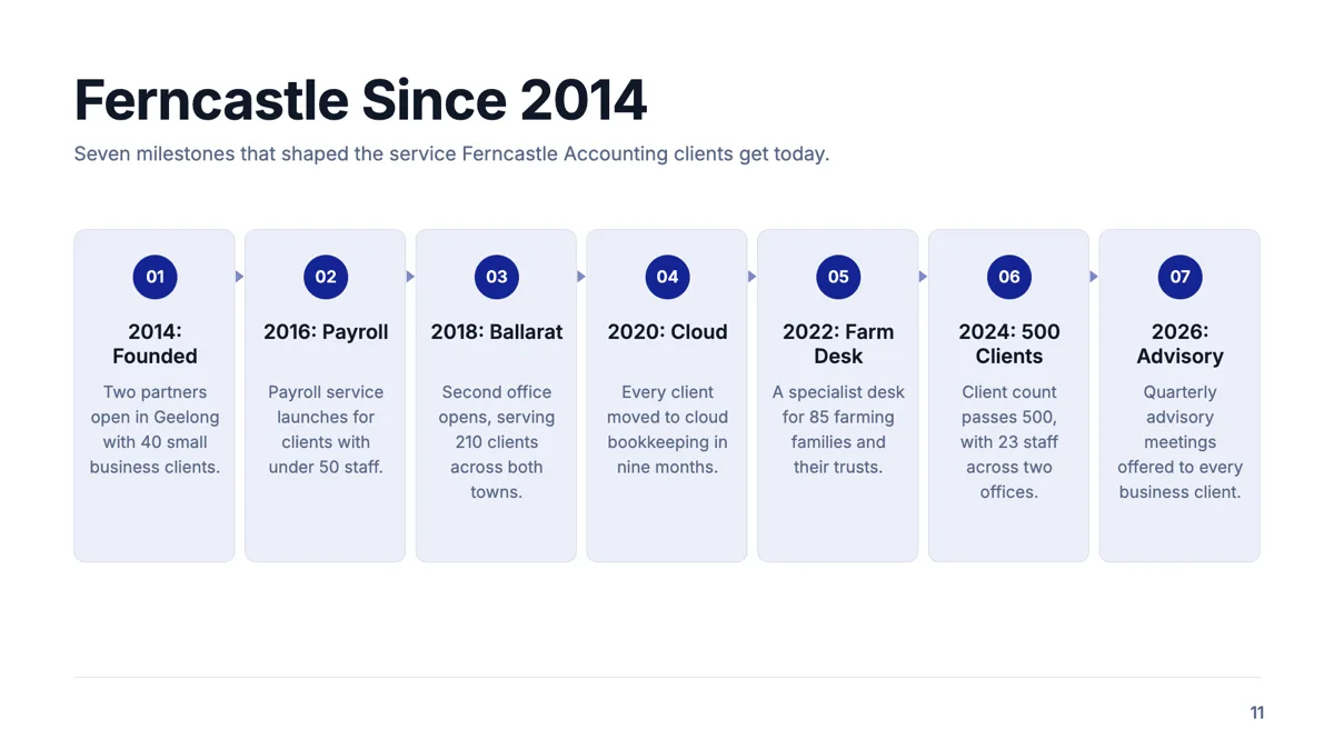
Company history slide with seven milestones that matter to clients
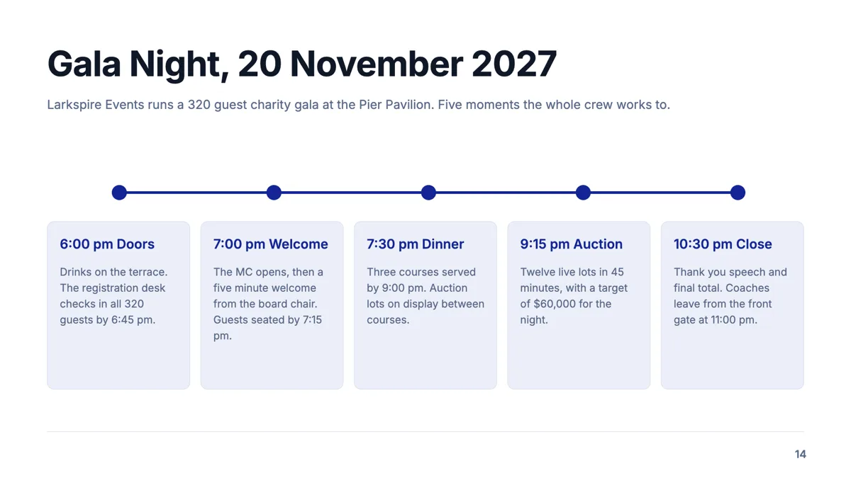
Event timeline slide with five timed moments on the night
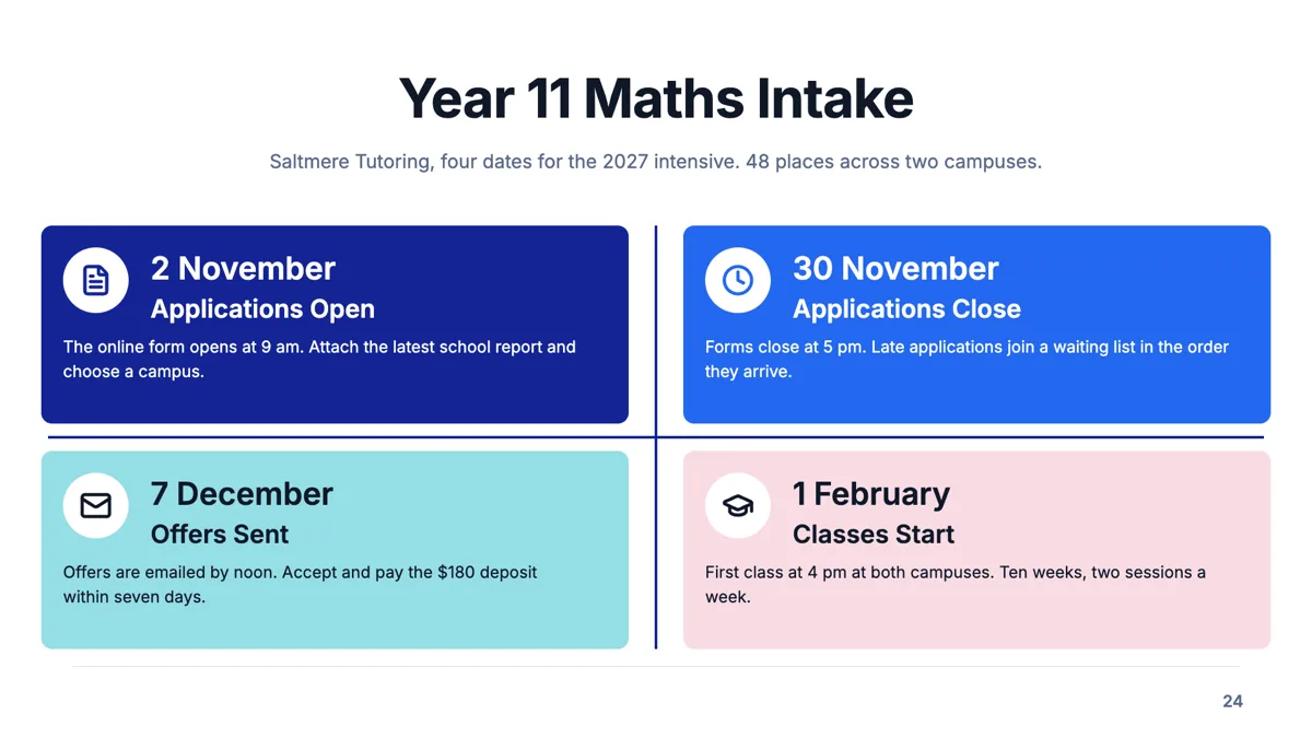
Four dates slide for a course intake with one task per date
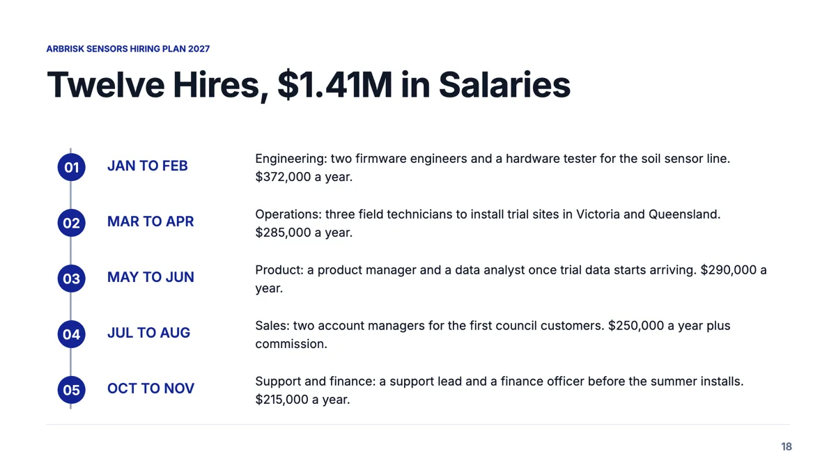
Hiring plan slide that sequences twelve roles and their cost
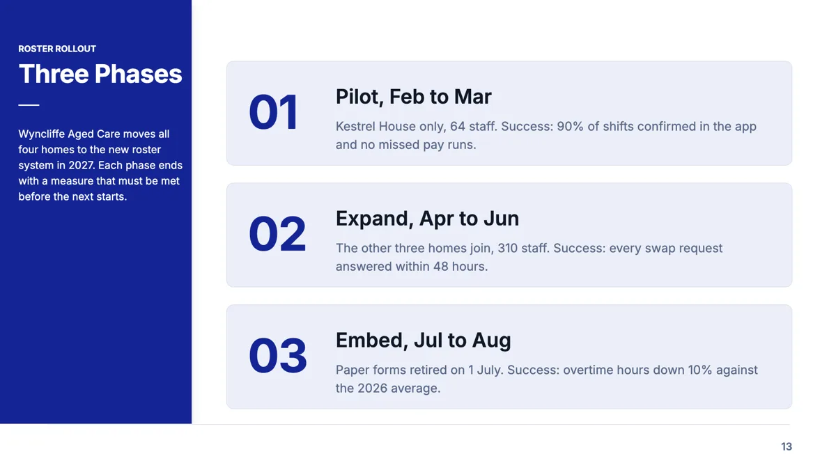
Implementation plan slide with a success measure for every phase
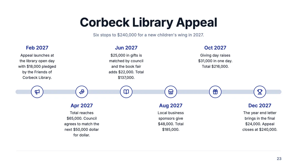
Milestone road slide with six dated stops and a running total
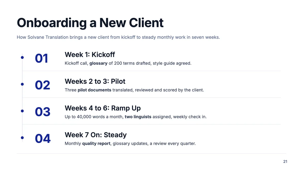
Numbered phases slide with three points under every phase
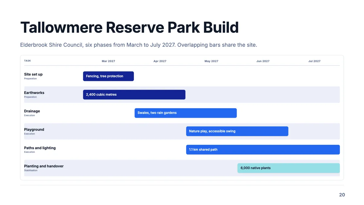
Phase gantt slide that shows where six phases overlap
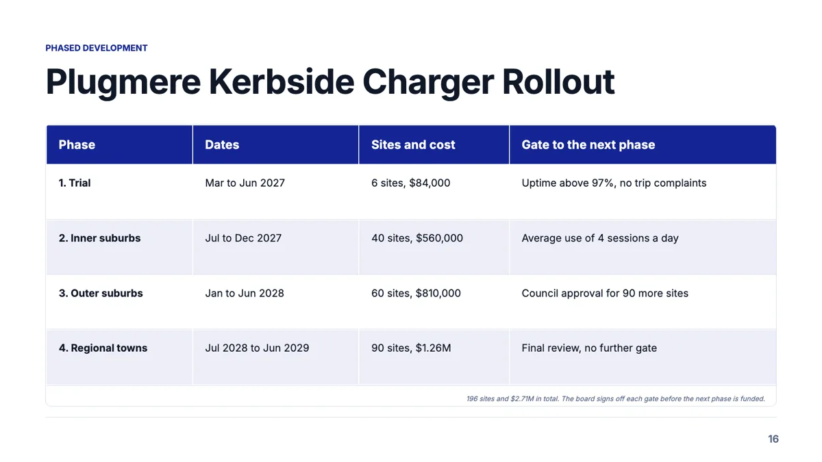
Phased development slide with a gate between every phase
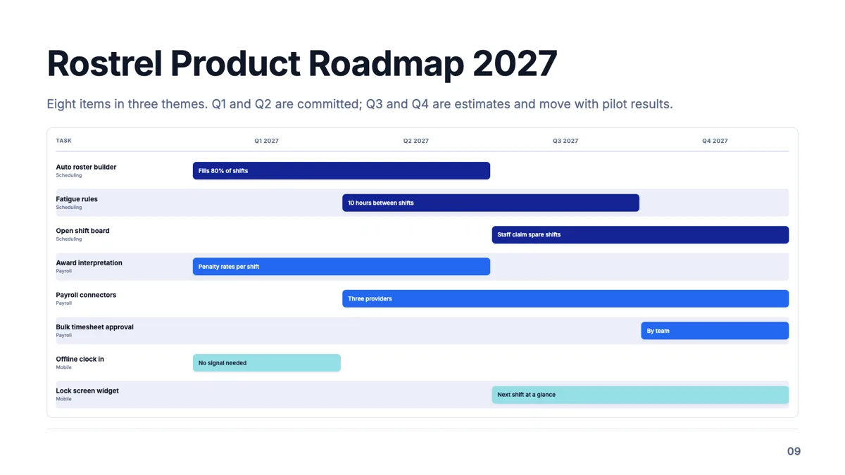
Product roadmap slide with eight items across four quarters
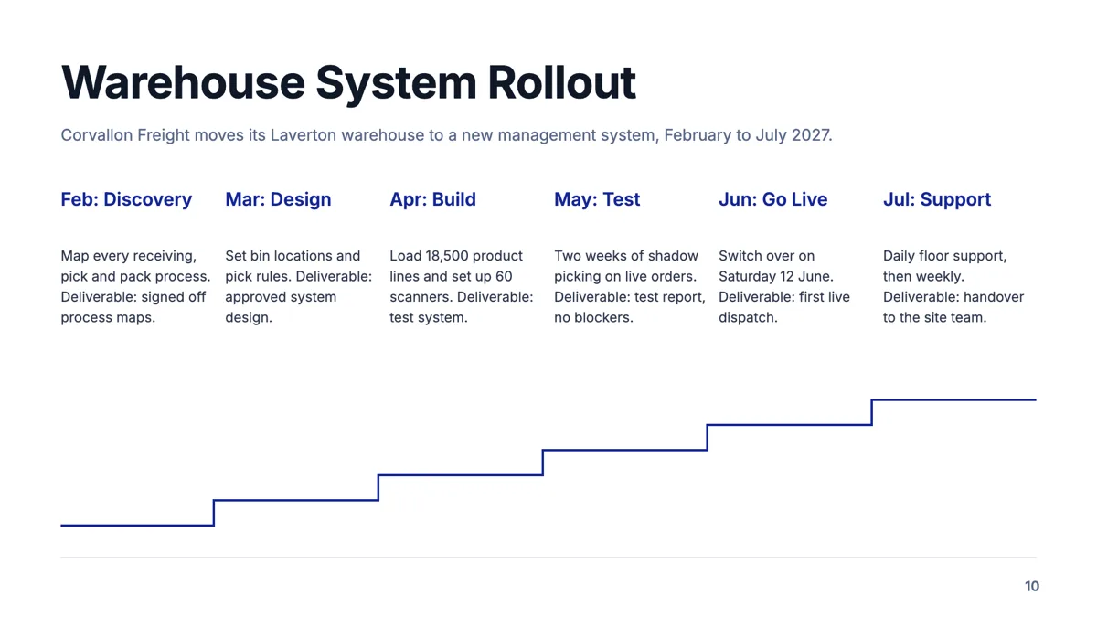
Project timeline slide with six phases and a deliverable each
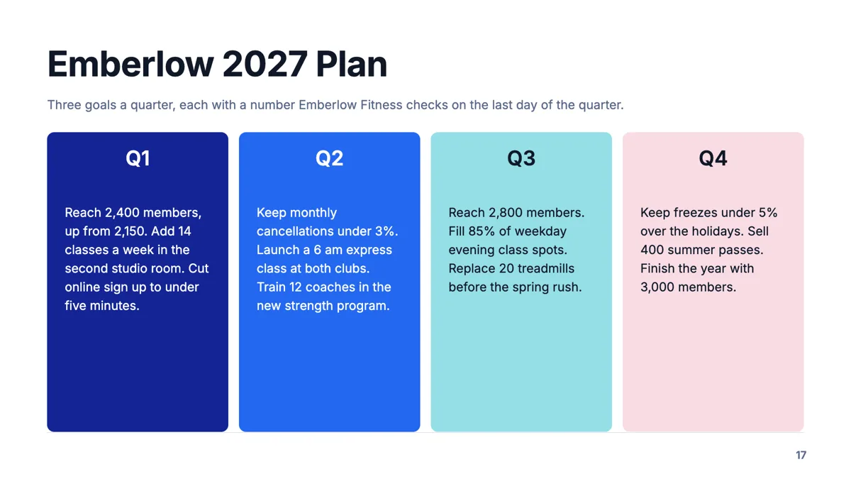
Quarterly plan slide with three measurable goals per quarter
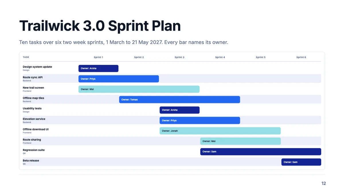
Sprint plan slide with ten tasks, six sprints and an owner on each bar
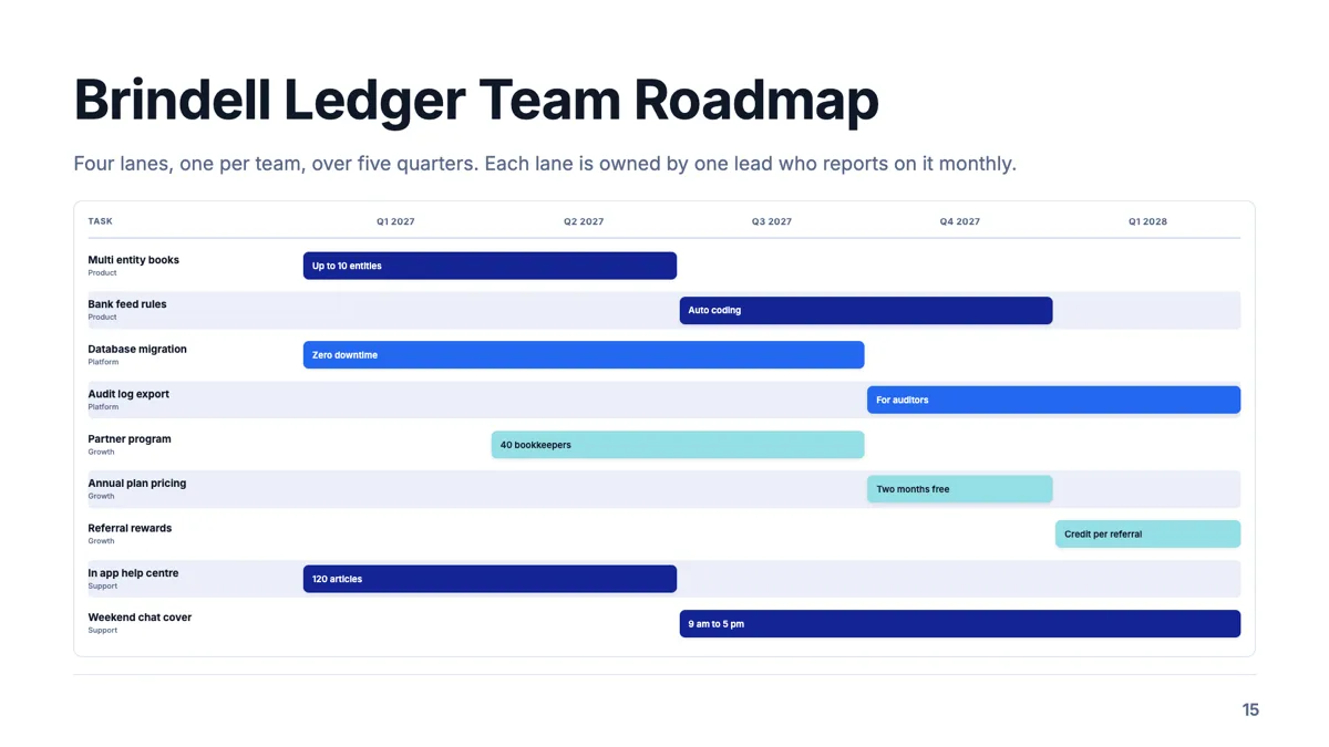
Swimlane roadmap slide with one lane per team
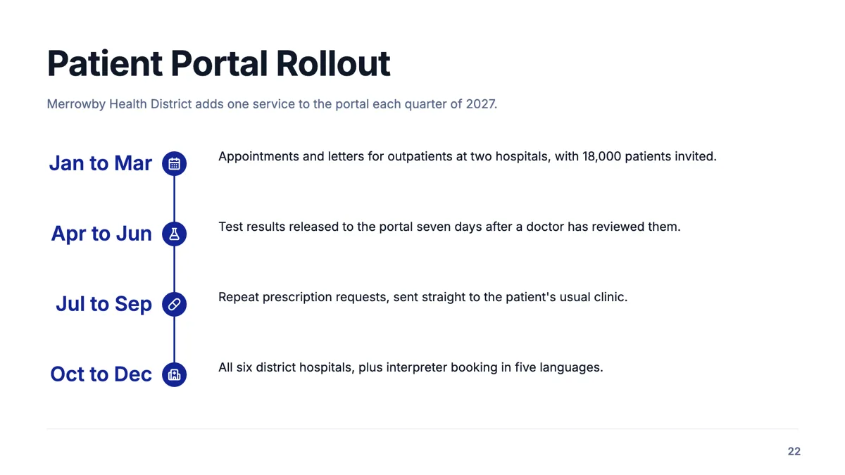
Vertical timeline slide with four phases down a spine
Questions people ask
Can I show uneven gaps between milestones?
Not by spacing. Every point is evenly placed. Put the real interval in the label, or use a vertical layout where equal spacing does not imply equal time.
Should I use a timeline or a Gantt?
A timeline when one thing happens at each point. A Gantt when phases run concurrently and the overlap is the message.
How many milestones fit on one slide?
Four to seven on a horizontal rail. Vertical layouts hold more because they scroll down the slide rather than across it.
Can I swap between timeline layouts without retyping?
Yes. They share a purpose, so the layout picker offers all twenty with your own content already drawn into each card, and picking one carries the content across.
Make your own presentation
The button opens the generator with this use case already described. Change the wording to match yours, generate, then edit anything you like.
Create a presentation with OneCraftRelated pages
Gantt chart slides
A Gantt on a slide is a communication object, not a plan. It exists to show an audience which things overlap and roughly when, which means the useful version has eight bars and readable labels, not two hundred rows exported from a scheduling tool.
Timeline in a document
A schedule buried in a paragraph is a schedule nobody checks. A timeline block takes the phases and their dates and lays them out in order, which is the one thing a client looks for in a proposal.
Reorder slides
The rail down the left is the deck's table of contents and its editing surface. Slides are dragged into a new order, duplicated, deleted, and each one shows the purpose it was built for, which is what makes the order easy to judge at a glance.
More finished work of this kind is on the presentation examples hub.
Written and checked by the OneCraft team. Last checked .