Presentations
Gantt chart slides
A Gantt on a slide is a communication object, not a plan. It exists to show an audience which things overlap and roughly when, which means the useful version has eight bars and readable labels, not two hundred rows exported from a scheduling tool.
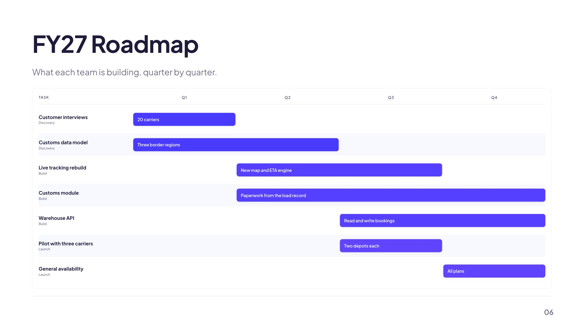
Four grids already sized for a real horizon
A quarterly roadmap across Q1 to Q4 holding up to eight bars. A phase rollup across five months holding six. A sprint plan across six sprints holding ten. A swim lane roadmap across five quarters, from Q1 2026 to Q1 2027, holding twelve. Those caps are set per layout because a bar chart with twelve rows in the space designed for six is unreadable rather than dense.
A bar is a start column and an end column
There are no dates. Each task names the column it starts in and the column it ends in, inclusive, so a task that starts and ends in the same column occupies one cell. Setting a start later than the end is not possible, because the end follows the start up automatically. That coarse model is the point: it makes the slide say this happens in Q2 and Q3 rather than inviting an argument about the fourteenth.
Groups do the colouring
Each task takes an optional group name, and tasks sharing a group share a colour drawn from the theme. Type Engineering on three tasks and they become one visual workstream. The field offers your existing group names as you type so you do not end up with Engineering and engineering as two different colours. Leave it empty and every bar takes the same colour, which is right for a simple phase plan.
Column labels are yours to rename
Q1 to Q4 is a default, not a constraint. The inspector opens a list of the column headings and each is editable, so the same grid becomes Week 1 to Week 5, Stage 1 to Stage 4, or the actual month names. The number of columns is fixed by the layout, so choose the layout by how many periods you need rather than planning to add one later.
There are no dependency arrows
Tasks carry a name, a start, an end, an optional group and an optional description. There is no link between two tasks and nothing draws an arrow from the end of one bar to the start of another. If a dependency is the point of the slide, write it into the description or say it in the flow of the talk. For a genuine dependency graph, a flowchart is the component that has edges.
How it works, in three steps
Step 1
Pick the grid by its horizon
Quarters, months or sprints. The column count comes with the layout, so start from the right one.
Step 2
Add tasks with a start and an end column
The counter in the inspector shows how many you have against the cap for that layout.
Step 3
Group the related ones
Typing the same group name on several tasks gives them a shared colour and turns a list of bars into workstreams.
The full walkthrough with screenshots is in the guide Add charts, maps and diagrams to slides.
Limits worth knowing
- No dependencies. Tasks cannot be linked and no arrows are drawn between bars.
- No real dates. A bar is placed by column index, so the smallest unit is one column.
- Task caps are set per layout: six, eight, ten or twelve depending on which you choose.
- The column count is fixed by the layout. You can rename the headings but not add a sixth column to a five column grid.
See it on a finished piece
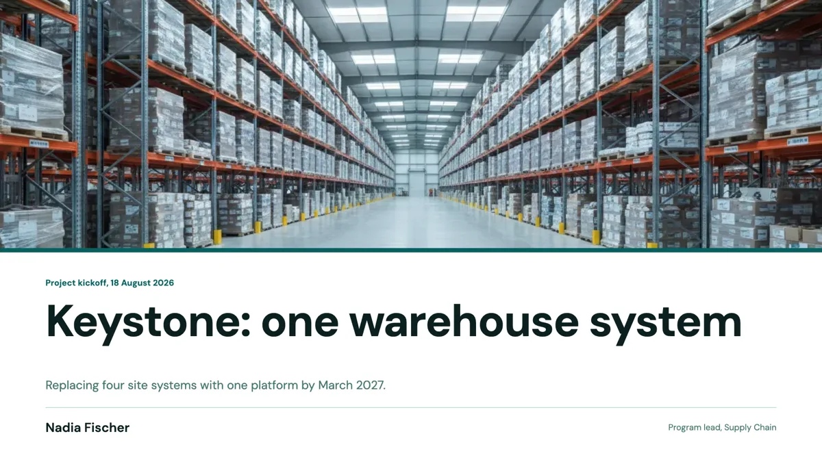


Slide examples
Finished single slides on this layout, each one built from a real template and written out in full.
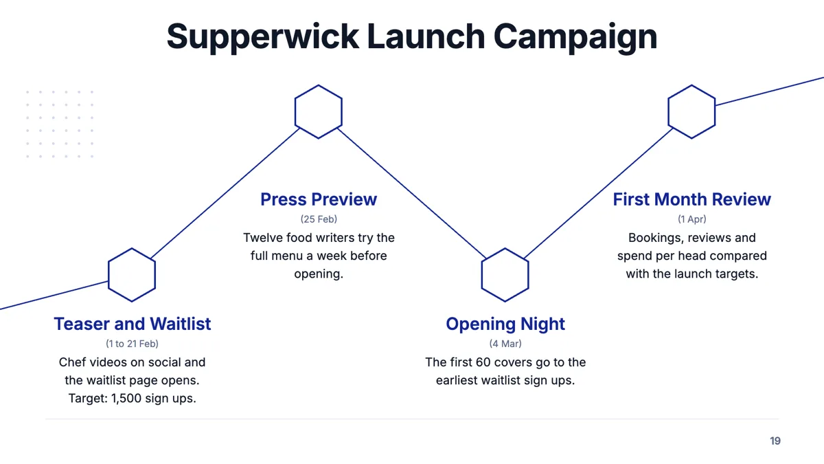
Campaign timeline slide with four launch milestones and their dates
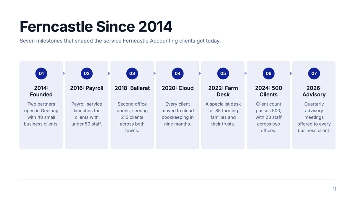
Company history slide with seven milestones that matter to clients
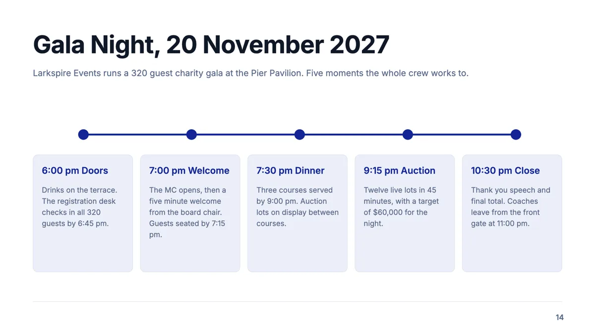
Event timeline slide with five timed moments on the night
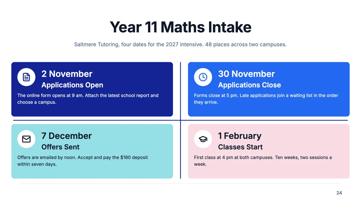
Four dates slide for a course intake with one task per date
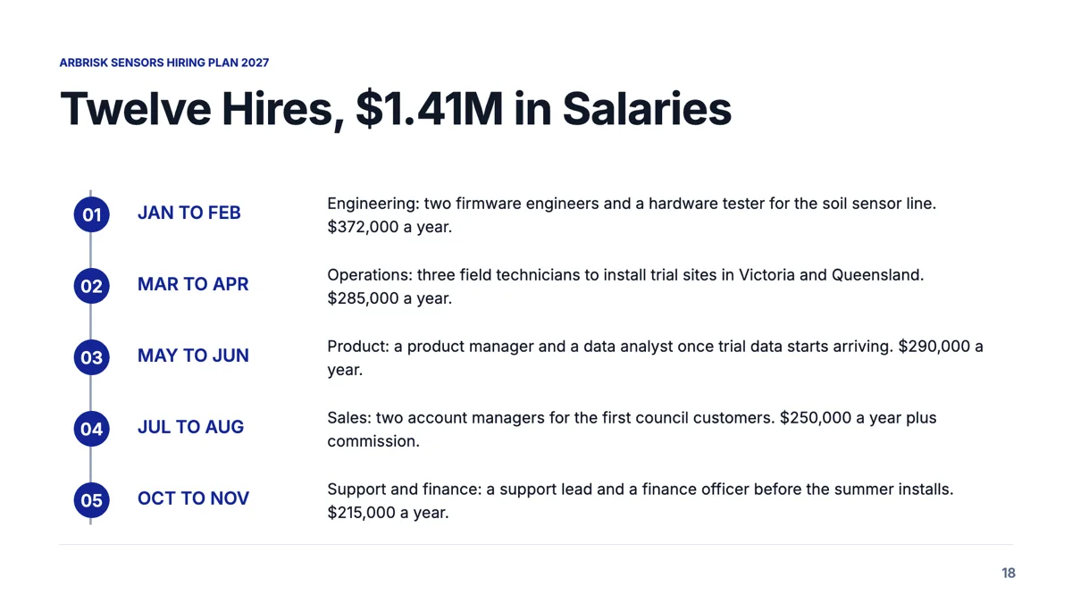
Hiring plan slide that sequences twelve roles and their cost
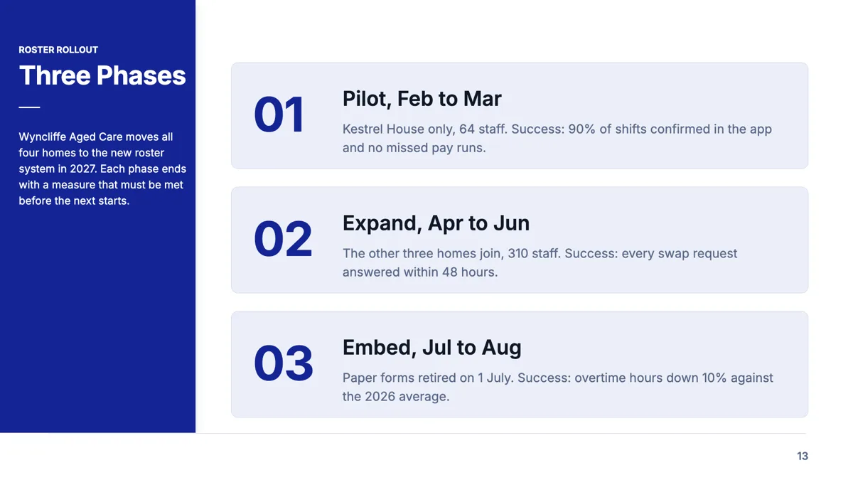
Implementation plan slide with a success measure for every phase
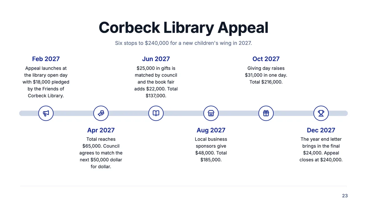
Milestone road slide with six dated stops and a running total
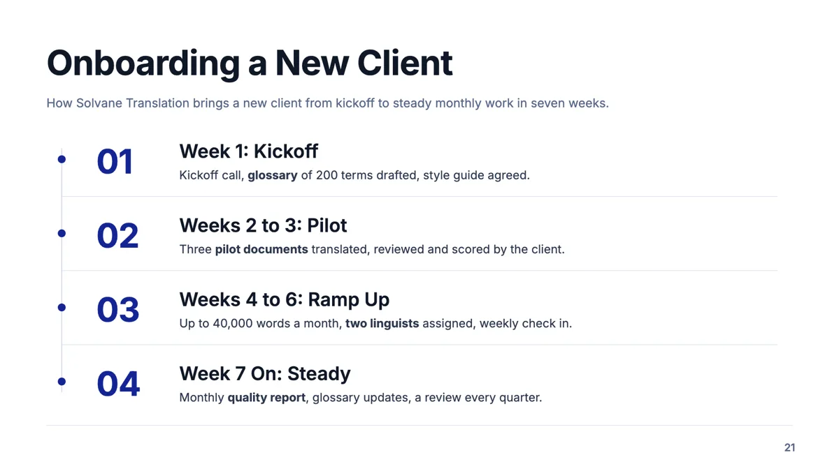
Numbered phases slide with three points under every phase
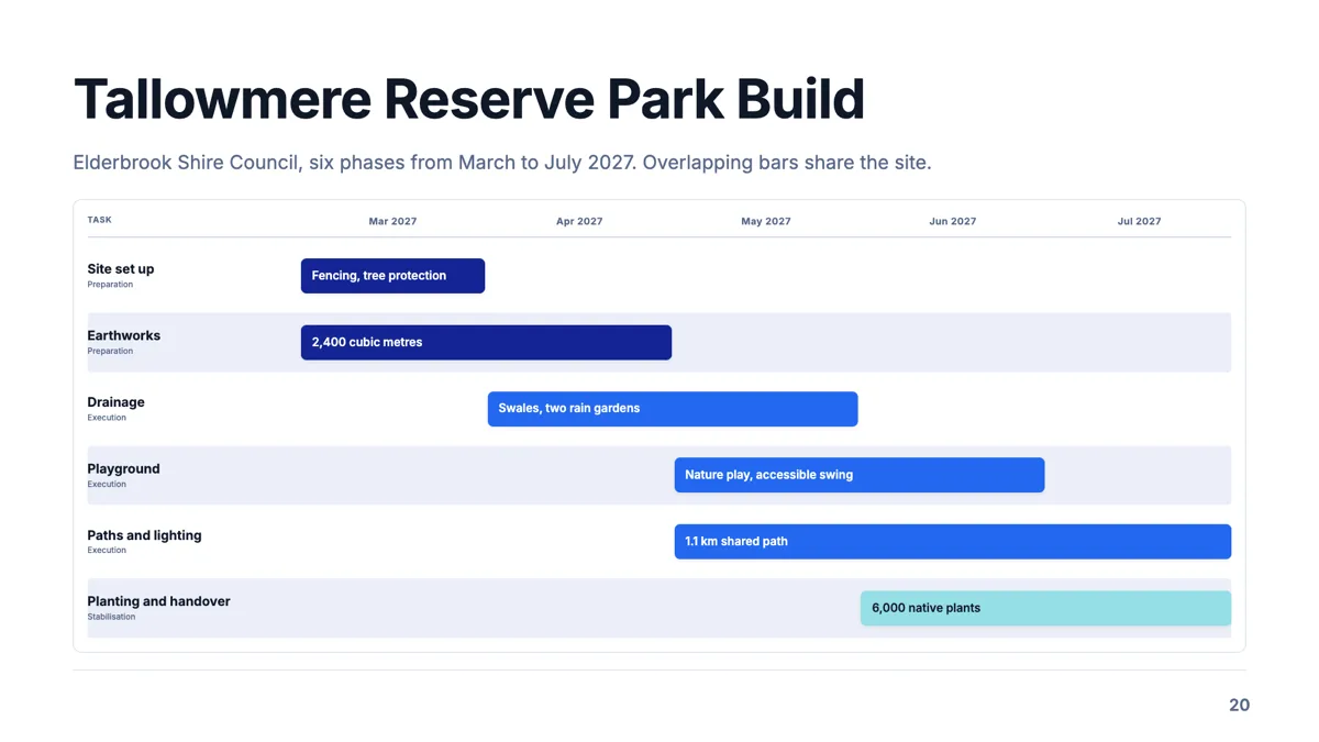
Phase gantt slide that shows where six phases overlap
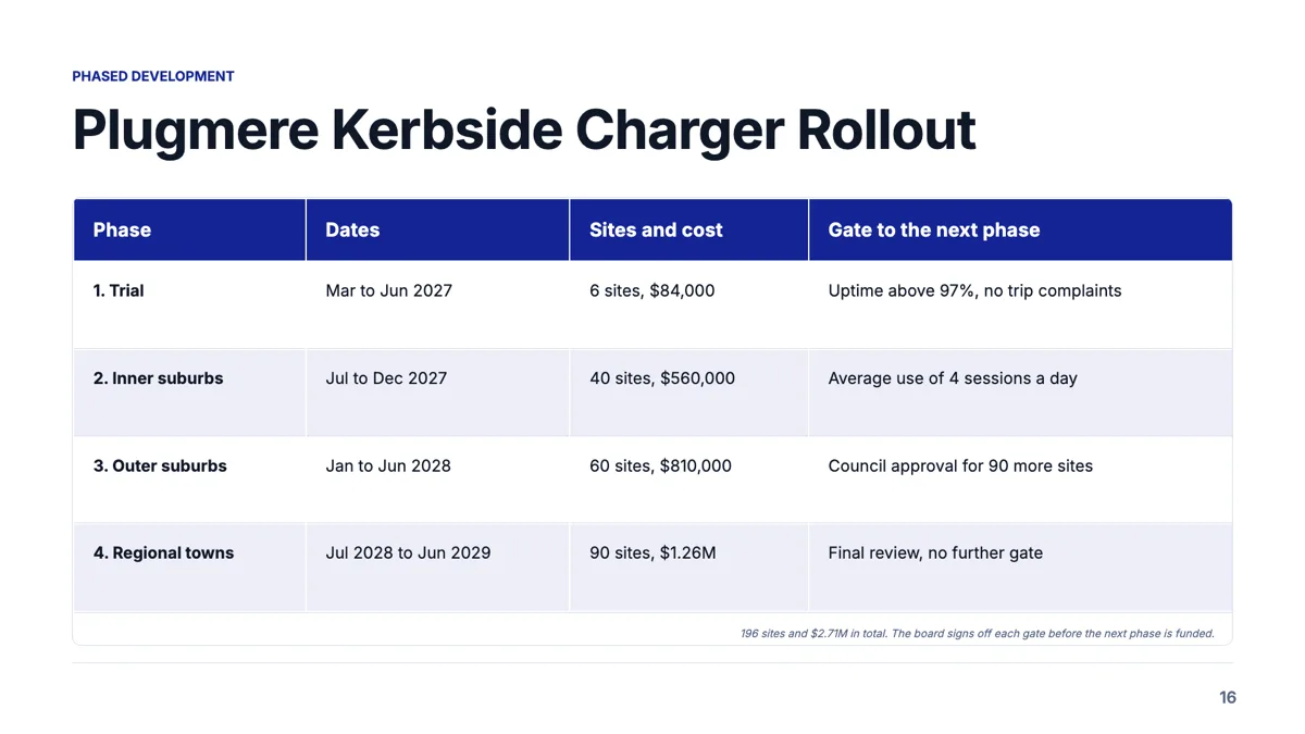
Phased development slide with a gate between every phase
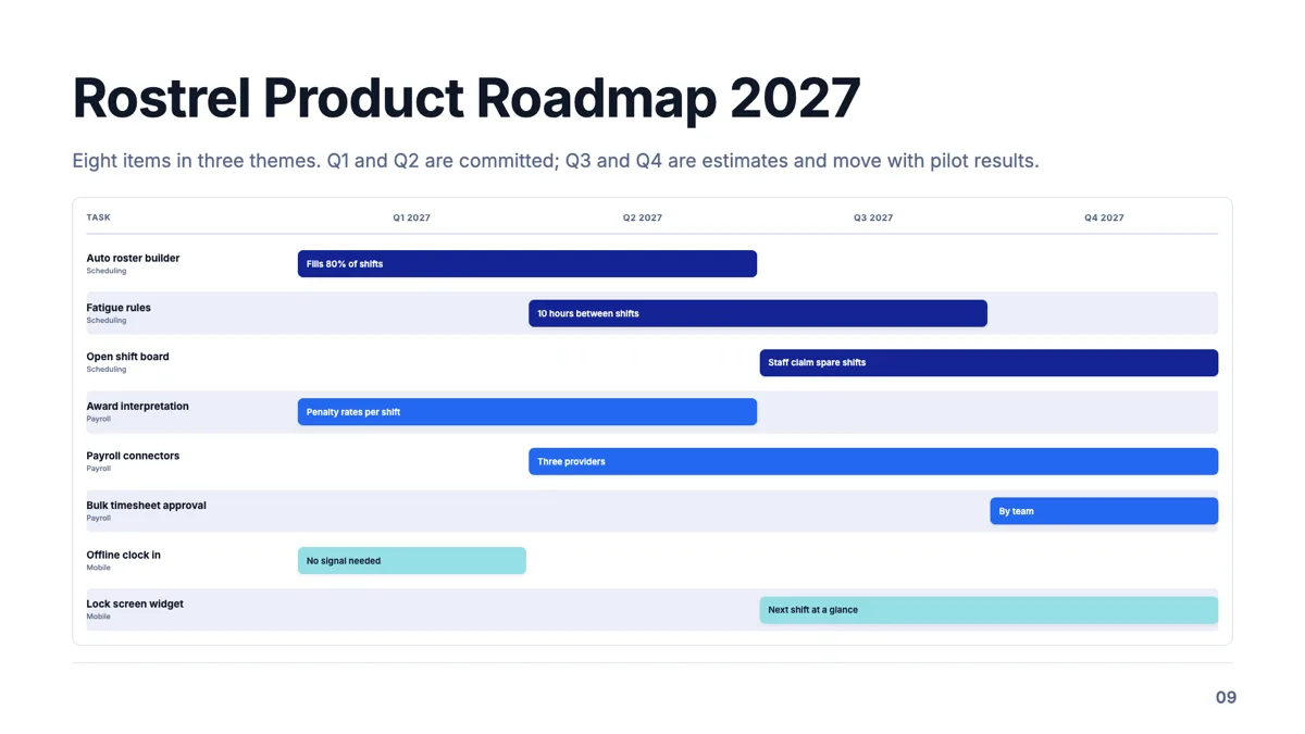
Product roadmap slide with eight items across four quarters
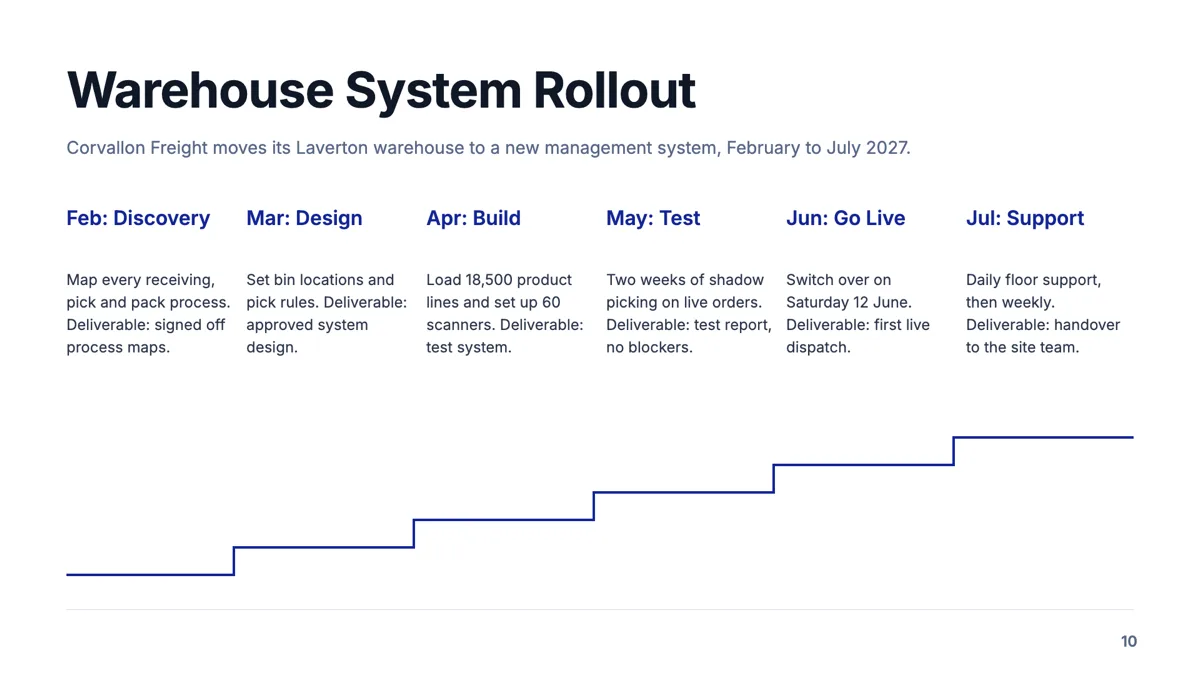
Project timeline slide with six phases and a deliverable each
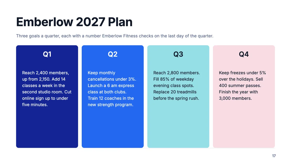
Quarterly plan slide with three measurable goals per quarter
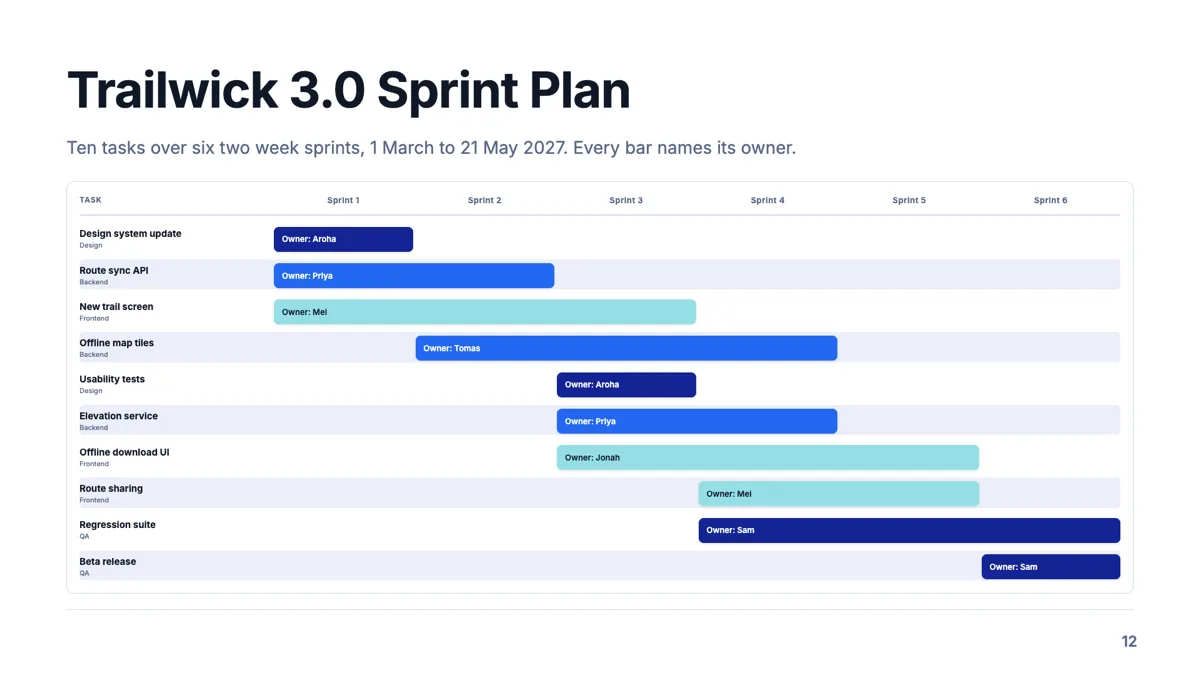
Sprint plan slide with ten tasks, six sprints and an owner on each bar
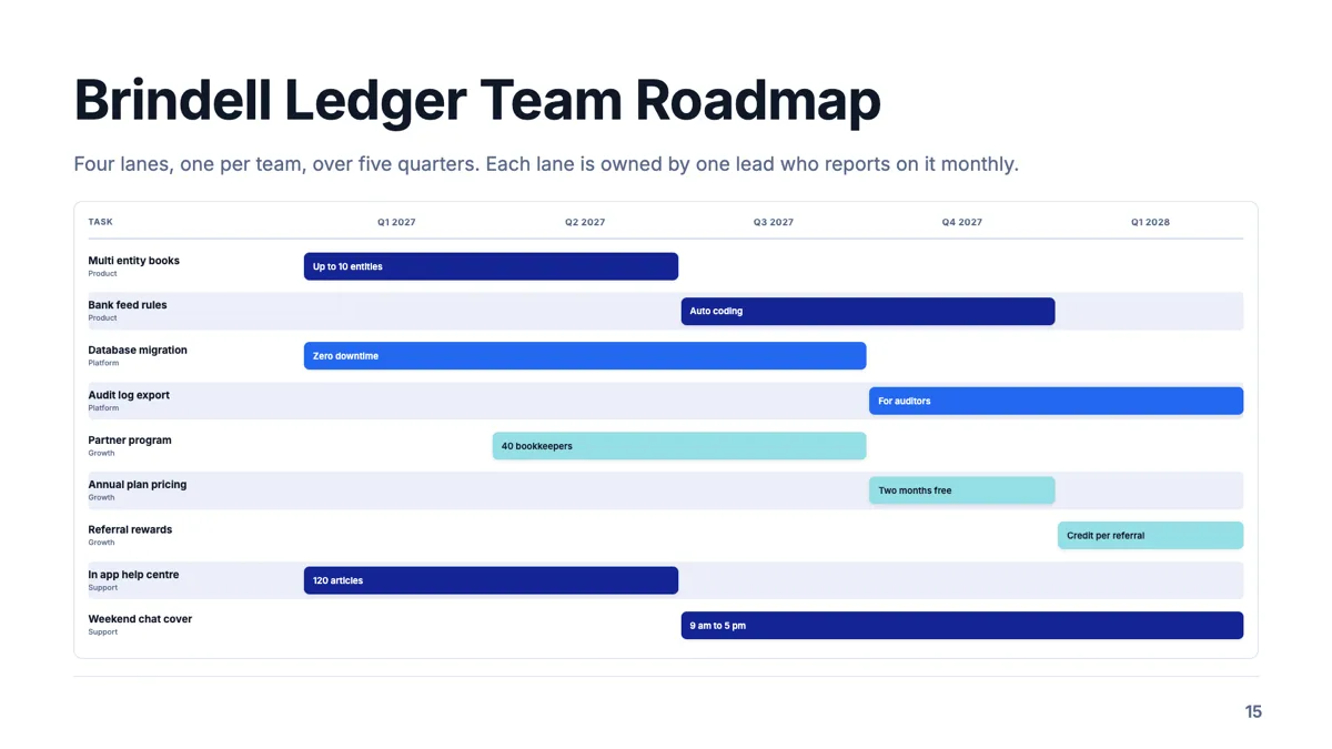
Swimlane roadmap slide with one lane per team
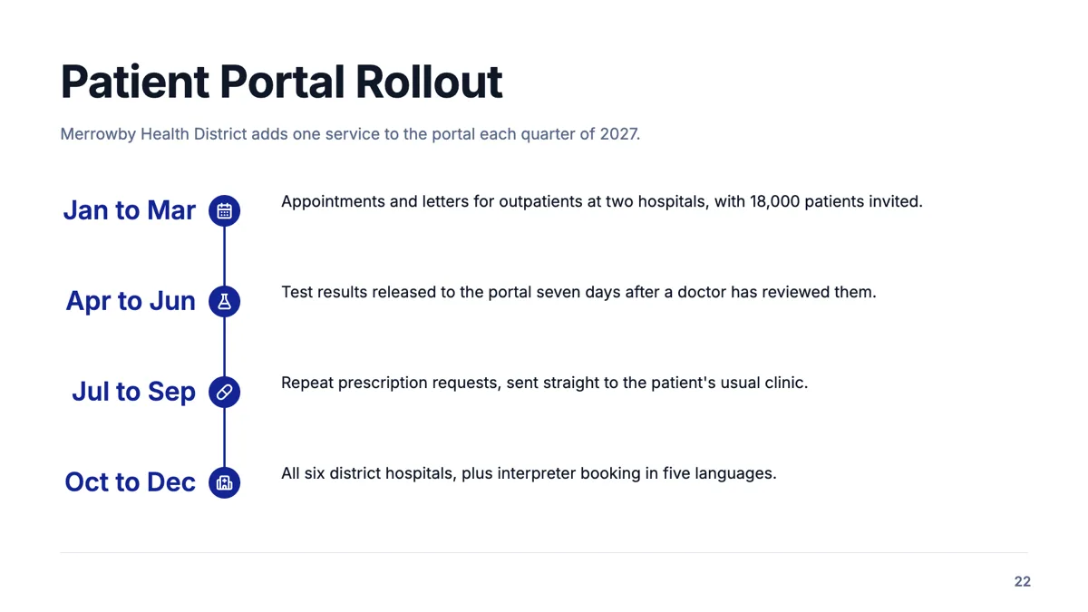
Vertical timeline slide with four phases down a spine
Questions people ask
Can I show that one task depends on another?
Not as a drawn link. Tasks have no relationships to each other. Put the dependency in the task description, or use a flowchart, which does have connections.
Can I enter real dates?
No. A task occupies whole columns, and the columns are whatever you name them. That coarseness is deliberate for a presentation.
How many tasks fit?
Between six and twelve depending on the layout, and the inspector shows the count against the cap as you add. Fewer bars read better on a projector.
How do the colours get chosen?
By group. Tasks sharing a group name share a colour taken from the theme, so a theme swap recolours the whole chart consistently.
Make your own presentation
The button opens the generator with this use case already described. Change the wording to match yours, generate, then edit anything you like.
Create a presentation with OneCraftRelated pages
Timeline slides
Time on a slide has more than one honest shape. A run of milestones wants a rail. A set of phases with detail under each wants columns. A history with unequal gaps wants a vertical list. Twenty layouts cover those cases, and choosing badly is what makes a timeline unreadable.
Process slide templates
A process slide shows work that happens in order, and seventeen layouts carry the purpose. Fifteen of them lay the stages out as rows, chevrons, lanes or cards; two draw a real flowchart with nodes and connectors, which is where a decision with two outcomes belongs. A roadmap of quarters belongs on a timeline instead.
Metrics slides
Numbers fail on slides for one of two reasons: there are too many to read, or there is one and it arrives without context. The 34 metrics layouts split cleanly along that line, between hero figures with a narrative and grids or tables that hold six, eight or ten values at once.
More finished work of this kind is on the presentation examples hub.
Written and checked by the OneCraft team. Last checked .