Conversational form
Website feedback survey template: task, success and one fix
A website feedback survey should ask what the visitor came to do and whether they managed it, before asking how they feel about the site. This template does exactly that in seven screens, then asks how easy it was, the one thing that got in the way, the device and whether they would return.
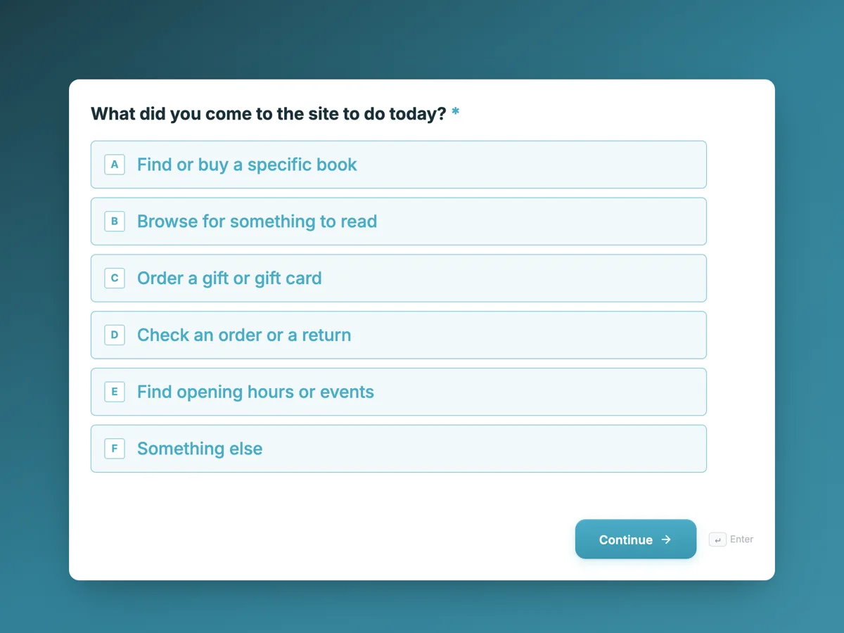
The form itself
The first screen of the form. A conversational form shows one question per screen, so the remaining screens are listed in the field table below. Nothing here can be filled in or submitted, so read it as a reference and build your own from the button above.
Every field, and what it collects
The complete field list, in the order respondents meet it.
- What did you come to the site to do today?Single choiceRequired
- Options: Find or buy a specific book · Browse for something to read · Order a gift or gift card · Check an order or a return · Find opening hours or events · Something else
- Did you manage to do it?Single choiceRequired
- Options: Yes, completely · Partly · No
- How easy was it, from 1 to 5?Single choiceRequired
- 1 is very hard, 5 is very easy.
- Options: 1, very hard · 2 · 3 · 4 · 5, very easy
- What got in the way, if anything?Long text
- The one thing you would fix first. Leave it blank if nothing did.
- What are you using right now?Single choiceRequired
- Options: Phone · Tablet · Laptop or desktop
- Would you use the website again?Single choiceRequired
- Options: Yes · Maybe, if the problem is fixed · No, I would rather visit the shop · No
- Email, only if you would like a replyEmail
- Optional. Leave it blank to stay anonymous.
What each screen of this survey asks
What did you come to do is a radio of six tasks, from finding a specific book to checking opening hours, plus something else. Did you manage it is yes, partly or no. Ease is a radio from 1, very hard, to 5, very easy. What got in the way is an optional long text capped at 600 characters, with a placeholder showing a useful answer. Device is phone, tablet or laptop. Would you use the site again has four answers, including rather visit the shop. The last screen is an optional email, for visitors who want a reply. Five of the seven screens are required.
Why the task comes before the rating
A rating on its own says how a visitor felt and not why. Pair it with the task and the answer becomes usable: a 2 out of 5 from someone checking an order points at the account pages, a 2 from someone browsing points at navigation. Task success, yes, partly or no, is the most direct measure of whether a website works, and usability researchers have used it for decades for that reason. The open question then asks for the one thing to fix first, not a general comment, which produces short, specific answers a small team can act on. The site team reads those monthly and fixes the most common.
How to adapt this survey
A software company swaps the tasks for its own, such as set up an account or find pricing. A council website adds a language question and a screen asking whether the visitor needed to phone afterwards. A bookshop running a redesign adds a screen comparing the new layout with the old one.
What makes this form work
It measures the task, not the mood
What did you come to do and did you manage it come first. Every later answer can be read against a real goal, from finding a book to checking an order.
One fix, not a wish list
The open question asks for the one thing to fix first, with a placeholder about search. Answers come back short and specific, and a small team can act on them monthly.
Anonymous unless asked
No name anywhere, and an optional email labelled only if you would like a reply. People report problems honestly, and those who want an answer can still get one.
Questions people ask
How many questions should a website feedback survey have?
Few enough to finish in about a minute, usually five to eight. This one has seven screens, two of them optional. Visitors give feedback while they are in the middle of something, so each extra question costs answers. The welcome screen says one minute so people know before they start.
Should a website survey be anonymous?
By default, yes. This survey asks for no name, and the email screen is optional, labelled only if you would like a reply. People describe problems more honestly when they are not identified. Those who want a response can still leave an address, which also lets the team ask a follow up question.
Why ask what device the visitor is using?
Because many website problems appear on only one device: a menu that works on a laptop can hide a button on a phone. Splitting answers by phone, tablet and laptop shows where a complaint comes from. The answer takes one tap and turns a vague report into a reproducible bug.
What does partly mean as an answer to task success?
That the visitor got somewhere but not all the way, such as finding a book but not the edition they wanted. Partly is often the most useful group, because those visitors were close. Reading their answers to what got in the way usually shows the gap between nearly and done.
How should the open answers be read?
Group them by theme each month, count the themes and fix the biggest, which is what the thank-you screen promises. The response export puts every answer in one column beside the task and the device, so filtering by task shows which part of the site each problem belongs to.
Where should a website feedback survey appear?
Linked from the footer, the order confirmation page and the account area, and shown after a visitor has had time to try their task. Asking on arrival gets no answer to did you manage it. A link with a short invitation, rather than an immediate popup, gets fewer but more thoughtful responses.
Build your own in about a minute
The button below opens the generator with this use case already described. Change the wording to match your own, generate, then edit anything you like.
Make one like thisOther form examples
App feedback survey template for crashes, speed and missing features
An app feedback survey has to collect what developers can act on: which platform and version, how often it crashed, where it is slow and what users want next. This template asks those in eight short screens, counts crashes for this week only, and takes an optional screenshot of the problem.
Hotel guest satisfaction survey from check in to check out
A hotel guest satisfaction survey has to show which part of the stay let a guest down, tied to a room so someone can fix it. This one follows the stay in order, from check in through a four item room grid, staff and breakfast, then asks whether a problem was reported and fixed.
Product feedback survey template with a feature importance matrix
A product feedback survey has to find out which features customers rely on and what is missing, segmented by who they are and how long they have used the product. This template asks tenure, role and main use first, then puts six features into one importance grid, and closes with price fairness and a recommendation score.
Want the steps in the builder? Read Create a conversational form with AI, then View, export and manage your responses. For everything this generator can do, see the form maker.
Sources
Written and checked by the OneCraft team. Last checked .