Conversational form
Cancellation survey with a main reason and a pause offer
A cancellation survey has to capture why a subscriber is leaving in a form the business can act on, while the decision is still fresh. This one asks for a single main reason, then what would have kept them, where they are going instead, and whether a pause would do.
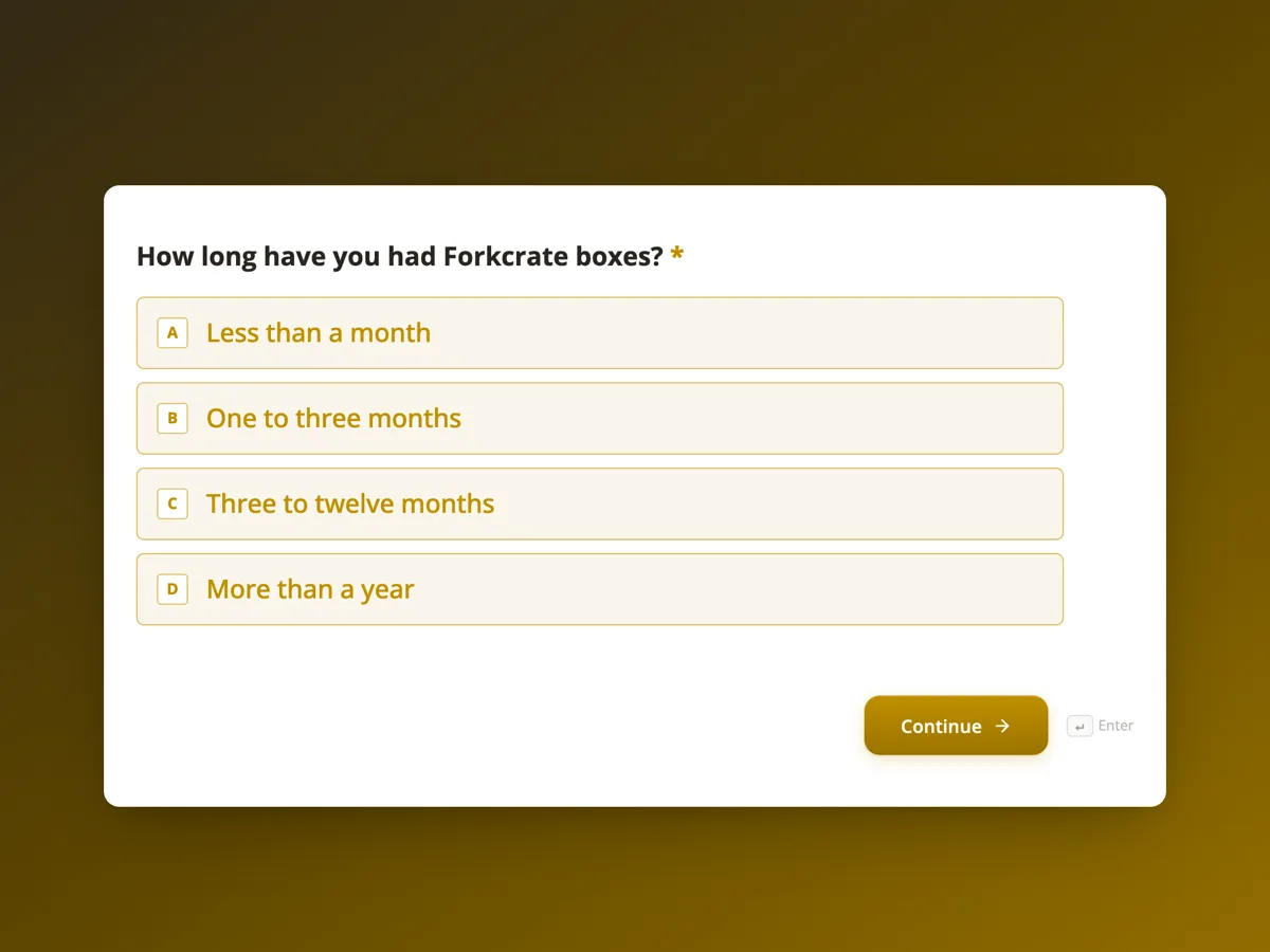
The form itself
The first screen of the form. A conversational form shows one question per screen, so the remaining screens are listed in the field table below. Nothing here can be filled in or submitted, so read it as a reference and build your own from the button above.
Every field, and what it collects
The complete field list, in the order respondents meet it.
- How long have you had Forkcrate boxes?Single choiceRequired
- Options: Less than a month · One to three months · Three to twelve months · More than a year
- Which plan are you on?Single choiceRequired
- Options: Two people, three meals a week · Two people, five meals a week · Family of four, three meals a week · Family of four, five meals a week
- What is the main reason you are cancelling?Single choiceRequired
- Pick the one that matters most. The next screen has room for the rest.
- Options: It costs too much · Too much food, meals going to waste · Not enough variety in the menu · Cooking takes longer than promised · Delivery problems or missing items · Moving, travelling or a change at home · Something else
- What would have kept you as a customer?Long text
- What will you do for dinners instead?DropdownRequired
- Options: Another meal kit service · Supermarket shopping and my own recipes · Ready made meals · Takeaway and delivery apps · Not sure yet
- Would a pause suit you better than cancelling?Single choiceRequired
- A pause holds your account and recipes, with no boxes and no charges until the date you choose.
- Options: Yes, show me the pause option · No, please cancel
- Can the customer team contact you about your answers?Single choiceRequired
- Options: Yes, by email · Yes, by phone · No, please do not contact me
- Your contact details, only if you said yesProfile
What each screen of this survey collects
Tenure is a radio of four bands, from under a month to over a year. Plan is a radio of the four box sizes. The main reason is a radio of seven, from price and food waste to moving house, with a note that only one counts. What would have kept you is an optional long text with a concrete placeholder. What you will do instead is a dropdown of five, from another meal kit to takeaway apps. The pause question is yes or no, with the pause terms in the help text. Contact permission offers email, phone or no. The last screen is an optional profile block for name, email and phone. Six of the eight screens are required.
Why one main reason, then the pause
A list where people tick every reason produces a chart where everything is a reason. Forcing one main reason gives a ranked cause of churn that can be tracked month to month, and the long text after it catches the second and third. The pause offer comes after the reasons on purpose. Asked first, it reads as a retention trap and colours the answers; asked after, it lands on people who have just said the problem was waste, travel or a busy month, which is exactly who a pause suits. The redirect add-on sends every respondent to one page after submit, so that page should carry both the pause button and the cancellation date.
How to adapt this survey
A software subscription replaces the plan screen with seats or tier, and the dinners dropdown with the tools a customer moves to. A gym swaps the pause terms for a membership freeze and adds a question on how often they visited. A streaming or magazine service drops the contact screens and keeps the survey to five taps.
What makes this form work
One reason that can be ranked
The main reason radio takes exactly one of seven causes. Month on month, the share citing price or food waste is a number the team can move.
The pause offer lands after the reasons
Screen six offers a pause only once the subscriber has said why they are going, and states that a pause means no boxes and no charges.
Where they go next is captured
The dropdown of five alternatives shows whether churn is going to a competitor, to the supermarket or to takeaway, which call for different responses.
Questions people ask
When should a cancellation survey appear?
Inside the cancellation flow, after the subscriber has asked to cancel and before the confirmation. Answers given in the moment are more accurate than an email a week later, and response rates are far higher. Keep it short enough that it never feels like an obstacle; eight taps and one optional text box is about the limit.
Should the survey block cancellation until it is answered?
No. Subscribers expect cancelling to be as easy as signing up, and a survey that stands in the way produces rushed, angry answers and complaints. Treat it as a request. In this form the pause screen states the terms plainly and offers a direct no, please cancel option.
Can the form send people to a different page depending on their answer?
Not with the redirect add-on, which sends every respondent to the same URL after submit. Conversational logic can route people to different screens inside the survey, but the final destination is one page. That is why the pause page here should also show the cancellation date for those who chose no.
How should churn reasons be reported?
Count the main reason by month and by plan, and read it beside tenure. Price complaints from new customers point at the introductory offer; price complaints from year long customers point at value. The what would have kept you answers are the place to look for a fix, so tag them into a handful of themes each month.
Is it worth contacting people who cancelled?
Only those who said yes on the contact screen, and only with something specific to what they wrote. A reply that fixes a delivery problem or offers the smaller plan they asked for wins some back. A generic discount email to everyone who left mostly teaches customers to cancel to get a deal.
Why is the contact block optional when contact permission is required?
Everyone has to answer whether they may be contacted, so the yes and no counts are complete. The details themselves are only useful from those who said yes, so the profile screen is optional and its label says so. Anyone who said no can continue past it without typing anything.
Build your own in about a minute
The button below opens the generator with this use case already described. Change the wording to match your own, generate, then edit anything you like.
Make one like thisOther form examples
Customer effort score survey template for closed support tickets
A customer effort score survey asks how easy it was to get an issue handled, on a seven point agreement scale, straight after the ticket closes. This template pairs that one statement with the ticket number, the channel, what got in the way, whether the issue is actually fixed and how many contacts it took.
App feedback survey template for crashes, speed and missing features
An app feedback survey has to collect what developers can act on: which platform and version, how often it crashed, where it is slow and what users want next. This template asks those in eight short screens, counts crashes for this week only, and takes an optional screenshot of the problem.
Product feedback survey template with a feature importance matrix
A product feedback survey has to find out which features customers rely on and what is missing, segmented by who they are and how long they have used the product. This template asks tenure, role and main use first, then puts six features into one importance grid, and closes with price fairness and a recommendation score.
Want the steps in the builder? Read Create a conversational form with AI, then Automate your form with add-ons. For everything this generator can do, see the form maker.
Written and checked by the OneCraft team. Last checked .