Presentations
Map slides
One map, the world by country, in two modes. Highlight answers where are we, shade answers how much is where. Anything below country level is out of scope, and knowing that before you plan the slide saves a wasted ten minutes.
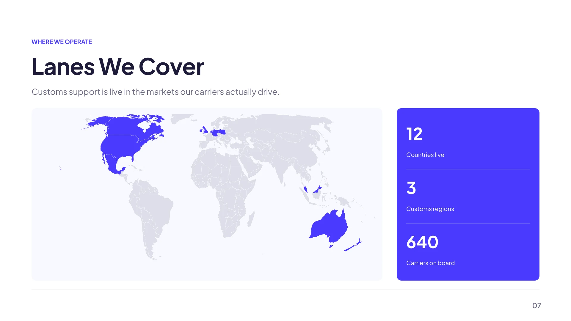
Highlight mode: in or out
Every country you list takes the accent colour and everything else stays neutral. This is a binary claim and it is the right mode for coverage, presence, launch markets and where our customers are. It needs nothing but the list, so it is also the mode that works when you have no numbers, which is most of the time on a market slide.
Choropleth mode: shaded by value
Each country carries a number and the fill is interpolated along a ramp between a floor colour and a ceiling colour, both chosen from theme tokens. The mode is greyed out until at least one country in your list has a numeric value, with a note explaining why, so you cannot end up with an all one colour ramp and no idea what went wrong.
Countries go in by their three letter code
USA, GBR, DEU, AUS. The field validates against a table of 250 codes and suggests matches as you type, so you are picking from a list rather than remembering. A code that is not real is rejected with a message naming it. Each entry can also carry a short label used as a tooltip, which is where a figure like 4.2 billion market goes.
There is no pin, and no street map
This is the honest limit and it is worth stating plainly. The map draws country shapes and fills them. It cannot place a marker on a city, cannot draw a route between two offices, and cannot zoom to a region, a state or a postcode. If your slide needs a pin on a shop address, take a screenshot of a mapping service and place it as a picture instead.
Three layouts carry one, and you can add one anywhere
The library has a regional map beside a pillar list, a world map with regional callouts, and a global presence map, all seeded in highlight mode. Beyond those, the element library has a Map tile in its Timeline and map section, so any slide can take one. Colour choices are limited to theme tokens by design, which is what keeps a map legible across every palette.
How it works, in three steps
Step 1
Add the map
Either one of the three library layouts, or the Map tile from the element library onto a slide you already have.
Step 2
Type the country codes
Three letters each. Suggestions appear as you type and anything invalid is rejected with a message.
Step 3
Add values only if you have them
Choropleth stays unavailable until at least one country carries a number, which is the product telling you the mode needs data.
The full walkthrough with screenshots is in the guide Add charts, maps and diagrams to slides.
Limits worth knowing
- One map, the world by country. There is no regional, state, city or street map.
- No pins and no routes. A marker on a city is not something the map can draw.
- Countries are identified by ISO three letter codes, validated against a table of 250.
- Fill colours come from a short list of theme tokens rather than a free colour picker.
See it on a finished piece

Slide examples
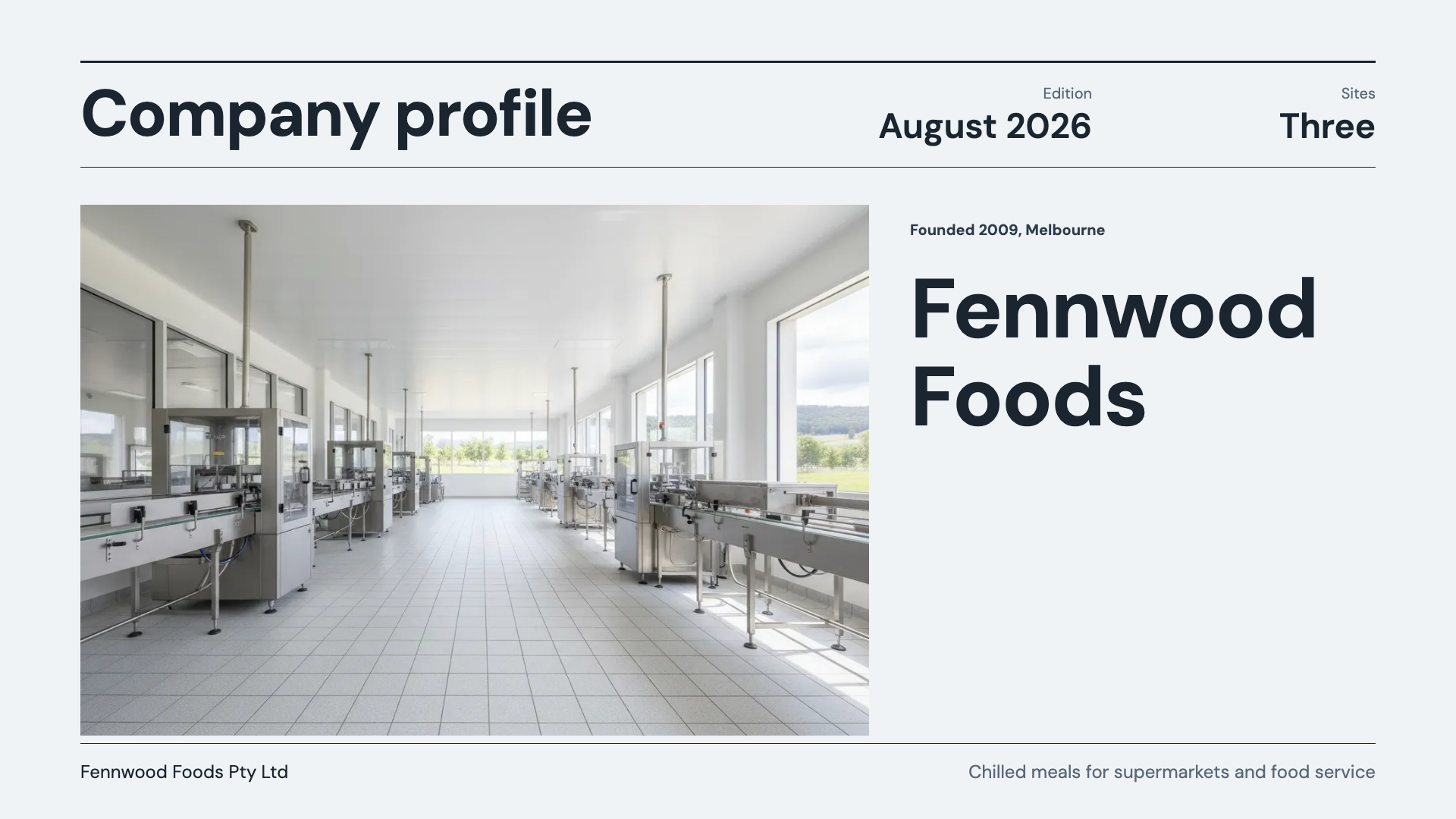
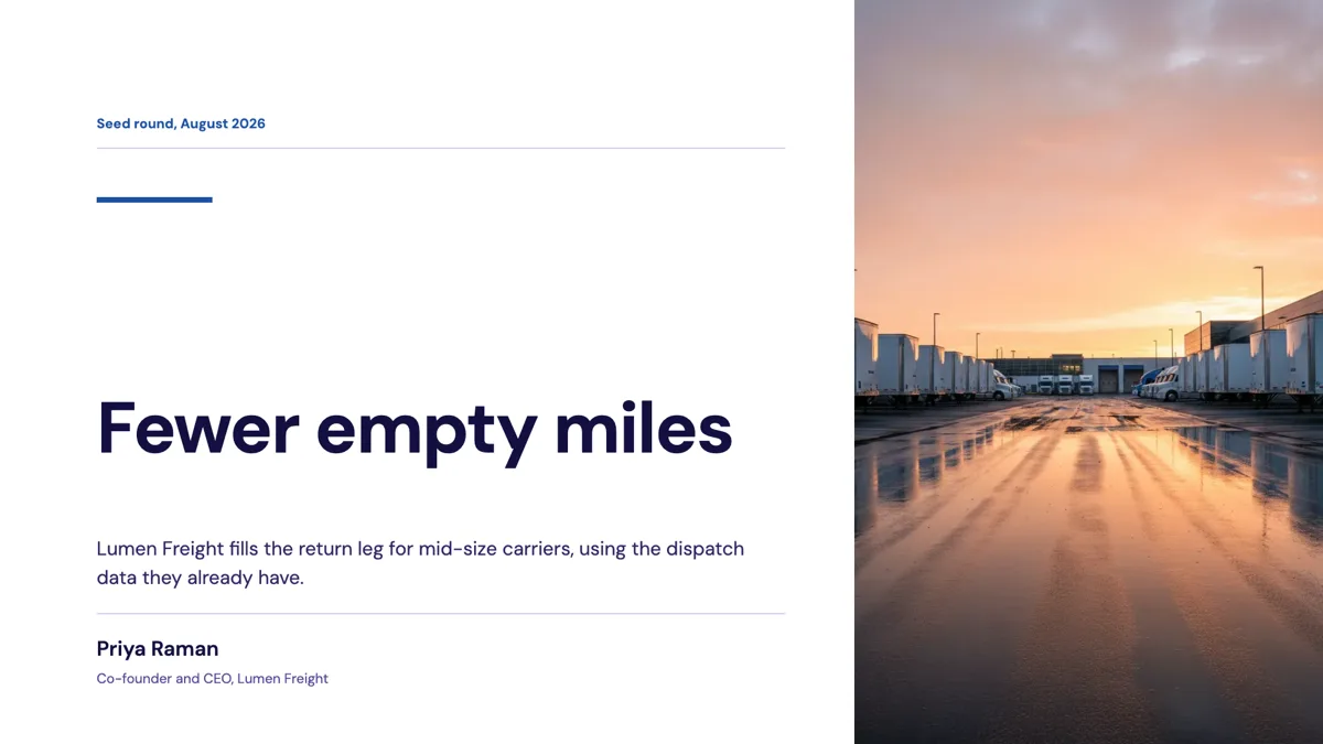
Finished single slides on this layout, each one built from a real template and written out in full.
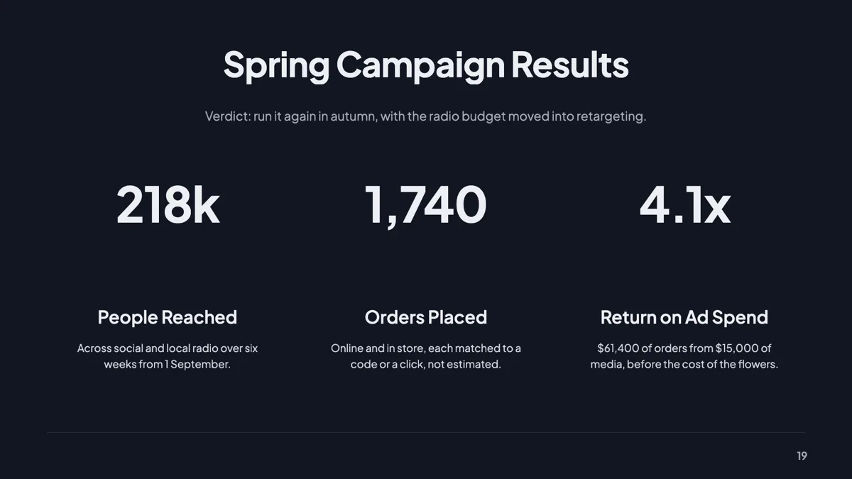
Campaign results slide with three hero stats and a verdict
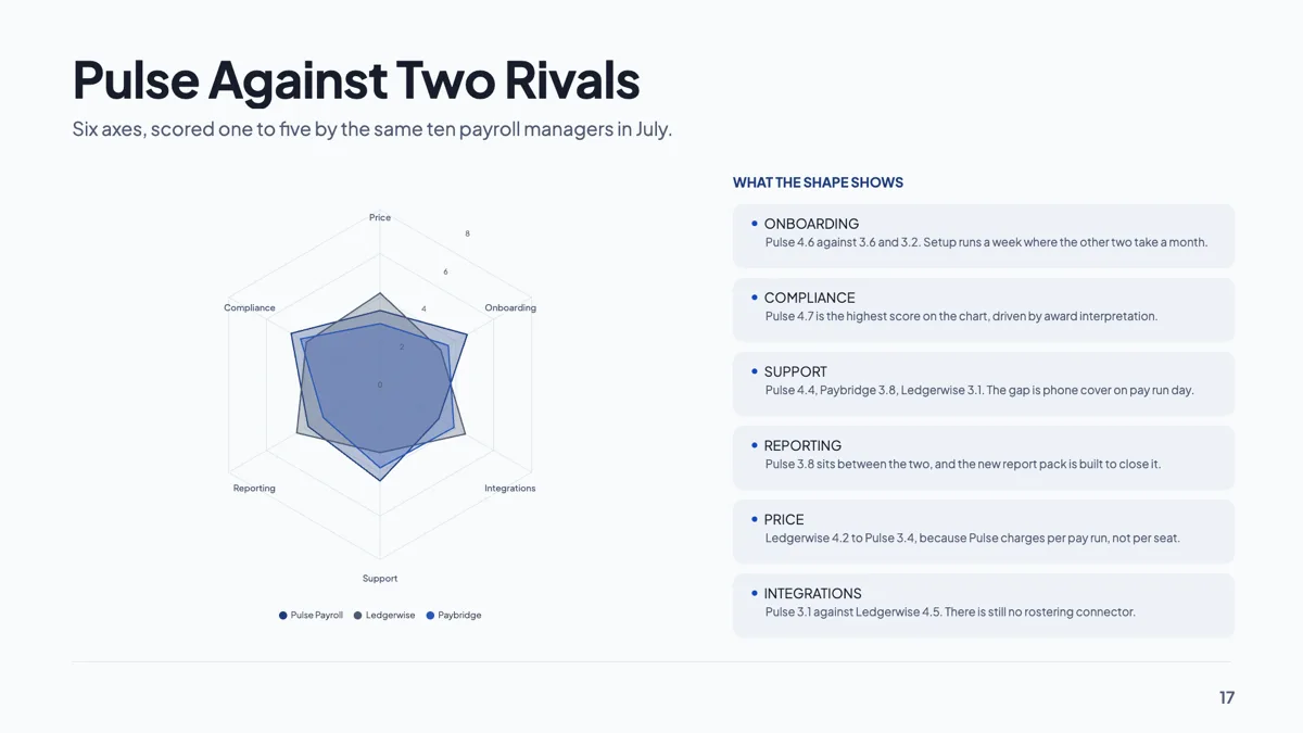
Competitor benchmark slide drawn as a radar on six axes
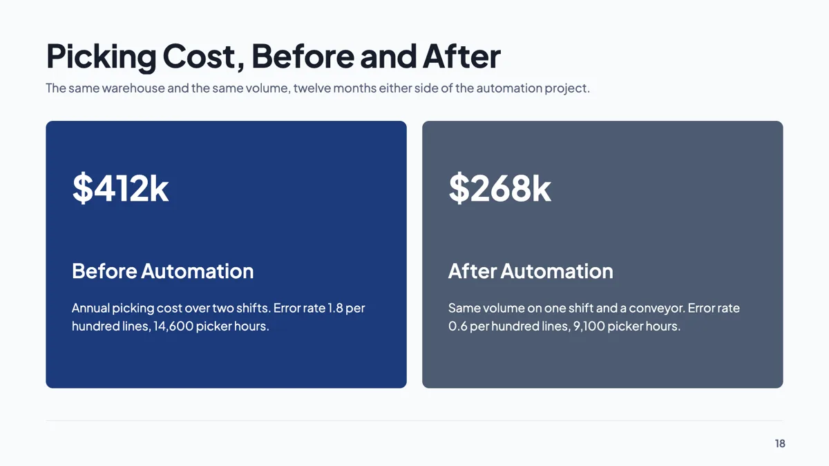
Cost savings slide with two hero panels, before and after
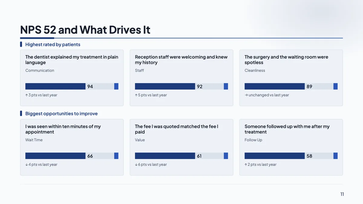
Customer satisfaction slide with NPS 52 and its six drivers
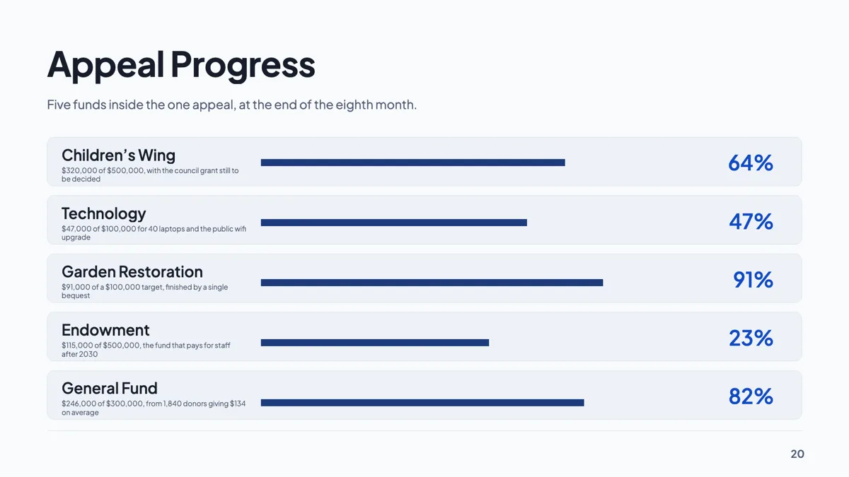
Fundraising progress slide with five funds against targets
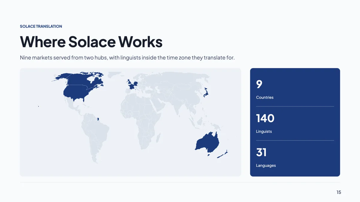
Global presence slide with nine countries highlighted on a map
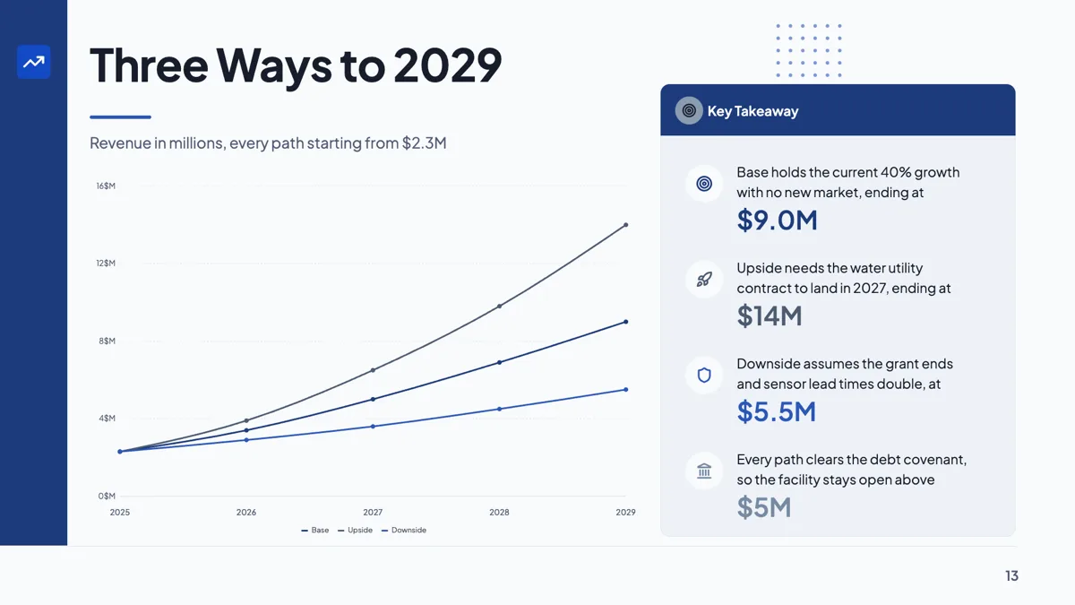
Growth scenarios slide with base, upside and downside to 2029
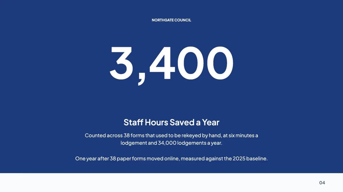
Hero number slide built on one figure, 3,400 hours saved
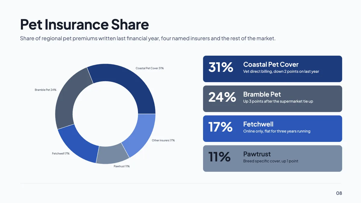
Market share slide drawn as a donut with five slices
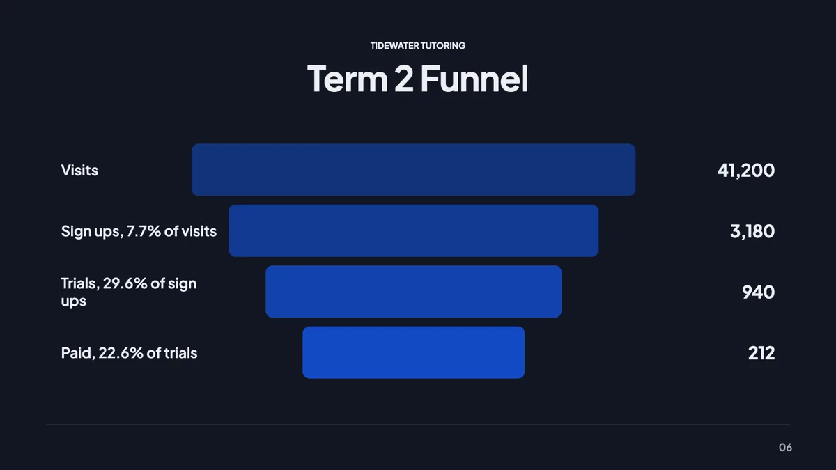
Marketing funnel slide with four steps from visit to paid
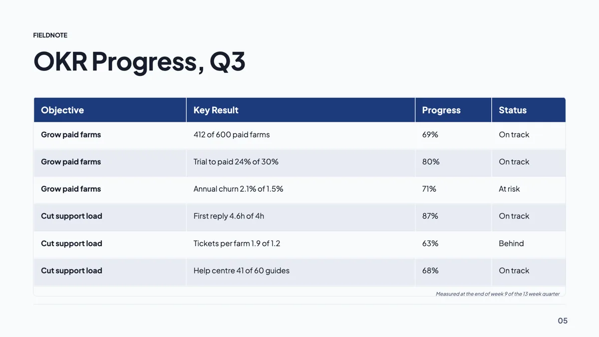
OKR progress slide example with two objectives and six key results
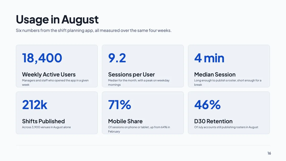
Product usage slide with six engagement stat cards
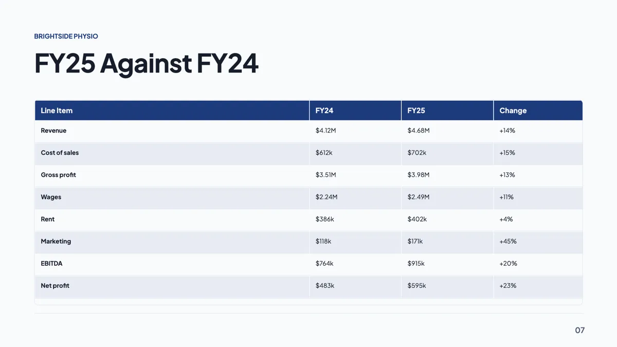
Profit and loss slide with eight lines and a change column
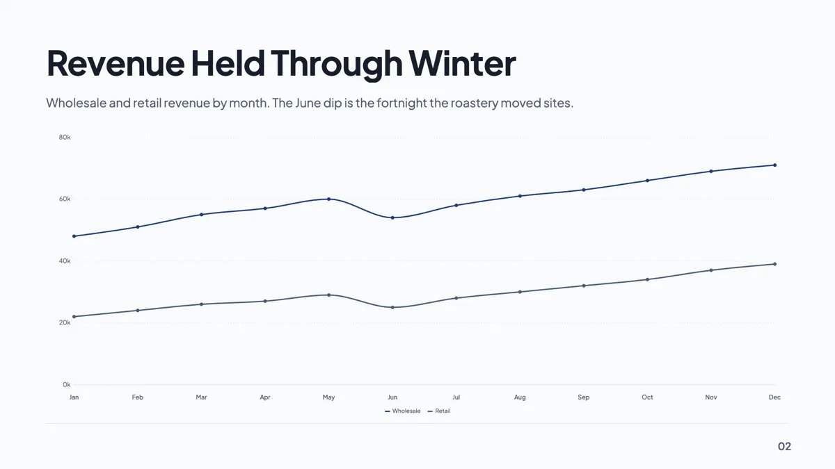
Revenue trend slide with twelve months on one line chart
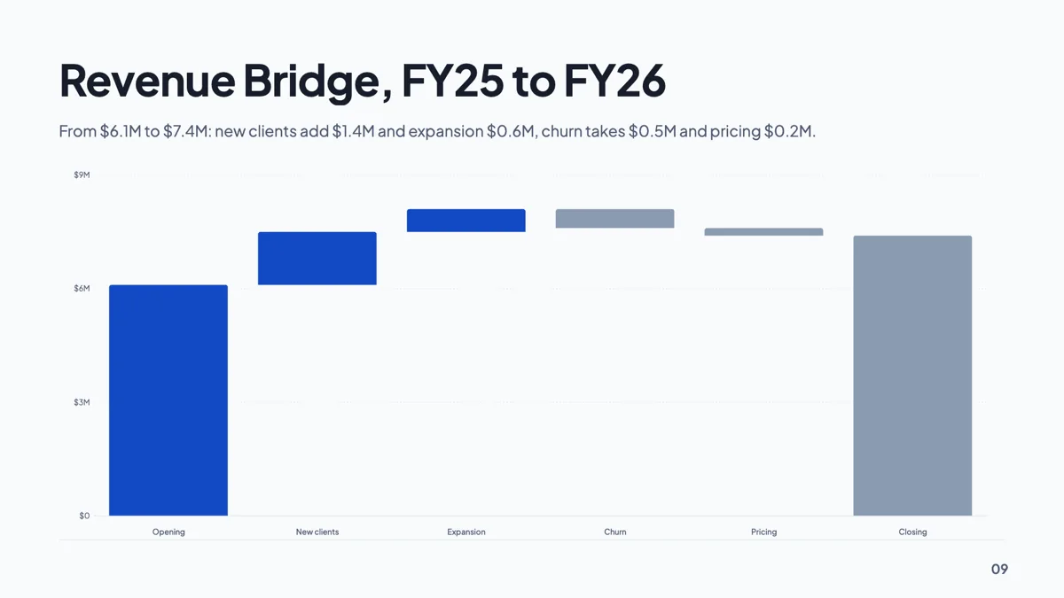
Revenue waterfall slide bridging $6.1M to $7.4M
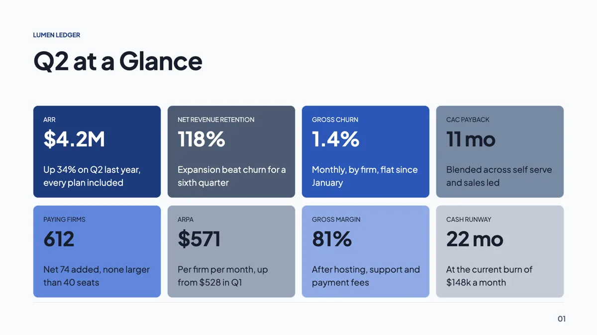
SaaS KPI slide example with eight numbers on one wall
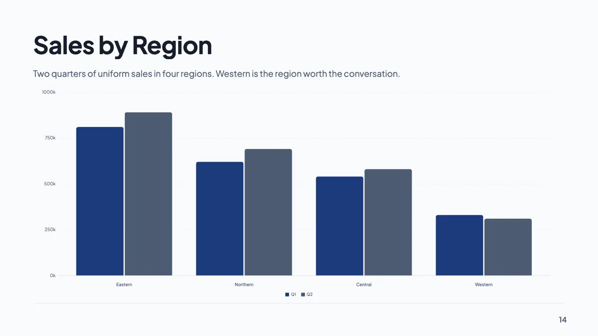
Sales by region slide with four regions on vertical bars
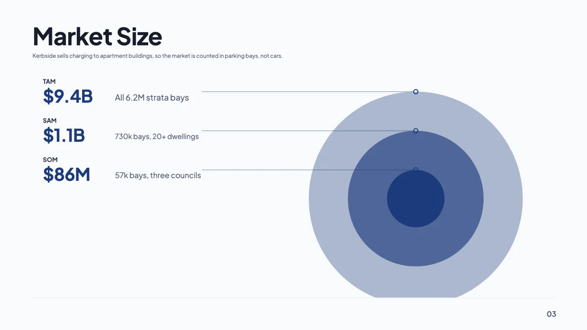
TAM SAM SOM slide example with the three numbers sourced
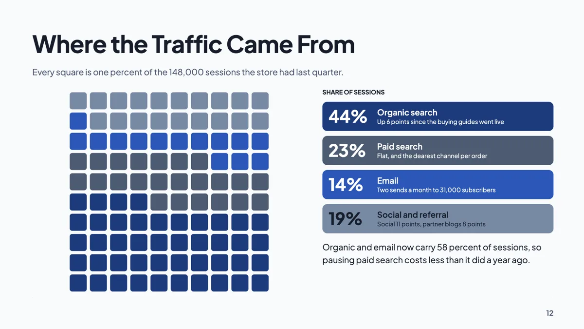
Website traffic slide with sources drawn as a waffle of 100
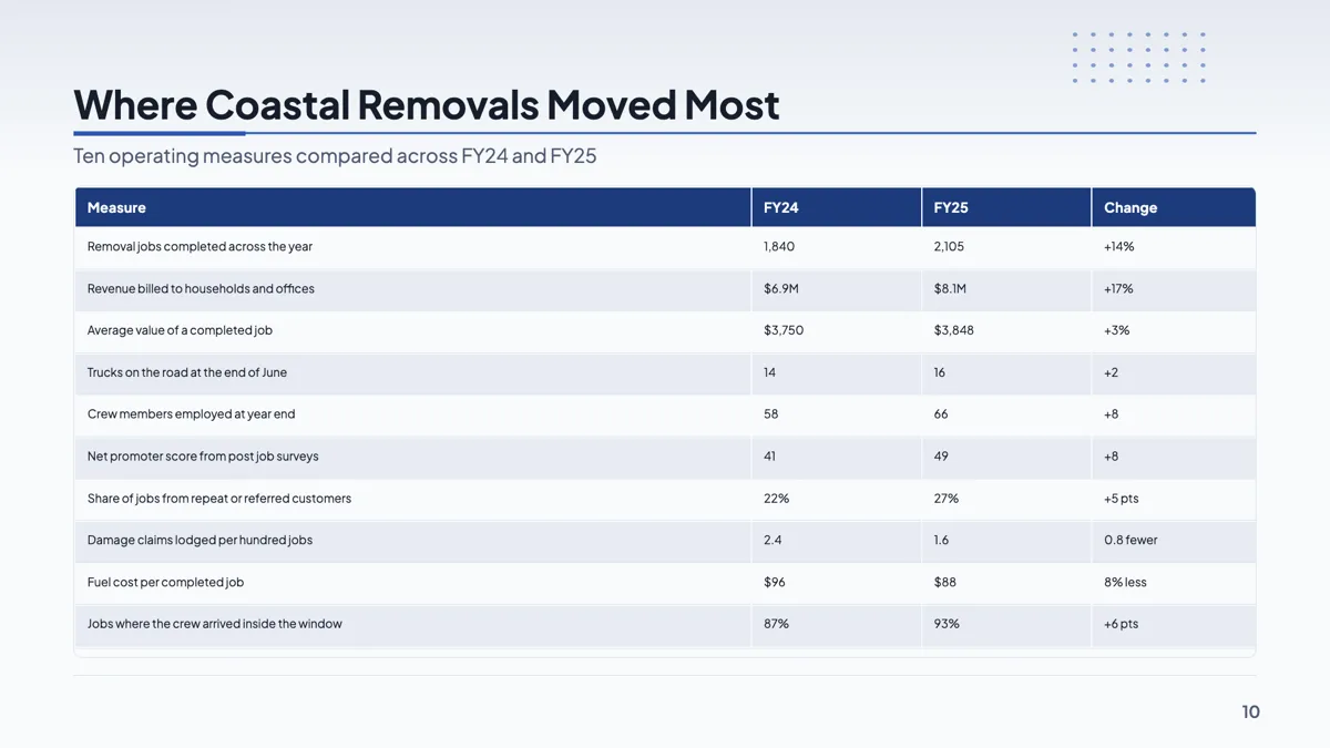
Year over year growth slide with ten metrics in one table
Questions people ask
Can I put a pin on a city?
No. The map fills country shapes and nothing else. For a city marker, screenshot a mapping service and place it on the slide as a picture.
Why is choropleth greyed out?
Because no country in your list carries a number yet. Add a value to at least one and the mode becomes available.
Can I show a region such as the European Union?
Only by listing its member countries individually. There are no grouped regions, so a note on the slide is usually the clearer way to say it.
Can I zoom into one continent?
No. The map always draws the whole world. If only three countries matter, highlight is usually more readable than a zoom would be anyway.
Make your own presentation
The button opens the generator with this use case already described. Change the wording to match yours, generate, then edit anything you like.
Create a presentation with OneCraftRelated pages
Make slides from screenshots
To make slides from screenshots, attach them to the slide generator with a line saying what each screen is for, and the deck is written from the words they contain. Then place the screenshots themselves on the slides in the builder, because the generator reads a picture and never pastes it. There are two different jobs hiding in this request, and mixing them up is why people are disappointed.
AI presentation maker
Most tools that write a presentation hand you a text outline and leave the design to you. This one plans the deck, chooses a purpose for every slide, binds each purpose to a real layout out of 1,071, writes the copy into the shapes that layout expects, and generates the pictures.
2x2 matrix slides
A 2x2 is only useful when both axes are things that can genuinely be high or low, and when putting an item in a quadrant is a claim somebody could dispute. Get the axes right and the grid does the arguing for you. Get them vague and it is decoration.
More finished work of this kind is on the presentation examples hub.
Written and checked by the OneCraft team. Last checked .