Presentations
2x2 matrix slides
A 2x2 is only useful when both axes are things that can genuinely be high or low, and when putting an item in a quadrant is a claim somebody could dispute. Get the axes right and the grid does the arguing for you. Get them vague and it is decoration.
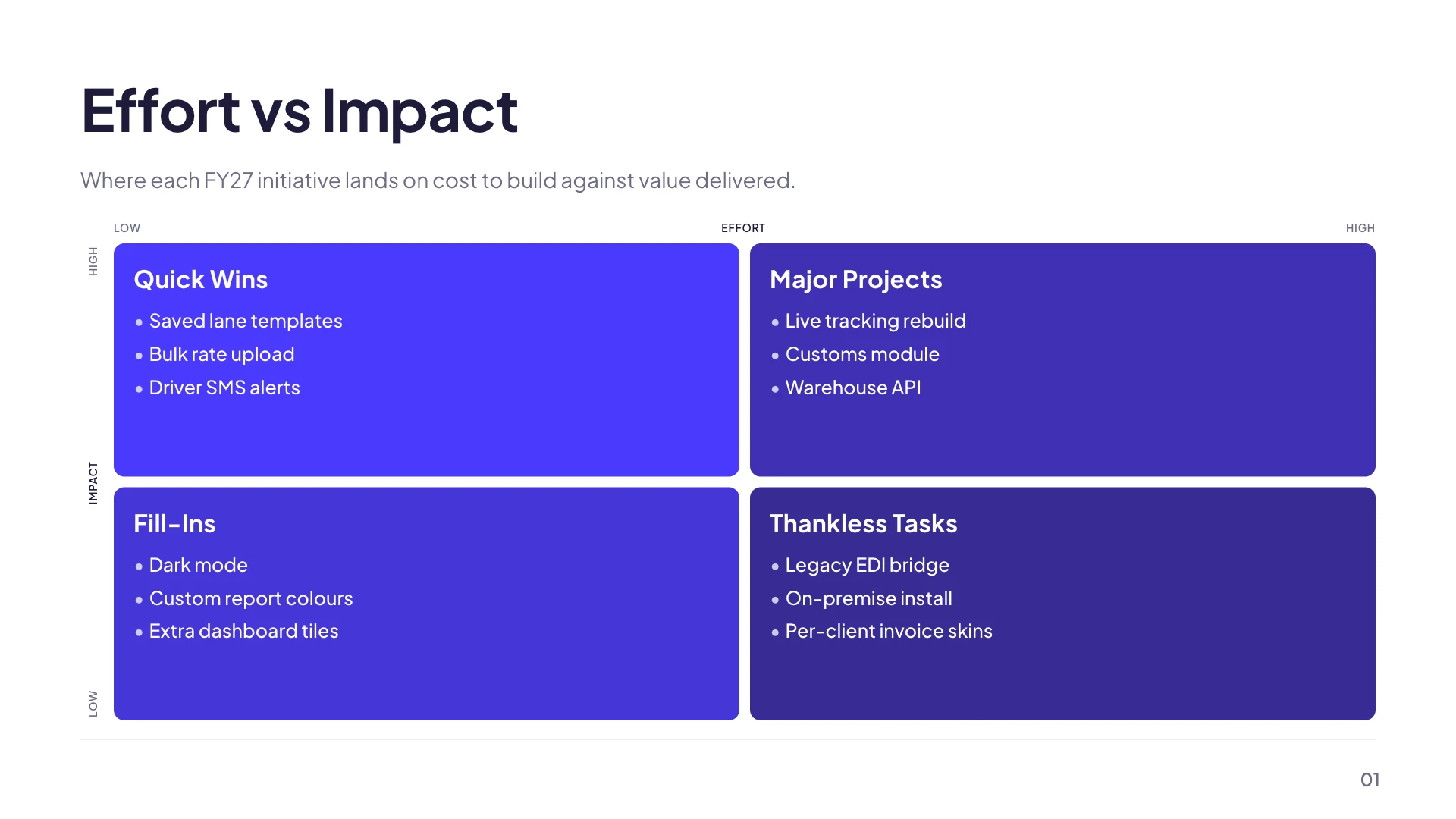
Four grids that already have their axes
The library carries effort against impact, urgency against importance in the Eisenhower shape, likelihood against impact for risk, and a competitor scatter plotting breadth of offering against depth of expertise. Picking one of those saves you the part people get wrong, which is not the drawing but the choice of what the two dimensions are. A nine cell version plots market share against growth rate.
Six labels, not two
Each axis carries a name plus a label at each end, so the grid reads Effort, low on the left and high on the right, rather than leaving the reader to assume a direction. All six are edited by clicking them on the slide. The pole labels are the ones people skip, and they are the ones that stop an audience reading the grid backwards.
Quadrant headings are the recommendation
The generic grid seeds with Quick wins, Major projects, Fill-ins and Thankless tasks, which is the point of the whole exercise: the quadrant name tells you what to do with anything that lands there. Rename them to your own decision language, Do now, Schedule, Delegate, Drop, and the slide stops describing a situation and starts making a proposal.
Items are short text, not plotted points
Each quadrant holds a list of entries you type. Nothing is positioned by a score, and there is no scatter of dots with coordinates, so an item is either in a quadrant or it is not. That is usually the right level of precision for a decision slide, because a debate about whether something sits at 0.6 or 0.7 on an effort axis is a debate nobody should be having in a meeting.
When to use nine cells instead
Three by three is worth it when the middle is a real answer rather than a fudge, which is the case for a portfolio grid where hold is as legitimate as invest or divest. It is not worth it when the middle just means the team could not decide. The nine cell version is a fixed mode and does not convert to a four cell grid, so choose it deliberately.
How it works, in three steps
Step 1
Start from a named grid
Add one of the ready made layouts from the library rather than a blank grid, so the axes are already sensible.
Step 2
Fix the pole labels first
Click each end of each axis. Low and high, or cheap and expensive. This is what makes the grid readable without you narrating it.
Step 3
Rename the quadrants as instructions
Do now, schedule, delegate, drop. A quadrant name that tells the reader what to do is worth more than one that describes the region.
The full walkthrough with screenshots is in the guide Add charts, maps and diagrams to slides.
Limits worth knowing
- Items sit in a quadrant. There is no numeric scoring and no plotted coordinate.
- A four cell grid can be switched between generic and SWOT modes. The nine cell version cannot be switched at all.
- Axis and quadrant labels are edited on the canvas. The inspector shows them read only.
- In an editable PowerPoint export the grid artwork stays a picture, although every label becomes a real text box.
See it on a finished piece



Slide examples
Finished single slides on this layout, each one built from a real template and written out in full.
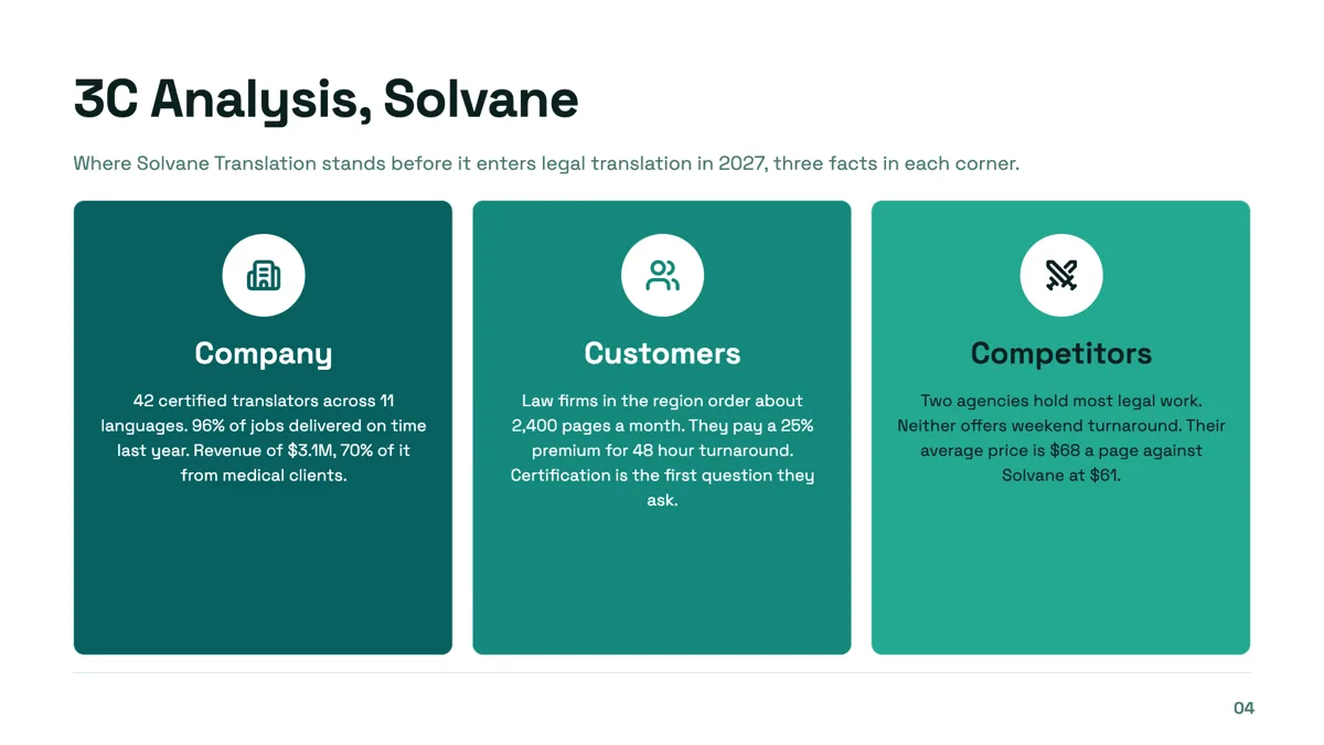
3C analysis slide with three facts in every corner
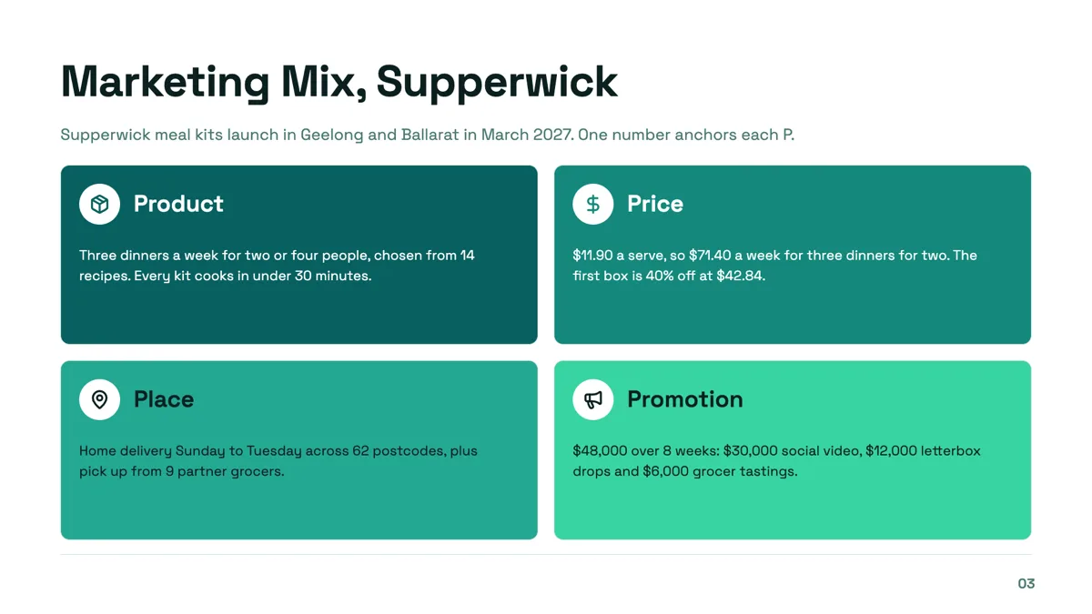
4P marketing mix slide with a number on every P
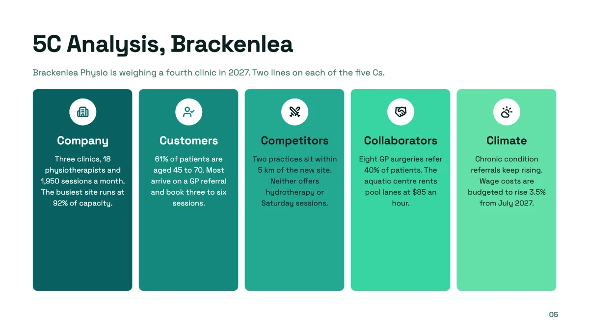
5C analysis slide for a fourth clinic decision
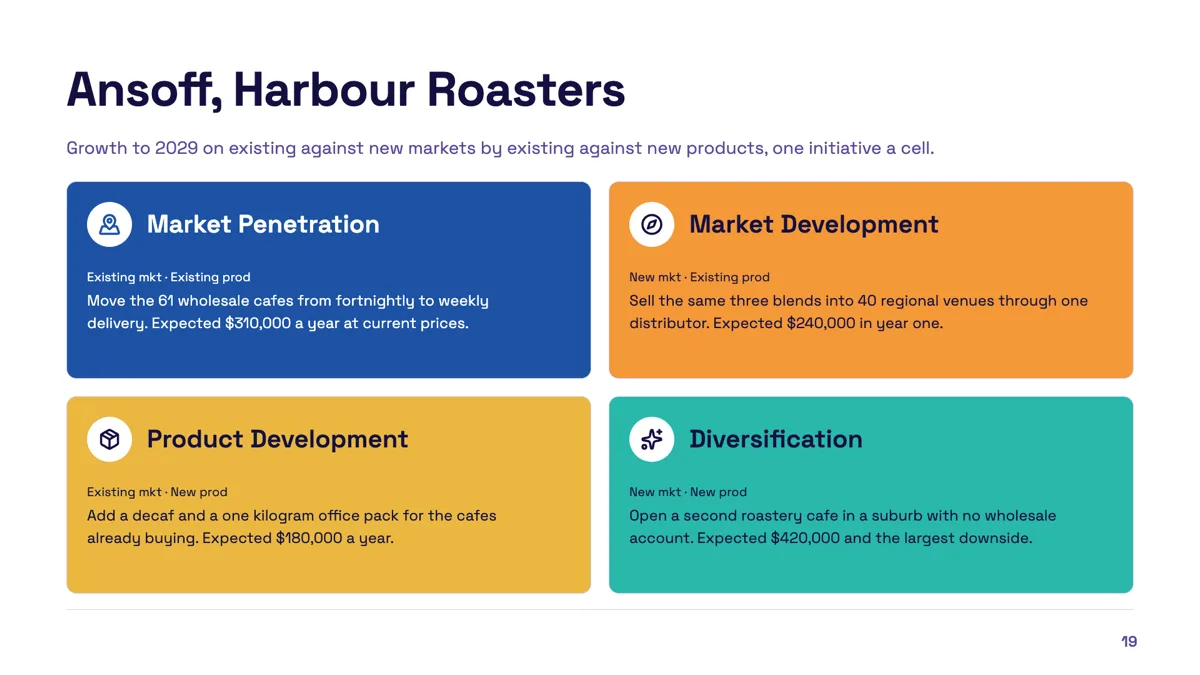
Ansoff matrix slide with one initiative in every quadrant
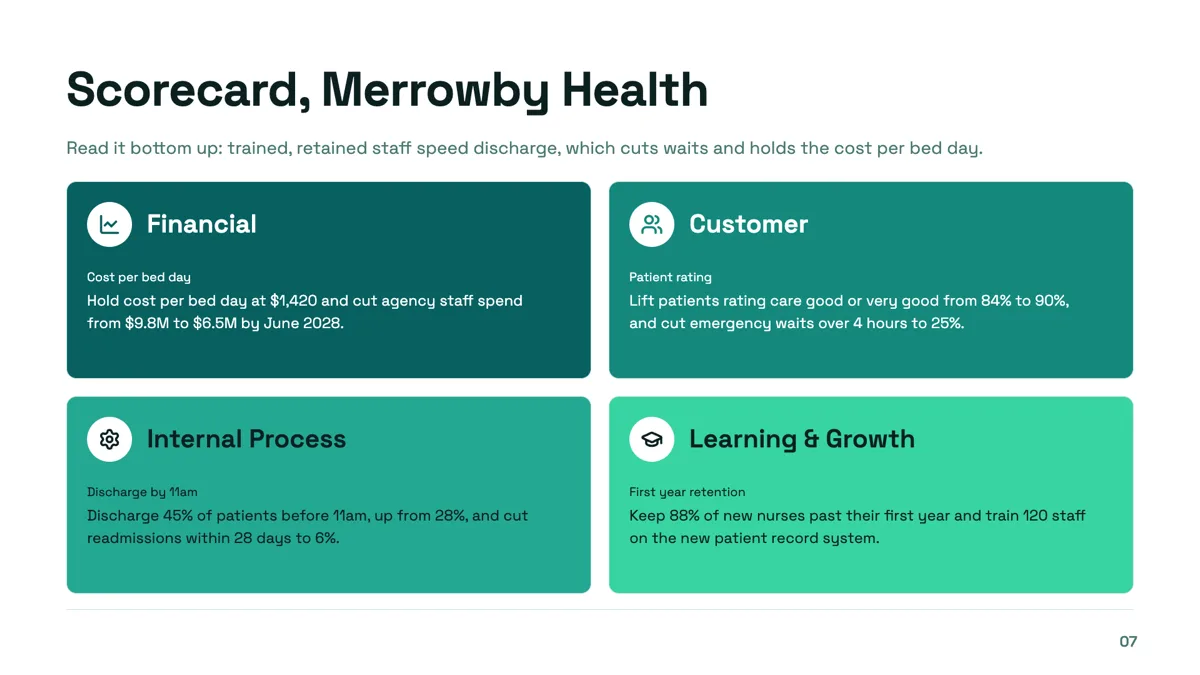
Balanced scorecard perspectives slide with a measure and target in each
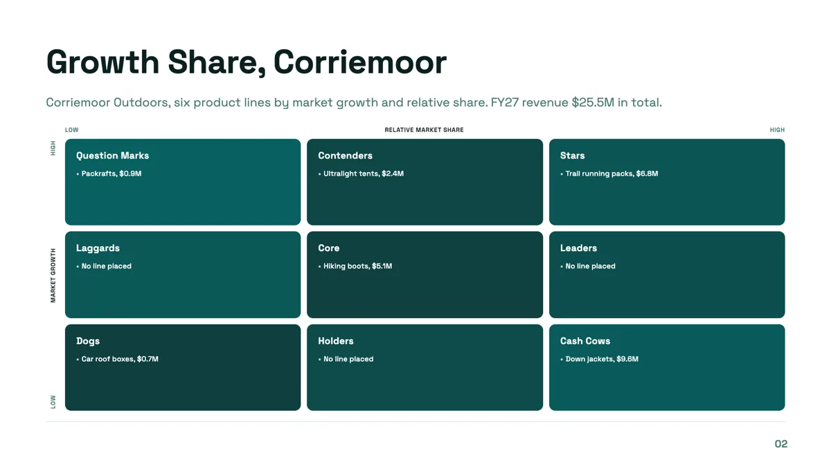
BCG matrix slide with six product lines on a three by three grid
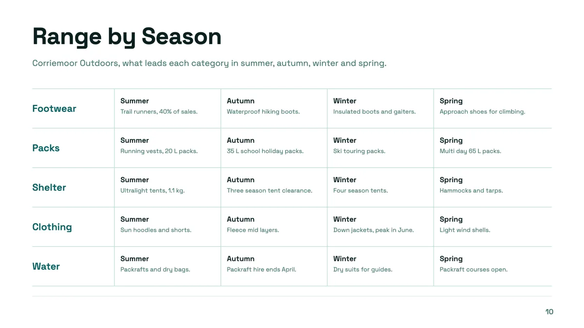
Category matrix slide with five categories across four seasons
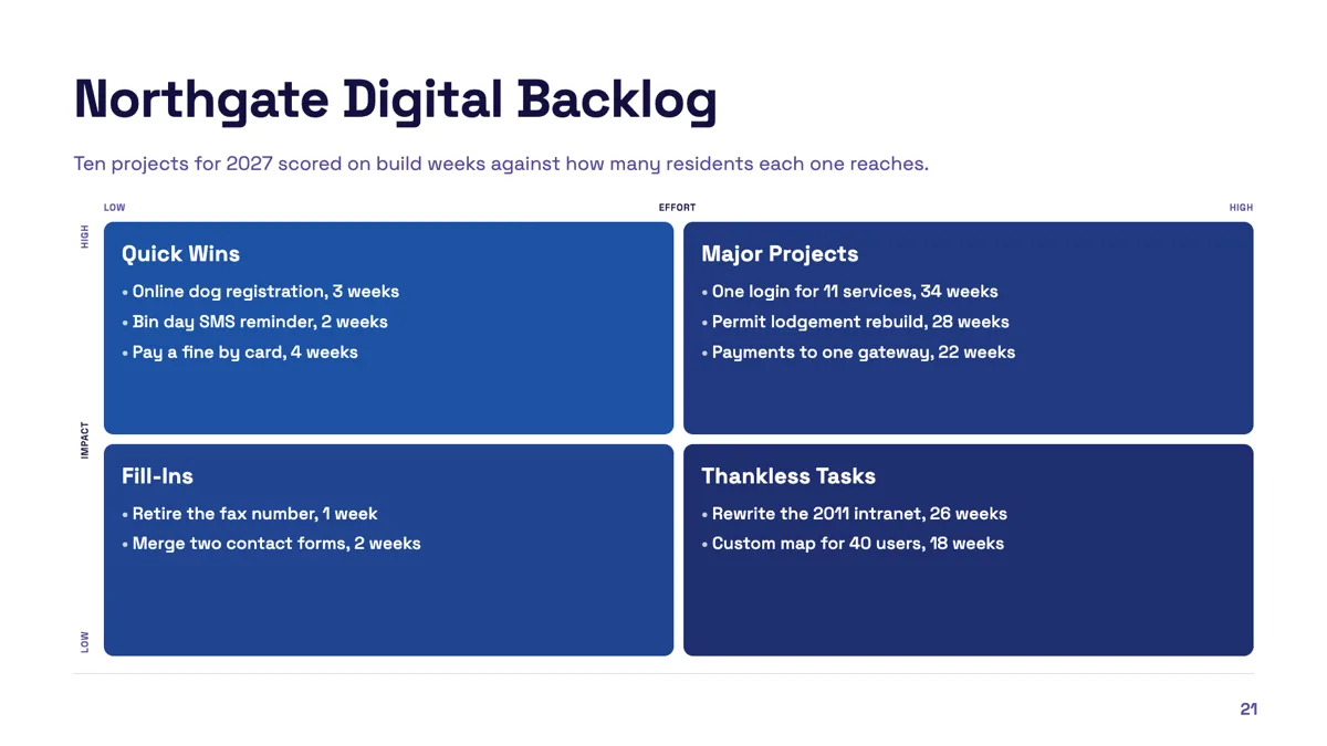
Effort impact matrix slide with ten projects placed
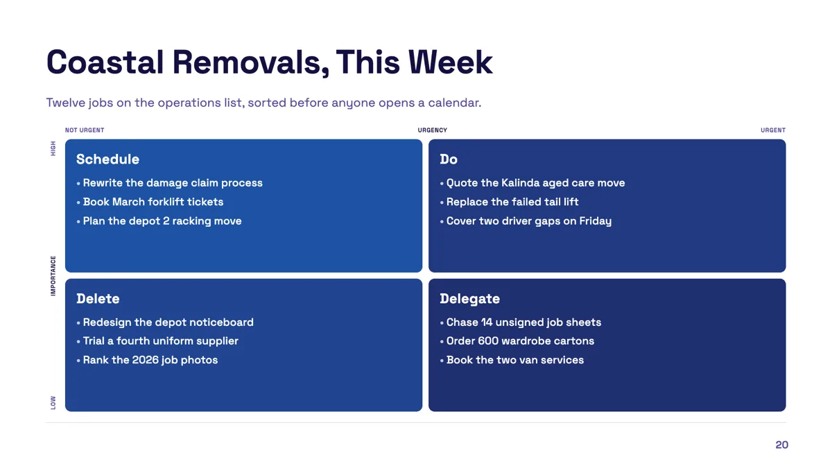
Eisenhower matrix slide with twelve tasks sorted
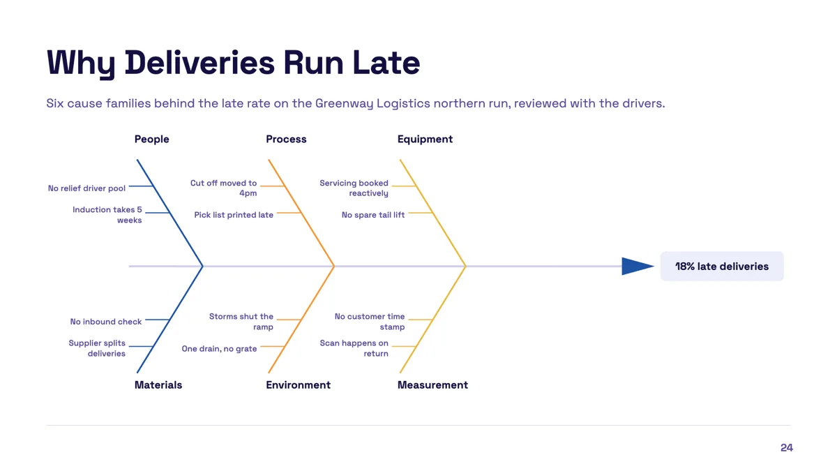
Fishbone diagram slide with six cause families
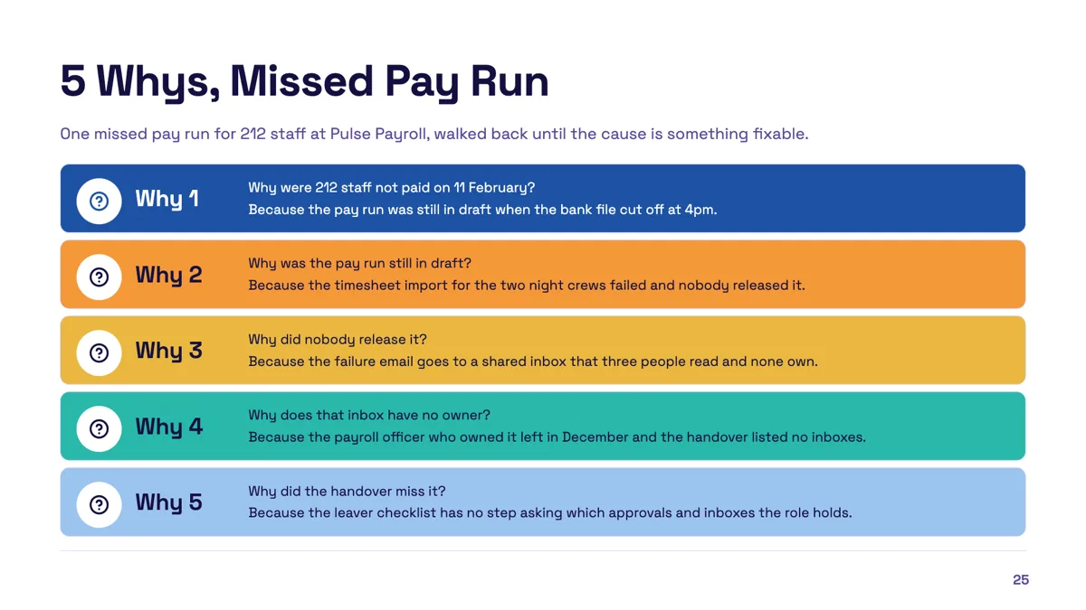
Five whys slide that ends at a fixable cause
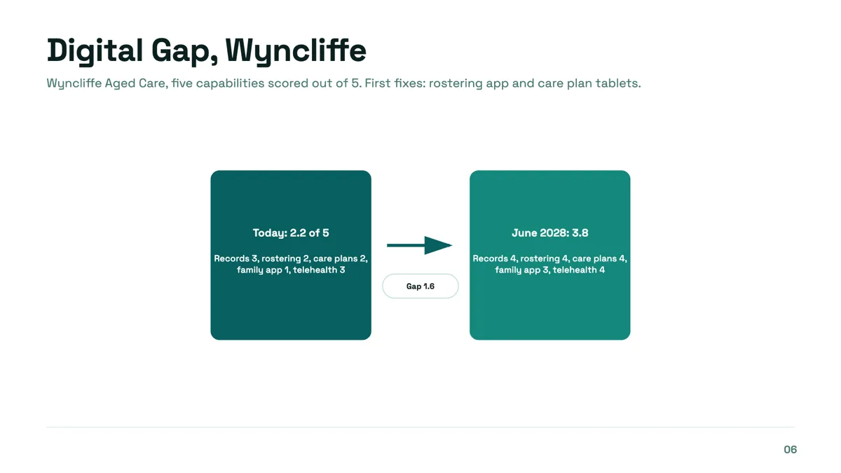
Gap analysis slide from current score to target
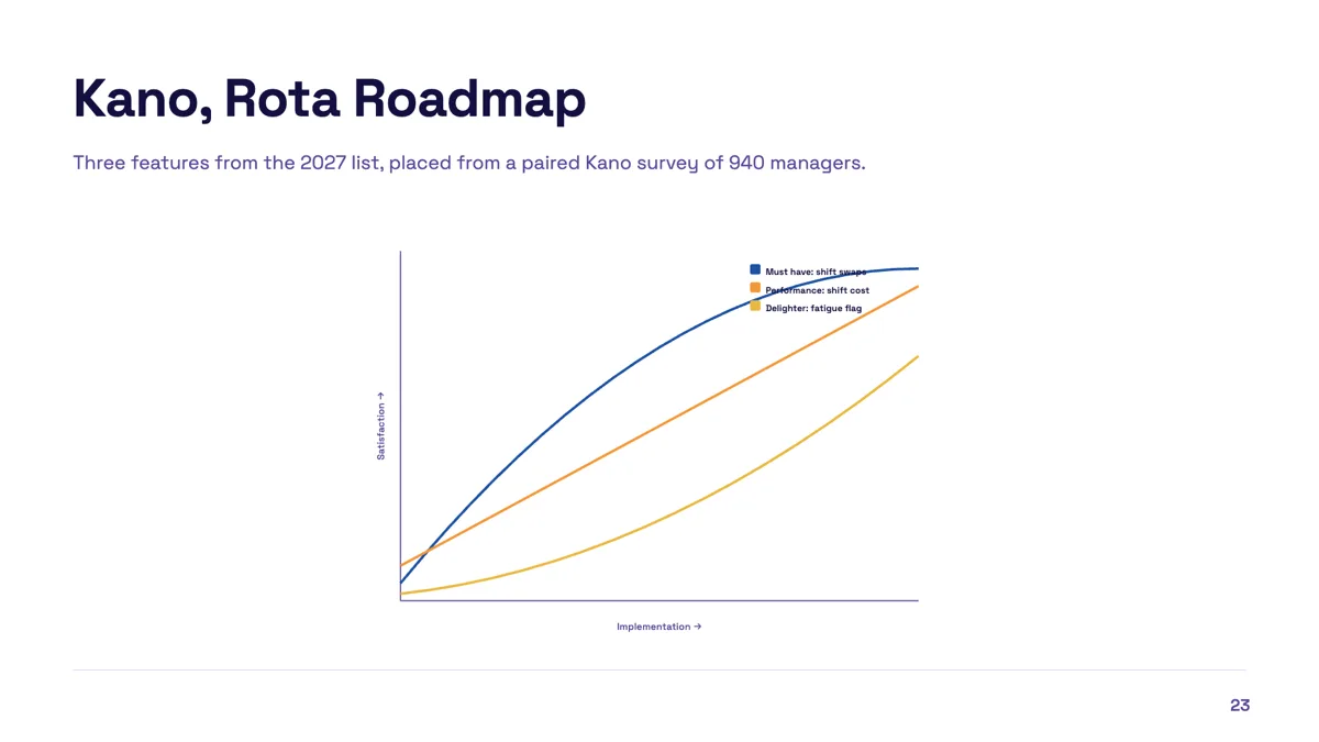
Kano model slide with three features classified
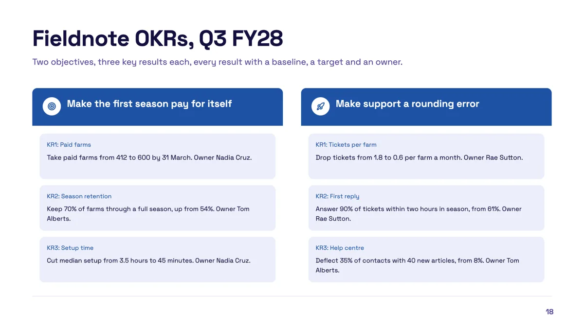
OKR slide example with two objectives and measurable results
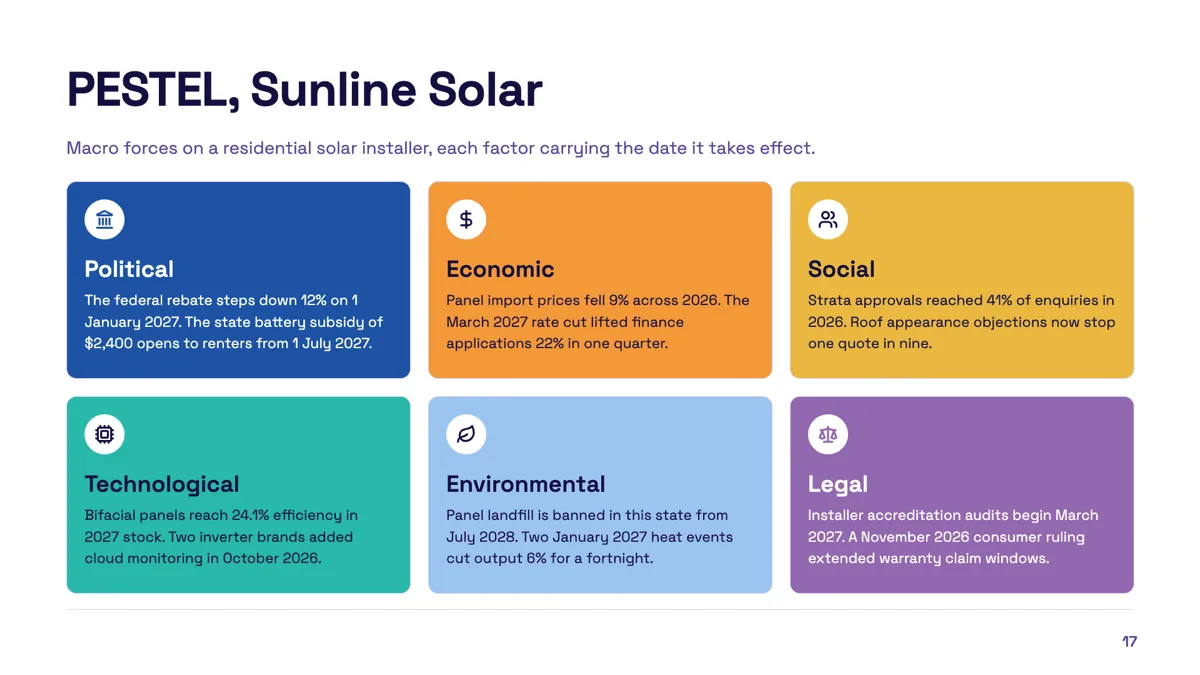
PESTEL slide example with a date on every factor
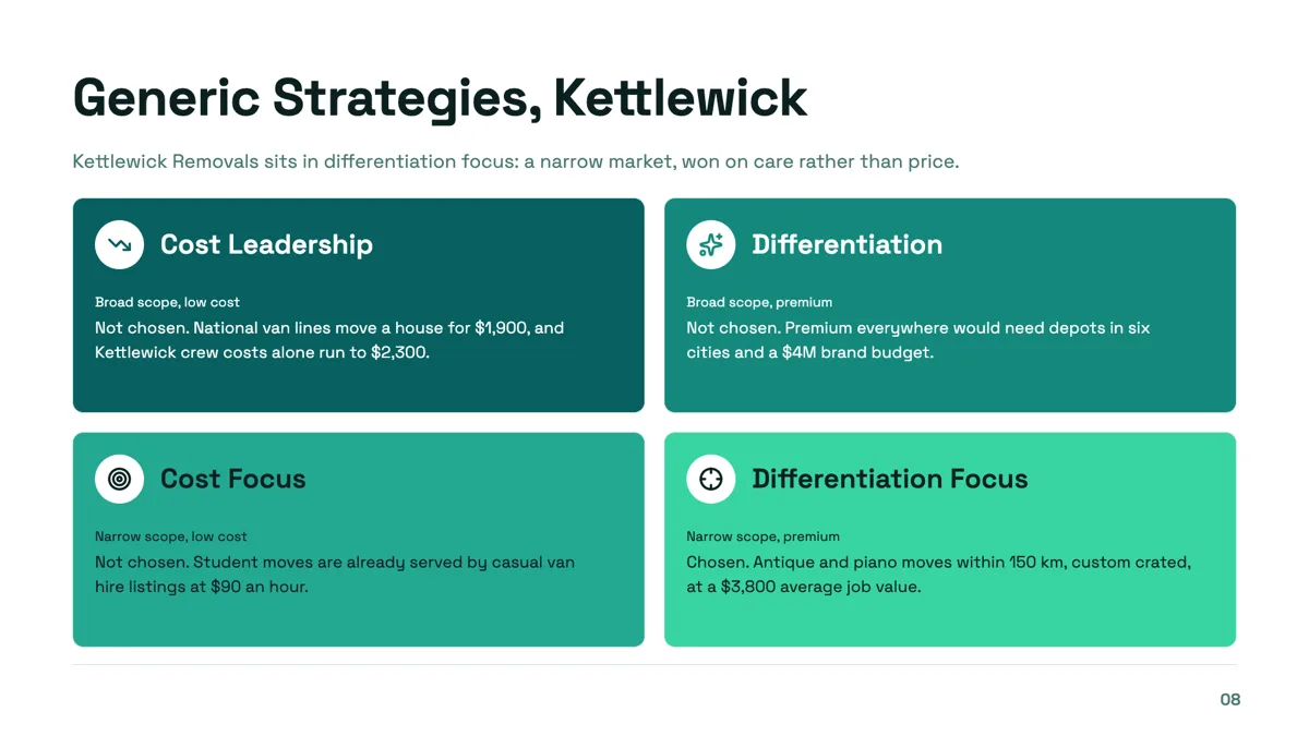
Porter generic strategies slide with one cell chosen and three ruled out
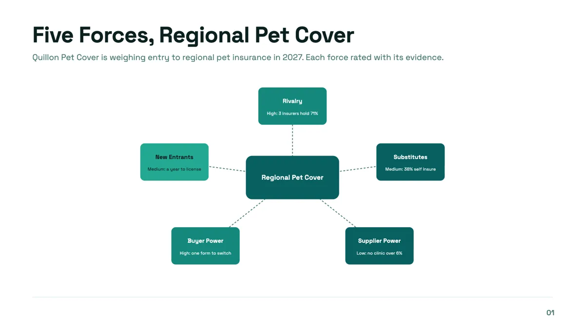
Porter's five forces slide with a rating and a reason on every force
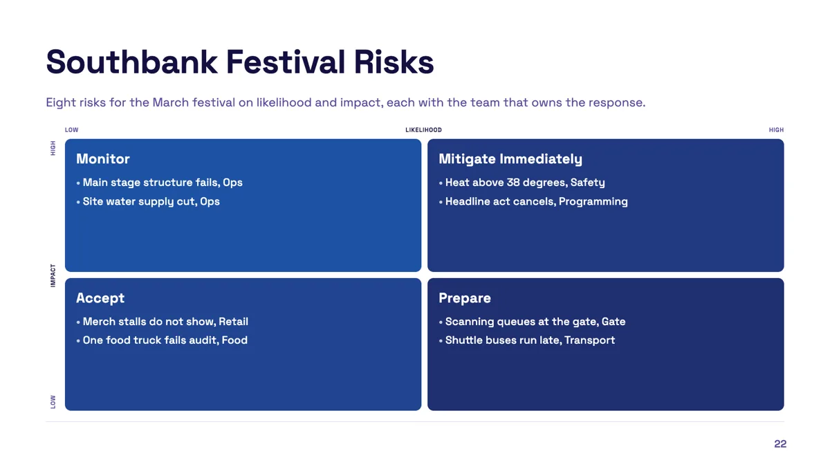
Risk matrix slide with eight risks and an owner on each
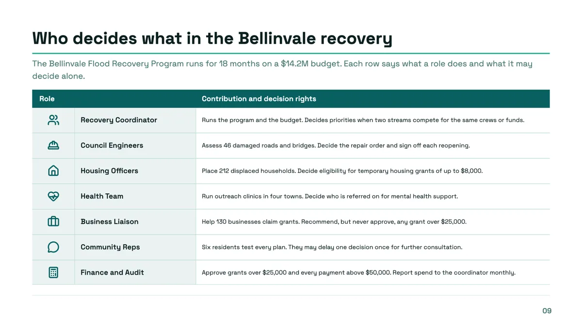
Roles and responsibilities slide with decision rights in every row
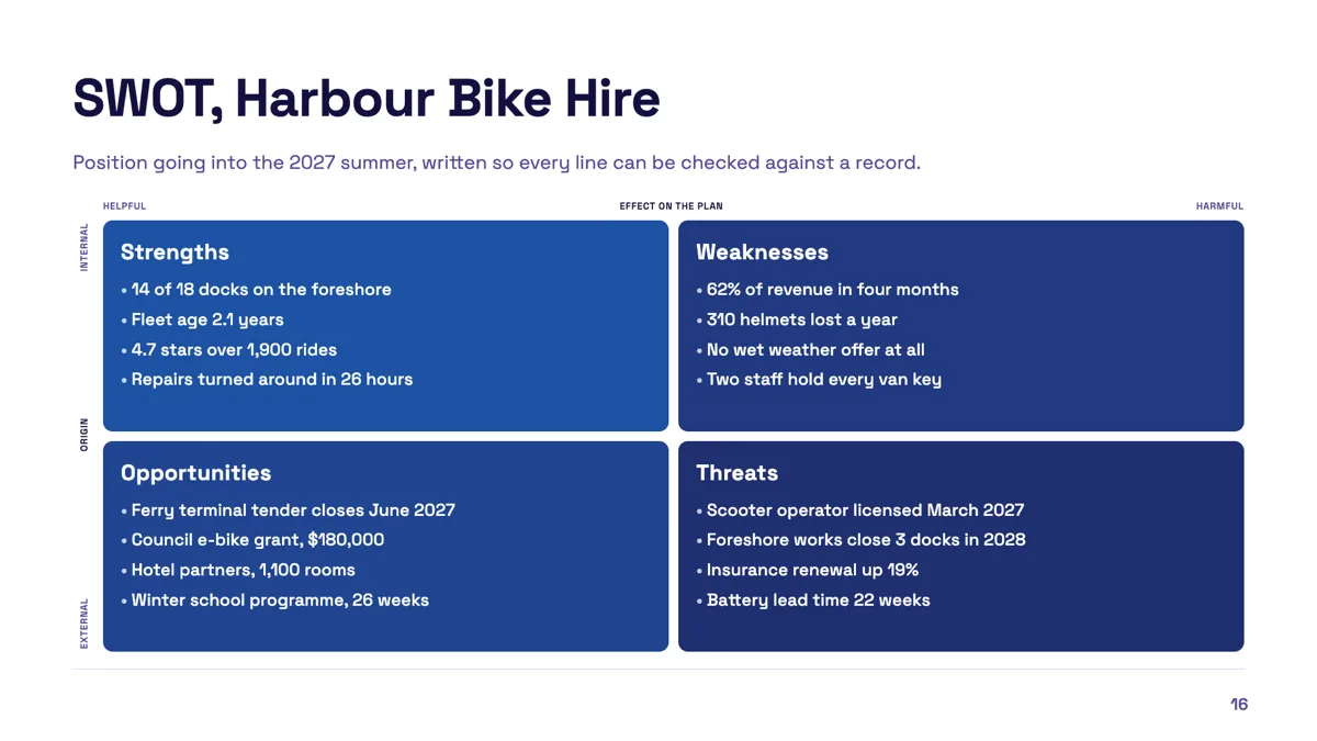
SWOT slide example filled with checkable points
Questions people ask
Can I position an item precisely inside a quadrant?
No. An item belongs to a quadrant and is listed inside it. If you need exact positions, a scatter is the wrong job for this component.
How many items fit in a quadrant?
There is no hard cap, and text shrinks to fit, which means readability is on you. Four short entries per quadrant is the practical ceiling on a projected slide.
Can I use my own axes?
Yes. Every axis name and every pole label is editable on the slide, so a ready made grid is a starting point rather than a fixed framework.
Is the Eisenhower grid different from the effort grid?
Only in its axes and its seeded quadrant names. They are the same component, so you can start from either and rewrite the labels.
Make your own presentation
The button opens the generator with this use case already described. Change the wording to match yours, generate, then edit anything you like.
Create a presentation with OneCraftRelated pages
SWOT analysis slide
A SWOT is four boxes and a discipline. The boxes are easy. The discipline is keeping each entry short enough to argue about and honest enough to be worth arguing about, which is mostly a writing problem rather than a design one.
Framework slides
A framework slide borrows a structure the audience already knows, so the argument arrives half understood. Twenty three layouts carry named models, from SWOT and PESTEL to Porter's five forces, Ansoff, the Kano model and a fishbone, each with the cell labels already in place.
Diagram slides
A diagram here is a list of labelled items and a decision about how to arrange them. Twelve arrangements are available and they all read the same list, so a funnel becomes a pyramid without you retyping anything.
More finished work of this kind is on the presentation examples hub.
Written and checked by the OneCraft team. Last checked .