3 finished designs
Open day flyer for a vocational college
Open day visitors arrive with one of three questions, what can I study, why here, and what happens on the day, and rarely all three. These flyers sell the same Saturday three ways for Bellweather College, a fictional provider teaching trades, nursing and hospitality to 2,200 students, and each one answers a different question while carrying the same date, time and campus.
The 3 designs
The same business laid out three ways, on three templates and three colour themes. Every price, name and time on these was written for this example, so you can judge the layouts on real content rather than placeholder text.
Course columns
Open Day, Saturday 15 August
Also native at A4 Landscape, Instagram Post, Instagram Story, Facebook Post, LinkedIn Post, Facebook Cover, Twitter Header

See it first
See It Before You Choose It
Also native at A4 Landscape, Instagram Post, Instagram Story, Facebook Post, LinkedIn Post, Facebook Cover, Twitter Header
Three step visit
Open Day, 15 August
Also native at A4 Landscape, Instagram Post, Instagram Story, Facebook Post, LinkedIn Post, Facebook Cover, Twitter Header
What each layout is doing
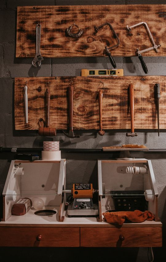
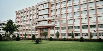
The courses design is the reference one: a tall workshop photo down the left, the date as the heading, a tinted why panel with five bullets, then three 300 character course columns and a footer split between contact and location with a small campus photo. It is the version for the mail-out, because it survives being read carefully. The promo design is the poster: two lines of hero type, a circular classroom photo, a five item list of what you can study, and a date badge, which is what goes in the shop window and the bus shelter. The plan design is the one for a student who has already decided to come, with three numbered steps, separate date, time and venue blocks, a bring a friend incentive and a QR code to register.
How to adapt these
For a primary school open day, drop the outcome percentage and put the class sizes and the enrolment dates where it sat, because parents are choosing on ratio and timing rather than employment. For a university faculty, keep the three column layout and use it for three degrees rather than three trades, and add the entry rank to each column since that is the first filter an applicant applies. For a childcare centre, the promo layout works with the five item list becoming the age groups you take, and the badge becoming the date your waitlist opens.
What makes these work
An outcome number sits above the fold
The courses design leads its why panel with 94% of graduates in work within six months, then one teacher to every 14 students, then real workshops rather than simulations. A prospective student choosing between two providers is comparing outcomes, and a flyer that opens with campus facilities is answering a question nobody asked first.
The visit is broken into three steps with a QR to start it
Register, pick a tour, ask about fees. The plan design gives each a 70 to 80 character body, then puts a QR slot beside the register link, and this template is one of the 17 designs that actually ships one. A visitor who knows the shape of the day before they arrive is a visitor who turns up at ten rather than at half past one.
All three say walk-ins are welcome
Registration lifts your numbers, but a flyer that makes registration sound compulsory loses the person who decided on Friday night. The courses design prints it in the eyebrow beside the hours, the promo design ends its call to action with "or just turn up on the day", and the plan design repeats it in the time block. Registration stays the ask, never the gate.
Questions people ask
What goes on an open day flyer?
The date and hours, the campus address, what a visitor can actually see or do, one reason to choose you over the next provider, and how to register. These three carry all five. What crowds a flyer is the full course list: three areas with a paragraph each tells a reader more than twenty course names in six point type.
Should I list every course?
No. Group them. The courses design uses three areas, trades, nursing and hospitality, and spends 300 characters on each explaining what the teaching looks like. The promo design lists five areas as bare labels, which is the right level for a poster. A full course list belongs on the website, where it can be filtered.
Do I need a map on the flyer?
You cannot draw one here. The map element is a world countries map with highlight and choropleth modes, so it can shade a country but not show a campus. Print the street address, the gate number and the nearest station instead, as these do with 80 Cannery Road, Gate 2, and put the directions link behind a QR on a design that ships a QR slot.
How do I get people to register rather than just turn up?
Give registration something walking in does not get. The plan design offers a draw for a $500 fee credit to anyone who registers two people, drawn at 4pm on the day, which is also a reason to stay until the afternoon. Keep the incentive small and the walk-in door open, because a hard gate costs you more visitors than the registration data is worth.
Where should open day flyers go?
Feeder schools, the local library, community centres, employment services and the counters of businesses in the industries you teach, which for this college means hardware shops, cafes and pharmacies. Online, the same design at Instagram Post and Facebook Post covers the feed. Check with your council before posting on poles, since unauthorised bill posting is usually an offence.
Can I export a version for the school newsletter?
Yes. A4 Landscape at 1754 by 1240 is a native size for all three designs, so the landscape version of the design is used rather than the portrait one being squashed. Add a page at that size, check the shorter layout still carries the date and the address, and export that page as a PNG or JPG.
Build your own in about a minute
The button below opens the generator with this use case already described. Change the wording to match your own, generate, then edit anything you like.
Make my open day flyer for a vocational collegeOther flyer examples
Bookshop event flyer
Marram Books puts sixty chairs in the room above the shop and sells a fifteen dollar ticket that comes off the price of the book on the night. Three flyers do the work. An announcement carries the price, the signing and the stairs. A window poster carries three sentences of the novel itself and almost nothing else. A ticketing sheet sets out the run of the evening, the venue block and a QR code that goes to the booking page.
School event flyer
Three flyers for the Brookvale Primary P&C Spring Fair on Saturday 20 September, each aimed at a different reader. The first goes home in the school bag with the date, 10am to 3pm on the oval, free entry, a $25 ride pass and six timed events. The second is the printed program handed out at the gate, thirteen rows of time, what and where. The third goes to stall holders, who have to apply by 29 August, with sites from $45 and the insurance and food registration a stall needs.
Concert and live music flyer
Three flyers for one Friday night at The Tannery on Peel Street, 12 September, with Kessler Drive, Amber Lowe and Night Ferry on the bill. The lineup poster goes up around the neighbourhood with the date, doors at 8pm and the 18+ line. The date poster goes behind the bar and lists the three acts against their set times, 8.30, 9.40 and 10.45. The full bill goes online for anyone deciding whether to buy, with the $28 entry, the Peel Street entrance and the last tram at half past midnight.
Want the steps in the builder? Read Choose the template, theme and size for your flyer, then Add or replace images in a flyer. For everything this generator can do, see the flyer maker.
Written and checked by the OneCraft team. Last checked .