3 finished designs
Seminar flyer for a business institute's evening talks
A seminar flyer sells a topic and a speaker rather than an agenda, and these three do it for Kestrel Business Institute, a fictional members club that runs free evening talks for members and charges guests $45. Each headline is the talk’s claim, the speaker’s name and credential sit in the first third of the page, and the same price line appears on all three so a member and a guest read the same fact.
The 3 designs
The same business laid out three ways, on three templates and three colour themes. Every price, name and time on these was written for this example, so you can judge the layouts on real content rather than placeholder text.

Retail seminar
Sell Everywhere Once
Also native at A4 Landscape, Instagram Post, Instagram Story, Facebook Post, LinkedIn Post, Facebook Cover, Twitter Header
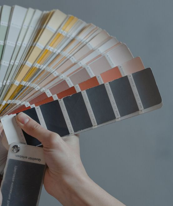
Brand positioning seminar
Own One Position, Not Ten
Also native at A4 Landscape, Instagram Post, Instagram Story, Facebook Post, LinkedIn Post, Facebook Cover, Twitter Header
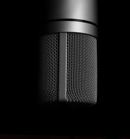
Public speaking seminar
Speak With Impact
Also native at A4 Landscape, Instagram Post, Instagram Story, Facebook Post, LinkedIn Post, Facebook Cover, Twitter Header
What each layout is doing
The retail design is the most informational of the three: a dark full bleed page with a photo band, three icon feature rows, and a bottom CTA button, so it works pinned to a noticeboard where someone reads it standing up. The positioning design splits the page diagonally, putting the headline and a 150 character intro beside the image and running the three steps as a navy band, which suits a handout at a networking breakfast where the reader has thirty seconds. The speaking design carries almost no body copy at all: a monogram, a spotlit photo and three short labels holding the date, the venue and the price, which is the version you print at A3 for the foyer.
How to adapt these
For a paid seminar, replace the members line with the single ticket price and add the refund cut-off in the same slot, because a paid seminar flyer that hides its refund rule generates emails instead of bookings. For a two speaker panel, use the positioning layout and give each speaker one of the three step titles, since the steps block is the only place with room for two names and two credentials. For a lunchtime seminar, cut the intro paragraph entirely and put the finish time in the headline block, because the only question a lunchtime audience has is whether they will be back at their desk by two.
What makes these work
The speaker is named above the fold on all three
The retail design carries "WITH ALANA VOSS, RETAIL CONSULTANT" in the header block, the positioning design opens its intro with "With Nadia Kerr, brand strategist", and the speaking design gives Marcus Delaney the largest type on the page under the word WITH. A seminar is a person talking for ninety minutes, so the person is the product, and none of these three makes the reader hunt for the name.
One price line, written the same way three times
Every design prints "Free for members, $45 guests" in the same eight words. It sits in the closing tagline on the retail flyer, under the CTA button on the positioning flyer, and in the third feature row on the speaking flyer. A member reads it as free and a guest reads it as $45, and neither has to email to find out which they are.
The feature lists stop at three
All three templates cap their feature list at three items, so the copy had to choose: stock in one system, returns without a fight, what it costs. That constraint is why these read as posters rather than programmes. A seminar flyer that lists eight takeaways has already told the reader the talk is unfocused before they decide whether to come.
Questions people ask
What goes on a seminar flyer?
Six things: the claim the talk makes, the speaker and one line of credential, the date and finish time, the venue, the price, and how to reserve a seat. These three carry all six and nothing else. What gets left off is the speaker biography and the sponsor list, because both push the price and the finish time below the fold, and those are the two facts people scan for.
Seminar or workshop flyer, what changes?
A workshop flyer sells an agenda and a seat cap because you do the work in the room, so it prints an hour by hour shape and a number of places. A seminar flyer sells a claim and a speaker, so it prints a name, a credential and a finish time instead. The layouts differ too: a workshop needs a step list, a seminar needs room for one large headline.
Do I need the speaker’s photo?
No, and none of these three uses one. The speaking design uses a microphone on a stand, the positioning design uses paint swatches, and the retail design uses a shop counter. An object photo carries the subject without a headshot session, and it means nobody has to sign a release before the flyer goes to print. If you do use a portrait, get it in writing first.
Where do I put the price for a free seminar?
In the same place you would put a paid price, and print the word free rather than leaving the line out. An empty price line reads as an omission, and readers assume the omitted number is high. These three print "Free for members, $45 guests" so the free half and the paid half sit in one sentence, which is also the fastest way to advertise membership.
How do I distribute a seminar flyer?
A4 for the noticeboard and the front desk, then the same design at a social size for the feed. Every design here is authored natively at seven other sizes, so you add a page, pick the size, and the matching version of the design is swapped in with your copy carried across. Check the shorter layouts, because a smaller canvas can drop a line that had no room.
Can I make a LinkedIn version?
Yes. LinkedIn Post is 1200 by 627 and every one of these designs has it, because the product reuses the Facebook Post file for LinkedIn at the same aspect. Add a page, choose LinkedIn Post, and the wide version of the same design comes in with the speaker and the date. Export that page as a PNG, since PNG export covers the page you are on.
Build your own in about a minute
The button below opens the generator with this use case already described. Change the wording to match your own, generate, then edit anything you like.
Make my seminar flyer for a business institute's evening talksOther flyer examples
Workshop flyer for a small business training studio
A workshop flyer sells one outcome, shows the agenda and makes registering obvious, and these three do exactly that for Kilnhouse Studio, a fictional training room in a converted pottery that runs paid workshops for local business owners. Each flyer names the outcome in the headline, breaks the day into three steps, and prints the price beside the date, because a workshop flyer without a price collects enquiries instead of bookings.
Cooking class flyer for a kitchen school's term classes
A cooking class flyer that only names the cuisine leaves the reader guessing about aprons, knives and whether dinner is included. These three are for Saltbush Kitchen School, a fictional school teaching 30 classes a term in a converted bakery, and each one says what you will cook, what is provided and what to bring, alongside the date and the price.
Webinar flyer for an online accounting education company
A webinar flyer has to do one thing a printed event flyer does not: state the time with its zone and make the link the biggest thing after the headline, because the reader is already on a screen. These three are for Ledgerwise, a fictional company that teaches finance to founders over live sessions, and each prints AEDT beside the time and puts the register link in its own block.
Want the steps in the builder? Read Create a flyer for Instagram and print, then Change flyer colours and fonts with themes. For everything this generator can do, see the flyer maker.
Written and checked by the OneCraft team. Last checked .