Classic form
Website brief form the discovery call can start from
A website brief is the difference between a quote and a guess, and clients will answer twenty questions if each one is obviously about their site. This questionnaire asks for goals in rank order, features as a checklist rather than a wish, and the two facts that change the price most, content readiness and budget.
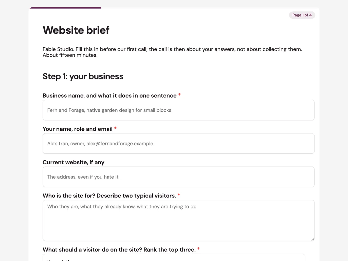
The form itself
A static copy of the finished form, exactly as it renders. Nothing here can be filled in or submitted, so read it as a reference and build your own from the button above.
Every field, and what it collects
The complete field list, in the order respondents meet it.
- Business name, and what it does in one sentenceShort textRequired
- Your name, role and emailShort textRequired
- Current website, if anyShort text
- Who is the site for? Describe two typical visitors.Long textRequired
- What should a visitor do on the site? Rank the top three.TableRequired
- Columns: Action
- Three websites you like, and one thing you like about eachTableRequired
- Columns: Site · What you like about it
- Pages you expectMultiple choiceRequired
- Options: Home · About · Services · Products or shop · Portfolio or work · Blog or news · Contact · Bookings · Careers · Other
- FeaturesMultiple choice
- Options: Online shop · Bookings or calendar · Payments · Member login · Newsletter signup · Multiple languages · Live chat · Search
- Roughly how many pages?Single choiceRequired
- Options: Up to 5 · 6 to 15 · 16 to 40 · More than 40
- Content: who writes the words?Single choiceRequired
- Options: We have it ready · We have some · We need it written
- Photos and videoSingle choiceRequired
- Options: We have professional images · We have phone photos · We need a shoot · Stock is fine
- BrandSingle choiceRequired
- Options: Logo and brand guide exist · Logo only · Nothing yet
- Logo and brand filesFile upload
- Up to 5 files, images or PDF. Vector files if you have them.
- Budget bandSingle choiceRequired
- Options: Under $5,000 · $5,000 to $12,000 · $12,000 to $30,000 · Over $30,000 · Not sure yet
- When does it need to be live, and why that date?Short textRequired
- Domain and hostingMultiple choice
- Options: We own the domain · We know the registrar login · We have hosting · We know who manages email
- Who signs off on the design?Short textRequired
- Anything that has gone wrong with a website project before?Long text
- Anything elseLong text
Step 1: your business
Step 2: the site
Step 3: practicalities
What a brief has to settle before a quote
Scope, content and money, and the middle one is the sleeper. Scope lives in step two as checklists, because online shop and member login are line items, not adjectives, and a ticked feature can be priced. Money is the budget band with an honest escape hatch. Content is the question that wrecks schedules: a site with words ready launches on time, and a site where we need it written is a writing project wearing a web project's clothes. That is why content readiness is its own required question rather than a line in a text box, and why the quote reads it first.
How to adapt this form
An app brief swaps the pages checklist for platforms and core screens, and the domain questions for app store account status. A rebrand brief expands the brand section into the whole of step two, asking what must survive the rebrand, which is the question that prevents the logo-shaped grief later. An agency intake version adds a how did you find us dropdown and a timeline question per project type. In each variant, keep a ranked goals table and the sign-off question: every troubled project in the anything-gone-wrong answers is missing one of those two.
What makes this form work
Goals are ranked in a table, not listed in a paragraph
The first table forces the top three visitor actions into rank order with numbered rows. When more enquiries outranks look more modern in writing, every later design decision has a referee, and the client made the call themselves on row one.
The two price-setting questions have escape hatches
Content readiness offers we have some, and budget offers not sure yet. Both answers are honest and both are usable: they trigger a conversation instead of a fiction, and the quote that follows carries assumptions the client has already seen named.
The domain checklist names four weeks of hidden delay
Owning the domain, knowing the registrar login, having hosting, knowing who manages email: each unticked box is typically a week of archaeology at launch time. Asking at the brief stage moves that digging to the quiet start of the project instead of its final fortnight.
Questions people ask
How many questions should a website brief ask?
Around twenty, which is what this form carries across its three steps. Fewer, and the quote is a guess with a margin built in; many more, and clients stall halfway. Every question here changes the price, the schedule or the design, which is the test each one had to pass to stay.
Should a designer ask for the budget?
Yes, as bands with a not sure option. A band is not a commitment; it is the difference between designing a $6,000 site and a $25,000 one, which are different objects. The thank-you screen makes the pact explicit: if budget and scope do not meet, the studio says so before the call.
Why ask for three sites they like?
Because the reason is the data. The table pairs each site with one thing you like about it, and those three reasons, the calm layout, the booking flow, the photography, are design direction in the client's own words. Without the reason column it is just three URLs and a mood.
When should the brief be sent?
Before the discovery call, which is the entire premise printed in the form's intro. A call that starts from the answers digs into ambition and taste; a call that starts from a blank page spends its hour collecting what this form collects in fifteen minutes.
Why is this a classic form and not one question per screen?
Because a brief is a document the client thinks about, scrolls back through, and revises before sending. The paginated classic layout shows each step whole, so the features checklist can be reconsidered after the budget band comes into view. One question at a time suits confessions, not briefs.
What happens with the logo files?
They arrive with the response and appear in its PDF, so the studio starts with the real assets rather than a screenshot of a letterhead. The field caption asks for vector files, which is a one line request that saves a fortnight of chasing the original designer.
Build your own in about a minute
The button below opens the generator with this use case already described. Change the wording to match your own, generate, then edit anything you like.
Make my website brief form the discovery call can start fromOther form examples
Lead capture form
A lead capture form has one job: find out quickly whether there is anything here for either side. This one asks nine questions, three of which are the contact details and five of which are genuine qualifiers, and it tells people outright what spend level makes the numbers work rather than booking a visit to break the news. It is conversational, because a short qualifying form that shows one question at a time gets finished on a phone.
Demo request form
A demo request form that opens with company size and budget is asking the buyer to qualify themselves before they have any reason to. This one takes the three contact fields first, then spends five questions working out who should run the session and what to actually show. It is conversational, one question per screen, because a booking form on a phone is finished when nothing on screen looks like work.
Request a quote form
Most quote request forms collect a name, a phone number and the sentence "I need a fence", which guarantees a call, then a visit, then a price. This one asks for the four things that actually let a trade put a number on a job: a measured run, a photo down the whole line, the ground conditions and a budget band. It is a classic form, because the photo field and the measurement have to be visible together while somebody stands at the job.
Want the steps in the builder? Read Paginate a classic form into steps, then Form builder components. For everything this generator can do, see the form maker.
Sources
Written and checked by the OneCraft team. Last checked .