Slides templates
Quarterly business review templates
A business review is a standing meeting with a fixed shape: what we said we would do, what the numbers say, what we are committing to next. Fourteen layouts across five roles cover that, chosen from the 369 slide templates so the numbers get tables and scorecards rather than decoration.
14 designs
What these designs are for
Use this for a quarterly or monthly review where the audience already knows the business and wants the figures. These layouts lead with tables and dashboards rather than hero statistics, and they end on commitments with owners rather than a thank you slide.
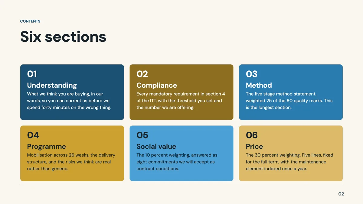
Agenda: Numbered Index Grid
Agenda. Six sections as a three by two index grid with numbered cards and a short description each.
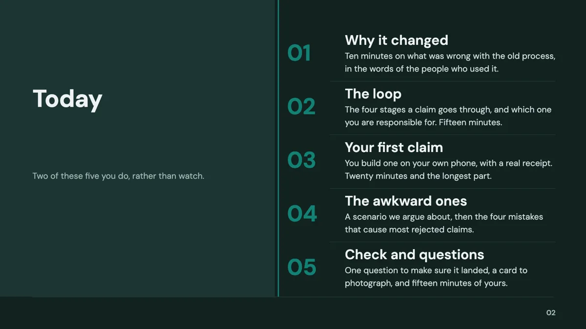
Agenda: Dual Column Five
Agenda. Five sections as stacked rows with giant numerals beside an oversized title panel.
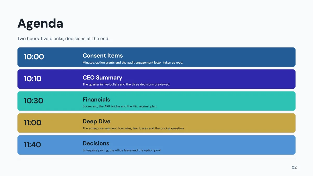
Agenda: Time Slot Rail
Agenda. Five rows, each a timestamp, a session name and a one line preview, for a timed meeting.
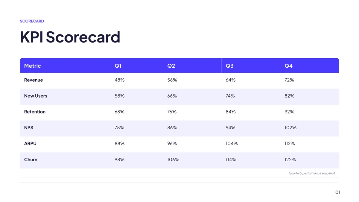
Metrics: KPI Scorecard Table
Metrics. Five columns of metric, target, actual, variance and status across five to eight rows.
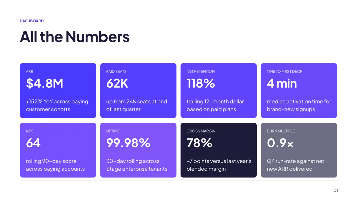
Metrics: Dashboard Wall of 8
Metrics. Eight KPI cards in a four by two grid, each with a label, a number and a delta line.
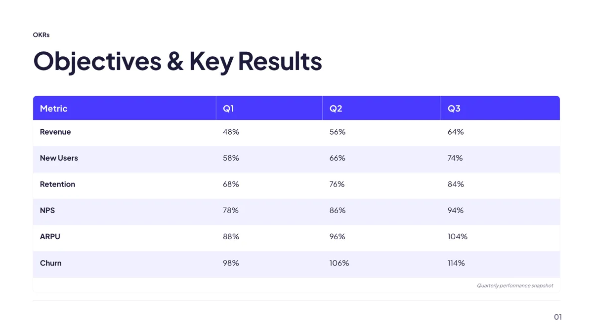
Metrics: OKR Tracking Table
Metrics. Objective, key result, progress and status in four columns across four to six rows.
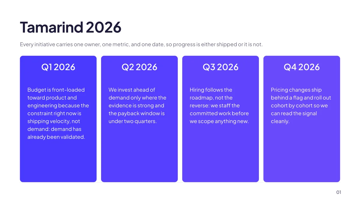
Timeline: 4 Quarter Columns
Timeline. Four quarter columns, each with a period label and a short prose body.
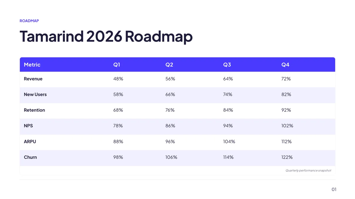
Timeline: Quarterly Roadmap Table
Timeline. A five column roadmap table naming a deliverable per quarter across four to six workstreams.
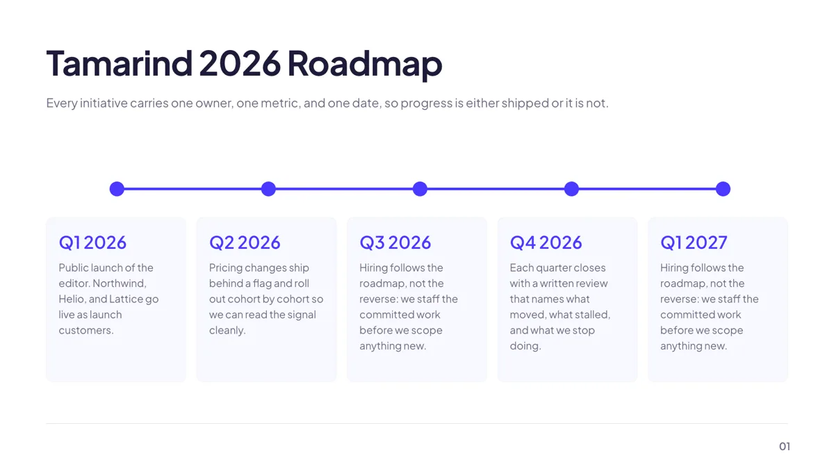
Timeline: 5 Horizontal Milestones
Timeline. Five milestone dots on one line, each with a label above and a sentence below.
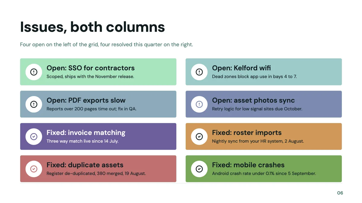
Checklist: Two Column Dense Eight
Checklist. Eight compact cards in a two by four grid, each an icon, a heading and one line.
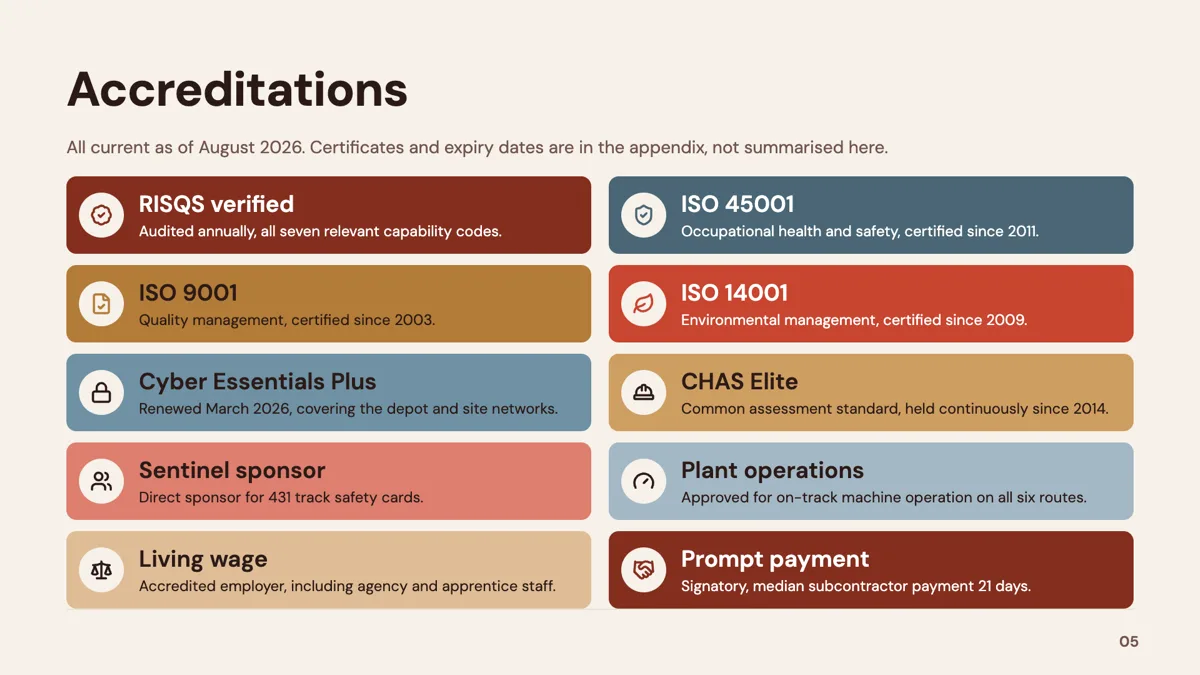
Checklist: 5×2 Grid
Checklist. Ten brand filled cards in a two by five grid for a comprehensive list.
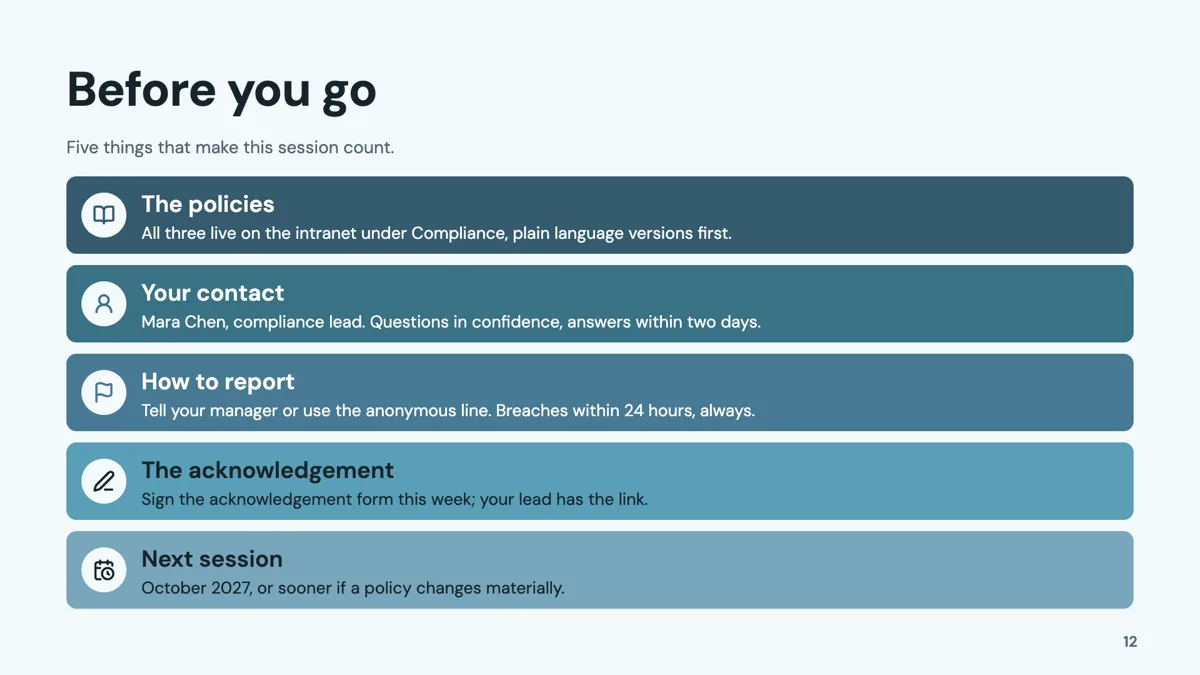
Checklist: 5 Row Stack
Checklist. Five full width cards stacked down the slide, the default checklist shape.
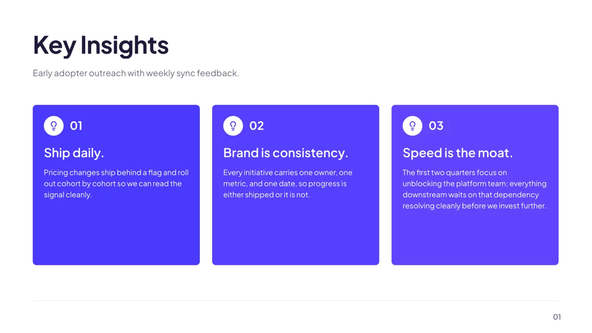
Takeaway: 3 Numbered Key Insights
Takeaway. Three numbered cards, each a heading and one sentence of reasoning.
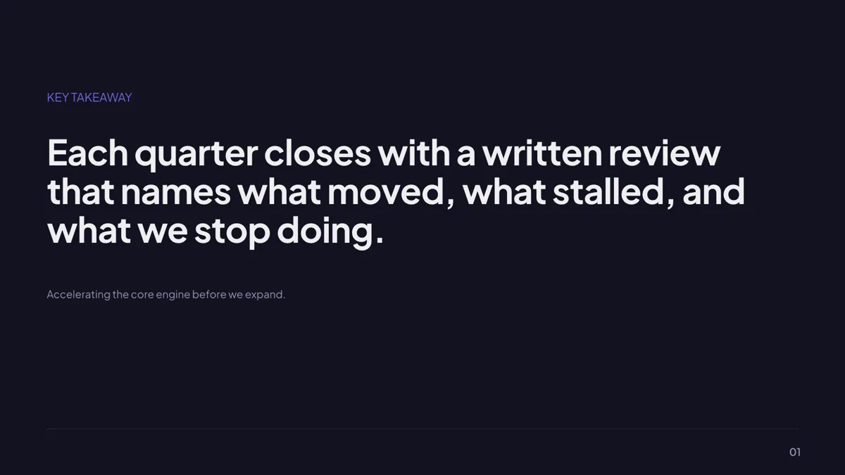
Takeaway: Single Bold Statement
Takeaway. One bold line filling the slide, with an optional attribution beneath.
Agenda: 12 layouts, pick by section count
The agenda role holds 12 templates and each is built for a specific number of sections: a two by two grid for four, a number rail for five, an index grid for six, a numbered list for eight. Padding a four card layout to six is what makes an agenda look wrong. If the review runs to time, the time slot rail is the only layout that gives each row a timestamp, which is worth having when the finance section always overruns.
Metrics: use the tables, not the hero numbers
Of the 34 metrics layouts, a review wants the ones that hold a grid of figures: the KPI scorecard with metric, target, actual, variance and status, the OKR tracker, and the dashboard wall of eight cards. Hero stat layouts are for a pitch, where one number is the message. Tables here are typed rather than linked to a spreadsheet, and a table slot grows to 20 rows and 8 columns, with an optional first column as a row header.
Timeline: the quarter, not the roadmap
Eighteen timeline layouts exist, four of which are Gantt charts. For a review, the quarterly column layout and the roadmap table carry more than a milestone rail does, because each period holds several parallel items rather than one label. Note two limits: points are evenly spaced, so a two month gap cannot be drawn wider than a two week one, and the Gantt has no dependency arrows, because the task shape is name, start, end and an optional group.
Commitments: a checklist with owners
The checklist role holds 13 templates, from a five row stack to a ten card grid. In a review, the checklist slide is where next quarter's commitments live, and the useful discipline is one owner and one date per row. The dense eight card grid is the largest that stays readable at the back of a meeting room; the ten card grid is better on a document that people read at their desks.
A note on the thumbnails
The agenda and checklist cards are slides from example decks published here; the metrics, timeline and takeaway cards are the layout rendered by the template library with its own placeholder content, the same sample text the public gallery shows. Nothing inside a thumbnail is a real figure, a real company or a real quarter. One takeaway layout is named in the prose rather than pictured because its sample line makes a performance claim, which has no place on a page about layouts.
How many slides a review runs to
The reviews published here are 10 to 12 slides: the quarterly business review deck is 10, the customer and sales QBR decks 10 each, the board meeting deck 12 and the all hands deck 11. The pattern is one agenda, three or four metrics slides, one timeline, one commitments slide and one takeaway. The takeaway role has only seven layouts in the whole library, so it is worth choosing deliberately rather than defaulting to the five to seven line bullet recap.
Finished examples
Questions people ask
What is in a quarterly business review?
An agenda, the numbers against target, what shipped in the quarter, what is committed for the next one, and the takeaways. The decks published here do that in 10 to 12 slides, with three or four of them given to metrics.
Can a KPI table pull figures from a spreadsheet?
No. Table content is typed into the slot, and a table grows to 20 rows and 8 columns with draggable column widths and an optional row header column. Paste the figures in when they are final, because nothing updates itself.
Can I show two quarters side by side?
Yes, with the year over year table layout, which sets an earlier and a later period against a change column, or with the two panel metrics layout for a single pair of figures. Both are typed, so the comparison is yours to state.
Do the status labels colour themselves?
Status values such as on track or at risk are text you type into the table. Series colours on charts follow the slide colour mode: spectrum and outline modes remap them, matching and dark modes keep the brand colour so a bar cannot vanish into the background.
Can I present this without a projector in the room?
Yes. Present mode runs full screen with keyboard control, and the notes pop out into a second window titled Speaker notes that you drag to another screen. Below 1024 pixels the notes pane does not exist, so a phone is not a presenter console.
Can I reuse last quarter's deck?
Yes. Open the deck, use restore from the version list if you need an older state, and retype the figures. Restoring clones the old version into a new one with a summary saying which version it came from, so nothing is lost.
Start a slide from a description
The button opens the generator with a starting description already filled in. Change it to match your own before you run it.
Create a presentation with OneCraftFor everything the generator can do, see the slide maker.
Other slide examples sets
Sources
Written and checked by the OneCraft team. Last checked .