Slides templates
Pitch deck templates, slide by slide
A pitch deck is not one template, it is a sequence of slides each doing a different job, and the layout that suits a market size chart is wrong for a use of funds table. This page walks the sequence in order and shows the real layouts filed under each role, fifteen of the 369 in the library, with the pricing and investment layouts described in words.
15 designs
What these designs are for
Use this when you know roughly what the deck has to say and need to choose the shape of each slide. The cover, the why now statement, the market sizing, the competitor position, the pricing and the raise each have layouts built for them, and choosing well is most of what makes a deck read as finished rather than assembled.
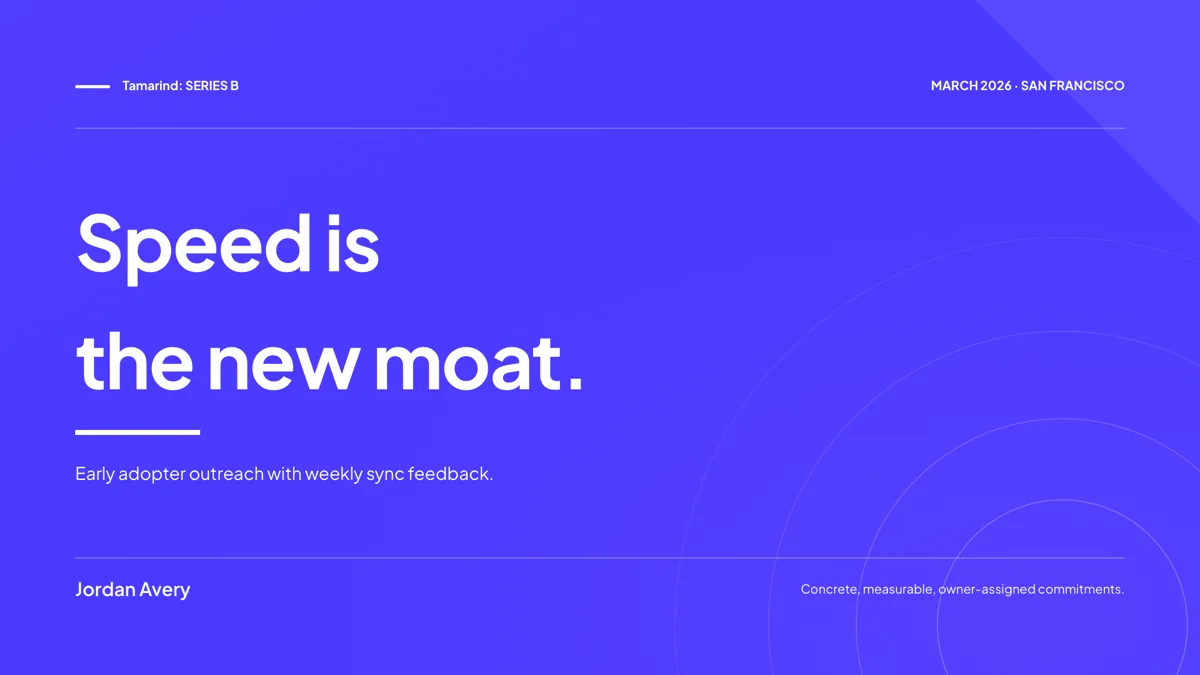
Cover: Dark Demo Day Bleed
Cover. Full bleed brand cover in the demo day tradition, with an event meta rail across the top.
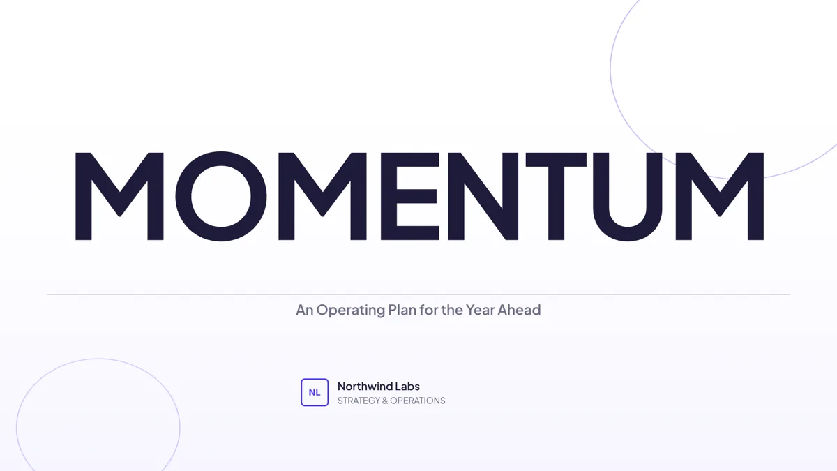
Cover: Oversized Condensed Word
Cover. One oversized condensed word fills the slide above a rule, with a serif sub line under it.
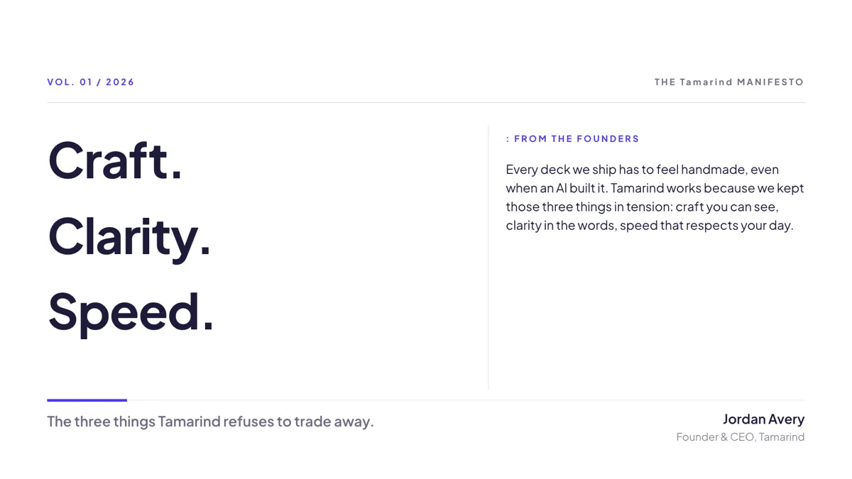
Cover: Stacked Display Type
Cover. Two column editorial cover with a stacked one word per line title and a masthead above.
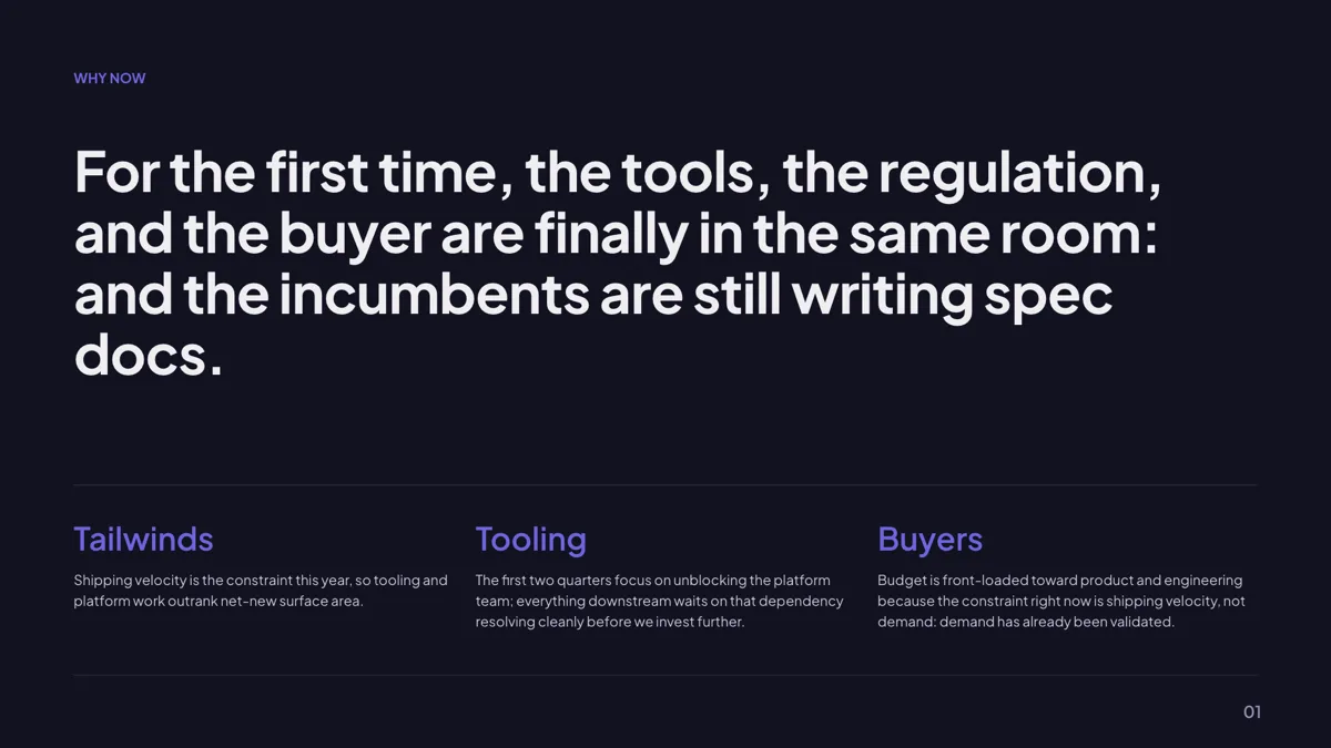
Context: Why Now Big Statement
Intro. A giant why now paragraph across the top two thirds, then three short named pillars.
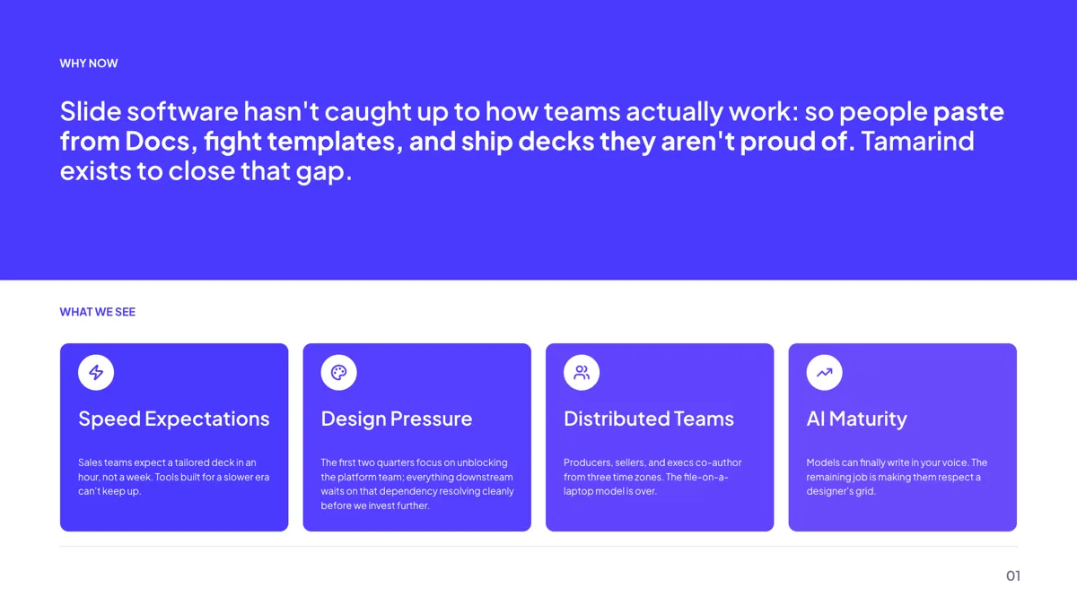
Context: Hero Statement, 4 Pillar Cards
Intro. A brand coloured hero band holding the thesis, with four icon led pillar cards below.
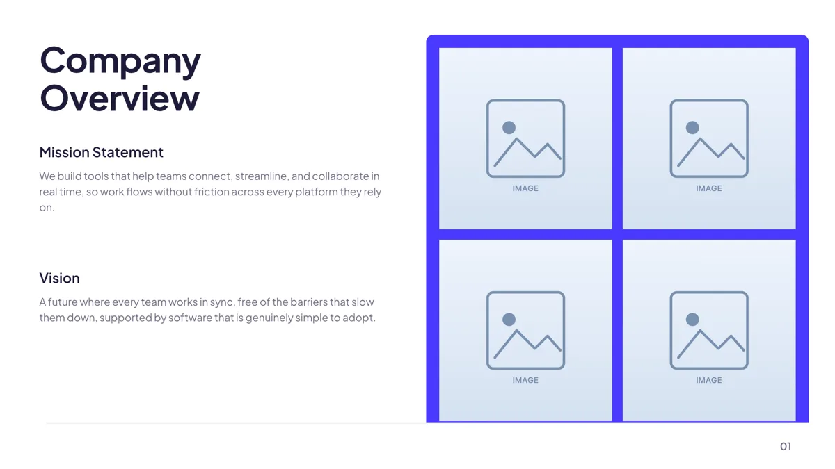
Context: Dual Statement + Photo Panel
Intro. A two line title over mission and vision blocks, balanced by a two by two photo collage.
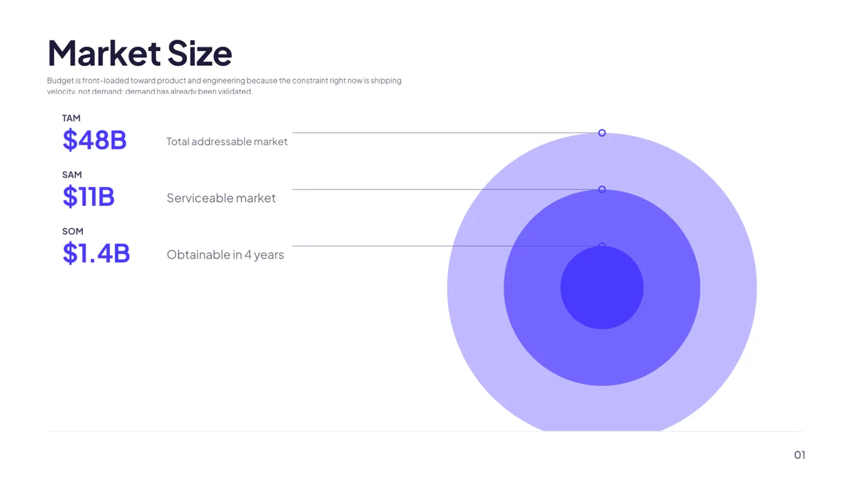
Metrics: TAM / SAM / SOM Concentric Circles
Metrics. Market sizing as three nested circles, each with a callout carrying the value and one line.
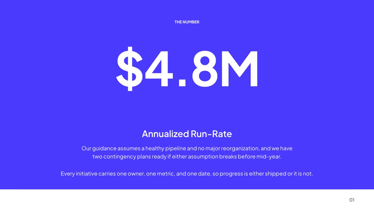
Metrics: Single Hero Number
Metrics. One number at display size with its label and a short line of context beneath.
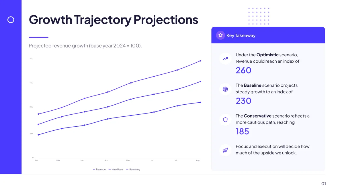
Metrics: Growth Trajectory Scenarios
Metrics. A three scenario growth line chart beside a key takeaway panel naming each endpoint.
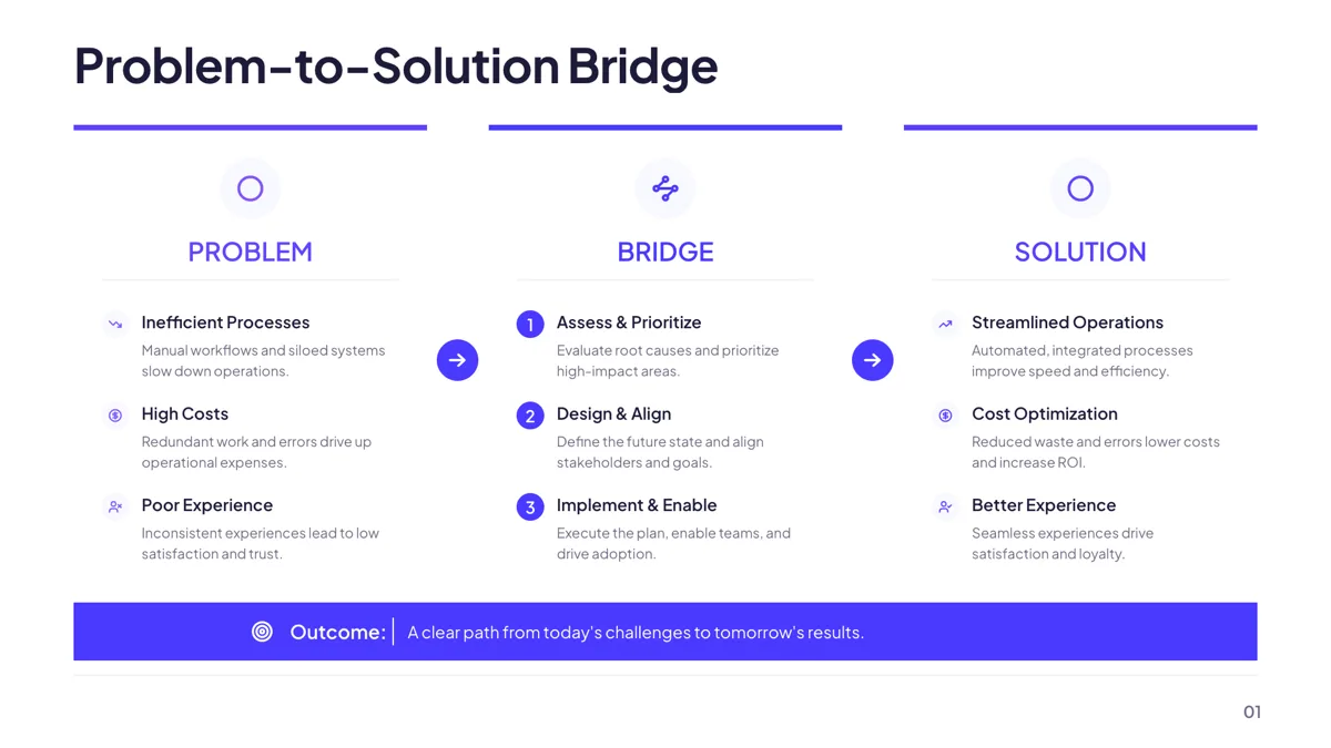
Comparison: Problem → Bridge → Solution
Comparison. Problem, bridge and solution as three columns that narrate the change end to end.
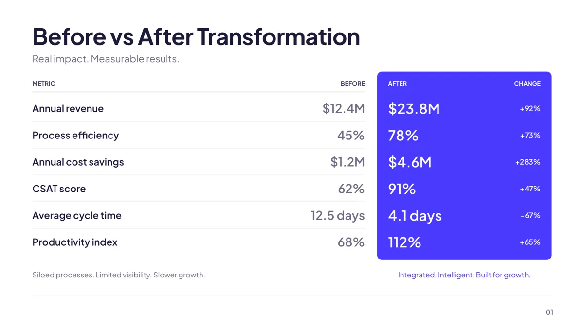
Comparison: Before/After Metric Panels
Comparison. Before and after panels with the figures that moved between them set side by side.
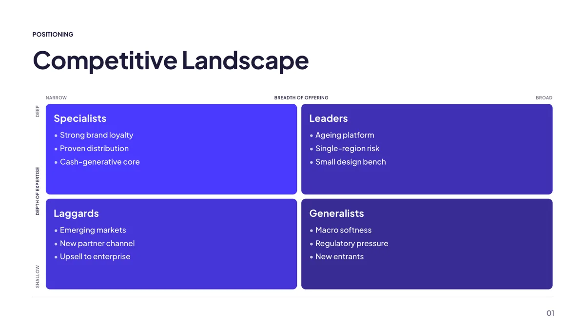
Grouping: Competitor Scatter 2x2
Comparison. A two by two positioning matrix with competitor names listed in each quadrant.
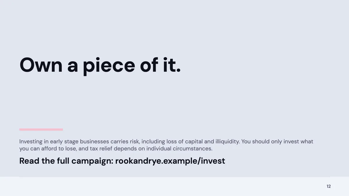
Closing: Left-Aligned CTA Hero
Closing. A left aligned invitation in display type with one action bar underneath.
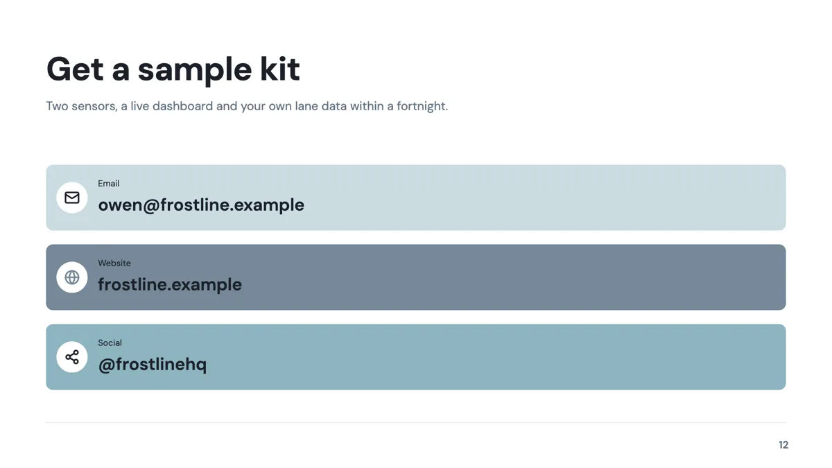
Closing: Contact Card Stack
Closing. A short headline over exactly three full width contact rows.
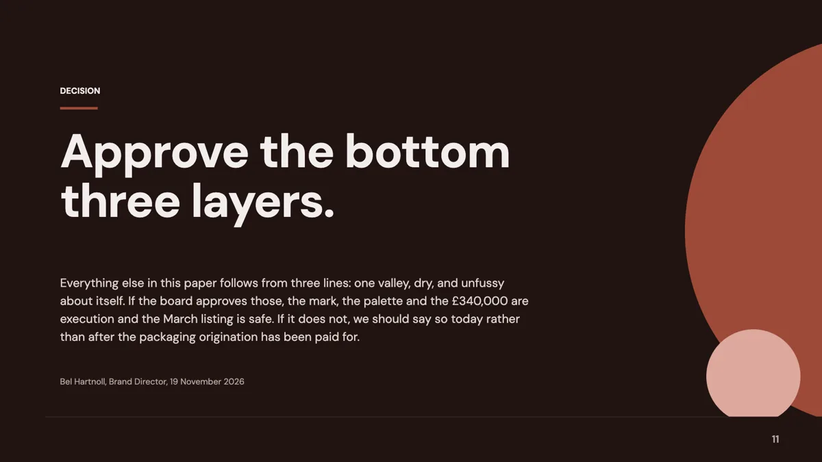
Closing: Bold Conclusion Statement
Closing. A conclusion eyebrow, a display size sentence and a supporting paragraph under it.
Cover: 27 layouts, and the deck is judged on this one
The cover role holds 27 templates, more than any role except metrics, pillars and comparison. They divide into photographic covers, typographic covers with no image at all, and editorial covers with a meta rail carrying a date or an event name. For an investor meeting the typographic and dark gradient covers tend to survive a projector better than a photo cover, because there is no image to go muddy. Whichever you pick, the canvas is 1920 by 1080, so the title has room for about six or seven words before it wraps.
Intro: why now, in one statement
Eleven templates sit under intro, and the three shown here are the ones built for an argument rather than a company description. A why now slide works when the statement is specific about timing: a regulation, a cost curve, a behaviour that changed. The four pillar variant is the better choice when the argument rests on several conditions at once, because each pillar gets a heading and a line rather than being buried in a paragraph.
Metrics: 34 layouts, and most decks need three of them
Metrics is the largest role in the library at 34 templates, which is why a pitch deck usually pulls several: a market size, a traction number and a growth trajectory are three different slides. The concentric market sizing layout carries the value, the acronym and a line for each ring. The hero stat layout exists for the one number you want remembered. The scenario chart is the honest way to show a forecast, because it draws three lines instead of promising one.
Comparison and pricing: where decks overreach
Comparison holds 32 primary templates and is offered on 46 slides once cross listed roles are counted, so there is no shortage of ways to draw a competitive claim. The scatter matrix is the most defensible, because it names axes and places everyone on them. Pricing has nine layouts: three and four tier cards, a two tier hero, a free against paid split, a single featured plan, a budget line sheet and two comparison tables. They are described here rather than pictured, because the library fills a pricing layout with its own placeholder plan names and prices. One real constraint is worth knowing: the three tier card layout deliberately does not highlight a middle tier, and its own notes say to choose a different layout if you need that emphasis. Tier name budgets 20 characters, price 12 and a feature line 60.
Investment: seven layouts for the ask
The investment role has seven templates, the smallest set a pitch deck depends on: a use of funds table, a funding request banner with four allocation cards, an allocation donut, a fund split, a hero breakdown of six rows, a hero of three items and an allocation strip of four. The table is the most scrutinised version, because the columns sum and an investor can check them. The four card banner is friendlier in a room and carries less detail. These are named rather than shown, for the same reason as the pricing layouts. Whichever you choose, the numbers come from you: the generator is instructed not to invent figures.
What the thumbnails show
The three closing cards are slides from example decks published here; every other card above is the layout drawn by the template library with its own sample text in it, the same content the public template gallery shows. The company names, dates, figures and quotes inside those thumbnails are invented to make a layout readable, not facts about anything. Layouts whose placeholder copy states a price, a funding round or a customer claim are described in words on this page instead of being pictured, so nothing here can be mistaken for a real figure.
How many slides a pitch deck runs to
The finished pitch decks published here run from 8 to 12 slides. The demo day deck is 8, the seed and angel decks 11 and 12, the series A and series B decks 12 each. The generator's length slider runs from 3 to 20 slides and defaults to 3, and on a free account the backend caps generation at 6 slides, returning a paid feature response above that. Twelve slides with one idea each is the shape these decks settle into.
Finished examples
Questions people ask
Is this one pitch deck template or many?
Many, on purpose. A deck is a sequence of roles, and each role has its own layouts: 27 covers, 11 intros, 34 metrics slides, 32 comparisons, 9 pricing, 7 investment and 11 closings. The fifteen shown here are one workable path through that sequence.
How many slides should a seed pitch deck have?
The seed and angel decks published here are 11 and 12 slides. That is enough for a cover, a why now, the problem, the market, the product, traction, the competitive position, pricing, the team, the raise and a close, with one idea per slide.
Can I swap a layout after the deck is written?
Yes. The layout picker draws every option with your own content already in it, and swapping re-keys content by box id. Per box styling survives the swap; only position and chart kind are stripped, and content with no matching box is parked and comes back if you swap back.
Can I export the deck to PowerPoint?
Yes, in two forms. Plain PowerPoint places one rendered image per slide. Editable PPTX emits text, lists, images, tables and charts as native objects, and turns diagram, matrix, Gantt, flowchart and map artwork into pictures with native text boxes over the labels. Both are paid features; PDF is free.
Will the AI write the financials?
No. It writes the words and picks images and icons from your brief, and it is told not to invent figures. It also does not choose the layout, the theme, the fonts or the positions, so a chart shows the numbers you supply and nothing else.
Can the use of funds table hold every line item?
It takes four to six spending rows by design, and a table slot can be grown to 20 rows and 8 columns in the inspector. Every cell is left aligned and there is no per column alignment control, so a currency column will not sit flush right.
Start a slide from a description
The button opens the generator with a starting description already filled in. Change it to match your own before you run it.
Create a presentation with OneCraftFor everything the generator can do, see the slide maker.
Other slide examples sets
Sources
Written and checked by the OneCraft team. Last checked .