Slides templates
Report deck templates
A report presented on slides is not a document with bullet points: it is a set of tables, a few charts and a written argument that has to hold together when read without a narrator. Twelve layouts across four roles cover that, taken from the 369 slide templates.
12 designs
What these designs are for
Use this for an annual report readout, a board paper, an investor update or any deck that will be sent as a file and read alone. The layouts here carry genuine tables, a profit and loss grid, a year on year comparison and a waterfall, rather than reducing the numbers to three headline figures.
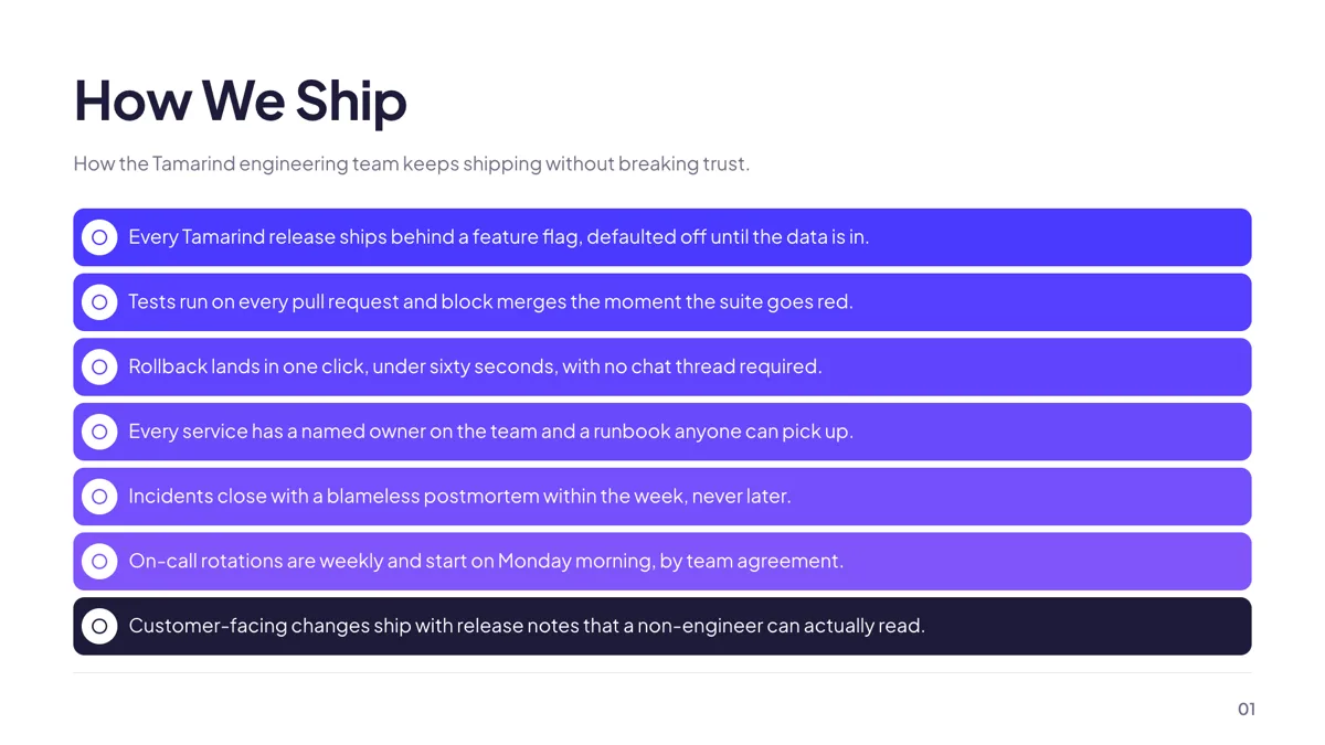
Content: Title + Bullets
Content. A title, an optional subtitle and seven tinted bullet cards, each with its own icon.
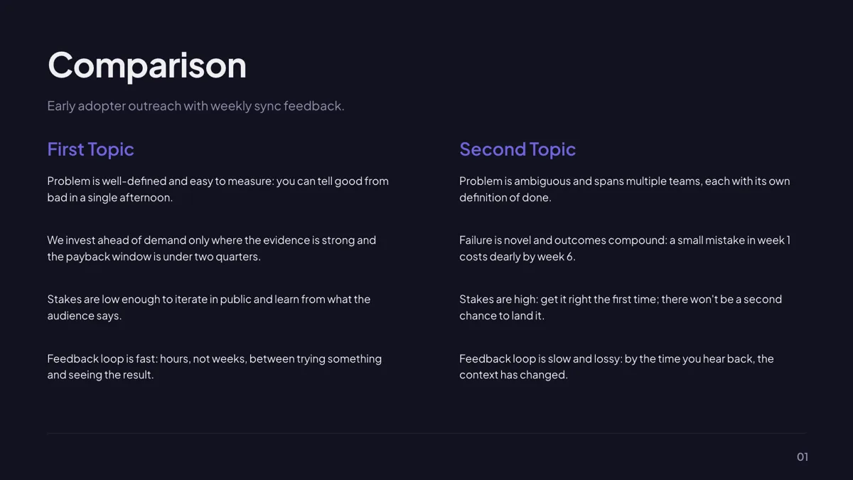
Content: Two Column Text
Content. Two headings, each followed by four prose bullets of one or two sentences.
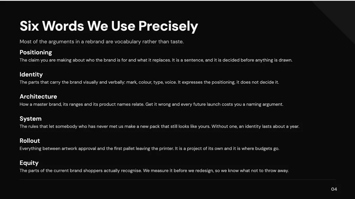
Content: Definition / Terms List
Content. Six term and definition pairs stacked in one column, separated by hairlines.
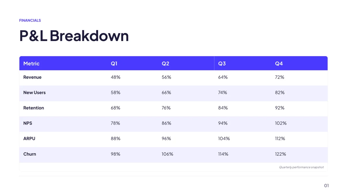
Metrics: Financial P&L Table
Metrics. A profit and loss table with a brand header row, alternating stripes and up to five columns.
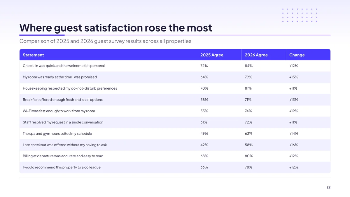
Metrics: Year-over-Year Table (10 rows)
Metrics. A four column year on year grid of statement, earlier year, later year and change.
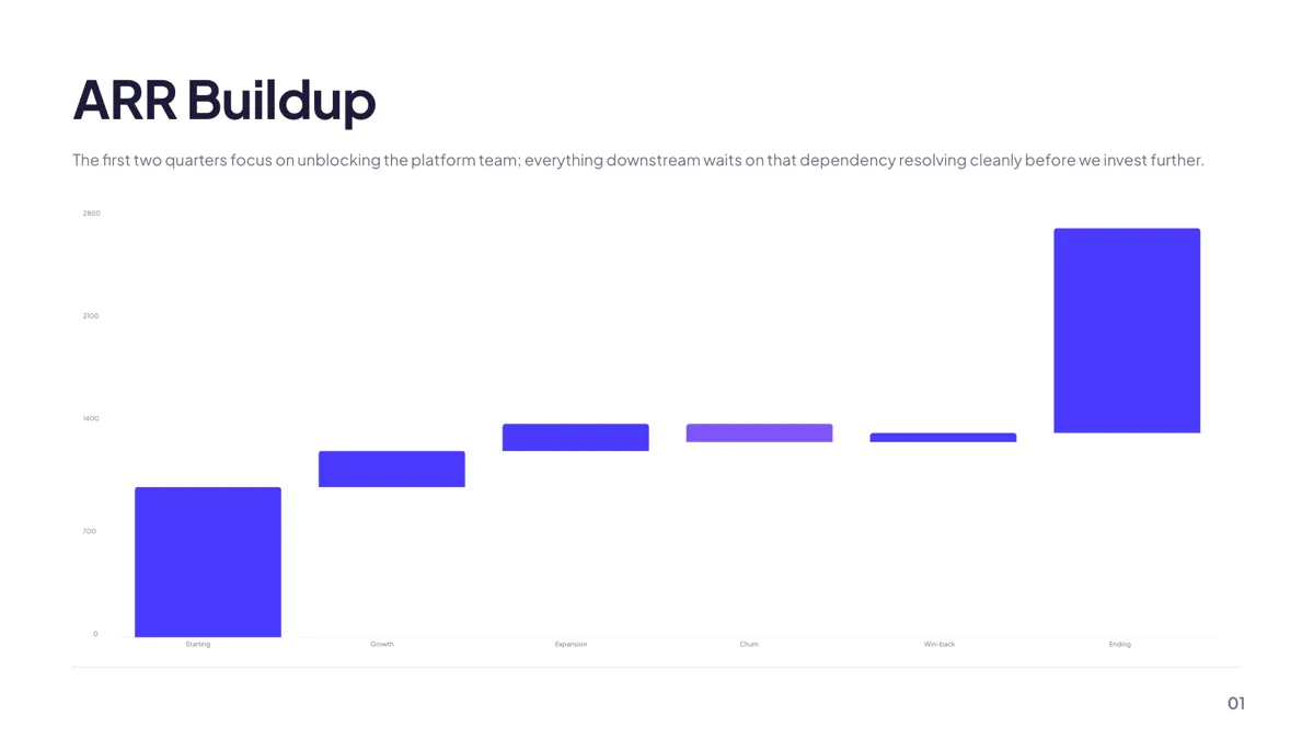
Metrics: Revenue Waterfall
Metrics. A four to eight step waterfall walking from a starting total to an ending total.
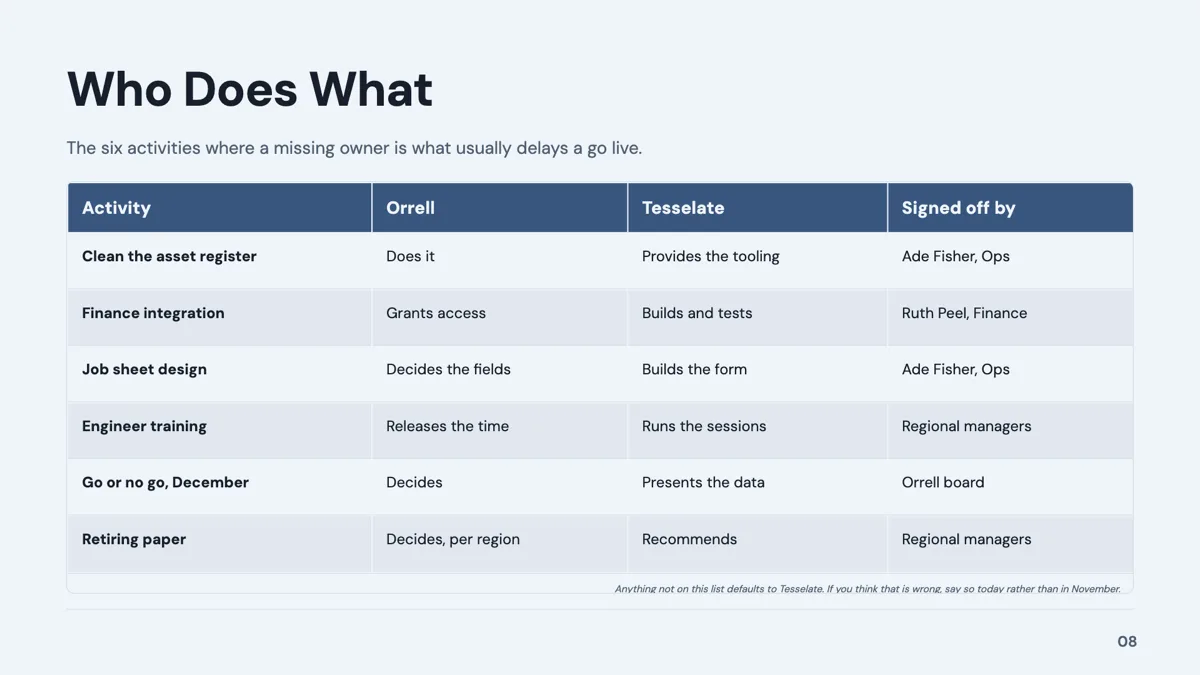
Comparison: Feature Matrix Table
Table. A wide feature table with three or four product columns and five to eight feature rows.
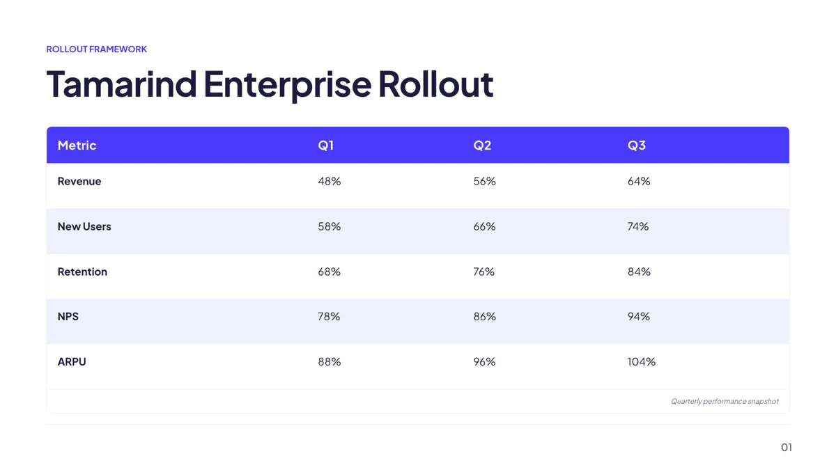
Timeline: Phased Development Table
Table. Phase, duration, key activities and deliverables across three to five sequential rows.

Context: Callout Card + Comparison Table
Table. A callout panel beside a table, for a decision and the options it was made against.
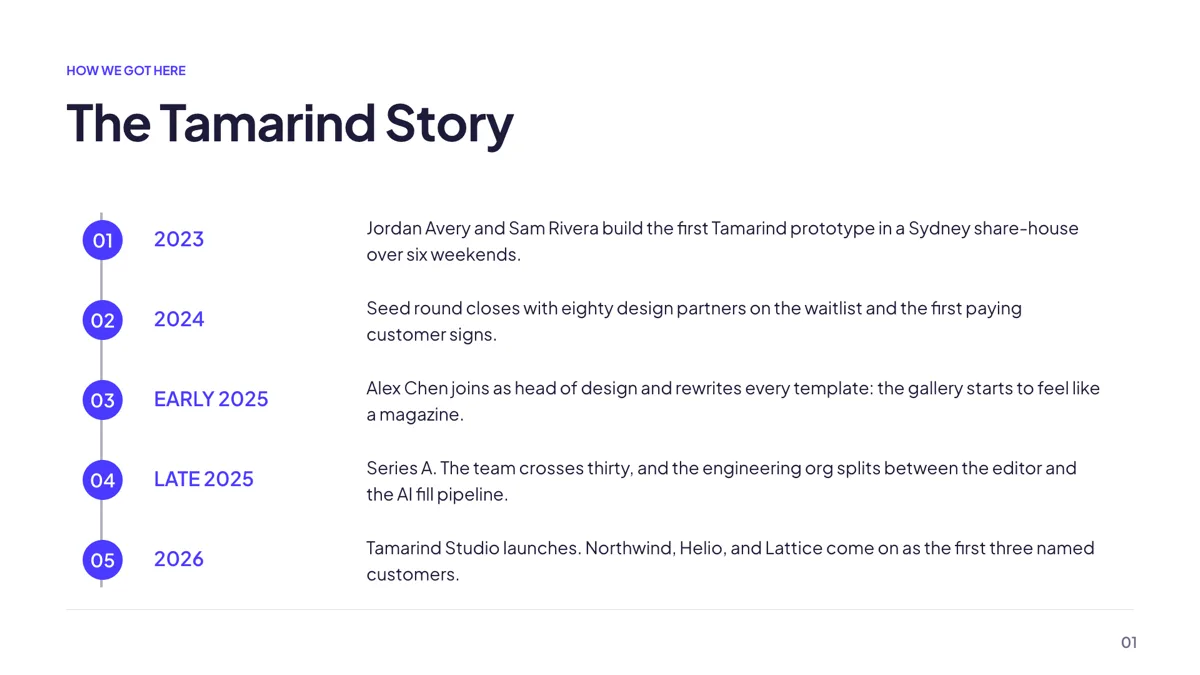
Timeline: Vertical Dotted Rail
Timeline. Five rows on a left hand rail, each a numbered disc, a period label and a sentence.
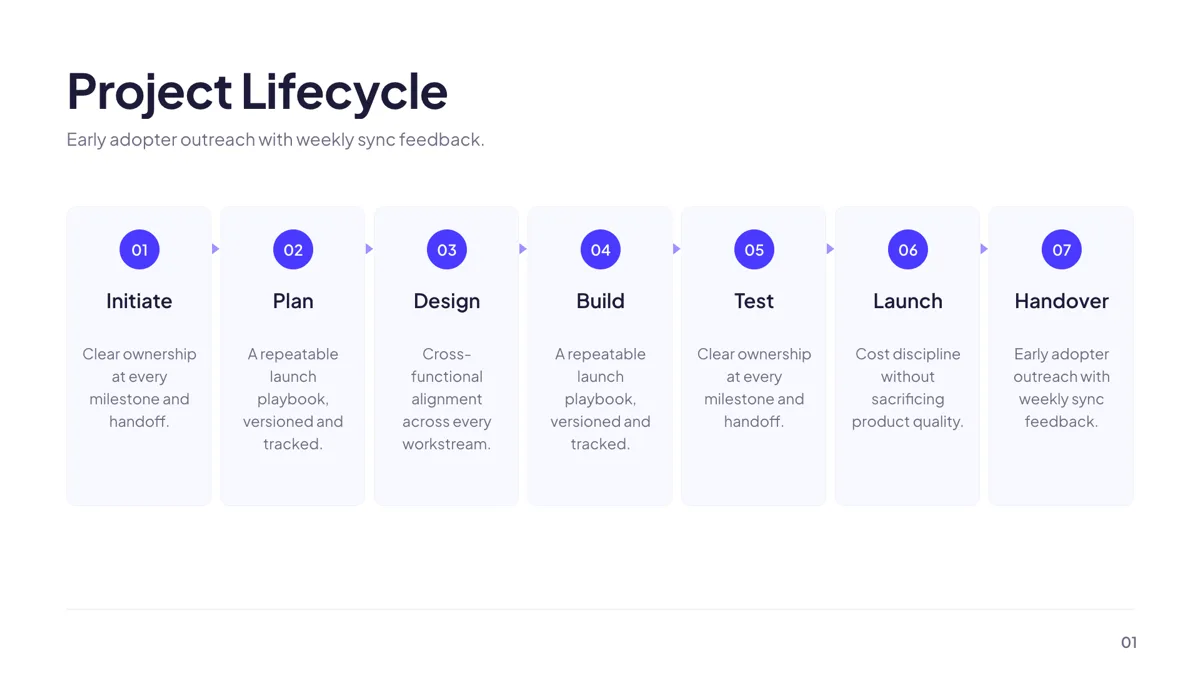
Timeline: 7 Numbered Milestones
Timeline. Seven stages as full height columns with chevrons marking the direction of travel.
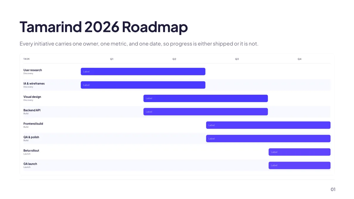
Timeline: Quarterly Gantt Roadmap
Timeline. Five to eight grouped tasks as overlapping bars across four quarters.
Content: 18 layouts for the written parts
The content role holds 18 templates and it is the one a report leans on hardest, because some of the argument has to be prose. The bullet card layout takes exactly seven items, each with its own icon. The two column layout takes two headings with four prose bullets each, up to 140 characters per bullet. The definition list takes six term and definition pairs. These counts are fixed by the layout, so write to them rather than expecting the slide to stretch.
Metrics: the financial layouts
Within the 34 metrics templates, three are built for a report rather than a pitch: a profit and loss table with a header row and alternating stripes, a year over year table of up to ten rows, and a revenue waterfall of four to eight steps where positive deltas take the brand colour. A waterfall is the clearest way to explain why a total moved, and it is one of the ten chart kinds the runtime draws. In the editable PowerPoint export, nine of those ten map to a real PowerPoint chart; waffle stays a picture.
Tables: there is no table role
Tables are a slot, not a role, so the fourteen layouts that carry one are filed under whichever role they serve: a feature matrix and a callout table split under comparison, a phased development table under timeline, a KPI scorecard and a profit and loss table under metrics, a plan table under pricing. Three are shown here because a report usually needs at least one. In the runtime a table can grow to 20 rows and 8 columns with an optional row header column and draggable widths; double clicking a divider clears the widths. Every cell is left aligned and the caption renders right aligned in a footer row.
Timeline: what happened, and what is next
Eighteen timeline layouts are available. A report usually wants two different things from them: a record of what happened, which suits the vertical rail or the numbered stages, and a plan, which suits the quarterly Gantt with its grouped bars across four quarters. Remember that a Gantt here carries no dependencies, and that every timeline spaces its points evenly regardless of the real intervals.
What the pictures show
The definition list and feature table cards are slides from example decks published here; the other cards are the layouts as the template library draws them, with the sample content it ships, which is the same thing the public gallery renders. The line items, periods and figures inside them are invented. Two table layouts are named in the prose rather than pictured, because their sample text carries prices and a competitor ranking.
How long a report deck runs
The report style decks published here are 10 to 12 slides: the investor update is 10, lessons learned 10, and the investment memo and board meeting decks 12 each. A report deck that will be read without a presenter should carry more words per slide than one that is spoken, which is exactly what the content layouts are budgeted for. The closing layouts are covered on the pitch and company profile pages rather than repeated here.
Finished examples
Questions people ask
How many slides should a report deck be?
The published examples run 10 to 12 slides. An investor update sits at 10, a board paper or investment memo at 12. A deck that will be read rather than presented can afford denser slides, which is what the content and table layouts are sized for.
Can a table hold a full profit and loss?
Up to 20 rows and 8 columns in the inspector, with the first column available as a row header. The profit and loss layout is designed for three to five columns and a page of line items, so a full statement usually needs summarising or splitting over two slides.
Can I align numbers to the right in a table?
No. Every cell in the slide runtime is left aligned and there is no per column alignment control. Column widths can be dragged on the header row, and double clicking a divider resets them.
Will the charts survive a PowerPoint export?
In the editable PPTX export, text, lists, images, tables and charts become native objects, and nine of the ten chart kinds map to a real PowerPoint chart. Waffle has no native mapping and stays a picture. Diagram, matrix, Gantt, flowchart and map artwork also stays a picture, but the labels become native text boxes.
Can I keep an audit trail of versions?
Yes. Every save appends a version, the drawer requests the last 50, preview opens an old version read only and restore clones it into a new version with a summary naming the one it came from. There is no autosave, so press Save when a figure changes.
Can I add my own footnote to a table?
A table slot takes an optional caption, which renders right aligned in a footer row under the table. Be aware that on poster boards a caption can be clipped by its block; on slides the caption sits in the table itself.
Start a slide from a description
The button opens the generator with a starting description already filled in. Change it to match your own before you run it.
Create a presentation with OneCraftFor everything the generator can do, see the slide maker.
Other slide examples sets
Sources
Written and checked by the OneCraft team. Last checked .